Animations - Choose a preferred entrance animation for the title area
7.Title Area
- Text Right to Left
- Title Area Top to Bottom
Don’t Show Title Text – Use this option to hide or show the title text. If the title text is enabled, then you can style it with several more options.
- Title Text Alignment
- Text Size
- Text Shadow
Note: If you are looking to display just the background image, or to have a solid color in the background area with no text – use this option to hide the title text.
Background Color – Here, choose a background color for the title area.
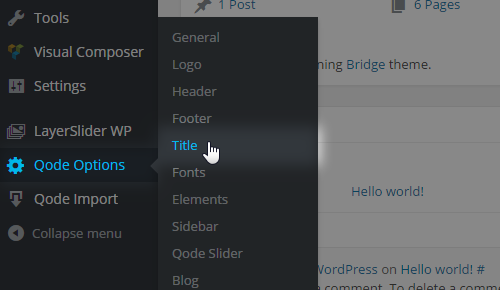
Title Image - Upload a default title background image. This options is located under Qode Title > Title Image:
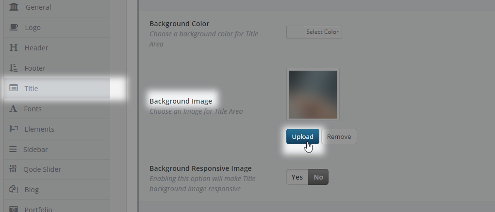
You can also upload different title images for different pages.
Background Responsive image – By default, the background image is not responsive, and in that case you can set it to be:
- Parallax Title Image
- No
- Yes
- Yes, with Zoom
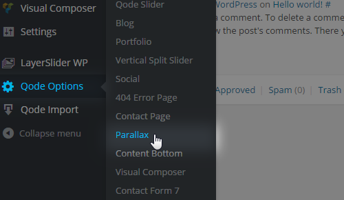
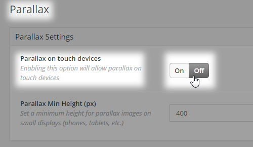
Note: The Parallax effect is not supported on all mobile devices, so we included the option to disable it for mobile. To do so, just navigate to Qode Options -> Parallax on touch devices and set it to No
- Title Height - If you’ve set the title image to not be responsive, here you should declare a height for the entire title area. Enter an absolute numeric value – omitting the unit at the end. So for a 400px high title area, just input 400 and save.
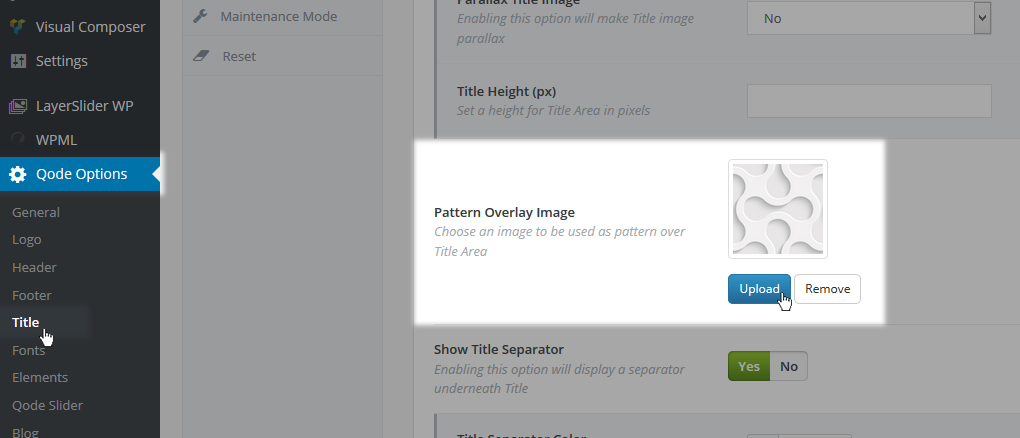
Pattern Overlay Image - Repeating patterns are a great way to add detail and texture to any website or interface design. Here you can upload a pattern image to be used as an overlay for the title background image.
Show Title Separator – By enabling this option you can include a small separator line just below the Title Text. You also have the following options available to style the separator:
- Title Separator Color
- Title Separator Width
Note: If you plan on using a subtitle, the title separator will come in between the title text itself and the subtitle which is placed below it.
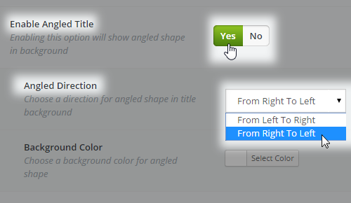
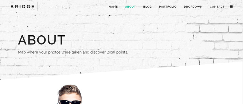
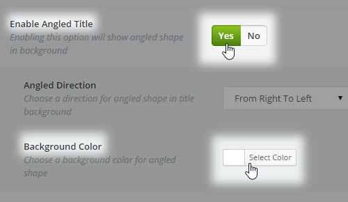
Enable Angled Title – A modern title area design, featured in this demo
- Angle Direction - Here you can set the angle direction From Left To Right, or opposite from Right to Left.
- Background Color - Set the color that will be visible at the bottom of the title area depending on the Angle Direction.
Note: When using a color picker you can type in the word ‘Transparent’ to omit the color completely.
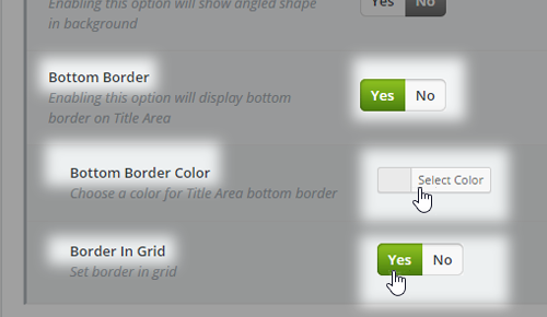
- Bottom Border - Here you can turn on a bottom border line to get a more distinctive separation between the title area and the page content. Style it to your preference:
- Bottom Border Color
- Border In Grid
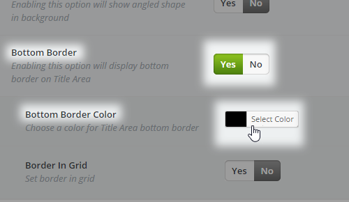
To add spacing between the entire title area and the content of your site use these two options.
- Margin After Title for Default Template (px) – for devices whose view-port width is above 1000px
- Margin After Title for Default Template on Touch devices (px) - for devices whose view-port width is below 1000px
Note: Use an absolute numeric value. For 200px spacing set 200.
7.1 How to setup the Title Area?
The Title Area is located directly under the header of your site. It’s one of the most prominent areas containing the title and the subtitle of a post, page or a portfolio item.
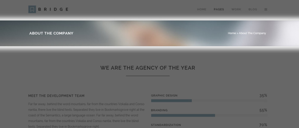

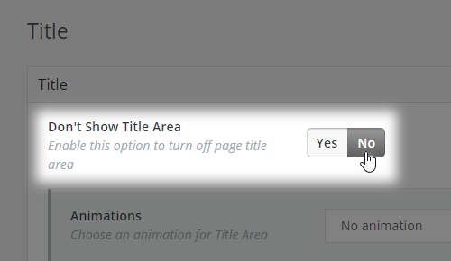
The title area can be set up globally, as well as on a page-level basis.
To set up the title area globally, please navigate to the Qode Options -> Title panel where we’ve included design solutions and properties for this area.
First, there is a main option for enabling/disabling title area named Don’t Show Title Area. If you set Yes here, than the title area will be turned off on your site.
If you choose to enable the title area, several options will become available. They are listed in three metaboxes: Title, Breadcrumbs and Title Scroll Animations. We will go through the options in each of these metaboxes in the following sections.
7.1.1 Title
Animations - Choose a preferred entrance animation for the title area
- Text Right to Left
- Title Area Top to Bottom
Don’t Show Title Text – Use this option to hide or show the title text. If the title text is enabled, then you can style it with several more options.
- Title Text Alignment
- Text Size
- Text Shadow
Note: If you are looking to display just the background image, or to have a solid color in the background area with no text – use this option to hide the title text.
Background Color – Here, choose a background color for the title area.
Title Image - Upload a default title background image. This options is located under Qode Title > Title Image:

You can also upload different title images for different pages.
Background Responsive image – By default, the background image is not responsive, and in that case you can set it to be:
- Parallax Title Image
- No
- Yes
- Yes, with Zoom
Note: The Parallax effect is not supported on all mobile devices, so we included the option to disable it for mobile. To do so, just navigate to Qode Options -> Parallax on touch devices and set it to No
- Title Height - If you’ve set the title image to not be responsive, here you should declare a height for the entire title area. Enter an absolute numeric value – omitting the unit at the end. So for a 400px high title area, just input 400 and save.
Pattern Overlay Image - Repeating patterns are a great way to add detail and texture to any website or interface design. Here you can upload a pattern image to be used as an overlay for the title background image.

Show Title Separator – By enabling this option you can include a small separator line just below the Title Text. You also have the following options available to style the separator:
- Title Separator Color
- Title Separator Width
Note: If you plan on using a subtitle, the title separator will come in between the title text itself and the subtitle which is placed below it.
Enable Angled Title – A modern title area design, featured in this demo
- Angle Direction - Here you can set the angle direction From Left To Right, or opposite from Right to Left.
- Background Color - Set the color that will be visible at the bottom of the title area depending on the Angle Direction.

Note: When using a color picker you can type in the word ‘Transparent’ to omit the color completely.
- Bottom Border - Here you can turn on a bottom border line to get a more distinctive separation between the title area and the page content. Style it to your preference:
- Bottom Border Color
- Border In Grid

To add spacing between the entire title area and the content of your site use these two options.
- Margin After Title for Default Template (px) – for devices whose view-port width is above 1000px
- Margin After Title for Default Template on Touch devices (px) - for devices whose view-port width is below 1000px
Note: Use an absolute numeric value. For 200px spacing set 200.
7.1.2 Breadcrumbs
A breadcrumb title is a series of connected links that provide a breadcrumb-like link structure from the homepage to the page you’re currently at. You can say that it resembles a stripped down navigation menu. For example:
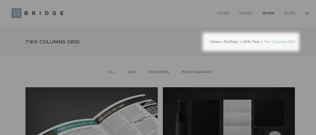
Each part of the breadcrumb is a link and can be used to go back to any page on the level above or find out what page you are currently on if it is unclear.
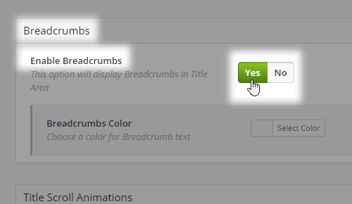
To enable breadcrumbs you should navigate to Qode Options -> Title -> Enable Breadcrumbs and set Yes.
Upon enabling this feature you can set the breadcrumbs color.
7.1.3 Title Scroll Animations
Here you can define animations for your page title area and all the elements located in this area.
This feature is aimed towards advanced users who have a basic knowledge of CSS.
Let’s go through each option:
Enable Whole Content Title Animations - Set this option to Yes if you would like to enable an animation for the whole title area and all its contents.
Scrolling Animation Start Point - Here you need to set the properties for the first keyframe in the scrolling animation. Use the Scrollbar Top Distance field to set when your animation will start in relation to the distance of the scrollbar from the top of the page, and use the Enter CSS declarations separated by semicolons field to enter your CSS declarations for the beginning of the animation (i.e. opacity: 1;).
Scrolling Animation End Point - Here you can set the properties for the last keyframe in the scrolling animation. Use the Scrollbar Top Distance field to set when your animation will end in relation to the distance of the scrollbar from the top of the page, and use the Enter CSS declarations separated by semicolons field to enter your CSS declarations for the end of the animation (e.g. opacity: 0;).
Enable Page Title Animations - Set this option to Yes if you would like to enable an animation on the page title. You can use the options described above to create your animation.
Enable Page Separator Title Animations - Set this option to Yes if you would like to enable an animation on the page title separator. You can use the options described above to create your animation.
Enable Page Subtitle Animations - Set this option to Yes if you would like to enable an animation on the page subtitle. You can use the options described above to create your animation.
Enable Page title Breadcrumbs Animation - Set this option to Yes if you would like to enable an animation on the page title breadcrumbs. You can use the options described above to create your animation.
For example, let’s do a basic ‘opacity with scaling’ animation:
Scrolling Animation Start Point:
- Scrollbar Top Distance: 0
- Css Animation:
opacity:1;
transform:scale(1);
Note: add vendor prefixes as necessary.
Scrolling Animation End Point:
- Scrollbar Top Distance: 200
- Css Animation:
opacity:0.8;
transform:scale(0.8);
This is how your settings should look like:
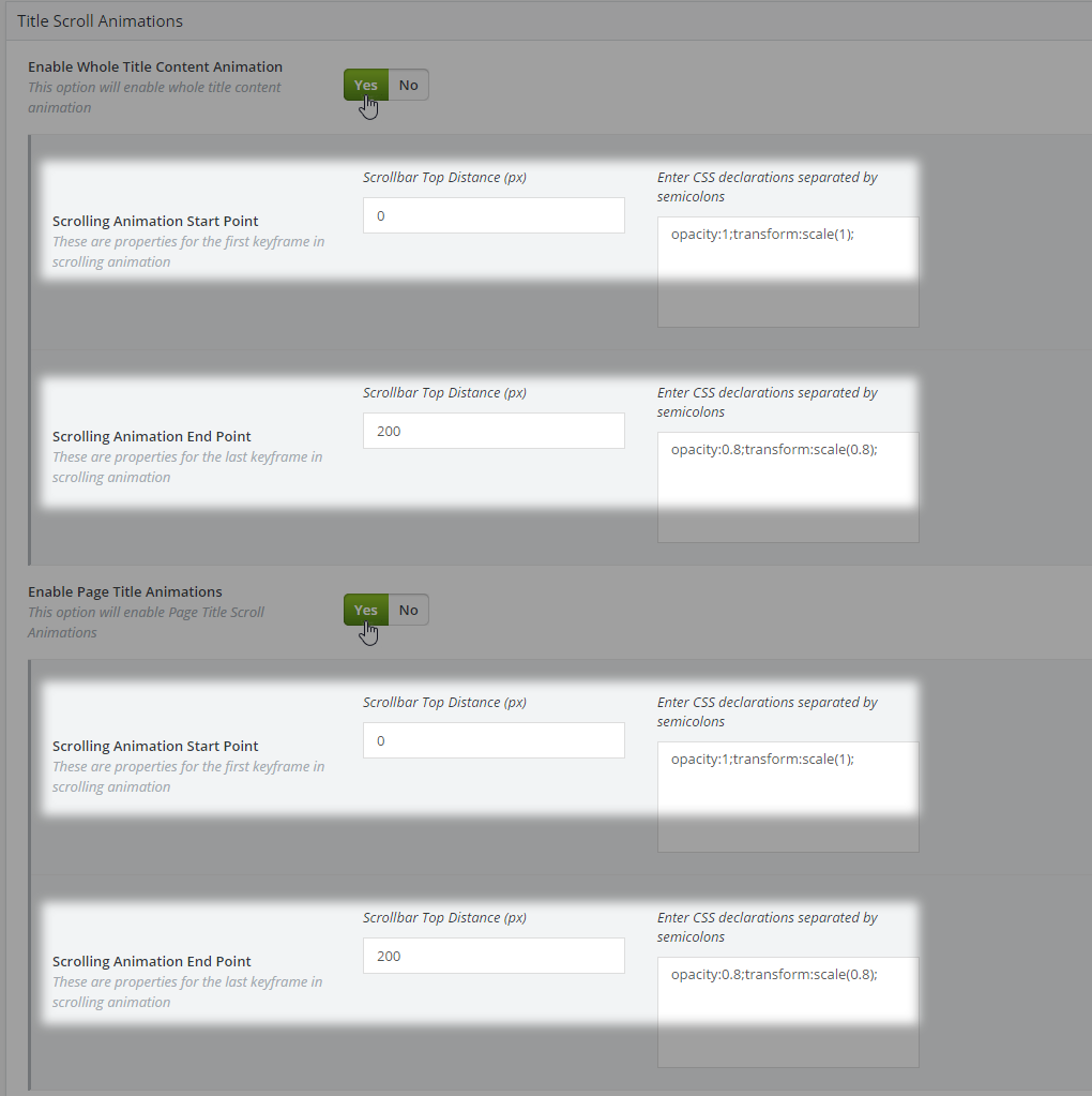
Paste this example code into your options to see the result you’ll get. Basically, on page scrolling action you’ll see a slight fade out which is achieved with CSS opacity and title decreasing through CSS transform property.
What else could be used here? Here’s another example with a ‘rotation’ animation:
Scrolling Animation Start Point:
- Scrollbar Top Distance: 0
- Css Animation:
transform:rotate(180deg);
Scrolling Animation End Point:
- Scrollbar Top Distance: 150
- Css Animation:
transform:rotate(0deg);
Here, your page subtitle will be initially positioned as if one is looking at it upside down, like on this screenshot:

... and on scrolling, since we set the transform property to rotate to 0 degrees, the page subtitle will return to its normal state of orientation.
7.2 Title Area – Additional Settings
TITLE TEXT DESIGN
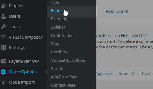
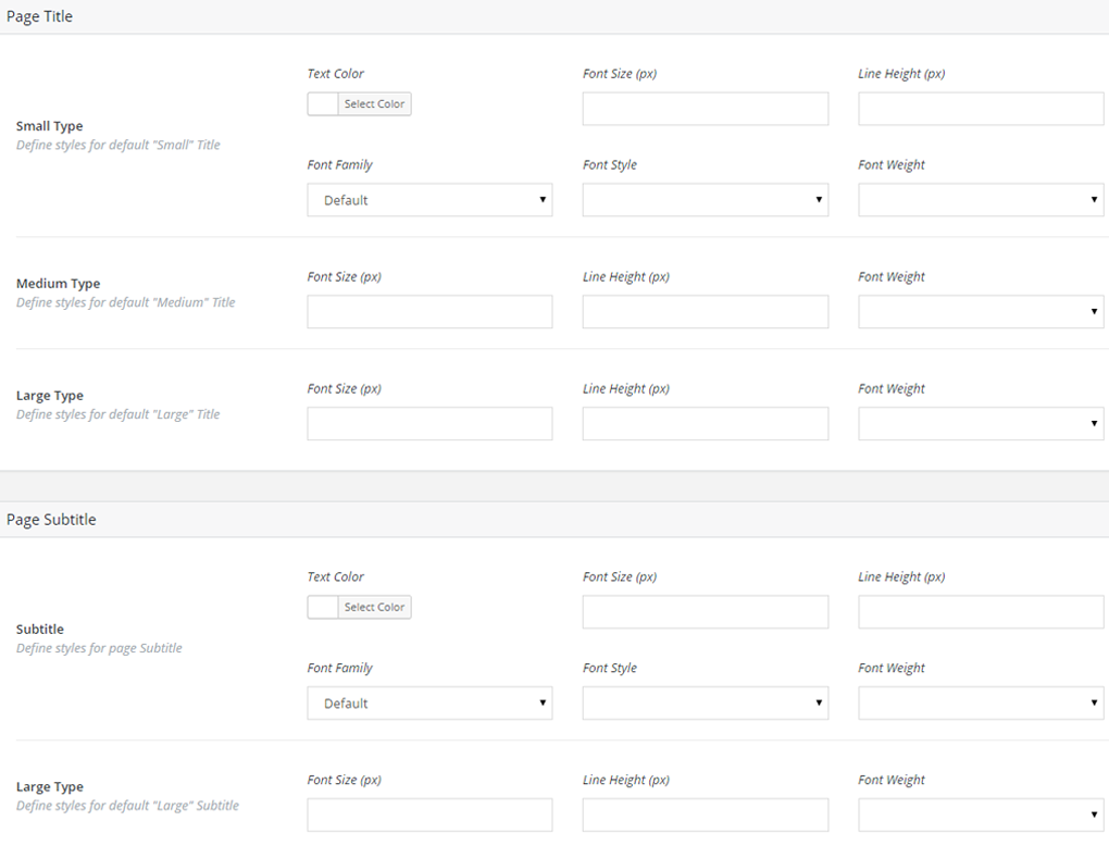
To change the typography of page titles and subtitles, we provided additional options in Qode Options -> Fonts in the Page Title & Page Subtitle sections.
Qode Title on each page
The majority of Title Area design options you set globally can be overridden in the Qode Title metabox on each page.
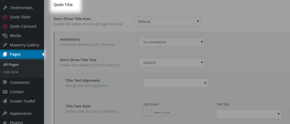
This could come in handy if you’ve imported a demo in which we’ve already set some page related options. If the options you see on your front end don’t correspond to those globally set in Qode Options, then they are probably set on a page basis.
7.3 Title Area – Demo Site Layouts
Let’s go over a few title area layouts used in our demos. We’ll go over some examples from our demo sites and provide you with the settings for each of them:
An example of a title area in between two borders. To create this we used the title bottom border and the header bottom border. Here’s how we set this one up:
To make this kind of layout, which is a basic title layout, we’ve set
- Title height to 460px
- Separator Under Title Text is set to No
- Upload Background Image for this page and
- Set it to be Responsive background Image
Which means that it looks like this on mobile devices:
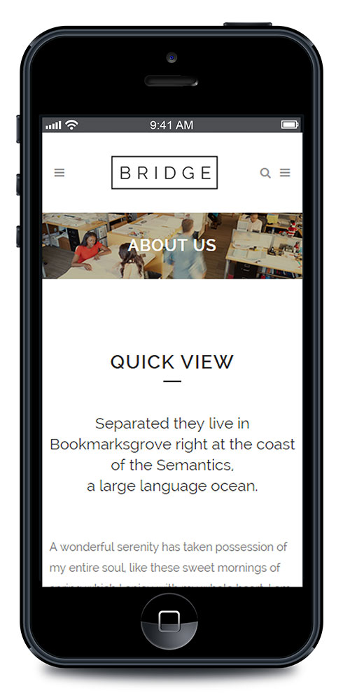
Responsiveness decreases the image dimensions when the browser is resized, so the image, along with the title text itself, fits the browser resolution.
For a basic parallax effect we’ve set:
- Title height to 500px
- Separator Under Title Text is set to No
- Upload Background Image for this page and
- Set it NOT to be be Responsive background Image, but
- Parallax Background Image is set to YES
If you try to scroll down you’ll see this parallax effect happening on the background image.
Note: The Parallax effect is not supported on all mobile devices, so we included the option to disable it for mobile. To do so, just navigate to Qode Options - > Parallax on touch devices and set it to No.

A more advanced parallax zoom-out effect is set through these setting values:
- Title height to be 600px
- Upload Background Image for this page and
- Set it NOT to be Responsive background Image, but
- Parallax Background Image is set to YES, WITH ZOOM OUT
If you try to scroll down you’ll see this parallax effect with zoom out on background image
Note: The Parallax effect is not supported on all mobile devices, so we included the option to disable it for mobile. To do so, just navigate to Qode Options -> Parallax on touch devices and set it to No.

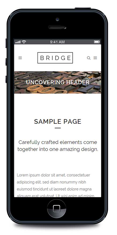
Here is an example with Title animations going on:
To make this layout with animations, we’ve set
- Title height to 500px
- Separator Under Title Text is set to No
- Upload Background Image for this page and
- Set it to be Responsive background Image
- And set the Animations option to Title Area Top To Bottom
Responsiveness decreases the image dimensions when the browser is resized, so the image, along with the title text itself, fits the browser resolution.
Here is an example with a solid background color:
To make this kind of layout, we’ve set
- Title height to be 500px
- For Background color we have chosen white
- And background image options are left default (empty)
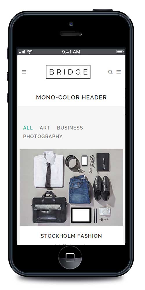
Now let’s have a look at the mobile layout:
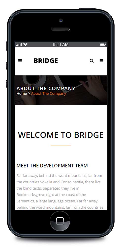
Here’s how title area with breadcrumbs looks like:
To make this kind of layout, we’ve set
- Enable Breadcrumbs to Yes
- Separator Under Title Text to No
Here’s how it will look on mobile devices
Let’s have a look at an angled title area. For this we’ve set:
- Title height to 400px
- Separator Under Title Text to No
- Upload Background Image for this page and
- Set it NOT to be Responsive background Image
- Set Enable Angled Title to Yes with
- Angled Direction set From Right To Left and
- Background Color to White
- Title height is set to 274px
- Separator Under Title Text set to No
- Background Image for this page has been removed removed
- Background Color is set to white, just like the body background color of the page;
Under global settings, Qode Options > Title > Bottom Border is enabled with a color value for it. The strucutre i set to be In Grid
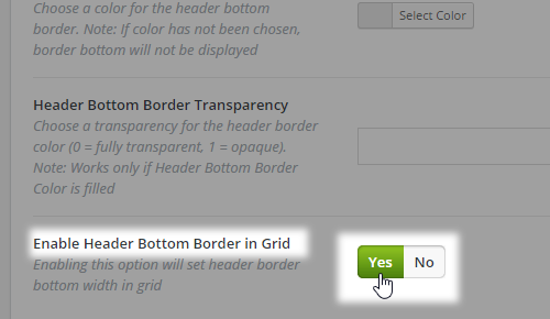
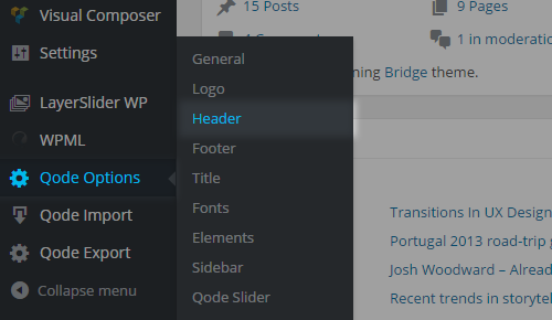
Also, under the global options for the Header, Qode Options > Header > Enable Bottom Border in Grid is set to Yes
7.4 Title Area – Errors and Troubleshooting
In this section we will describe the most common errors that can occur when setting up your title area, and provide solutions for each one.
7.4.1 The background color I chose is not being applied
This may happen if you have set a background image for your title area. In this case your chosen background color won’t be applied. So, if you want to have a background color, then just remove the background image if one is uploaded, or simply set Yes for the Don’t Show Background Image option.
7.4.2 Background color and background image are displayed together
This may happen if you pick a Background Color, and upload an image under Background Image option, and then after that you set also Yes for Don’t Show Background Image.
This is happening because the database field for Background image is filled, and even if you set Don’t Show Background Image to Yes, the background image would still be visible.
What you should do is simply remove the uploaded background image.
7.4.3 Title text is line breaking in the middle of words
To fix, this you could use the following CSS code and paste it into WP Admin -> Qode Options -> General -> Custom CSS field.
.title h1 {
word-break: normal !important;
}
7.4.4 How to style the title area in category, archive, tags, search or 404 pages?
These pages are using the WordPress page templates archive.php, 404.php, search.php that are native wordpress pages. So, all Title options that are set under Global settings, Qode Options > Title will be applied to these pages. Further customization on each page is not supported.
For pages, portfolio items, or posts that are edited through the backend editor, you can use the Qode Title metabox to apply a different title styling than the one set in WP Admin -> Qode Options -> Title.


