In this section you can define if a sidebar will be visible on the post or not
11. Blog
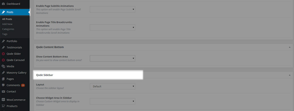
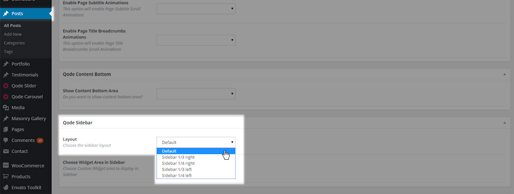
You can choose one of five predefined sidebar layouts:
- Default – No Sidebar is used
- Sidebar 1/3 right – The sidebar is placed on the right side of the page taking 1/3 of its width
- Sidebar 1/4 right – The sidebar is placed on the right side of the page taking 1/4 of its width
- Sidebar 1/3 left – The sidebar is placed on the left side of the page taking 1/3 of its width
- Sidebar 1/4 left - The sidebar is placed on the left side of the page taking 1/4 of its width
After selecting a layout for the sidebar, the default sidebar widget area will be displayed. If you would like to use a different sidebar, you can create a custom widget area and select it as the sidebar for that page. This can be set in the Choose Widget Area in Sidebar field in the Sidebar section
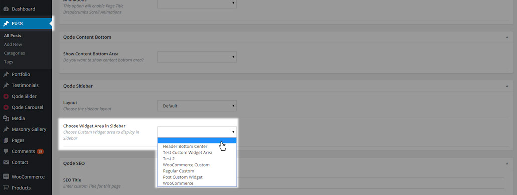
This dropdown area is populated with all the custom widget areas created.
11.1. Blog List Page Templates
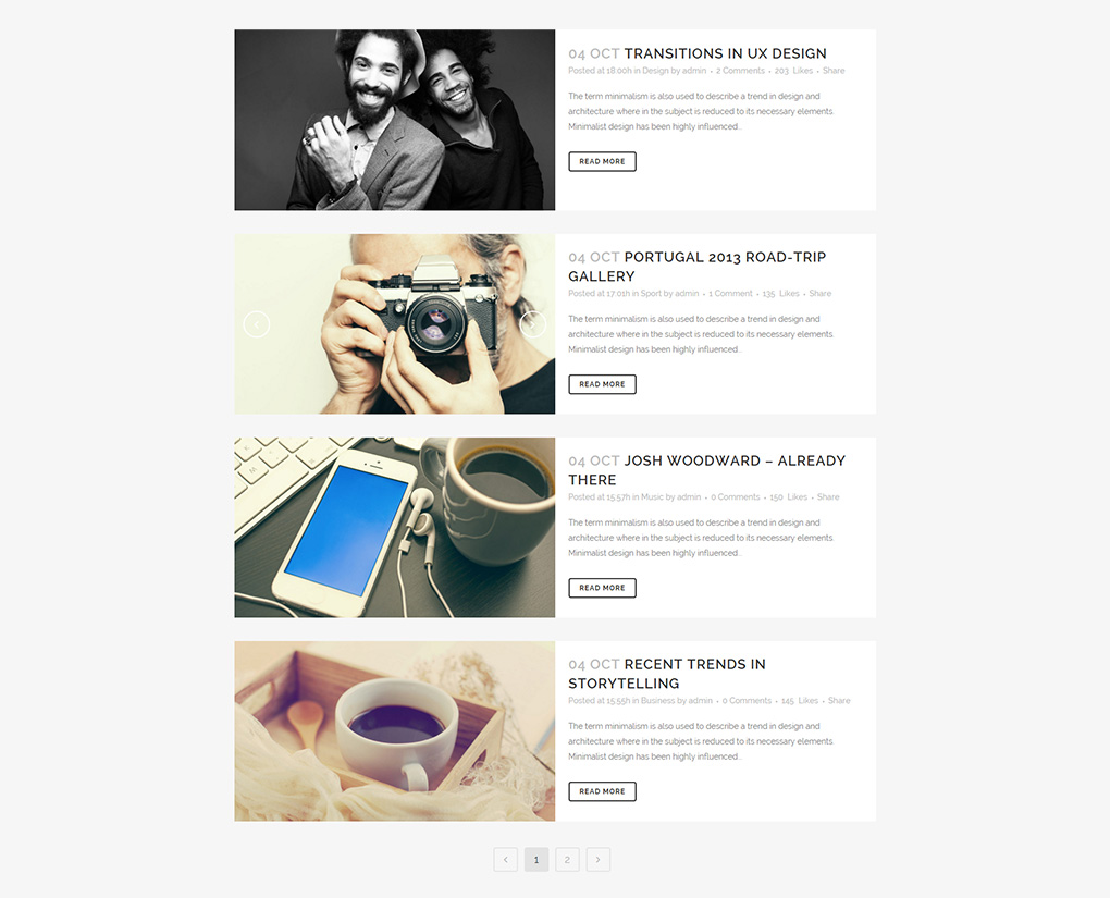
The blog list page is a page on your website with a listing of all of your blog posts. Creating a blog list page is very easy. All you have to do is create a new page, and set it to one of the available blog templates:
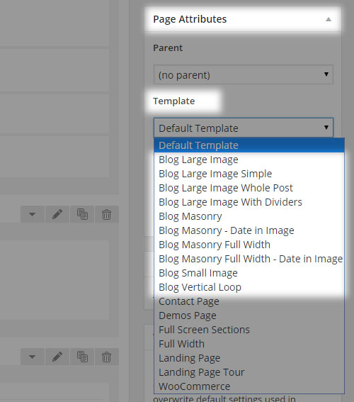
Bellow you can take a look at each of the available Bridge blog list templates:
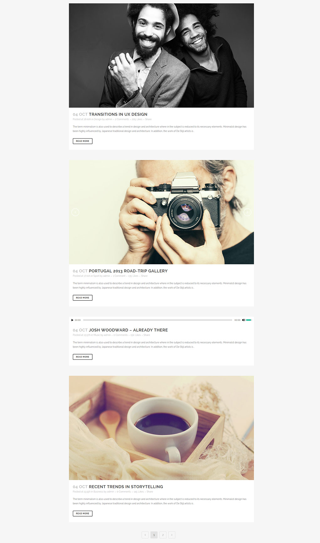
01 Blog Large Image
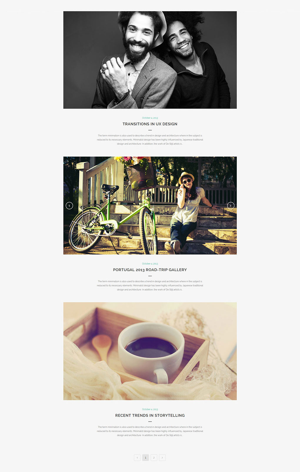
02 Blog Large Image Simple
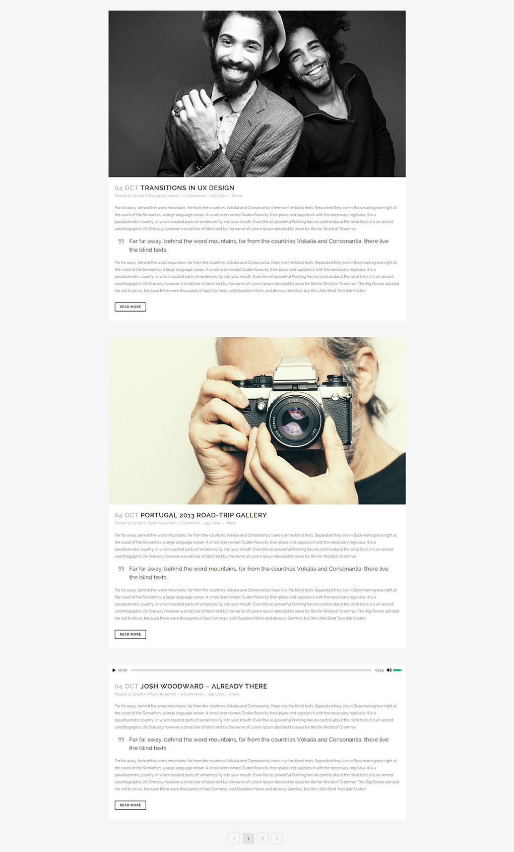
03 Blog Large Image Whole Post
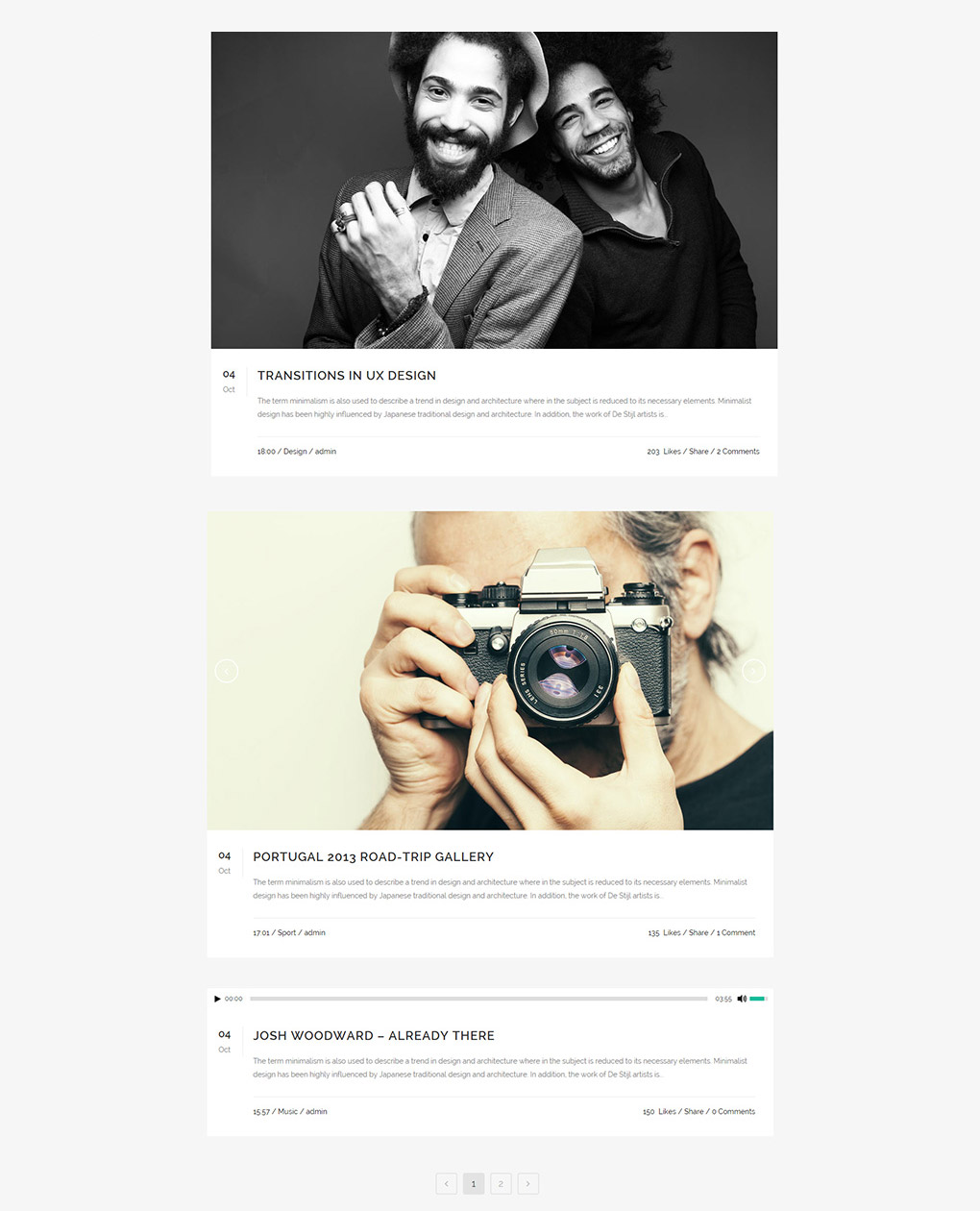
04 Blog Large Image With Dividers
05Blog Masonry
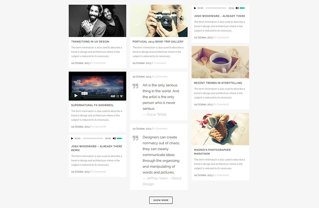
06Blog Masonry – Date in Image
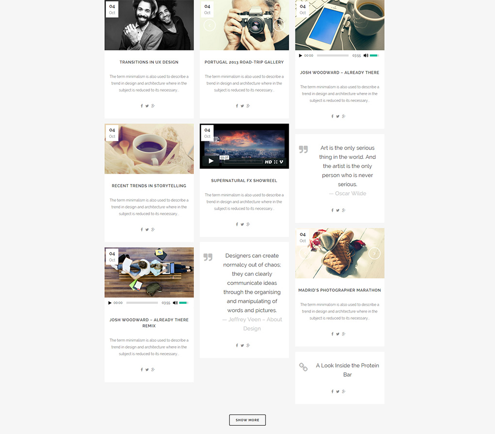
07Blog Masonry Full Width
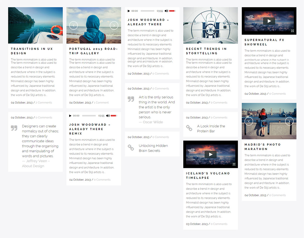
08Blog Masonry Full Width – Date in Image
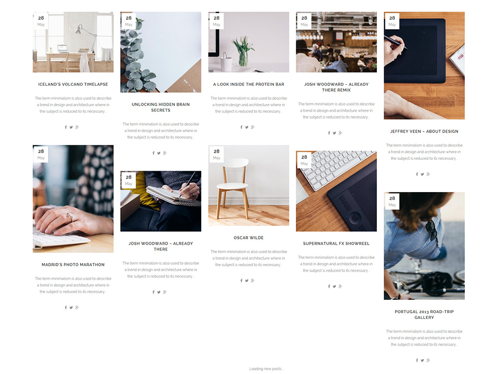
09Blog Small Image
10Blog Vertical Loop
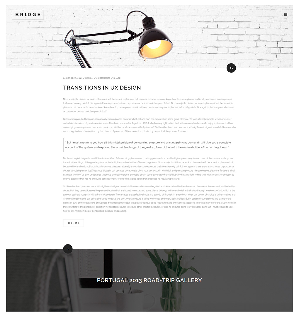
In a later section we will go through all the available global options for each blog list template.
11.2. Blog Single Posts
After you set up a page to display your blog list, you can start creating blog posts.
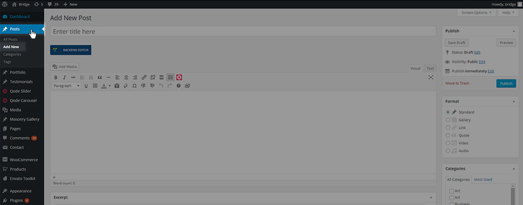
To create a new post, navigate from the WP Admin to Posts -> Add New
11.2.1 Basic Setup
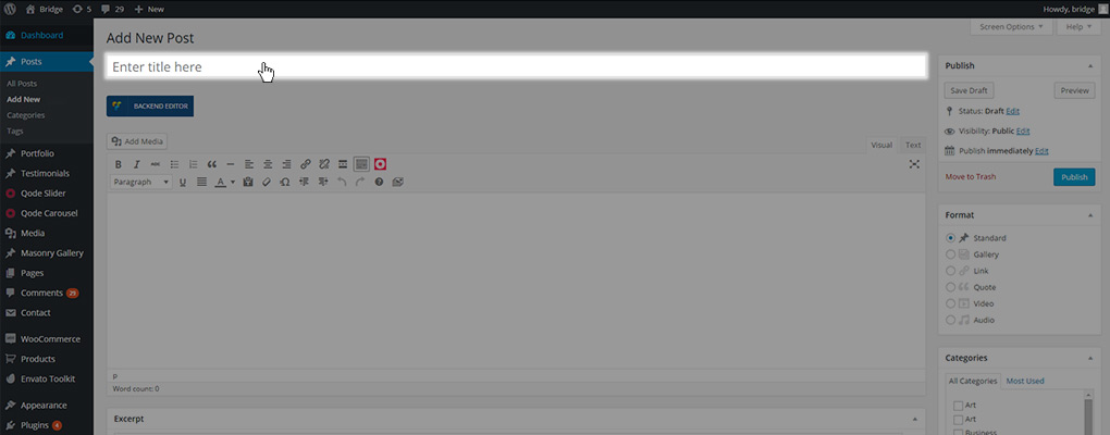
The first things you should do when creating a new post is enter a title for the post
and set a featured image
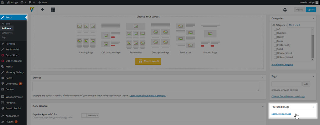
Then you can use the meta fields to configure your desired settings and layout.
In the following sections we will go through all the available meta fields for blog posts.
11.2.1.1 General
This section contains some general post settings

Here we will describe each of these settings and how it can be used:
- Page Background Color: Defines the body background color of the post

This setting can also be set in Qode Options -> General under Content Background Color. By setting it on a specific page or post you will override the color you set in the global options just for that specific page or post.
- Page Transition: If you have page transitions enabled in your global options, and would like a certain post to have a different loading effect from other pages or posts, or if you would like only a specific post to have a loading effect at all, you can set that here. Leaving this field empty means the page (or in this case post) will use the default setting from your global options.

- Hide Featured Image: If you don’t want to have the feature image displayed on a single post page then you should set this property to Yes value. Otherwise, leave it set to No like it is set by default

- Layer Slider or Qode Slider Shortcode: As you can see from our page structure, every post can also contain a Slider that is placed below the header, but before the page content. The slider is implemented through this field. This is the only proper way for setting a Qode Slider onto your page, while the LayerSlider can be also placed in the page (or post) content using its shortcode. In order to display a slider between the header and content using this field, all you have to do is paste the desired slider’s shortcode into the field.
- Qode Slider

- Layer Slider

In order to get a slider’s shortcodes:
- For the Qode Slider
- In your admin panel select Qode Slider -> Sliders

- Copy the desired slider’s shortcode

- Paste it in the Qode Slider and Layer Slider shortcode field on the page you would like to display it on

- For the Layer Slider
- In your admin panel select Layer Slider WP -> All Sliders
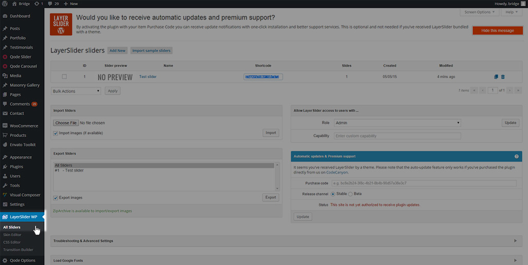
- Copy the desired slider’s shortcode
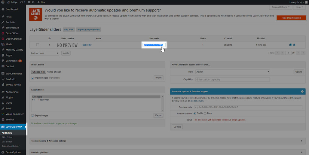
- Paste it in the Qode Slider and Layer Slider shortcode field on the page you would like to display it on

- Dimensions of image for Blog Masonry – Date in Image: If you choose the Blog Masonry – Date in Image template for your blog page or as the default template for your archive pages, you can define the format the featured image will be displayed within the masonry layout using this field. You can choose one of four options

- Default – Original image proportions will be used, and resized to fit the masonry grid

- Landscape – An 800x600px image will be used, but resized within the same proportions based on the number of posts that should be displayed in one row

- Portrait - A 600x800px image will be used but resized within the same proportions based on the number of posts that should be displayed in one row

- Square – A 570x570px image will be used but resized within the same proportions based on the number of posts that should be displayed in one row

- Always put content below header: Our header is implemented so that if it has some transparency set, the Title (if enabled) or the Qode/Layer slider (if set) will be pulled underneath
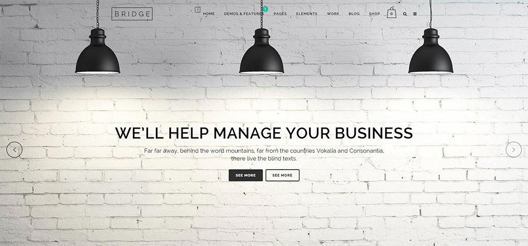
If you don’t like this effect you can disable it using this setting which will place all post elements (title – slider – content) below the header.
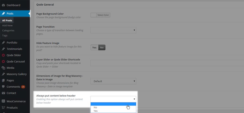
Leaving this field empty, or setting it to No means the post will use the default setting, while setting this field to Yes will put all post elements below the header.
11.2.1.2 Header
The Header has a lot of options as is explained in more detail in the Header Setup section of the documentation. However, some of those settings can be overridden on a page to page (or post to post) basis. All of these settings are located under the Qode Header section of the post’s meta fields
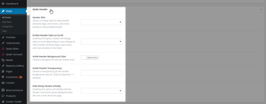
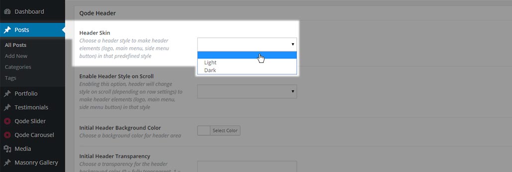
- Header skin: If you would like a particular post to have a different header skin from that set in your general header setting, you can define that in this field. Leaving the field empty means the header of this post will use the default setting, while setting the field to either light or dark will set that type of header skin for this post
- Enable header style on scroll: In our theme, the header style can also be applied to a specific row within the post. Similar to the Header skin setting which defines the default skin of the post header, this setting provides the possibility to change the header skin depending on the row it is currently covering
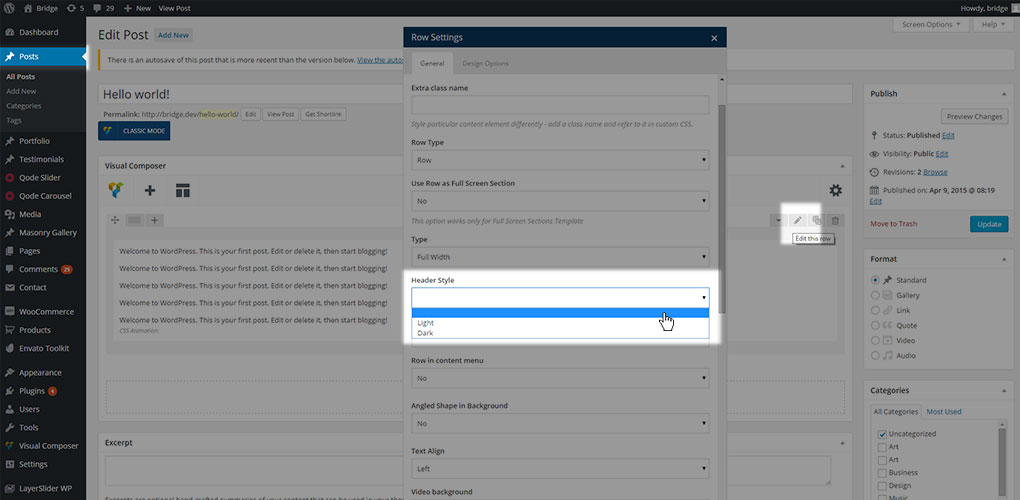
Leaving the field empty means the post header is using the default setting, while setting this field to Yes will change header style based on the row settings, and No will disable that behaviour
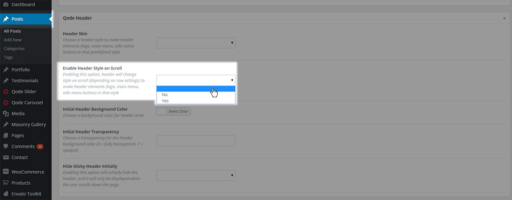
This setting is applied only if you are using the WPBakery page builder for creating content. If you set this field to Yes, you can then define which header skin will be displayed for each row on the page by going to edit that row and setting the desired skin in the Header Style field in the row options.
- Initial Header Background Color: This field changes the color of the header background for this specific post

This will affect both header areas: header top and header bottom.
- Initial Header Transparency: Defines the header transparency for this specific post. This field also affects the header top and header bottom area, and can take values from 0 to 1.

- Hide Sticky Header Initially: This setting will initially hide the header before the page is scrolled, after which the header will appear (depending on the value set in the Scroll amount for sticky header appearance field.

Empty field means post header is using default setting, while setting this field to Yes will hide header initially and No will disable that.
11.2.1.3 Title
In this section you can override the default settings made in Qode Options -> Title.
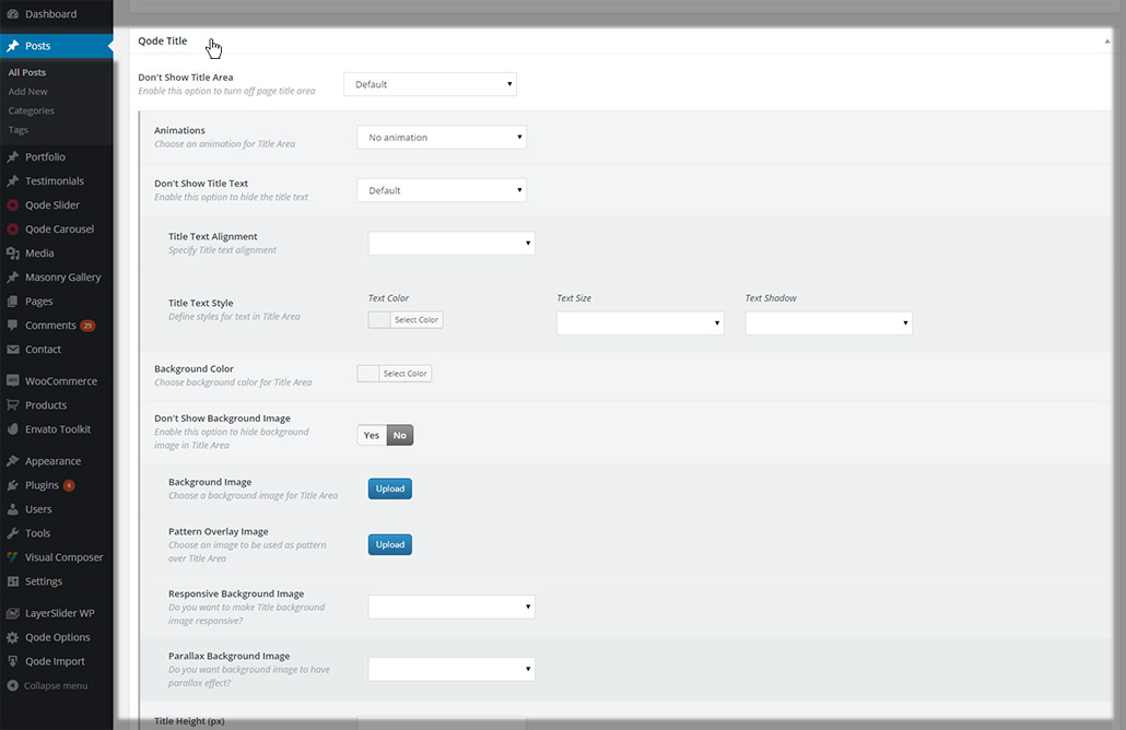
- Don’t Show Title Area: In this field you can define whether the title area will be visible on this post.

You can set one of three values:
- Default - the default value set in Qode Options -> Title will be used, and some extra options will be available so you can override the default settings
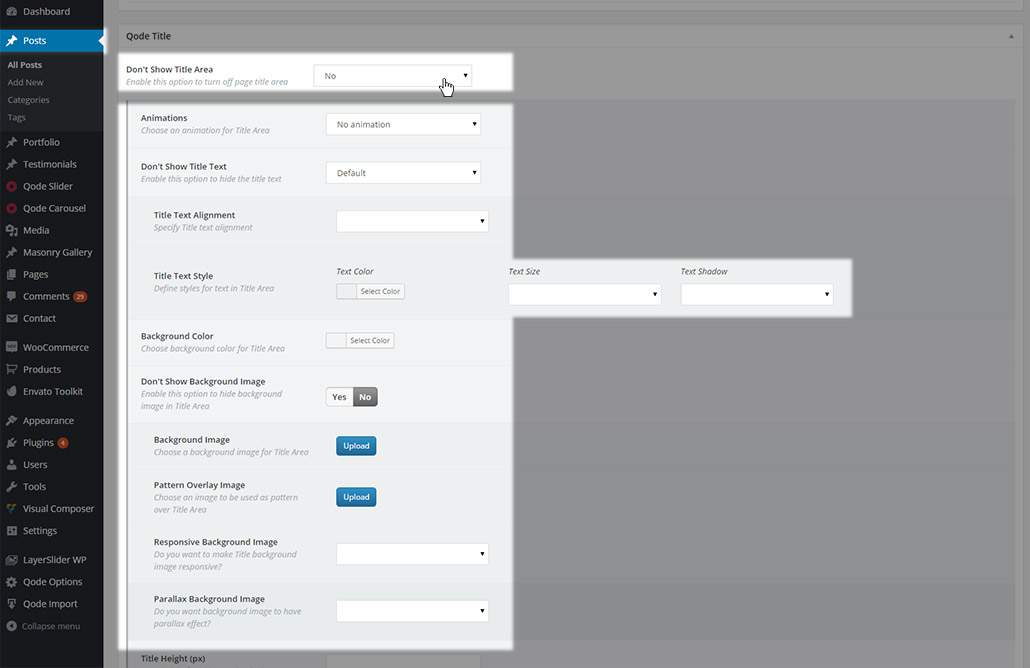
- No –If the title is enabled in your global options, setting this field to No will simply give you access to other options regarding the title which will override global options. If the title is disabled in your global options, then setting this field to No will display the title on this specific page (or post).
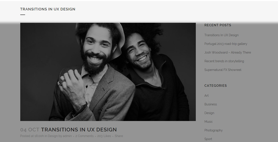
- Yes – Setting this field to Yes will make sure the title is not displayed on this page (or post). .

If you chose to display the title on your post, you will see some extra options enabled. We will now go through all of them:
- Animations – choose if you want your title to have an animation effect

You can choose one of the following options
- Empty value – the default value from Qode Options -> Title -> Animation will be used
- No animation – no animation will be set .
- Text right to left – text will appear from the right side of the screen and slide in to the left side of the title area.
- Title area top to bottom – the entire title area will appear from the top of the screen.
- Don’t show title text – with this option you can hide the title text, leaving only the title image visible. You can choose one of three options

- Default – the default value from Qode Options -> Title -> Don’t show title text will be used
- No – the title text will be displayed and additional options will appear

- Title text alignment – set a text alignment for the title. You can choose between default (empty value), left, right or center

- Text color – set a color for the title text

- Text size - set a predefined size for the title text. You can choose between default (empty value), small, medium, or large the title text

- Text shadow - choose whether you would like a text shadow to be visible on the title text

- Yes – The title text will not be displayed.
- Background color – Choose if you would like your title area to have a background color. This color will only be visible if there is no title image set, or the title image height is lower than the height of the title area

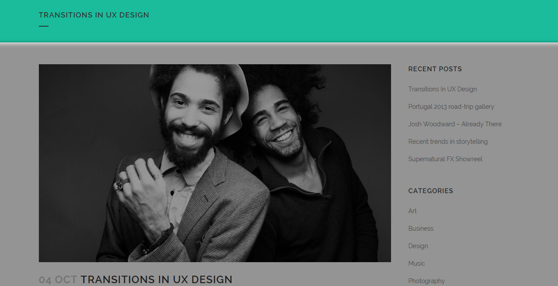
- Don’t Show Background Image – here you can disable the default title background image which has been set in the global options. You can choose between two values:
- Yes – Background Image will not be displayed

- No – Background Image will be displayed and additional options will appear
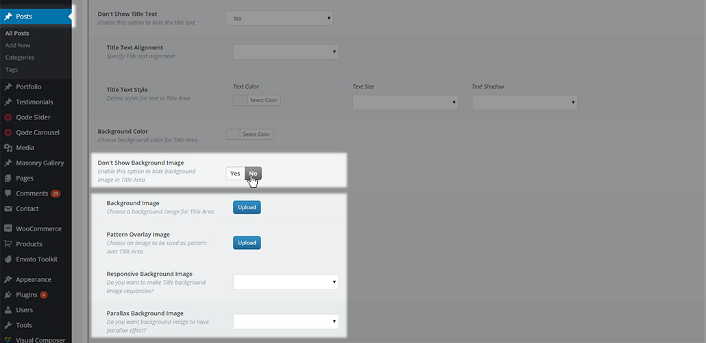
- Background image – Choose a background image to be displayed in title area for this page.
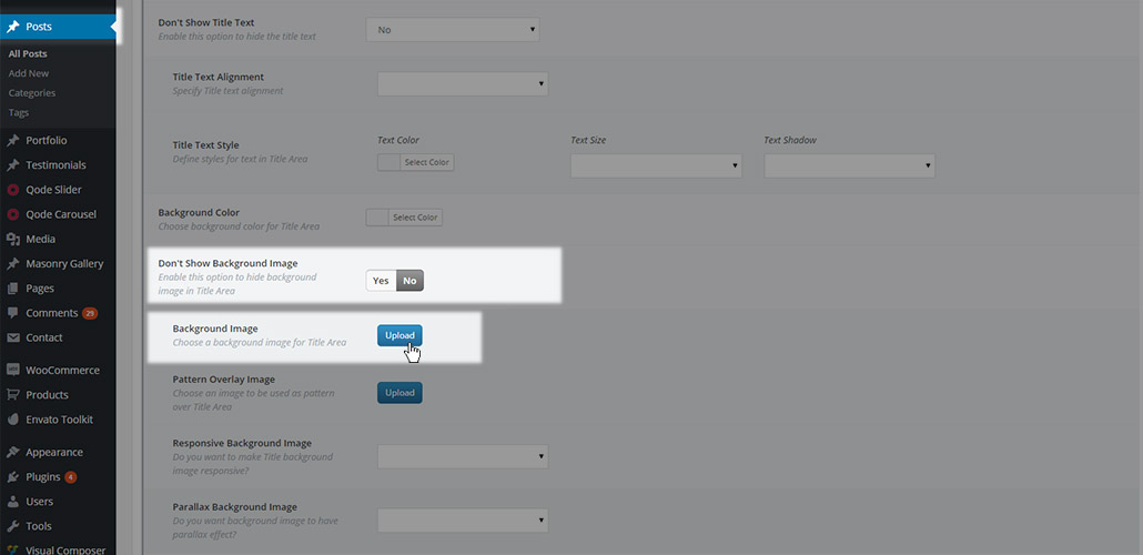
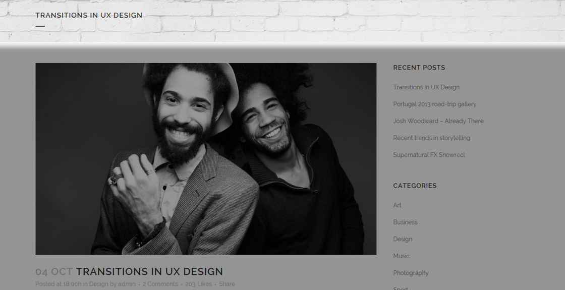
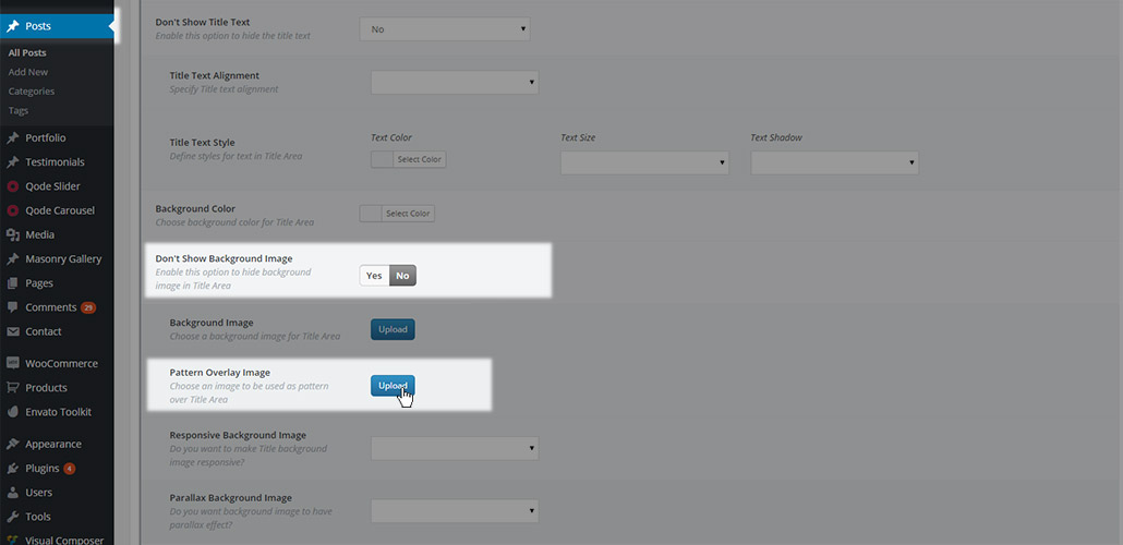
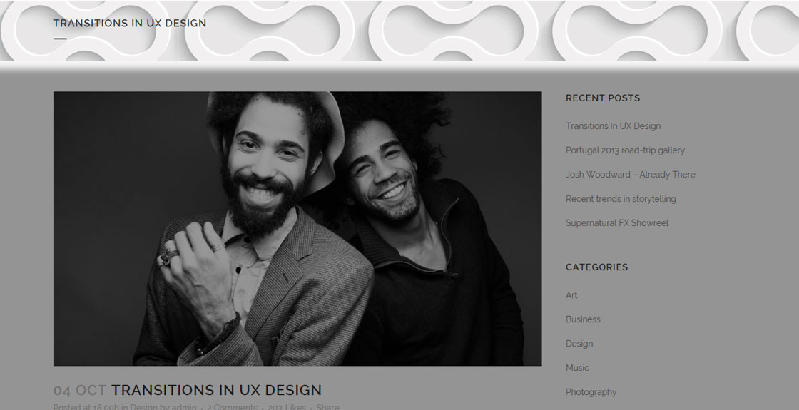
- Pattern Overlay Image - Set a pattern overlay image. This image will be used as the title area background image, but as repeating pattern
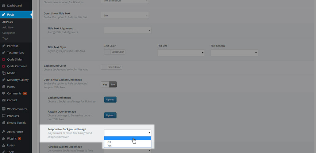
- Responsive Background Image – You can choose whether you would like your title image to be responsive across different devices. You can choose between three values: default (empty value), Yes or No. If you choose not to have a responsive background image, new option will appear for Parallax Background Image
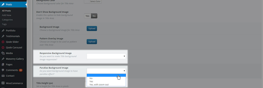
- Parallax Background Image – Choose if you want to have a parallax effect on your title image. You can choose between four values: default (empty value), No, Yes, and Yes, with zoom out.
- Title Height (px) – Define the height of the title area.
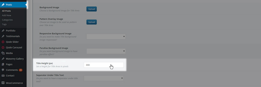
the value should be entered without the unit at the end (only value, for example 500. Not 500px). This value will override the title height setting from Qode Options -> Title.
- Separator Under Title Text – Here you can choose whether you would like to have a separator displayed under the title text. You can chose one of three values: default (empty value), No to hide the separator, or Yes to display it.
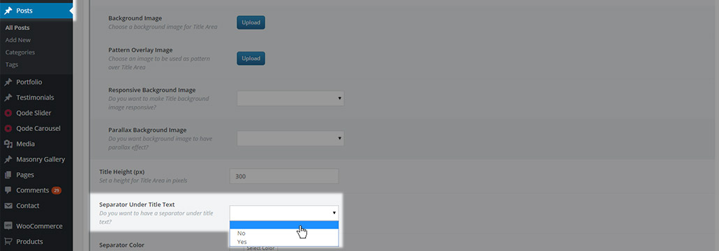
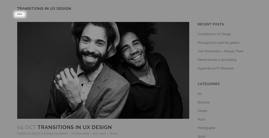
- Separator color – Set a desired color for the separator if you have it enabled either in Qode Options -> Title, or on a specific post.
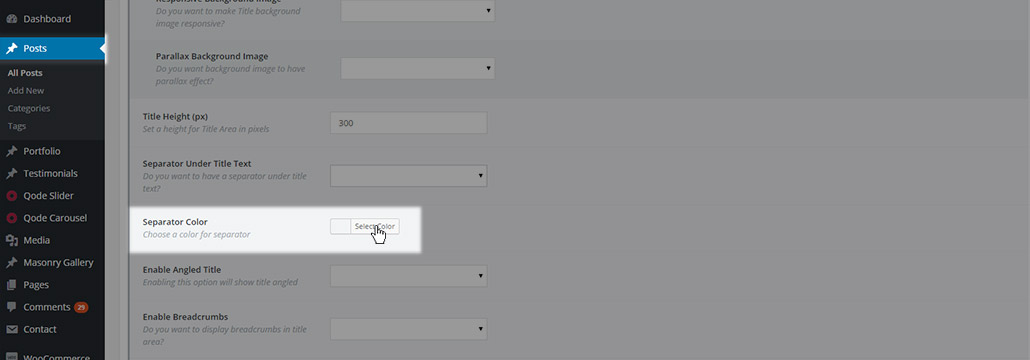
This color will override the one set in Qode Options -> Title.
- Enable Angled Title - With this option you can enable or disable an angled title, which is displayed as styled empty space at the bottom of title area. You can choose one of three options
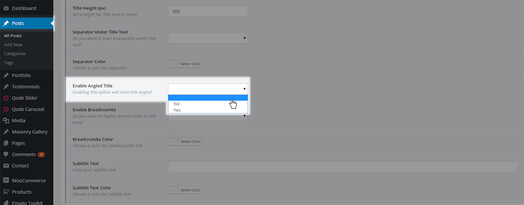
- Empty value – the default value from Qode Options -> Title -> Angled Title will be used
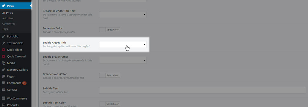
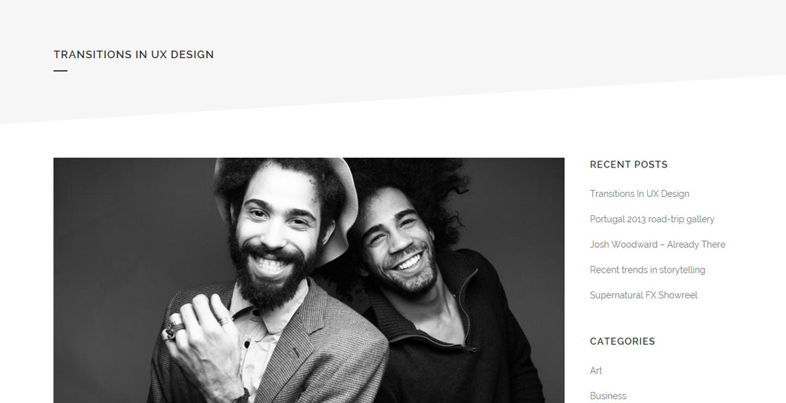
- No – the angled title will not be displayed. This overrides will override the Qode Options -> Title -> Angled Title setting if it is set to yes

- Yes – the angled title will be displayed and a panel with additional options for the angled title will be displayed.
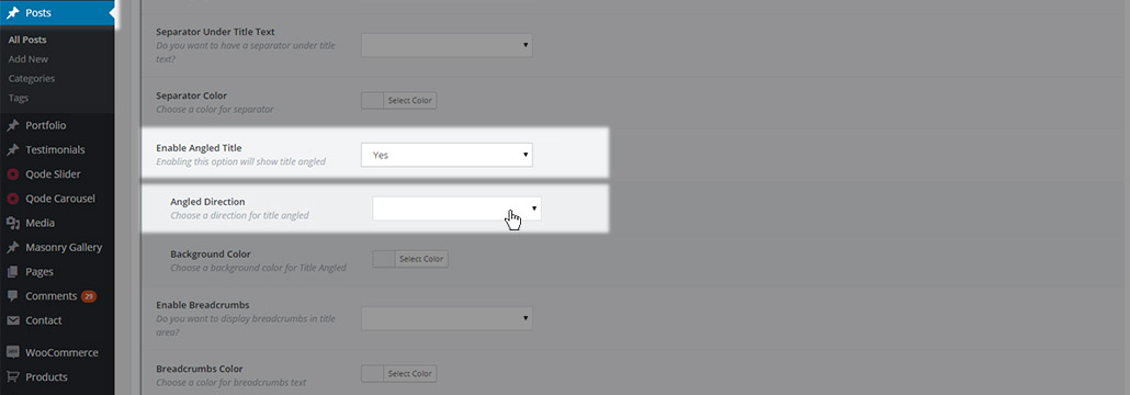
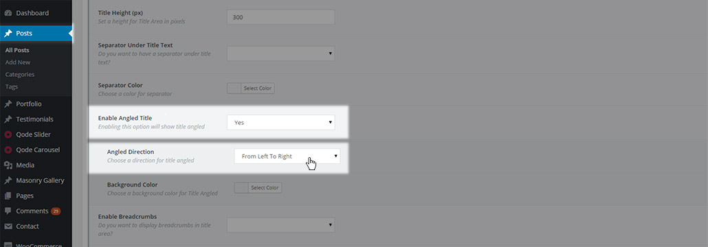
- Angled direction - you can choose a direction for your angled title. You can choose one of three values
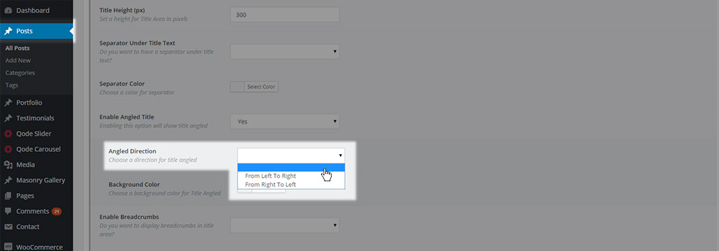
- Empty value – the default value from Qode Options -> Title will be used
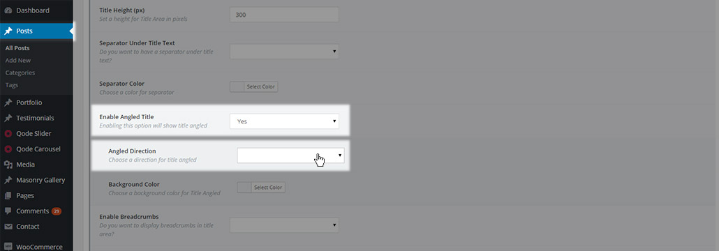
- From Left To Right – the direction and space will decrease from the left side of the title to the right
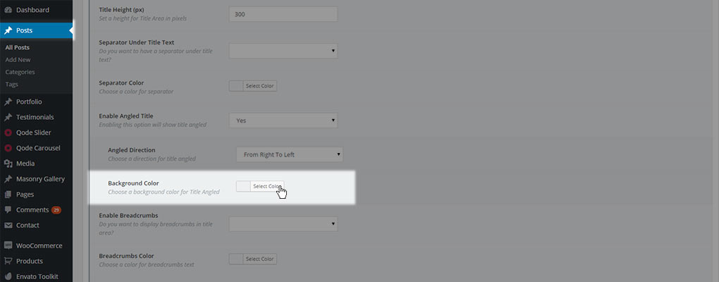
- From Right To Left – the direction and space will decrease from the right side of the title to the left

- Background color – choose a background color for the angled area
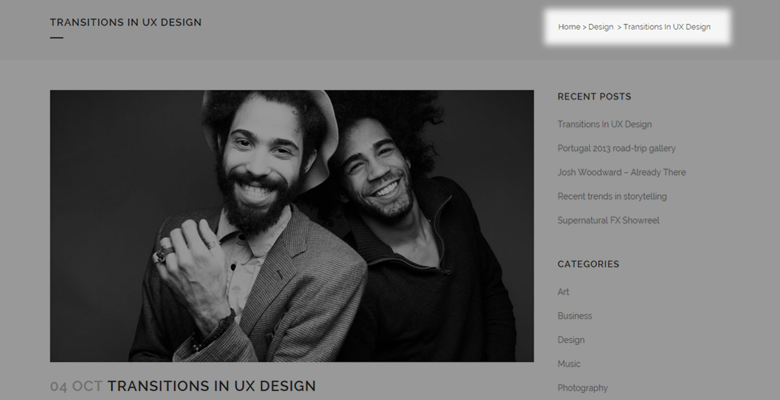
- Enable Breadcrumbs – choose if you would like to have breadcrumbs enabled in the title area of this post. You can choose one of three values
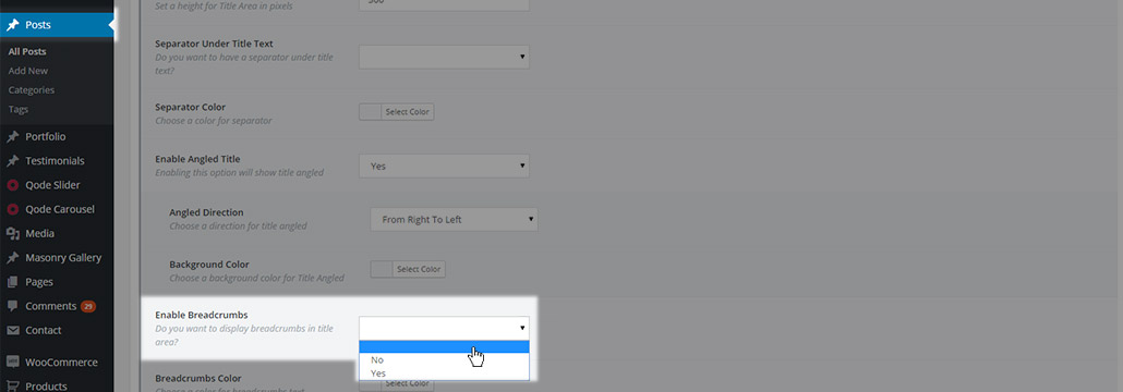
- Empty value – the default value from Qode Options-> Title will be used

- No – breadcrumbs won’t be displayed in the title area of this post

- Yes – breadcrumbs will be displayed in the title area of this post
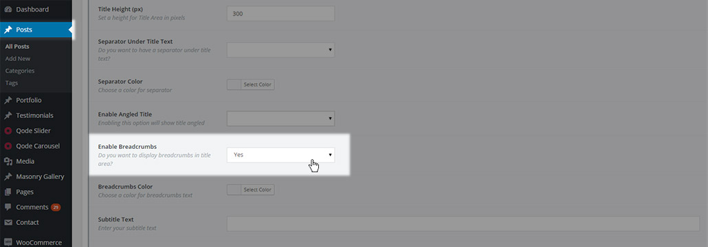
- Breadcrumbs color – choose a color for the breadcrumbs text. If no color is chosen then the color set in Qode Options -> Title will be used
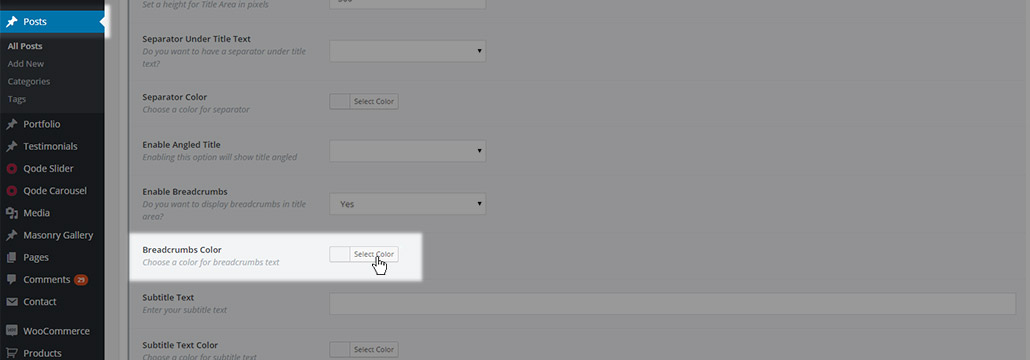
- Subtitle text – here you can input subtitle text which will be displayed below the title text in the title area.
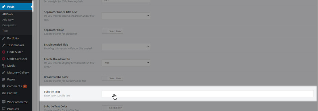
- Subtitle text color – choose a color for the subtitle text

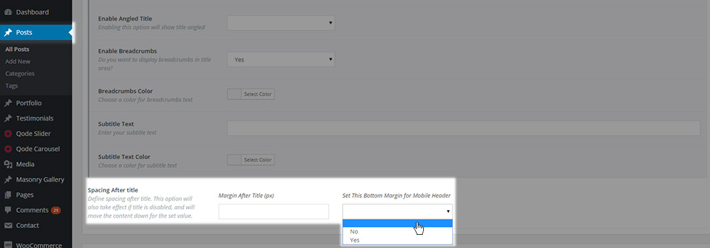
- Spacing After title - Additionally, regardless of whether you have set the title area to be visible or not, two more fields are available for defining the spacing after title. The first fields defines the margin after the title area (no need to input the unit, just the value: e.g. 50, not 50px) while the second field lets you choose if this same margin will be applied for the mobile header also.
11.2.1.4 Scroll Title Animations
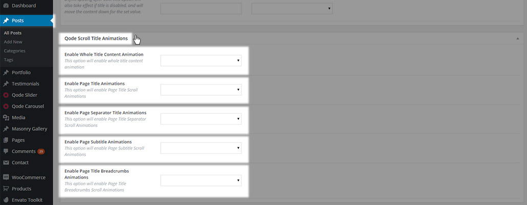
In this section you can create custom animations for the entire title area, or just selected parts of the title area. Animations can be defined for:

- Whole Title Content - The defined animation will be applied to the entire title area.
- Page Title – Only the title text will be animated
- Page Separator – Only the separator will be animated
- Page Subtitle – Only the subtitle text will be animated
- Page Title Breadcrumbs – Only the breadcrumbs text will be animated
All these fields can take one of three values
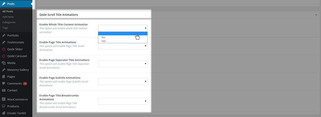
- Empty value – the default value set in Qode Options -> Title will be used
- No – Animation won’t be set for this part of the title area. If some other value is set in Qode Options -> Title, this setting will override it and disable the animation.
- Yes – Animations will be enabled, and extra fields for defining the animation will appear
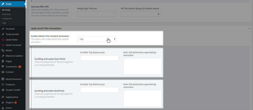
The options available for defining the animation are the following:
- Scrolling animation start point
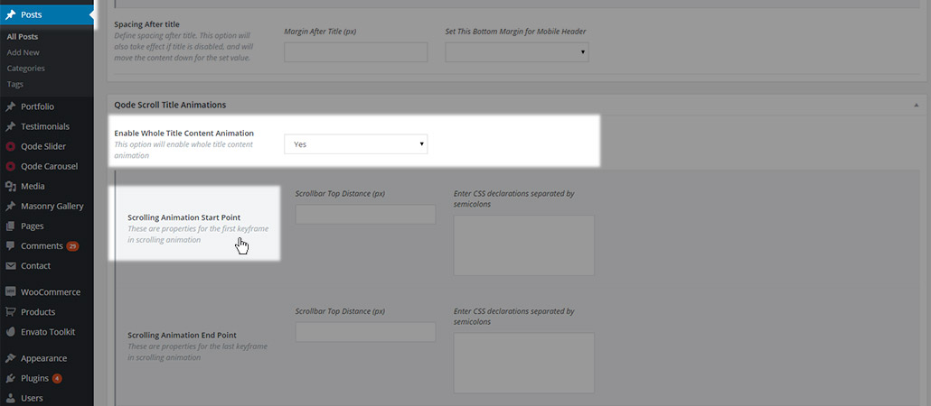
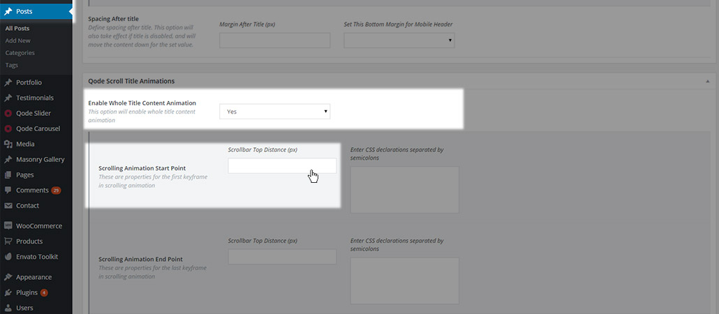
consisting of:
- Scrollbar Top Distance (px) represents the distance from the top of the page at which the animation should start
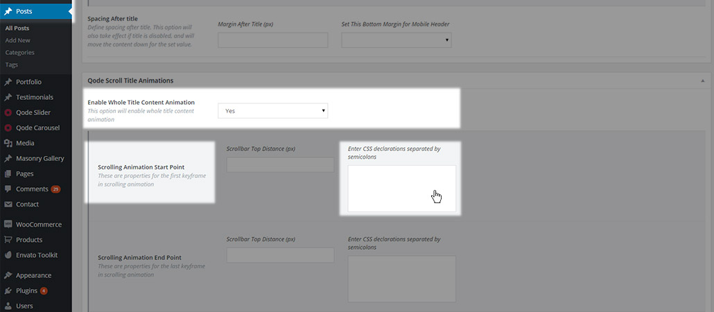
- CSS declaration is where you should enter the starting css code for the animation
- Scrolling animation end point
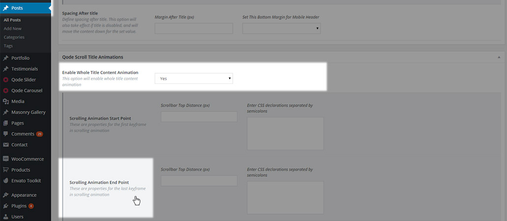
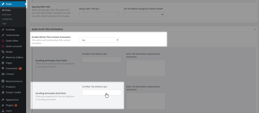
consisting of:
- Scrollbar Top Distance (px) represents the distance from the top of the page at which the animation should end
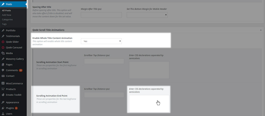
- CSS declaration is where you should enter the ending css code for the animation
This feature is created for advanced users that have experience with CSS animations.
11.2.1.5 Content Bottom
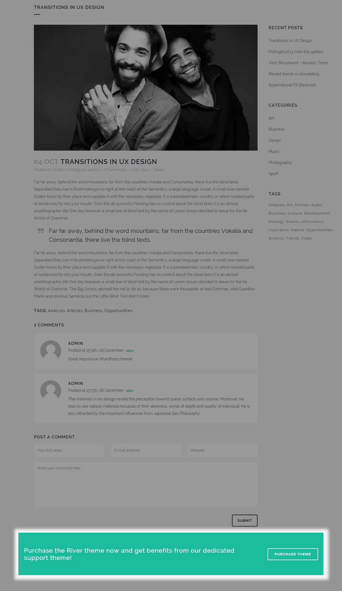
If you would like to set some content to appear between the post content area and the footer, then you can use Qode Content Bottom area.
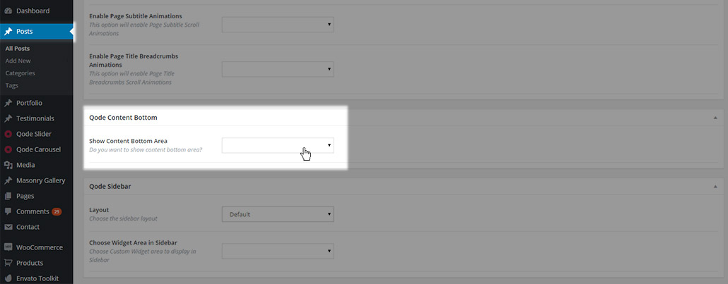
This area grants extra space in the form of a widget area, and the content of this area is created through widgets. You can either define the content bottom area in the global theme options, making it visible on all pages on your website, or you can set it on a page to page basis.
Leaving this field empty will revert to the default settings defined in the global options. Setting the field to No will disable the content bottom area, while setting it to Yes will enable it and provide some extra options
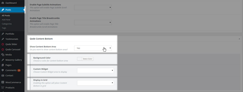
- Background color – set a background color for the content bottom area
- Custom widget – Choose a widget area to be displayed in the content bottom area.
- Display in Grid – Choose whether the content bottom area should be displayed in Grid or in Full Width
11.2.1.6 Sidebar
In this section you can define if a sidebar will be visible on the post or not

You can choose one of five predefined sidebar layouts:
- Default – No Sidebar is used
- Sidebar 1/3 right – The sidebar is placed on the right side of the page taking 1/3 of its width
- Sidebar 1/4 right – The sidebar is placed on the right side of the page taking 1/4 of its width
- Sidebar 1/3 left – The sidebar is placed on the left side of the page taking 1/3 of its width
- Sidebar 1/4 left - The sidebar is placed on the left side of the page taking 1/4 of its width

After selecting a layout for the sidebar, the default sidebar widget area will be displayed. If you would like to use a different sidebar, you can create a custom widget area and select it as the sidebar for that page. This can be set in the Choose Widget Area in Sidebar field in the Sidebar section

This dropdown area is populated with all the custom widget areas created.
11.2.1.7 SEO
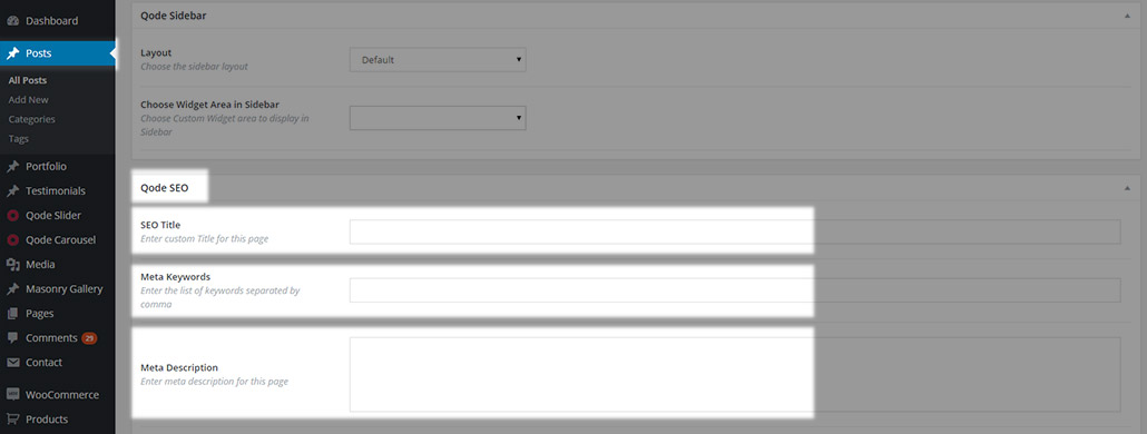
This section contains fields for the Search Engine Optimization of your page:
- SEO title – enter a custom SEO title for the page
- Meta keywords – enter a list of keywords you want to assign to your page. The keywords should be divided with commas
- Meta description – enter a meta description for your page
11.2.1.8 Post Excerpt field
Here you can set up an excerpt for your post (an optional summary or description of a post). The post excerpt is the short text that will be displayed on your blog list page. If you don’t see the post excerpt field, please check the Screen Options in the upper right corner of your screen.
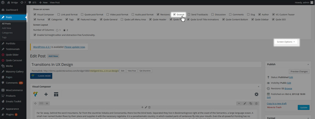
Note that the excerpt field doesn’t display shortcodes but plain text only. If you don’t set up the excerpt field you might end up seeing something like this on your Blog list page:

11.2.2 Post Types & Creating Post Content
Now it’s time to add content to your post. There are two ways of creating content:
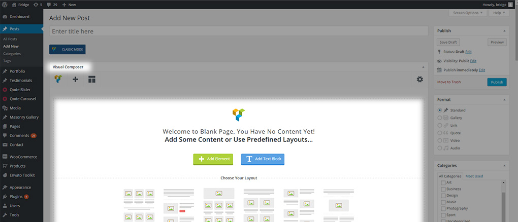
- Classic mode
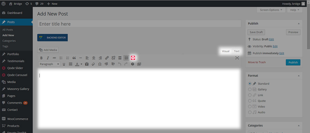
- WPBakery Backend Editor
If you don’t see the classic mode/backend editor switcher
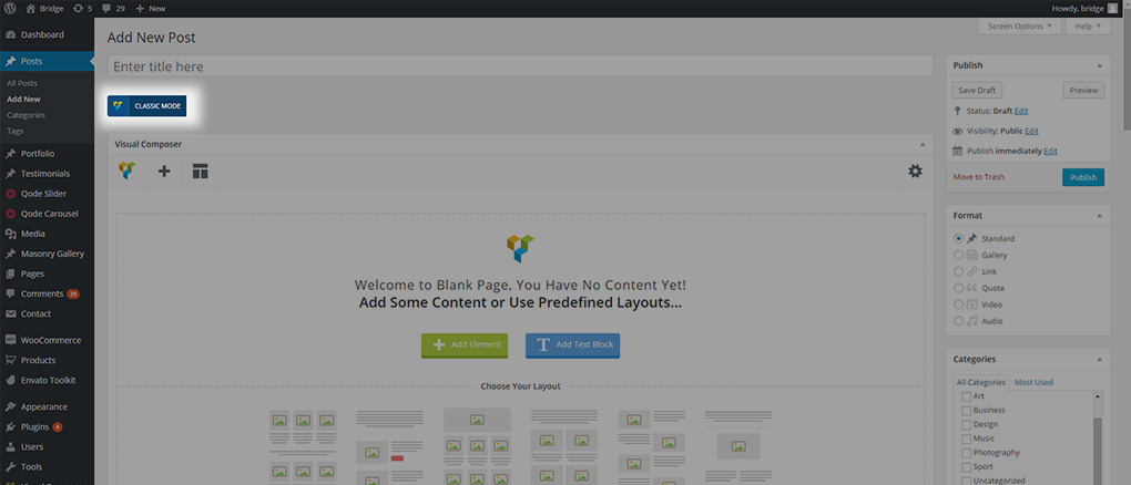
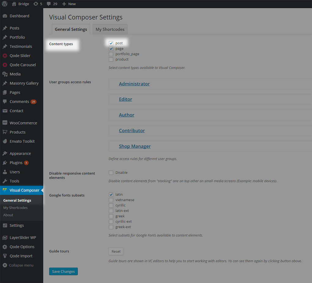
then post types are not enabled for visual composer editing, and you should navigate to WPBakery -> General Settings and enable Visual Composer for posts
It’s time to add content. First, select the post type you would like to create
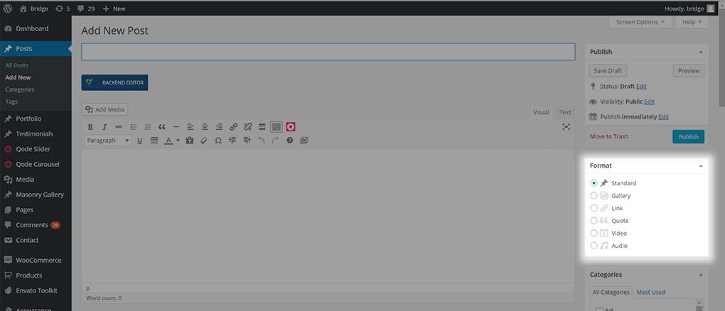
- Standard
- Gallery
- Link
- Quote
- Video
- Audio
11.2.2.1 Standard post format
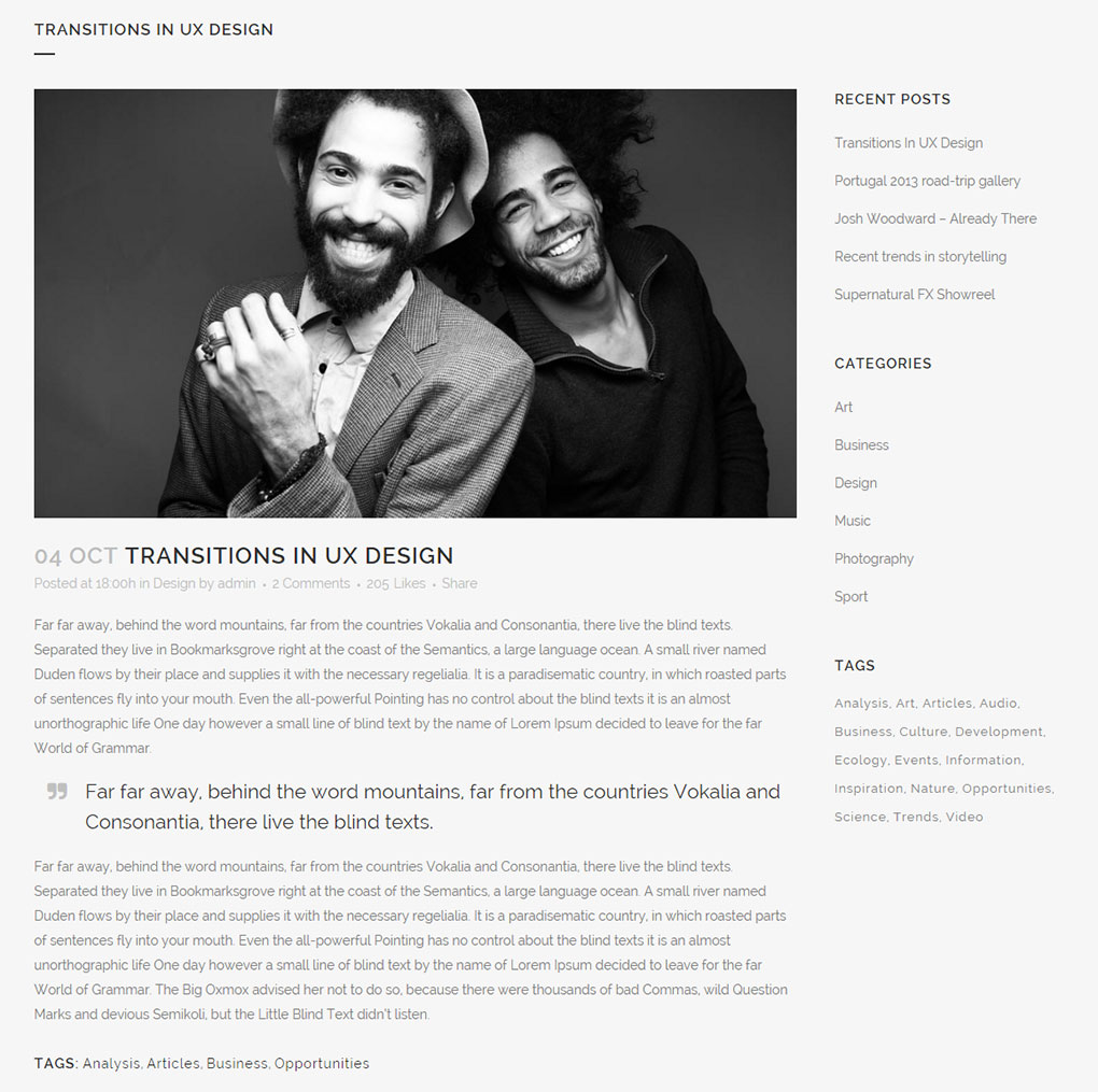
Standard – this is default blog format
11.2.2.2 Gallery post format
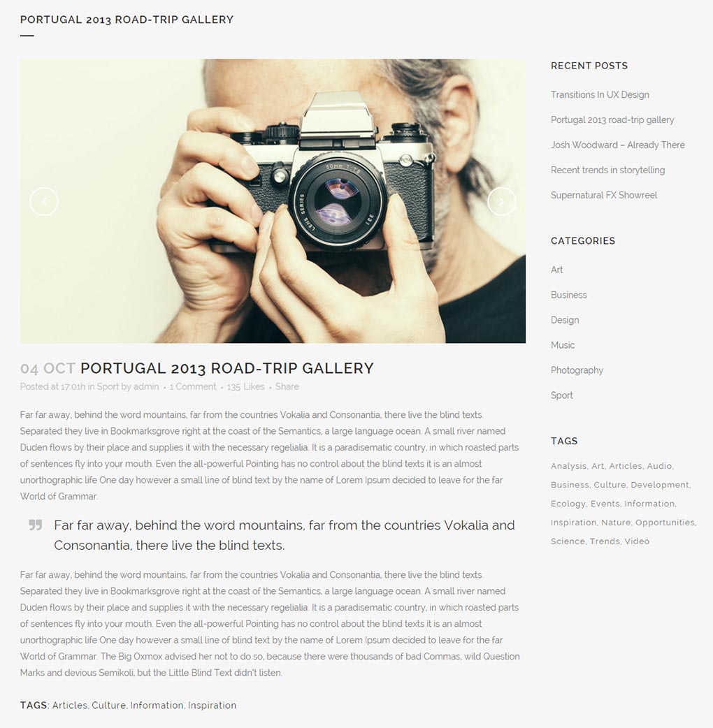
Gallery – this format features an image gallery slider. In order for it to work, you need to add a gallery at the top of your page.
You can do this by following these steps:
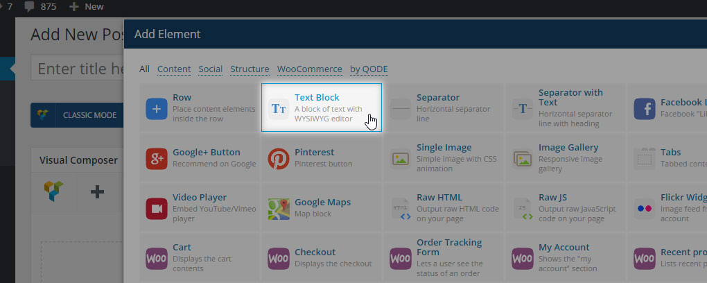
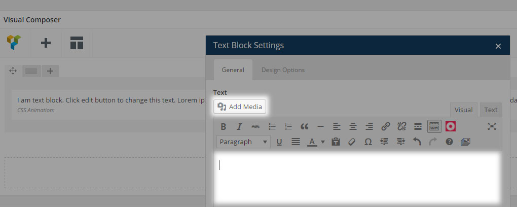
- Click on “Add Element” and choose “Text Block”
- Delete any default text in the pop-up window and click on “Add Media” in the upper left corner
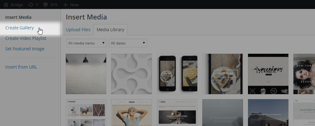
- Click on “Create Gallery” from the menu on the left
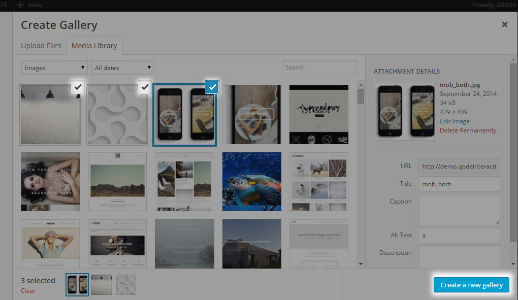
- Select the images that you wish to add, and click the “Create a new gallery” button. It is recommended that you upload images that are the same size.
- You can reorder images by clicking and dragging, or you can set a random order by checking the Random Order box under Gallery Settings (see screenshot below)
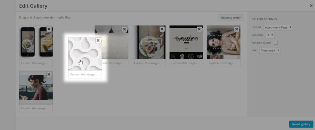
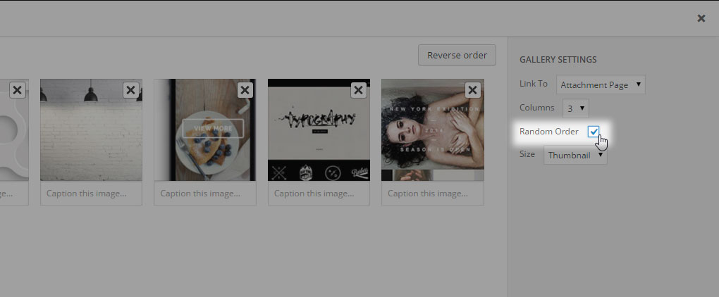
Please note that if you enter a caption for your image, it will not be displayed. The caption will only be visible if you add that image as content within the post itself.
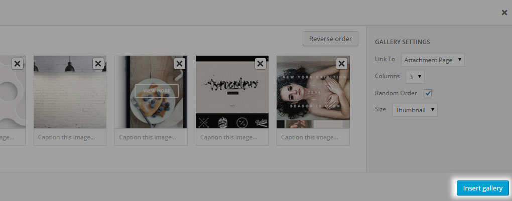
- Click the “Insert Gallery” button. Click on “Save changes”
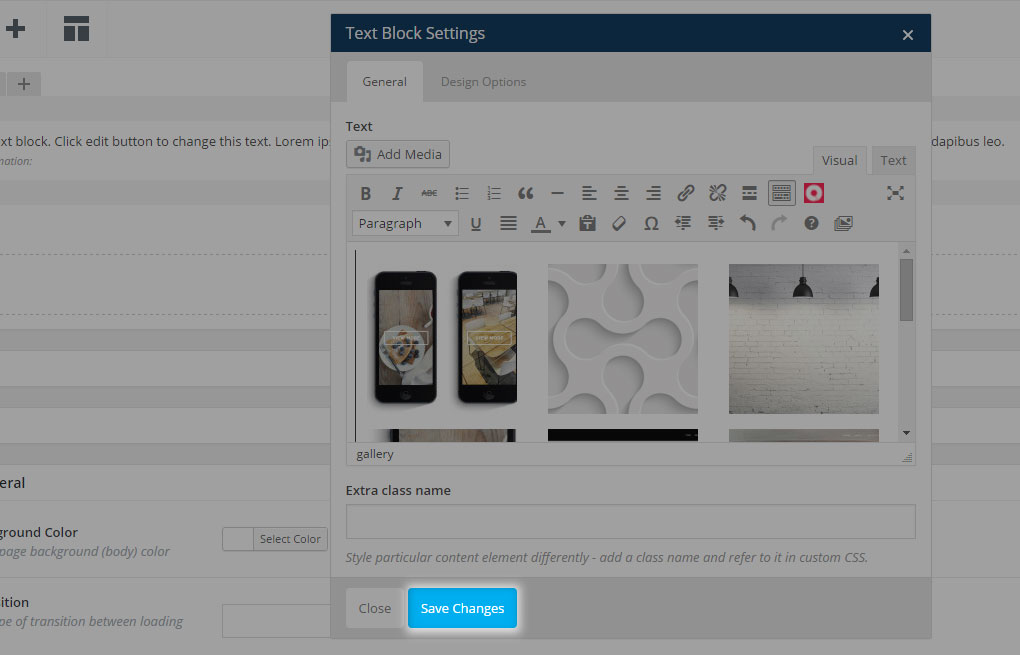
If you prefer using the WordPress default editor, then you can add a gallery by navigating to Posts -> Add New Post where you should click on the Add Media button and repeat steps from c) – e). Then you can add content to the post as you would regularly do for any page, post, portfolio etc.
11.2.2.3 Link post format
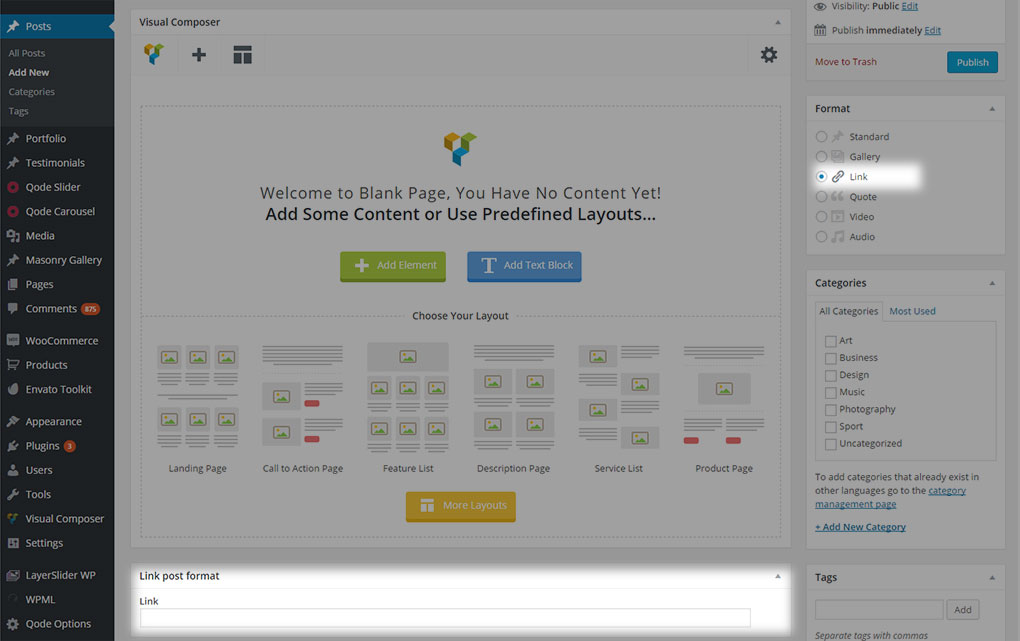
Link – The link post format can be used to display links to other web pages.
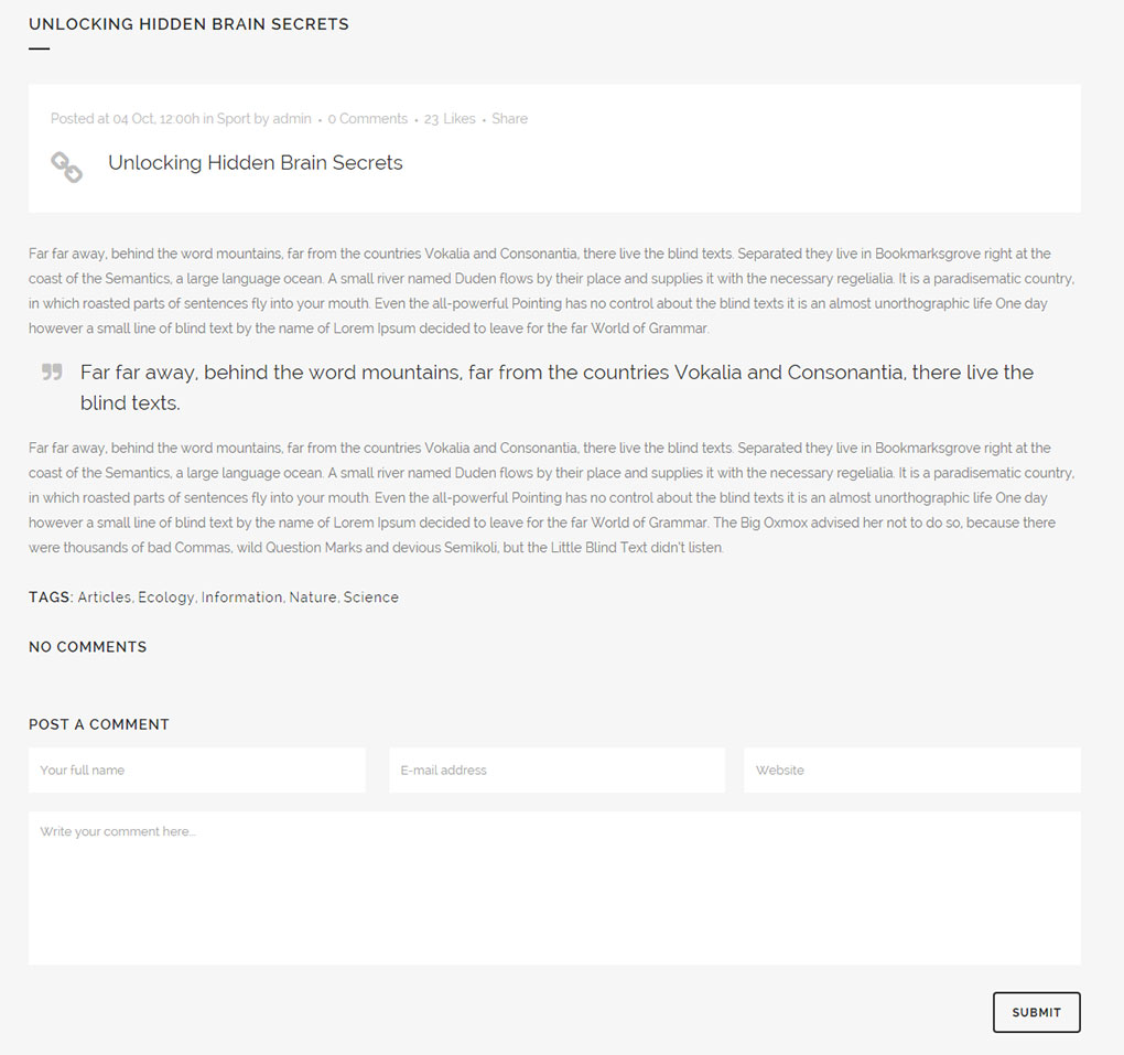
If you choose this post format one more additional field called Link will appear. Here you can enter the full URL or the page you wish to link to. This link will be accessible only when you open the post. Otherwise – on your Blog List page you will not be able to open the link directly, only the post itself. Also note that this post type doesn’t have an excerpt (it doesn’t matter if you add content to the excerpt field in the backend of the post).
11.2.2.4 Quote post format
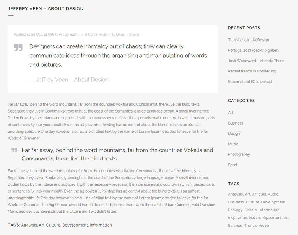
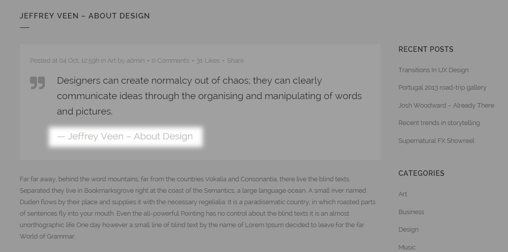
Quote - The quote post format can be used to create a post that will display a quote on your blog list page:
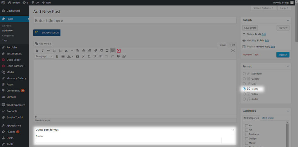
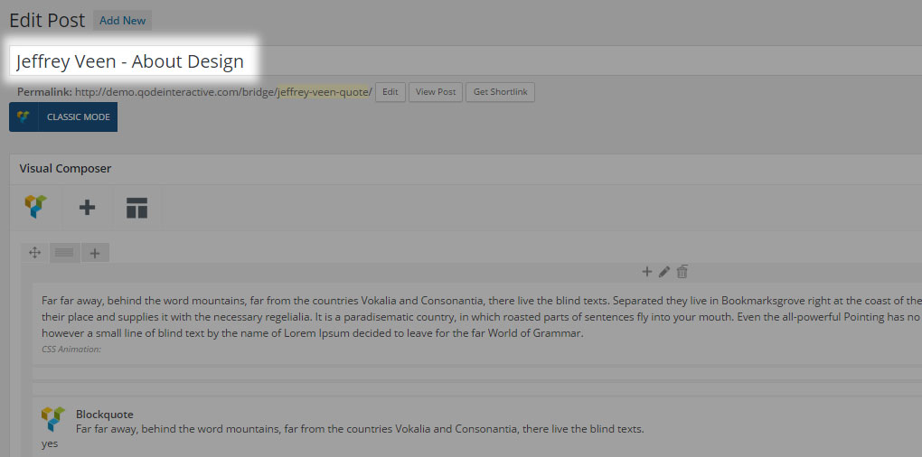
When you select this type of post format, an extra field will appear in which you can place the quote you would like to have displayed
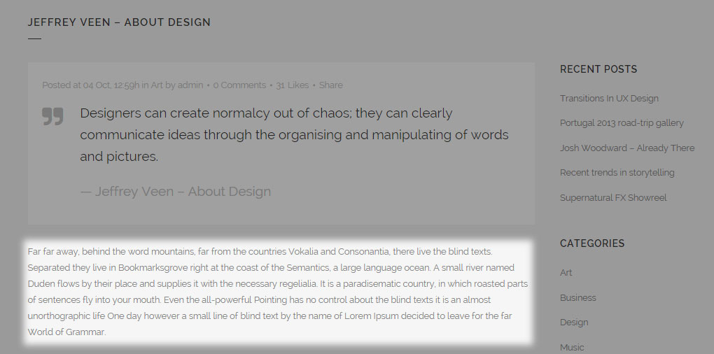
If any content is added in the content area, it will be displayed below the quote.
Underneath the quote text, the title of the quote post will be displayed.
11.2.2.5 Video Post Format
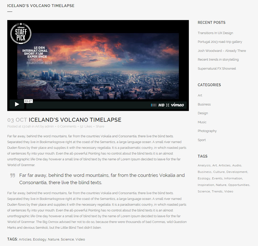
Video – The video post format can be used to display YouTube, Vimeo, and self-hosted videos.
When you select this type of post format, an extra field will appear in which you can enter the video you would like to display
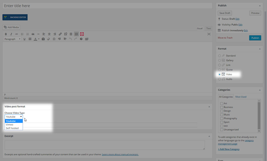
You can insert three types of videos
- Youtube
- Vimeo
- Self hosted
11.2.2.5.1 Youtube videos
If you are inserting a YouTube video, you should only paste the video ID into the Video ID field, not the entire video URL. In order to get the YouTube video ID, open the desired YouTube video and copy the video ID like the one marked in the following screenshot:
and then paste the ID into the Video ID field
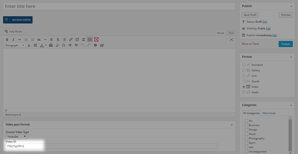
11.2.2.5.2 Vimeo videos
If you are inserting a video from Vimeo, you should also only paste the video ID, not the entire URL, in the Video ID field. In order to get the Vimeo video ID, open the desired Vimeo video and copy the video ID like the one marked in the following screenshot:
and then paste it into the Video ID field
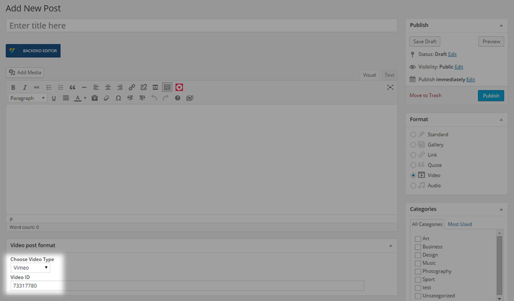
11.2.2.5.3 Self- hosted videos
If you want to insert a self-hosted video, you will first have to upload a video to your media library
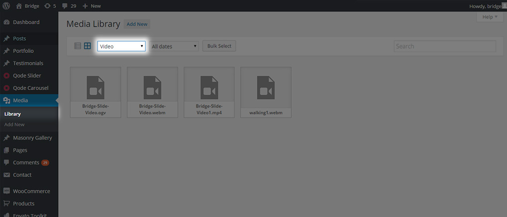
and then use its link inside the Video field
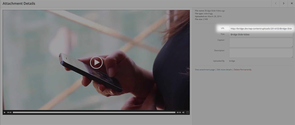
To upload a video follow these steps:
- Go to Media Library -> Add New

- Select the desired files from your computer and upload them

- Go to your Media Library and select to display videos
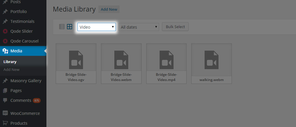
- Click on your video and the video editor will open
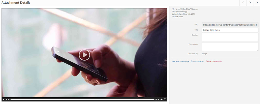
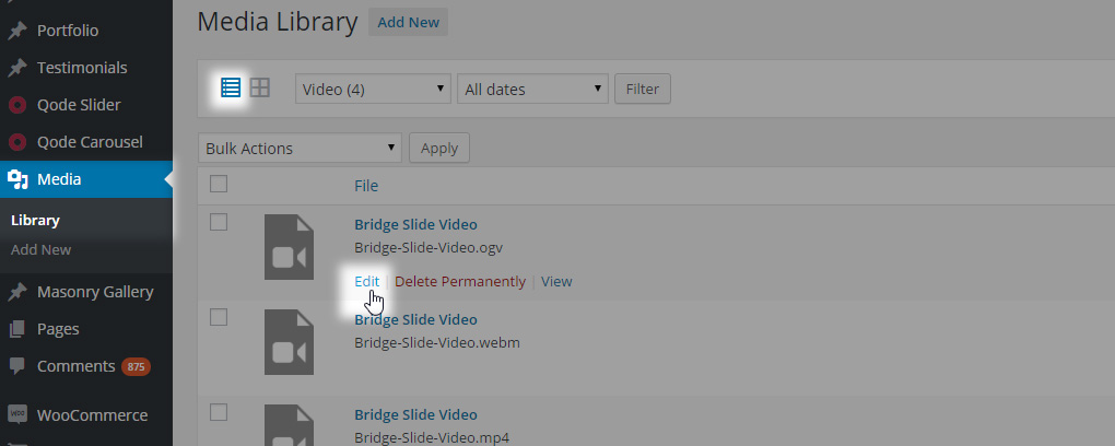
(if you are using the list display, you can click on edit link or on the video title
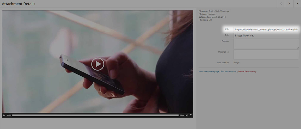
- Copy the video url
- Go back to your post and paste the video URL into the appropriate video field
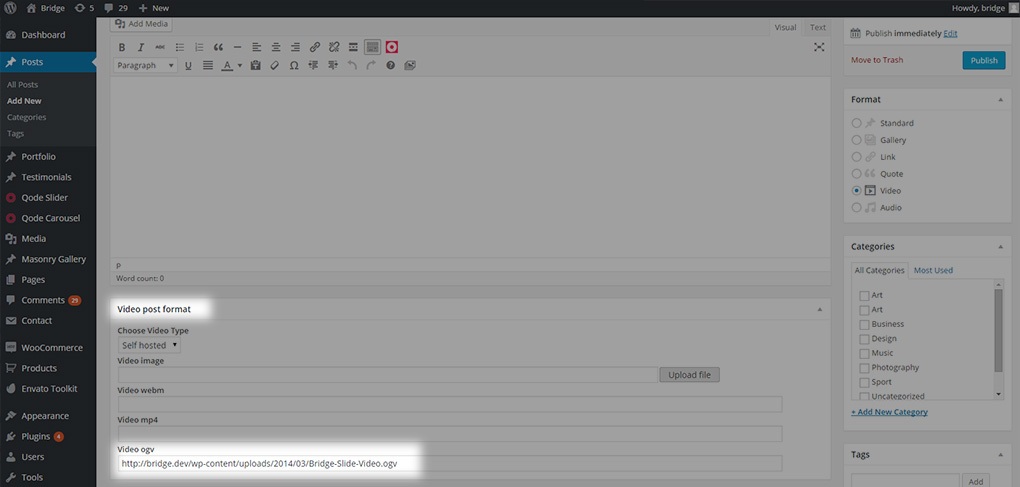
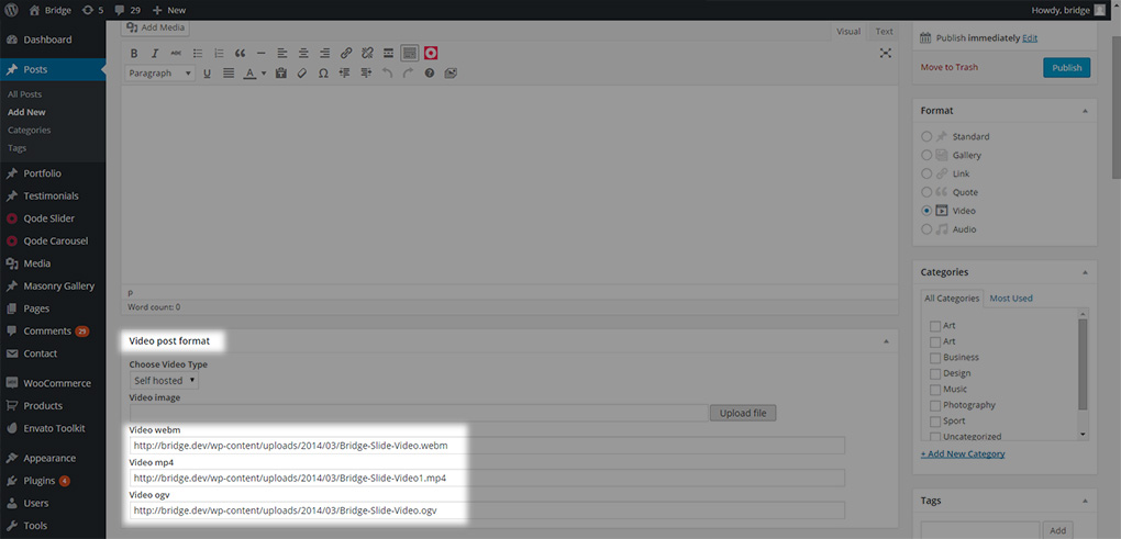
It is recommended to upload videos in all three formats (webm, mp4, ogv) to make sure your video will be displayed in all modern browsers.
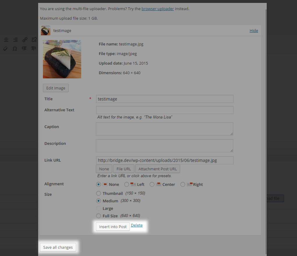
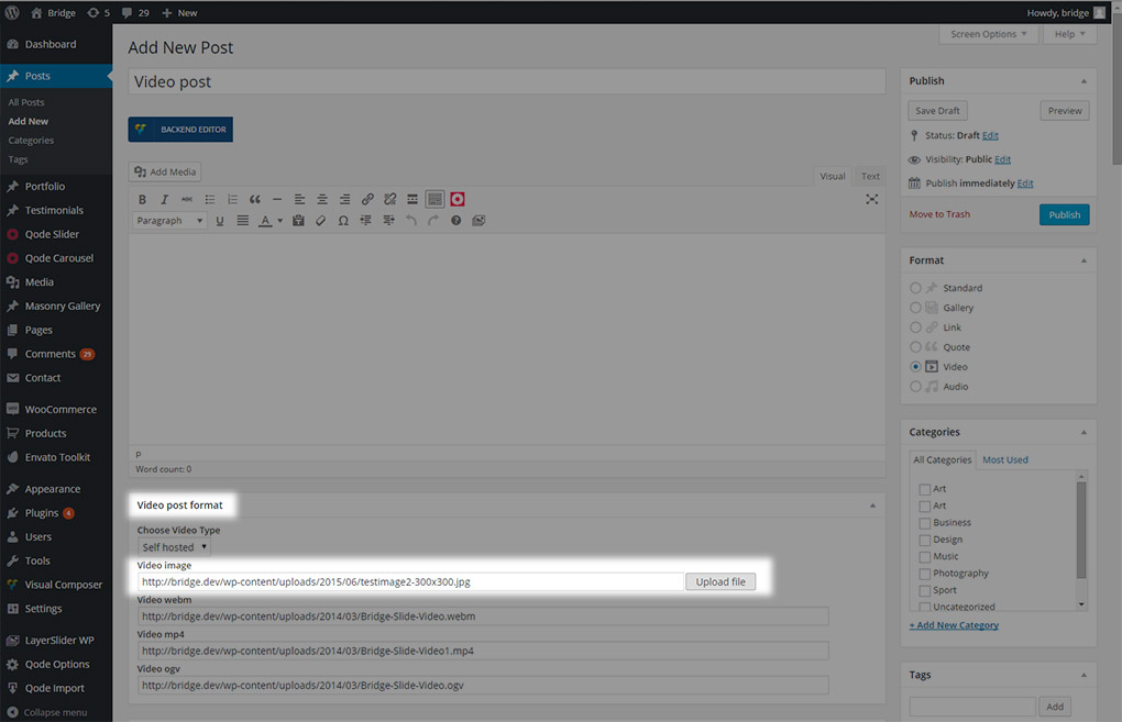
You can use the Video Image field to upload a background image that will be displayed while the video is loading. In order to achieve this follow these steps:
- Click Upload file
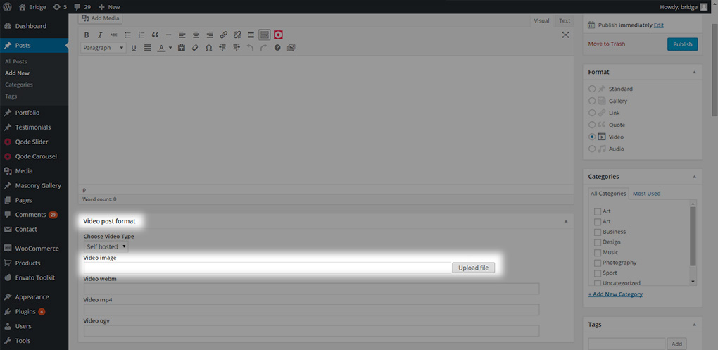
- Select an image file from your computer or the media library
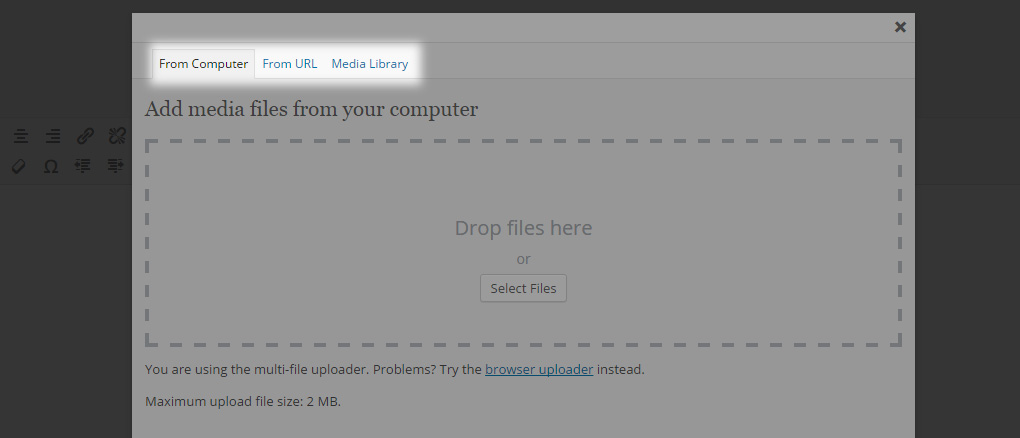
- Set your desired settings, click Insert into post and save all changes
At the end, your video fields should look like this
11.2.2.6 Audio Post Format
Audio – The audio post format can be used to display audio files.
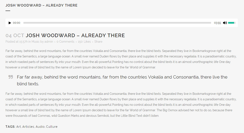
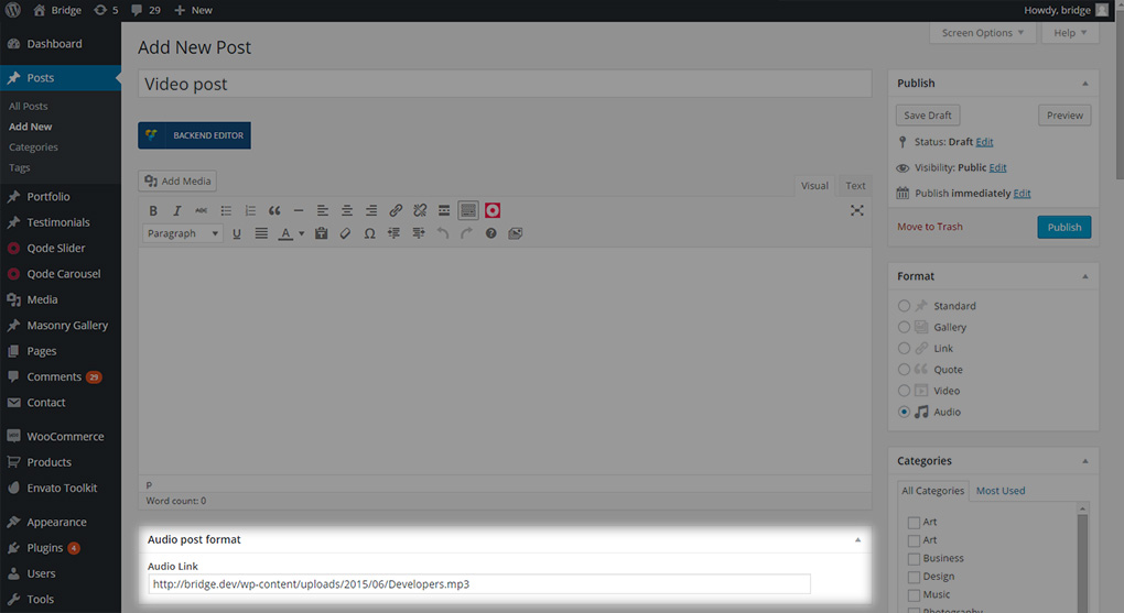
When you select this type of post format, an extra field will appear in which you can enter a link to the audio file you would like to display
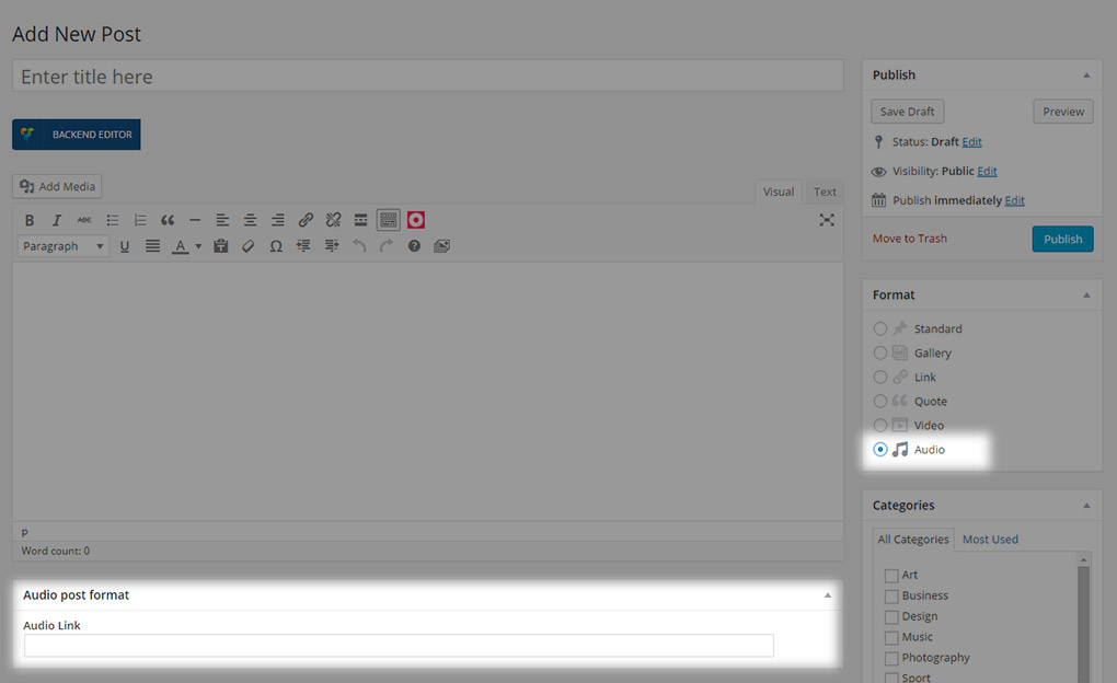
You should paste the link of an audio file you have previously uploaded to your media library into this field. To upload an audio file follow these steps:
- Go to Media Library -> Add New
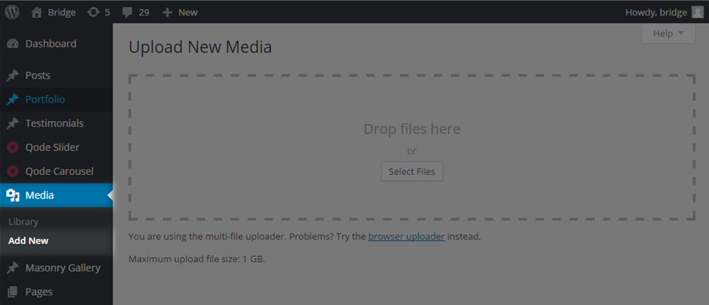
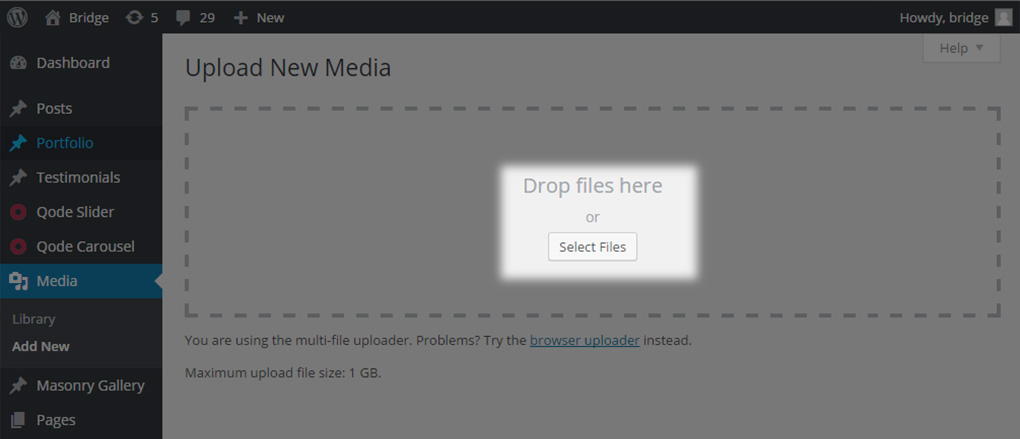
- Select the desired files from your computer and upload them
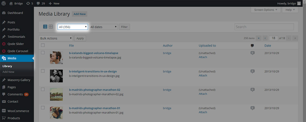
- Go to your Media Library and select to display all
- Find your audio file (you can use the search tool)
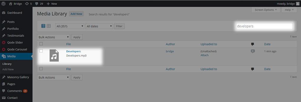
- Click on the edit link or on the audio file title
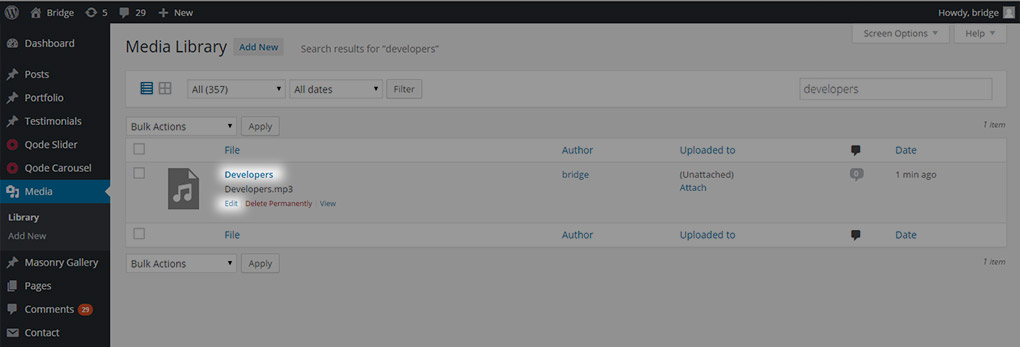
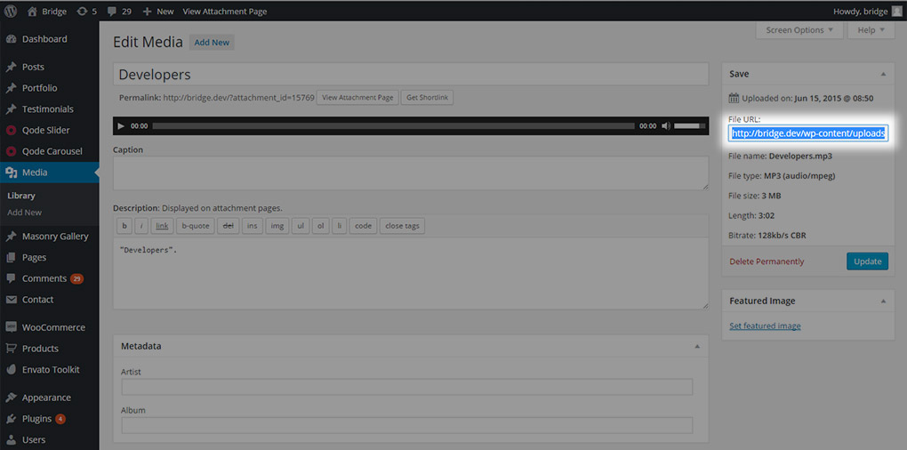
- Copy the audio file link
- Paste it into the audio link field
11.2.3 Categorizing Blog Posts
In this section we will explain how to create categories for your blog posts and how to add your posts to specific categories.
11.2.3.1 Creating categories
In order to create a category, go from your WP Admin to Posts -> Categories.
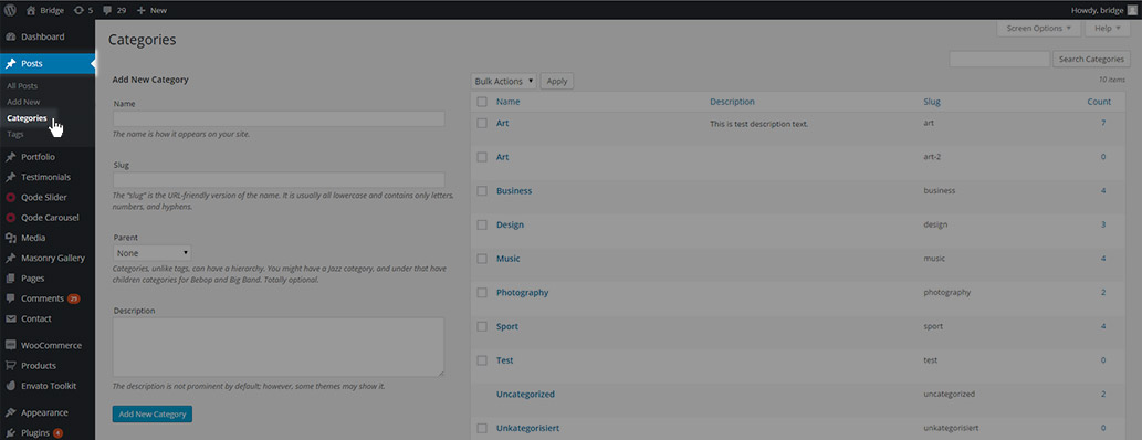
Here, enter the desired category name, choose a parent for the category if needed, and optionally add a description.
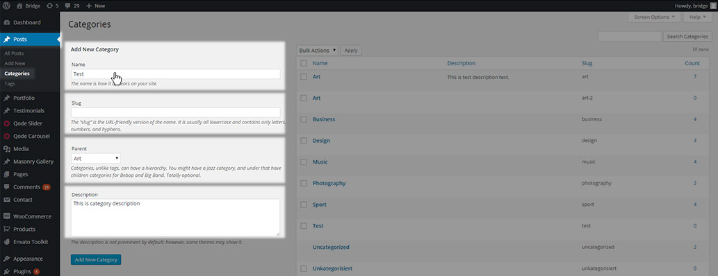
You can also enter a slug for the category, but don’t worry, if you don’t enter a slug it will be generated automatically. After creating categories, they will be available for you to assign posts to them in the post editor.
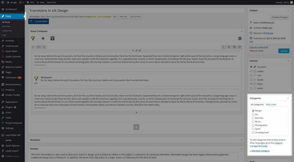
11.2.3.2 Assigning categories
All posts can be assigned to a category.

There are two ways to assign posts to categories:
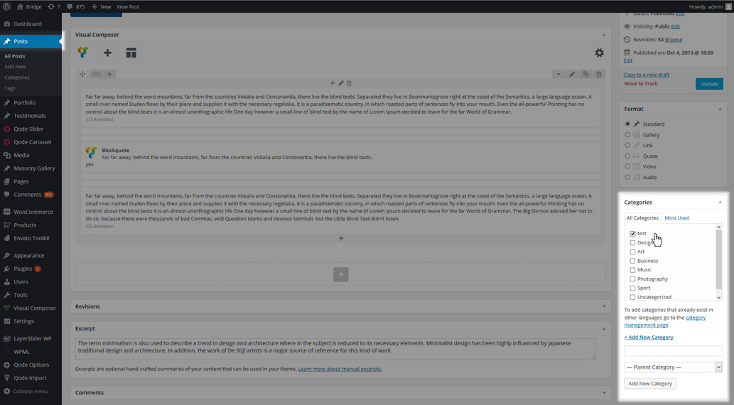
- Assigning a post to a category that has previously been created

- Creating new category directly from the post editor

To create a category directly from the post editor, click on +Add new category.
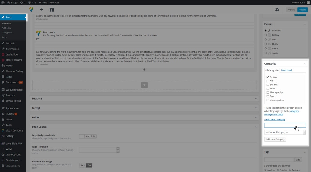
Add a category name, select a parent category if needed, and click Add New Category.
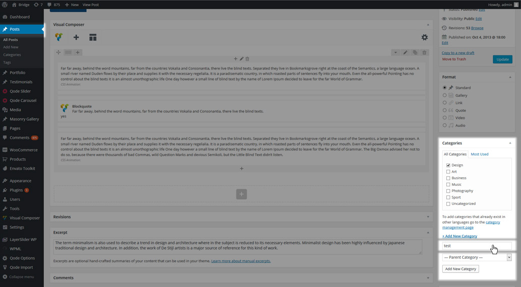
The new category will be displayed on the list, and selected as the category for the post you are editing.
11.3 Global Blog Options
In this section we will describe all the available global blog options in detail.
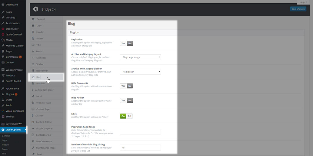
All settings related to single posts, blog page templates, and blog shortcodes can be found in Qode Options -> Blog
11.3.1 Blog List Settings
In the Blog List panel of the global blog options you will find general settings for your blog list, as well as individual sets of settings for each of the available blog list templates in our theme.
11.3.1.1 General Settings
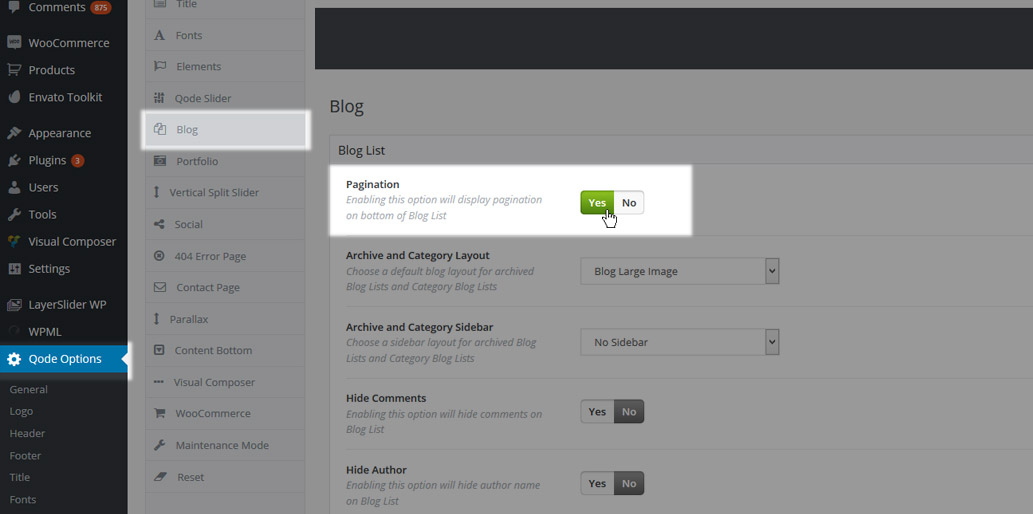
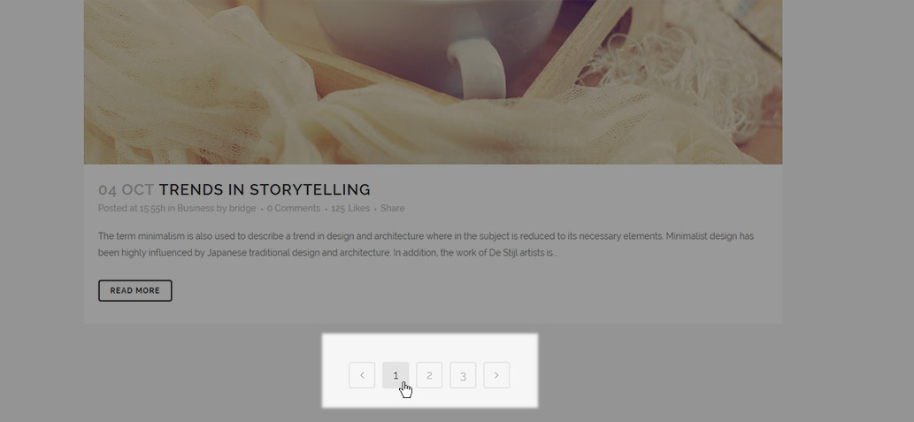
- Pagination – Enable or disable the pagination on your blog lists. Setting this option to Yes will display pagination, while No will disable it.
- Archive and Category layout – This setting defines the layout of blog archive and category pages, as well as the home page if it is set to display latest post. .
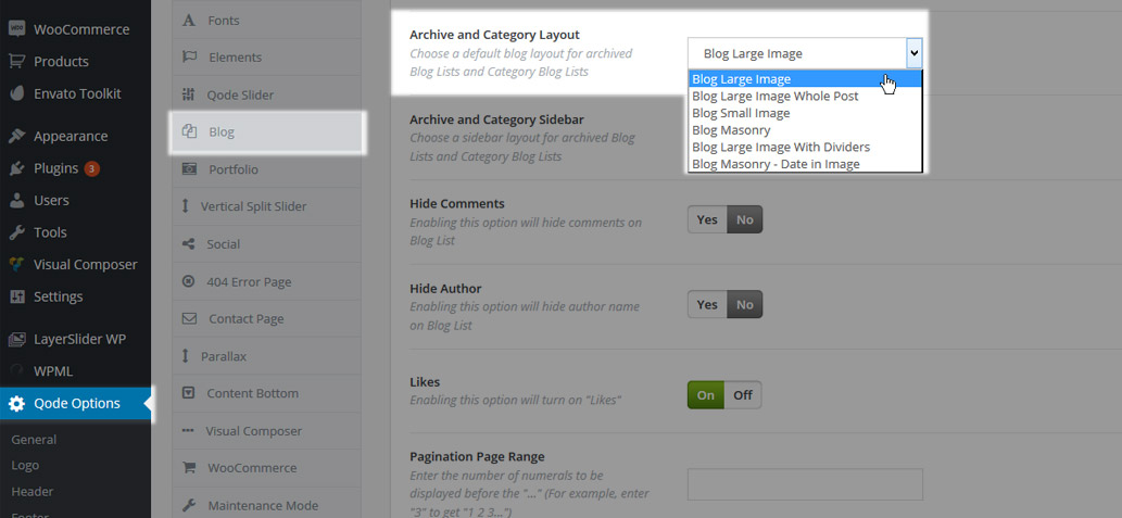
You can choose one of six page templates:
- Blog Large Image
- Blog Large Image Whole Post
- Blog Small Image
- Blog Masonry
- Blog Large Image With Dividers
- Blog Masonry – Date in Image
- Archive and Category Sidebar – Here you can define whether the archive and category pages, as well as the home page if it is set to display latest posts, will have a sidebar displayed on them
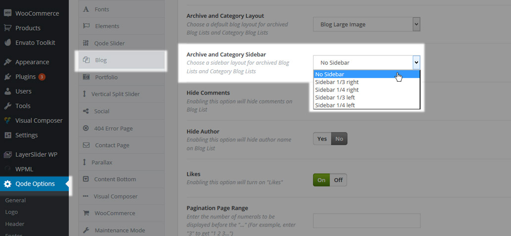
You can choose one of five values:
- No Sidebar
- Sidebar 1/3 right
- Sidebar 1/4 right
- Sidebar 1/3 left
- Sidebar 1/4 left
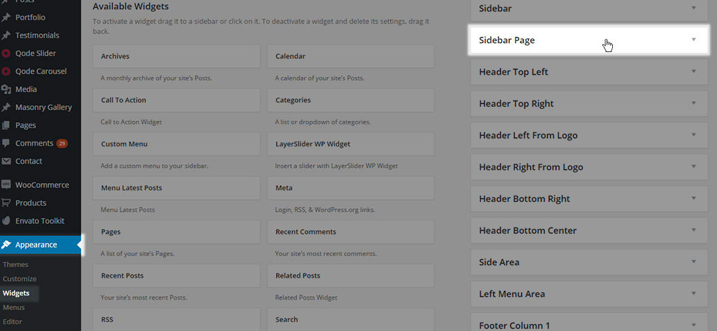
The widget area that will be used for the sidebar on these pages is the Sidebar Page widget area
- Hide Comments – Choose whether you would like to have information about post comments displayed or hidden on your blog list page and archive and category pages. You can choose either Yes - to hide comments,

or No - to display comments.

(these screenshots are for the Blog Large Image template, comments on other blog templates might have a slightly different look)
- Hide Author – Choose whether you would like to have the post author displayed on blog lists
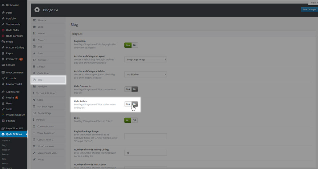
You can choose either Yes – to hide the author,

or No – to display the author

(these screenshots are for the Blog Large Image template, the author information on other blog templates might have a slightly different look).
- Likes – Here you can choose whether likes will be displayed on your blog lists.
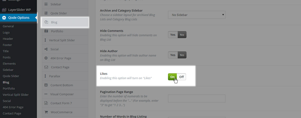
You can choose either On – to display likes,

or Off - to hide them.

- Pagination Page Range – Here you can define the number of pages that should be displayed in the pagination.
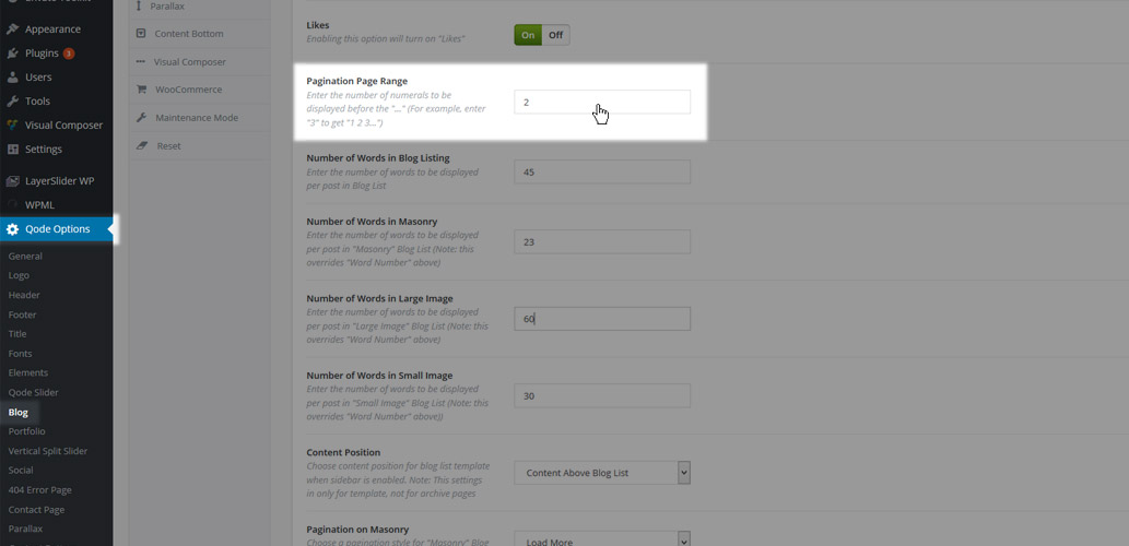
After your selected number of pages, three dots will appear (…), and the last available page will be displayed after the dots.
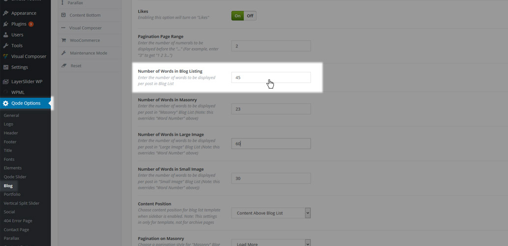
- Number of Words in Blog Listing – Here you can define how many words you would like to be displayed in the post excerpt on blog lists, no matter which blog template is used
- Number of Words in Masonry – Here you can define how many words you would like displayed in the post excerpt on blog lists set to the Blog Masonry template and in posts displayed using the Blog Masonry shortcode.
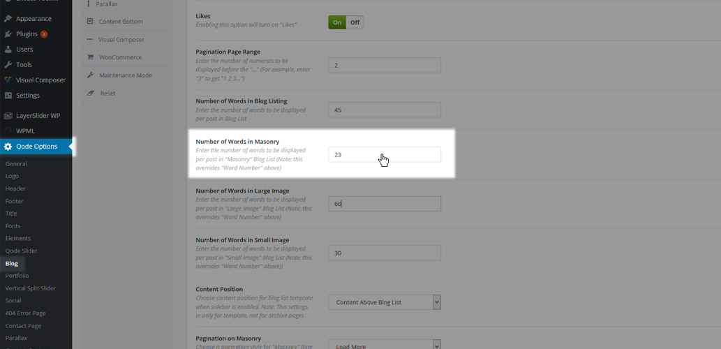
The number of words set in this field will override the number set in the Number of Words in Blog Listing field
- Number of Words in Large Image – Here you can define how many words you would like displayed in the post excerpt on blog lists set to the Blog Large Image template.
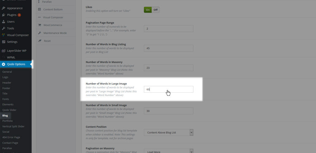
The number of words set in this field will override the number set in the Number of Words in Blog Listing field
- Number of Words in Small Image - Here you can define how many words you would like displayed in the post excerpt on blog lists using the Blog Small Image template.
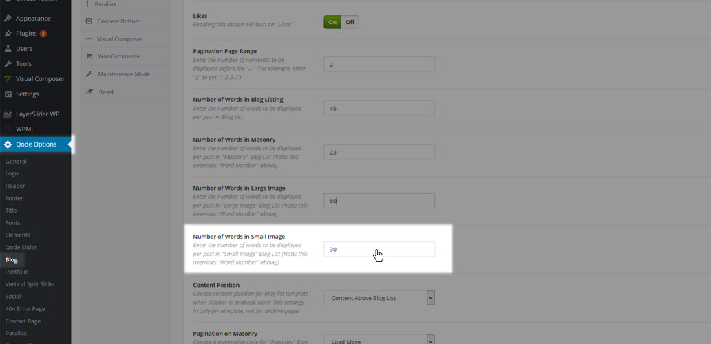
The number of words set in this field will override the number set in the Number of Words in Blog Listing field
- Content Position – This setting is created for blog page templates that have a sidebar enabled.

You can choose one of two options:
- Content Above Blog List – The page content will be placed above the blog list, and the sidebar will be aligned with the top of the content.
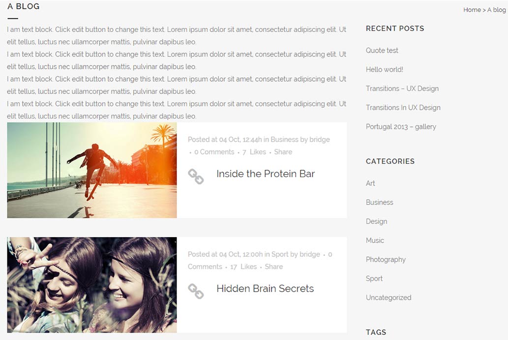
- Content Above Blog List and Sidebar – The content will be placed above the blog list and the sidebar, while the sidebar will be aligned with the blog list.
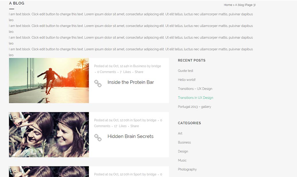
- Pagination on Masonry – In this field you can define the pagination type that will be used on pages set to the Blog Masonry template.
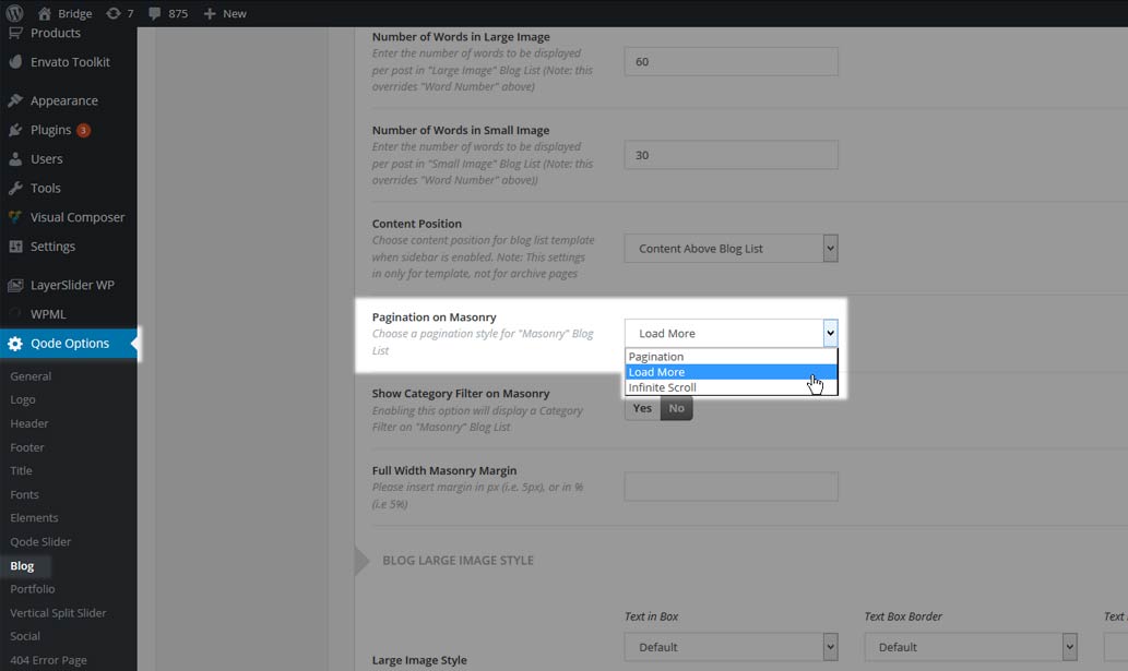
You can choose one of three types of pagination
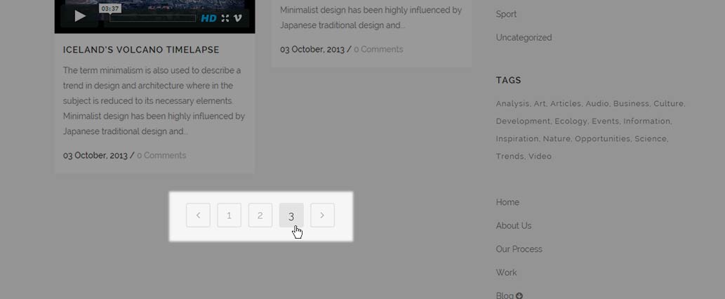
- Pagination – Default pagination with numbers will be displayed at the bottom of the page
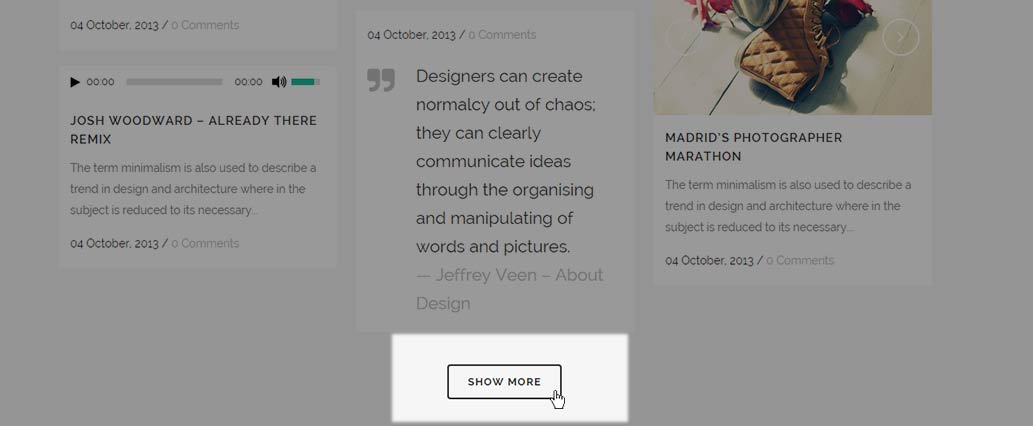
- Load More – A Load More button will be displayed at the bottom of the page and when that button is clicked, more posts will load
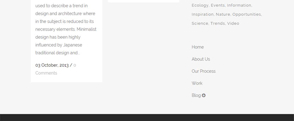
- Infinite Scroll – When you scroll to the end of page more posts will automatically be loaded
- Show Category Filter on Masonry – This option defines where the filter for displaying posts from specific category should be displayed or not.

You can choose either Yes – to display the category filter

or No - to hide it.
- Full Width Masonry Margin – Here you can define a value for the content margin for pages set to the Blog Masonry Full Width template

You can enter the value in percentages (for example 10%) or in pixels (for example 100px). This value will apply to both left and right margins.
11.3.1.2 Blog Large Image Style
Settings from this section are applied to the Blog Large Image and Blog Large Image Whole Post blog page templates. Here you can set the following options:
- Large Image Style – Here you can define the style of the post info box in the Large Image blog list
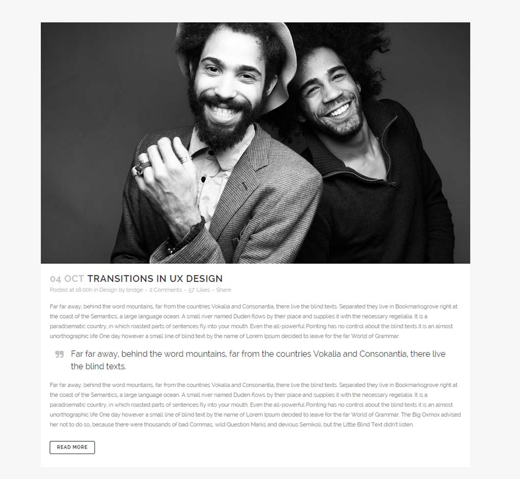
The following settings can be modified:
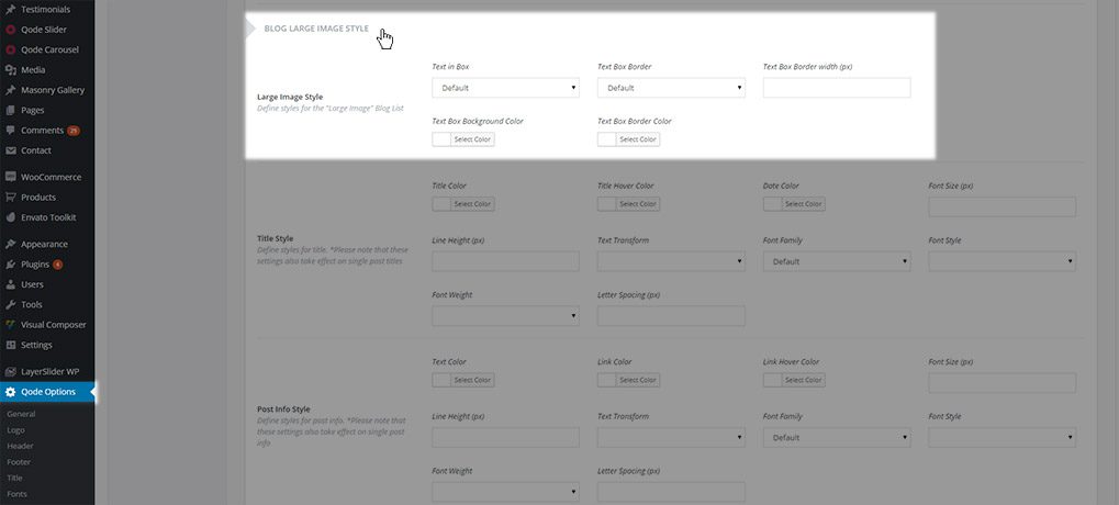
- Text in Box
- Text Box Border
- Text Box Border Width
- Text Box Background Color
- Text Box Border Color
- Title Style – Here you can define styles for post titles in the Large Image blog list
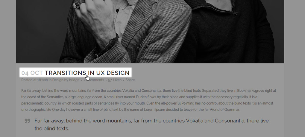
The following settings can be modified:
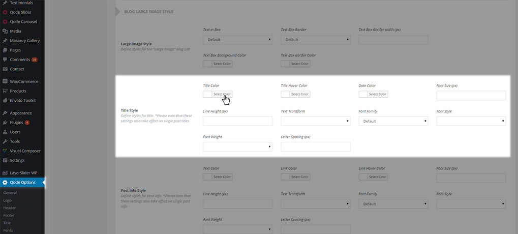
- Title Color
- Title Hover Color
- Date Color
- Font Size
- Line Height
- Text Transform
- Font Family
- Font Style
- Font Weight
- Letter Spacing
Note: These settings are also applied on single posts
- Post Info Style – Here you can define styles for the post info text
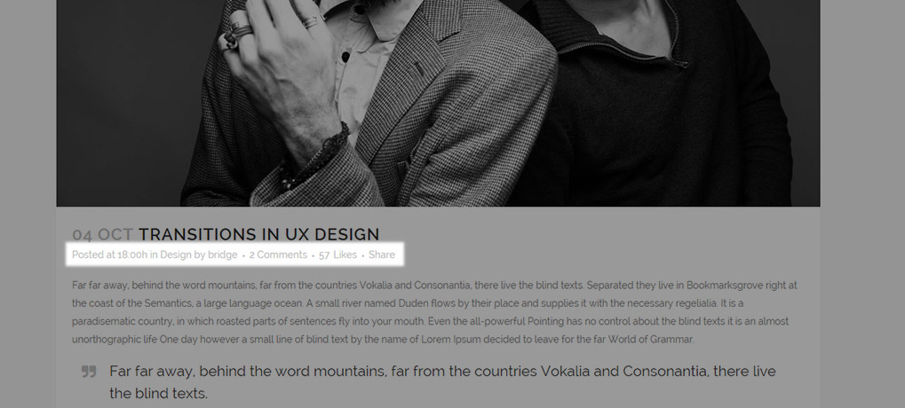
The following settings can be modified:
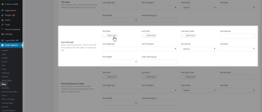
- Text Color
- Link Color
- Link Hover Color
- Font Size
- Line Height
- Text Transform
- Font Family
- Font Style
- Font Weight
- Letter Spacing
- Post Info Quote/Link Style – Here you can define styles for the post info text in posts set to the quote or link post formats.
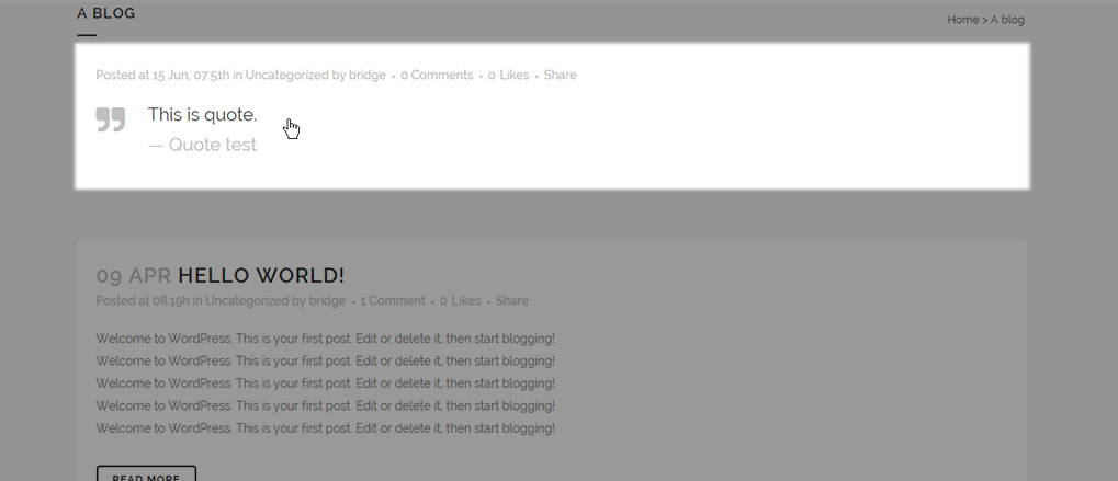
The following settings can be modified:
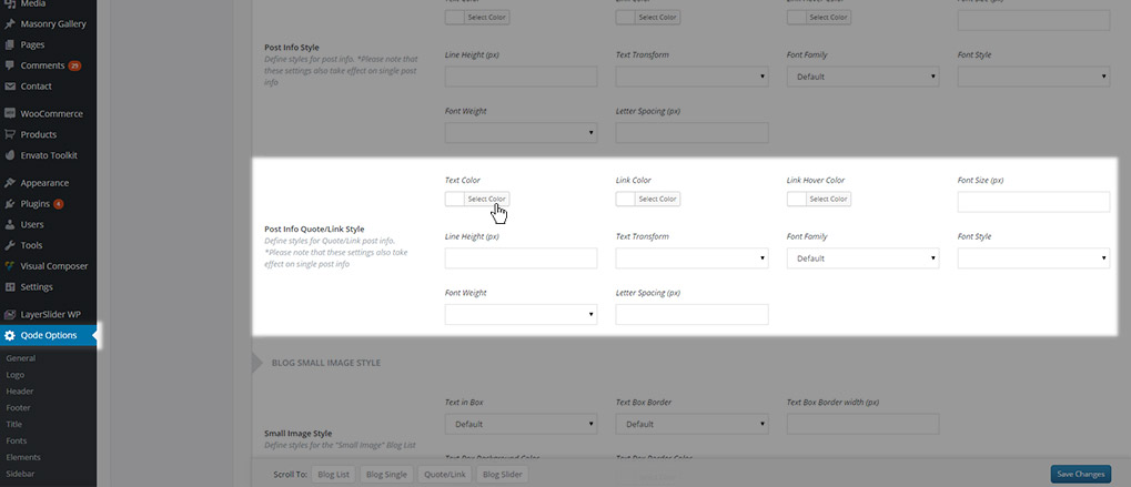
- Text Color
- Link Color
- Link Hover Color
- Font Size
- Line Height
- Text Transform
- Font Family
- Font Style
- Font Weight
- Letter Spacing
Note: These settings are also applied on Quote and Link single posts
11.3.1.3 Blog Small Image Style
Settings from this section are applied to the Blog Small Image blog page template. Here you can set the following options:
- Small Image Style – Here you can define the style for the post info box in the Small Image blog list
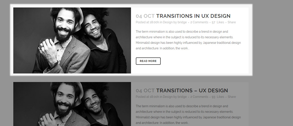
The following settings can be modified:
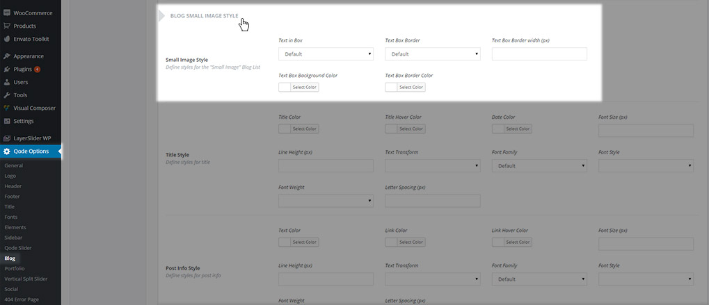
- Text in Box
- Text Box Border
- Text Box Border Width
- Text Box Background Color
- Text Box Border Color
- Title Style – Here you can define styles for post titles in the Small Image blog list
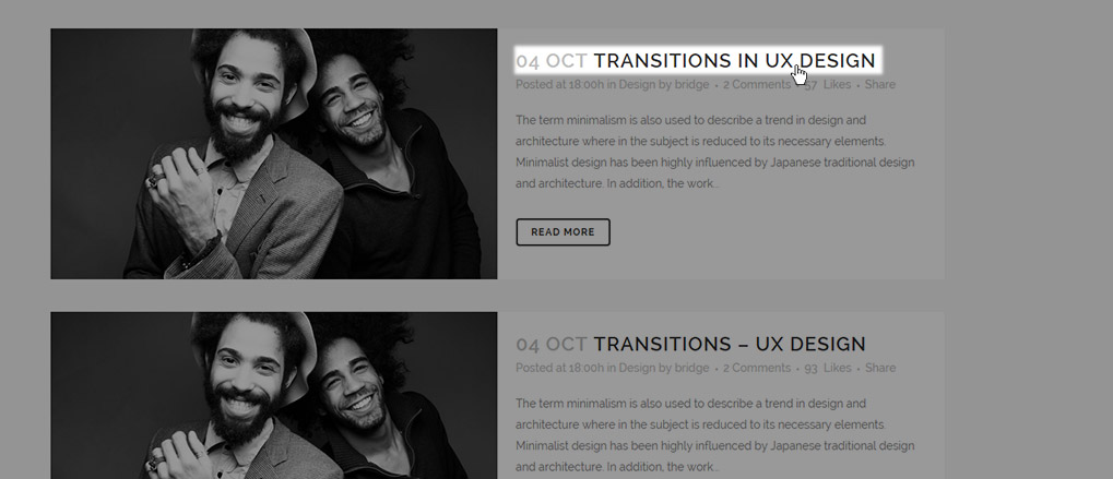
The following settings can be modified:
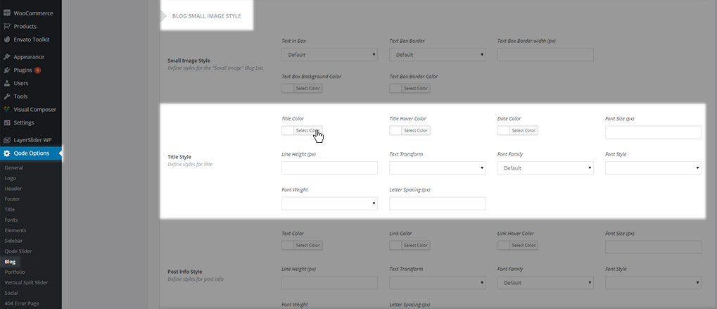
- Title Color
- Title Hover Color
- Date Color
- Font Size
- Line Height
- Text Transform
- Font Family
- Font Style
- Font Weight
- Letter Spacing
- Post Info Style – Here you can define styles for the post info text in the Small Image blog list
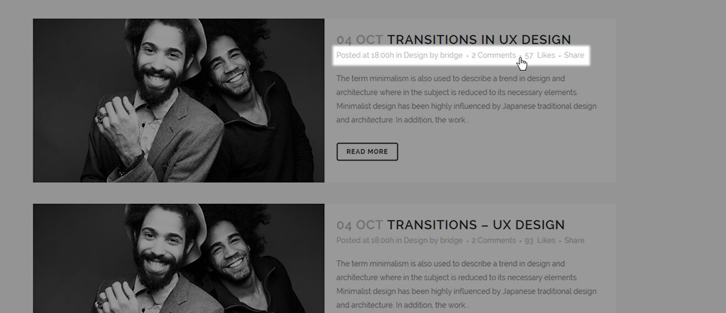
The following settings can be modified:
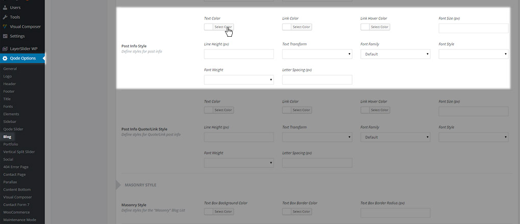
- Text Color
- Link Color
- Link Hover Color
- Font Size
- Line Height
- Text Transform
- Font Family
- Font Style
- Font Weight
- Letter Spacing
- Post Info Quote/Link Style – Here you can define styles for the post info text in posts set to the quote or link post formats.
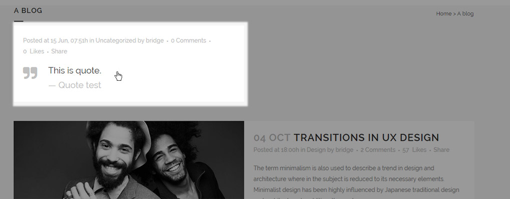
The following settings can be modified:
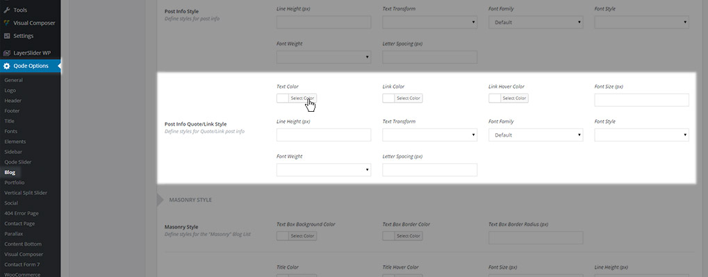
- Text Color
- Link Color
- Link Hover Color
- Font Size
- Line Height
- Text Transform
- Font Family
- Font Style
- Font Weight
- Letter Spacing
11.3.1.4 Masonry Style
Settings from this section are applied to the Blog Masonry and Blog Masonry Full Width blog page templates. Here you can set the following options:
- Masonry Style – Here you can define the style for the post info box in the Masonry blog list
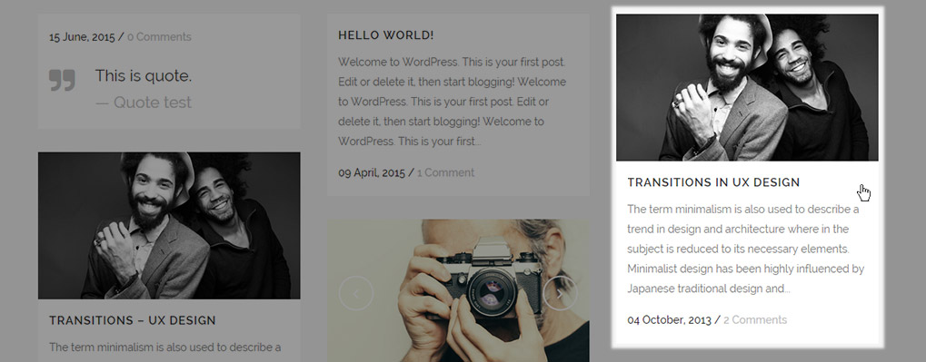
The following settings can be modified:
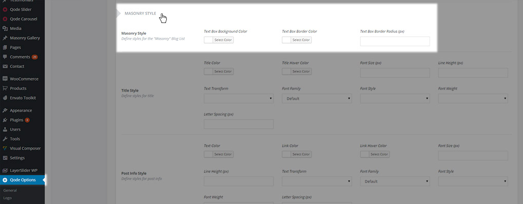
- Text Box Background Color
- Text Box Border Color
- Text Box Border Radius
- Title Style – Here you can define styles for post titles in the Masonry blog list
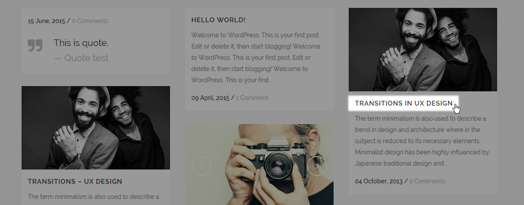
The following settings can be modified:
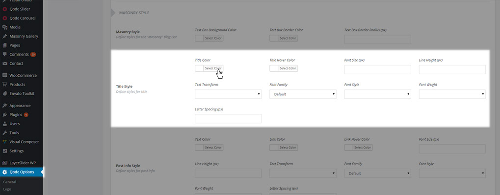
- Title Color
- Title Hover Color
- Date Color
- Font Size
- Line Height
- Text Transform
- Font Family
- Font Style
- Font Weight
- Letter Spacing
- Post Info Style - Here you can define styles for the post info text in the Masonry blog list
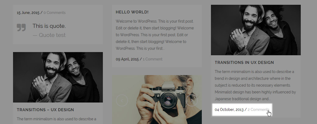
The following settings can be modified:
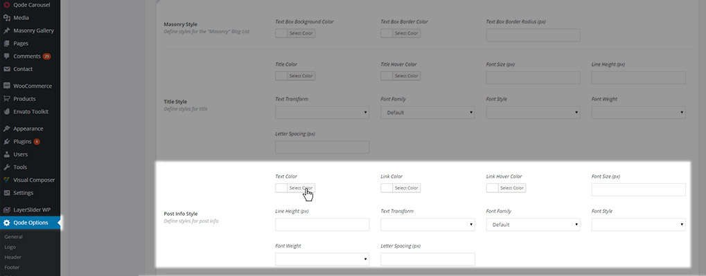
- Text Color
- Link Color
- Link Hover Color
- Font Size
- Line Height
- Text Transform
- Font Family
- Font Style
- Font Weight
- Letter Spacing
- Post Info Quote/Link Style - Here you can define styles for the post info text in posts set to the quote or link post formats.
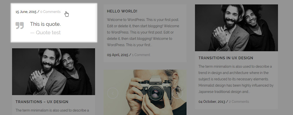
The following settings can be modified:
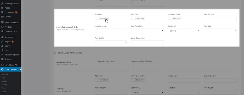
- Text Color
- Link Color
- Link Hover Color
- Font Size
- Line Height
- Text Transform
- Font Family
- Font Style
- Font Weight
- Letter Spacing
11.3.1.5 Blog Large Image Simple
Settings from this section are applied to the Blog Large Image Simple blog page template. Here you can find the following options:
- Box Content Style – Here you can define styles for the style for the post info box content in the Large Image Simple blog list.
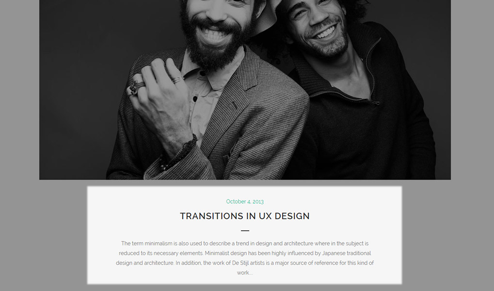
The following settings can be modified:
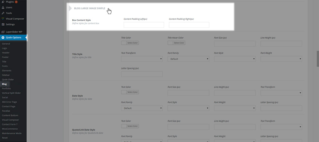
- Content Padding Left
- Content Padding Right
- Title Style - Here you can define styles for post titles in the Large Image Simple blog list
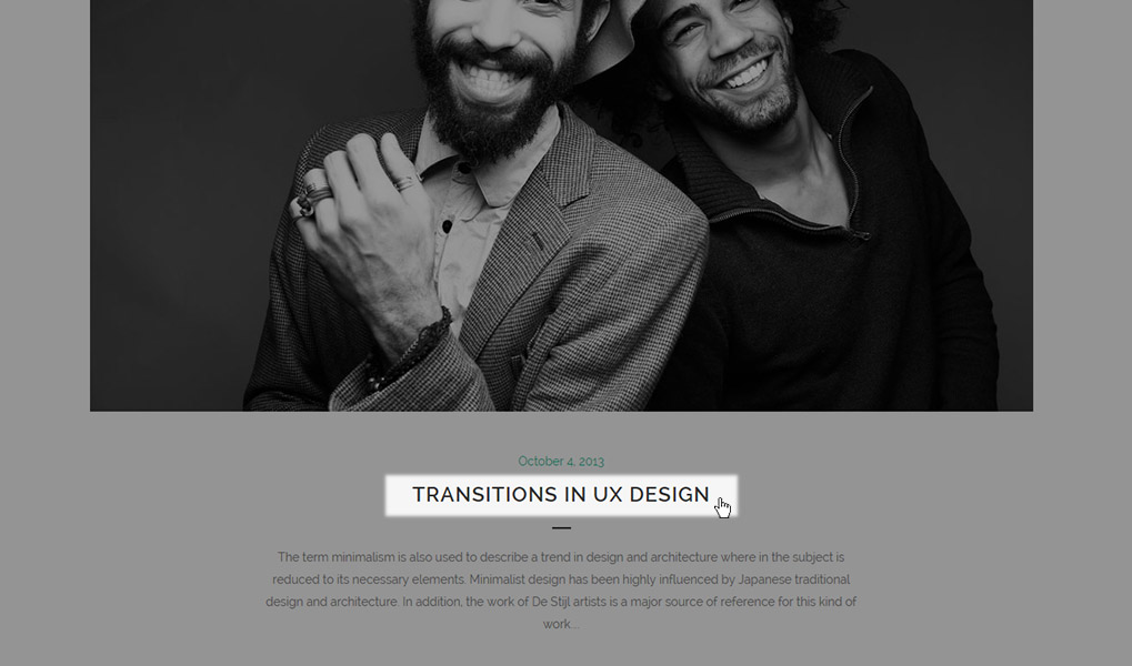
The following settings can be modified:
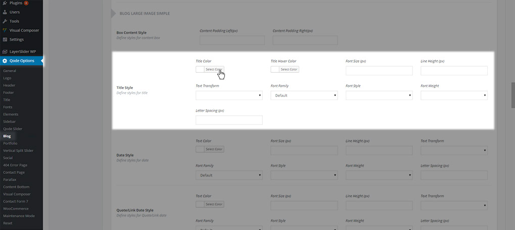
- Title Color
- Title Hover Color
- Date Color
- Font Size
- Line Height
- Text Transform
- Font Family
- Font Style
- Font Weight
- Letter Spacing
- Date Style – Here you can define styles for the date displayed on posts in the Large Image Simple blog list.
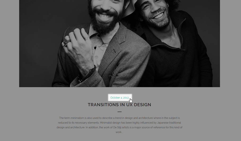
The following settings can be modified:
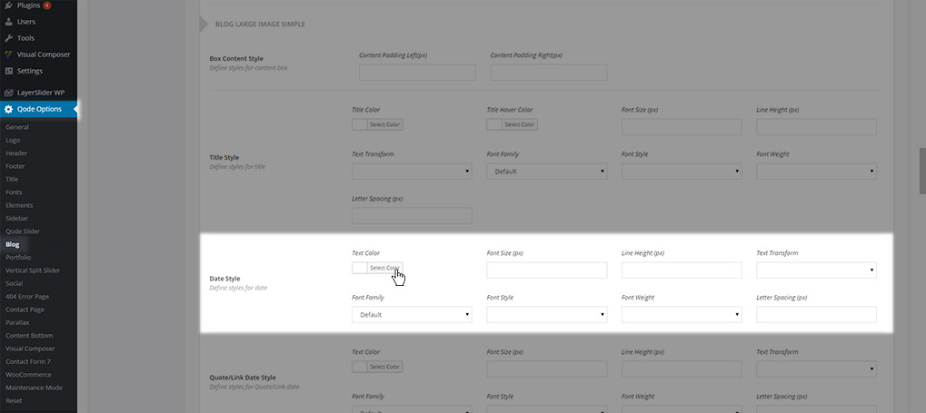
- Text Color
- Font Size
- Line Height
- Text Transform
- Font Family
- Font Style
- Font Weight
- Letter Spacing
- Quote/Link Date Style – Here you can define styles for the date in posts set to the quote or link post formats.
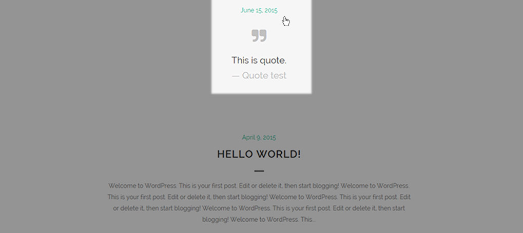
The following settings can be modified:
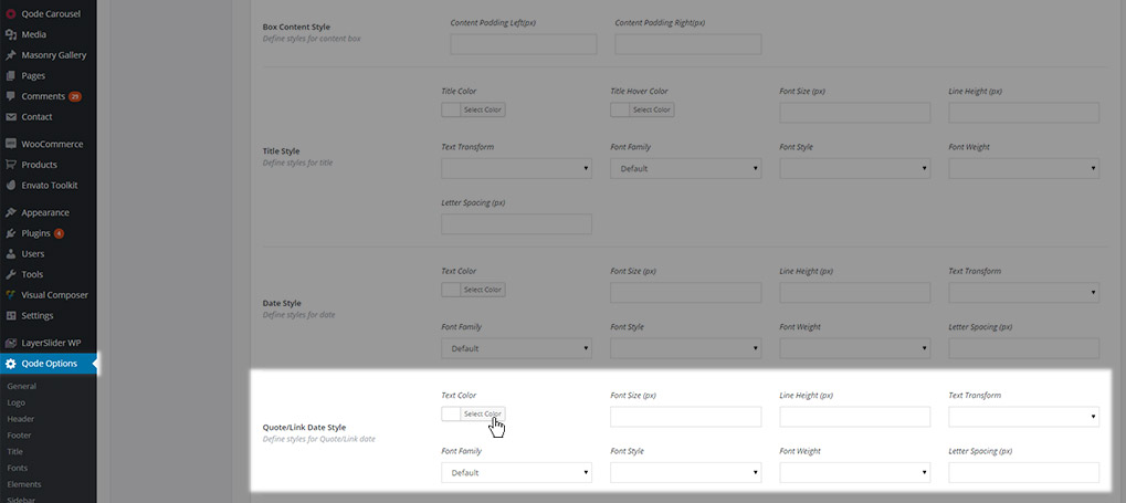
- Text Color
- Font Size
- Line Height
- Text Transform
- Font Family
- Font Style
- Font Weight
- Letter Spacing
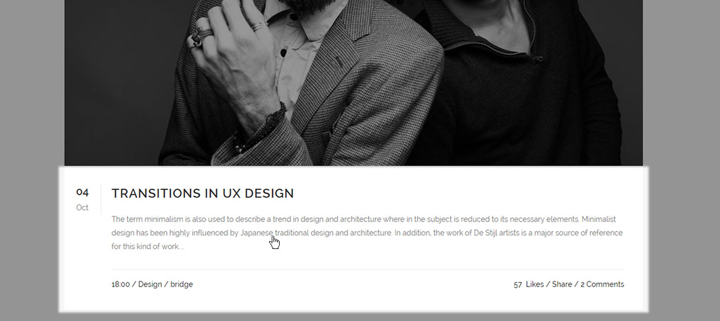
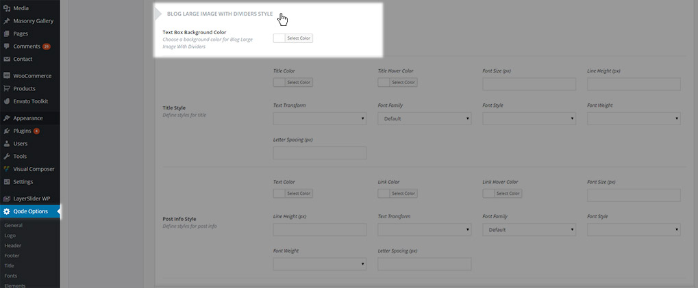
11.3.1.6 Blog Large Image With Dividers Style
Settings from this section are applied to the Blog Large Image With Dividers blog page template. Here you can find the following options:
- Text Box Background Color – Here you can define the background color of the box containing text and post info
- Title Style - Here you can define styles for post titles in the Large Image with Dividers blog list
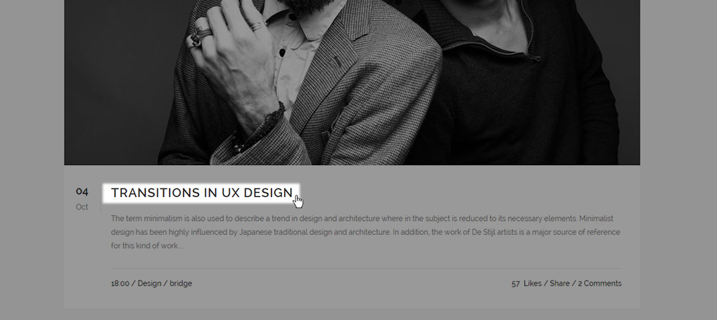
The following settings can be modified:
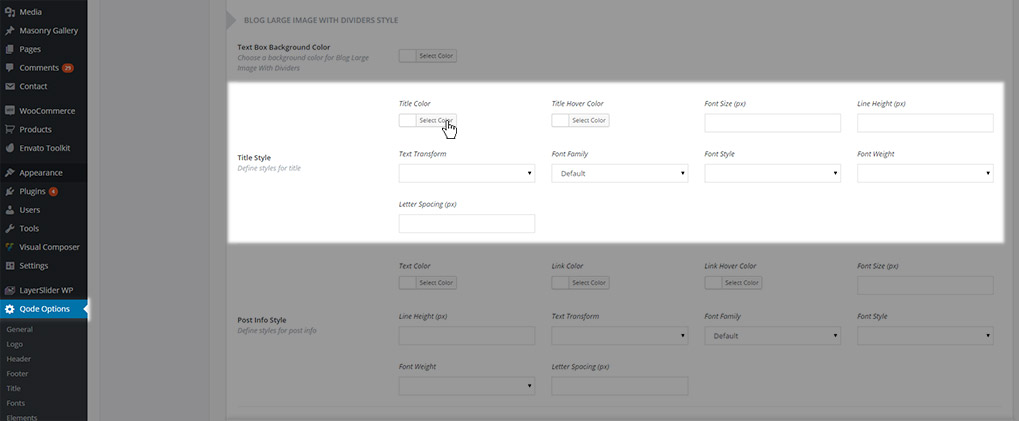
- Title Color
- Title Hover Color
- Font Size
- Line Height
- Text Transform
- Font Family
- Font Style
- Font Weight
- Letter Spacing
- Post Info Style - Here you can define styles for the post info text in the Large Image with Dividers blog list
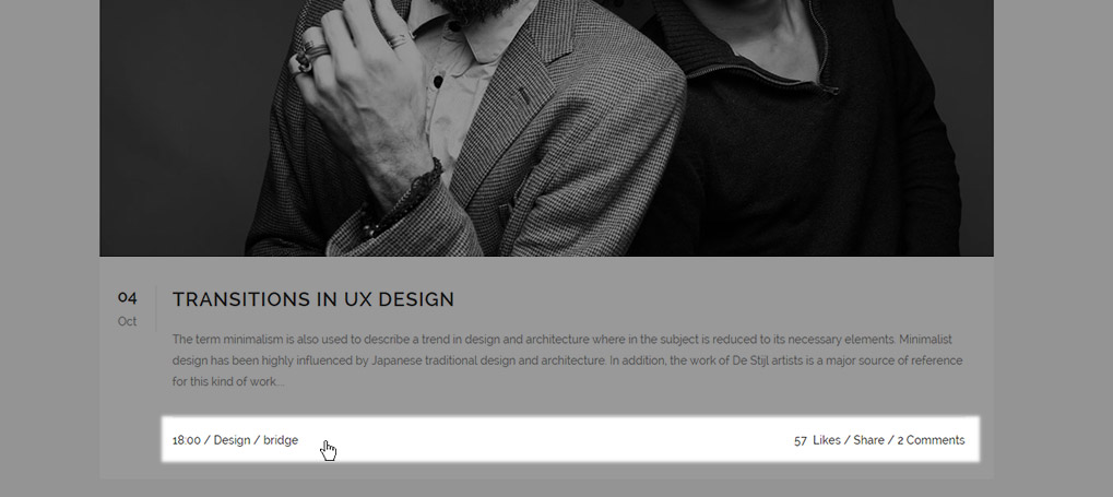
The following settings can be modified:
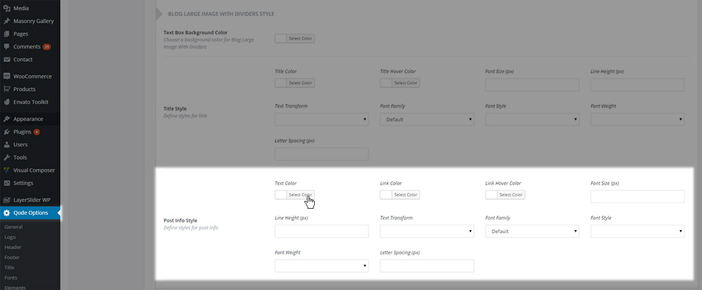
- Text Color
- Link Color
- Link Hover Color
- Font Size
- Line Height
- Text Transform
- Font Family
- Font Style
- Font Weight
- Letter Spacing
- Post Info Quote/Link Style - Here you can define styles for the post info text in posts set to the quote or link post formats.
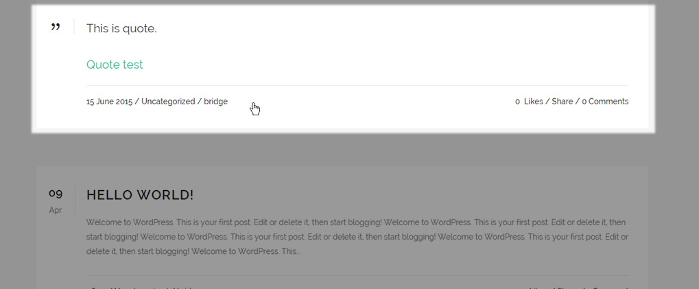
The following settings can be modified:
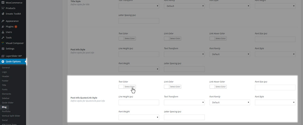
- Text Color
- Link Color
- Link Hover Color
- Font Size
- Line Height
- Text Transform
- Font Family
- Font Style
- Font Weight
- Letter Spacing
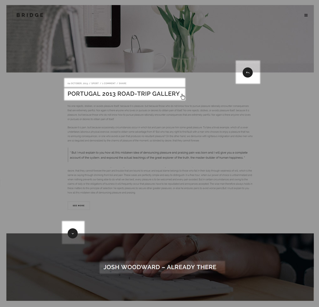
11.3.1.7 Blog Vertical Loop
Settings from this section are applied to the Blog Vertical Loop blog page template. Here you can find the following options:
- Title Style - Define the look of post titles in the Vertical Loop blog list.
- Next Post Title Style - Define styles for the title of the next post.
- Post Info Style - Define styles for the post info text.
- Quote/Link Title Style - Define the style for the post titles on posts set to the quote or link post formats.
- Quote/Link Post Info – Define the style for the post info text on posts set to the quote or link post formats.
- Next/Prev Button Style – Define the style for the next/previous post buttons.
11.3.1.8 Masonry – Date in Image Style
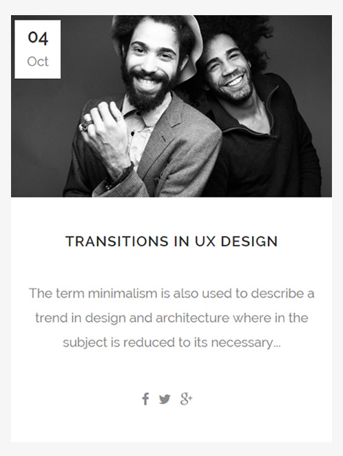
Settings from this section are applied to the Masonry – Date in Image blog page template. Here you can find the following options:
- Masonry - Date in Image Style – Here you can set a background color for the text box.
- Title Style - Define the look of post titles in the Masonry – Date in Image blog list.
11.3.2 Blog Single
In the Blog Single panel of the global blog options you will find general settings for your blog single posts. The following options can be modified:
- Sidebar Layout - Choose a sidebar layout for your blog single posts.
- Sidebar to Display - Choose a custom widget area to display in your sidebar.
- Show Blog Author – Set this option to "Yes" if you want your blog single posts to contain an "About the author" section which is displayed between the post content and the comment section (if the comment section is enabled).
- Blog Single Spacing - Set margins for the image, title, and post info on blog single posts.
11.3.3 Quote/Link
Here you can define settings specifically for posts set to the quote and link post formats. The following options can be modified:
Box Background Color - This option applies only to blog posts that are set to either the Quote or the Link post format. The box color you set here will be visible on both Blog Lists and Blog Single pages. This option doesn’t depend on the blog template that you are using.
11.3.4 Blog Slider
In the Blog Slider panel of the global blog options you will find general settings for the blog slider shortcode. When setting the blog slider shortcode onto a page on your site you can choose between two types of blog sliders. There are separate sets of options in the Blog Slider panel of the global blog options for both slider types. Please note that default type of Blog Slider is Carousel.
11.3.4.1 Blog Carousel Slider Style
Here you can define settings for the Carousel type of blog slider. The following options can be modified:
- Title Style - Set styles for the slider title.
- Post Info Style - Set styles for the post info text.
- Day Style - Set styles for the day (in the post info), when post info position is set to bottom. (Otherwise the style will be inherited from the Post Info Style options above).
- Blog Slider Spacing - Define margins for the slider content.

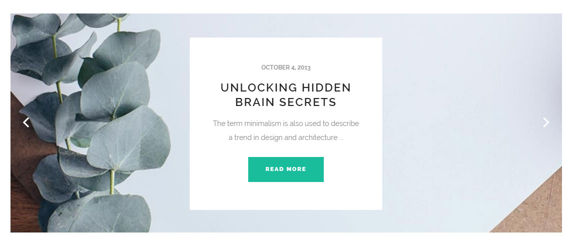
11.3.4.2 Blog Simple Slider Style
Here you can define settings for the Simple type of blog slider. The following options can be modified:
- Title Style - Set styles for the slider title.
- Post Info Style - Set styles for the post info text.
- Blog Slider Spacing - Define margins for the slider content.
- Box Style - Define styles for the post info box.
Note: All fields that require values in pixels (Font Size, Line Height, Letter Spacing, Margins, Padding, etc.) have px value in brackets after title (for example

and you should enter only the values in these fields (no units required) like in this example

11.4 Blog Shortcodes
In this section we will describe the shortcodes provided in Bridge for displaying blog posts, and go through all the available options for each one.
11.4.1 Latest Post
You can easily display posts on any page by adding the Latest Post shortcode to the page. There are 4 different layouts that you can create with this shortcode, each with its own set of options:
01 Images in Left Box
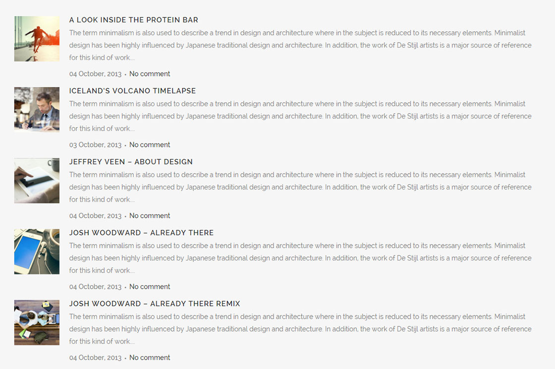
02Minimal
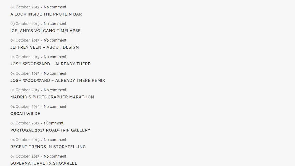
03Boxes
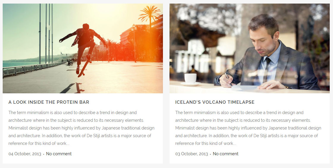
04 Boxes with dividers
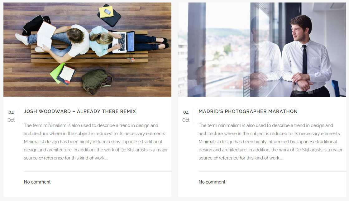
All types except Minimal will show the featured images of displayed posts. Therefore, it is recommended that you set featured image for all posts (and for all post types – including quote/link, gallery etc.). If the featured image is bigger than 539x303 pixels then it will be cropped to those dimensions. This only means that the maximum size for featured image is 539x303px, it doesn’t mean that the featured image will be displayed in those dimensions. The actual display size of featured images depends on the screen size, page layout (full width, in grid, with sidebar) and the type of Latest Post layout that you have chosen.
If you select either the Images in Left Box or Minimal type of Latest Post, you will have the following options available to modify:
- Number of Posts - Enter the number of posts you would like to display.
- Order By – Choose how you would like to order the posts. Blog posts can be organized by title or date.
- Order - Choose between ascending or descending order.
- Category Slug - If you would like to show blog posts from certain categories, enter the category slugs here, separated by commas. Alternatively, to display all categories, leave this field empty.
- Text length - Enter the number of characters, spaces included, that you would like to display per post excerpt.
- Title Tag - You can choose a heading style to apply to the post titles.
- Display category - Choose whether to display the category tag.
- Display date - Choose whether to display the date. The date will be displayed in format d M, Y (e.g. 01 June, 2015).
- Display comments - Choose whether to display the number of comments the post has.
- Display like - Choose whether to turn on "likes."
- Display share - Choose whether to enable social sharing. Please note that you also have to enable this option in Qode Options -> Social.
With the Boxes type of Latest Post the following options are available:
- Number of Columns - You can choose the number of columns (up to 4) you would like your posts to be displayed in.
- Number of Rows - Choose the number of rows (up to 5) you would like your posts displayed in.
- Text from edge – Text can stretch across the full width of the box, or it can have padding on the sides.
- Order By - Choose how you would like to order the posts. Blog posts can be organized by title or date.
- Order - Choose between ascending or descending order.
- Category Slug - If you would like to show blog posts from certain categories, enter the category slugs here, separated by commas. Alternatively, to display all categories, leave this field empty.
- Text length - Enter the number of characters, spaces included, that you would like to display per post excerpt.
- Title Tag - You can choose a heading style to apply to the post titles.
- Display category - Choose whether to display the category tag.
- Display date - Choose whether to display the date. The date will be displayed in format d M, Y (e.g. 01 June, 2015).
- Display comments - Choose whether to display the number of comments the post has.
- Display like - Choose whether to turn on "likes."
- Display share - Choose whether to enable social sharing. Please note that you also have to enable this option in Qode Options -> Social.
Note: Please note that there is no Number of Posts option for these two types of Blog List. However, you can control the number of displayed posts using the Number of Rows and Number of Columns options, which basically mean that you can display a maximum of 20 posts with these two types.
With the Boxes with Dividers type of Latest Post the following options are available:
- Number of Columns - You can choose the number of columns (up to 4) you would like your posts to be displayed in.
- Number of Rows - Choose the number of rows (up to 5) you would like your posts displayed in.
- Order By - Choose how you would like to order the posts. Blog posts can be organized by title or date.
- Order - Choose between ascending or descending order.
- Category Slug - If you would like to show blog posts from certain categories, enter the category slugs here, separated by commas. Alternatively, to display all categories, leave this field empty.
- Text length - Enter the number of characters, spaces included, that you would like to display per post excerpt.
- Title Tag - You can choose a heading style to apply to the post titles.
- Display category - Choose whether to display the category tag.
- Display date - Choose whether to display the date. The date format different for this type of Latest Post: d M (e.g. 01 June).
- Display comments - Choose whether to display the number of comments the post has.
- Display like - Choose whether to turn on "likes."
- Display share - Choose whether to enable social sharing. Please note that you also have to enable this option in Qode Options -> Social.
Note: Please note that there is no Number of Posts option for this type of Blog List. However, you can control the number of displayed posts using the Number of Rows and Number of Columns options, which basically mean that you can display a maximum of 20 posts with this type.
With the Image in Left Box and Minimal types of Latest Post, only the post title is a link that leads to the post itself. With the other two types - Boxes and Boxes with Dividers, the post featured image and title are both links that lead to the post.
Note: The Latest Posts shortcode does not have a built-in option to display a Read More button.
11.4.2 Blog Masonry
This shortcode allows you to display your blog posts in masonry style. With this shortcode posts are listed the same way they are when using the Blog Masonry template. This means that for non-standard post types, instead of the featured image, a video (for the video post type), gallery (for the gallery post type), etc. will be displayed.
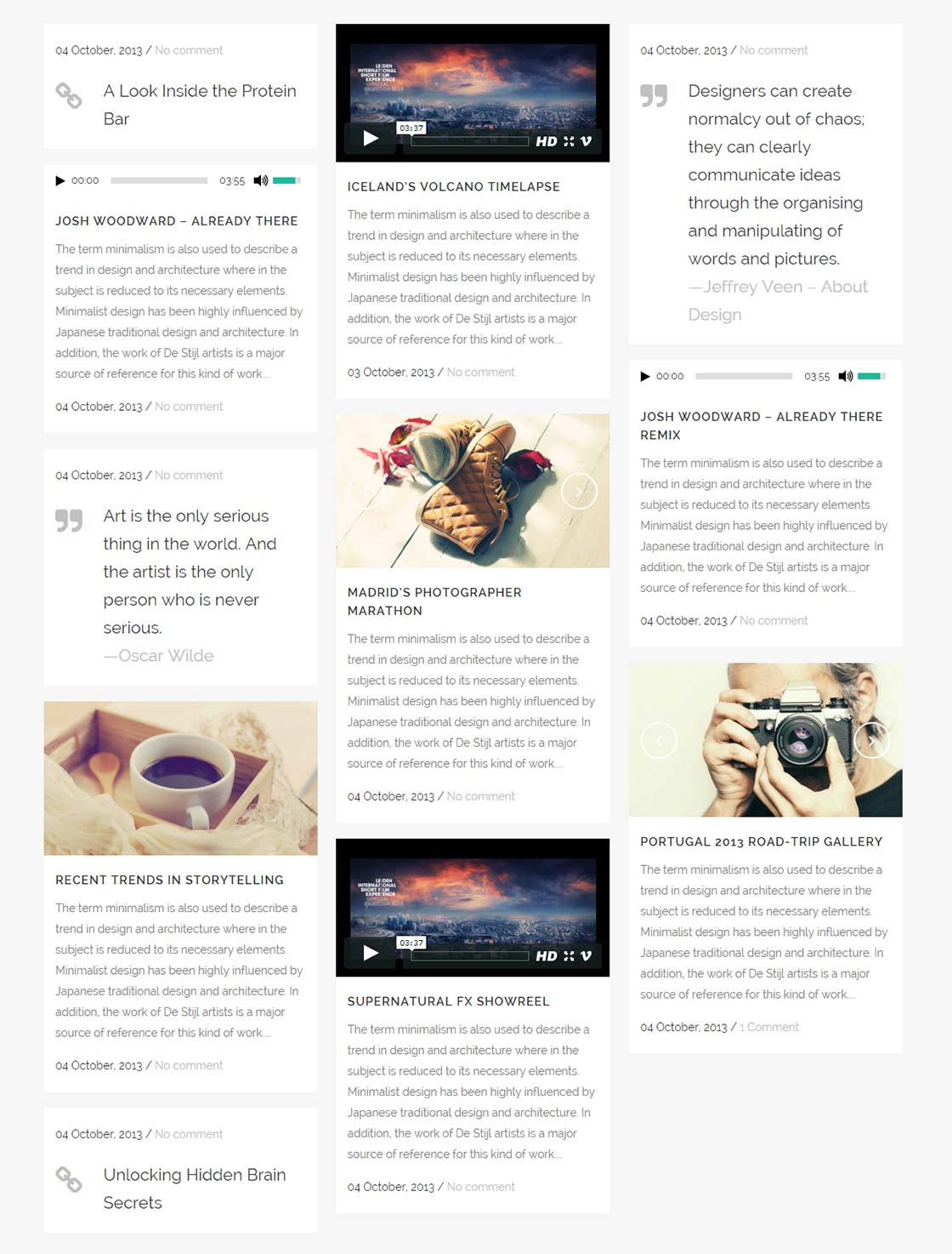
If this shortcode is used with the Default page template, then the maximum number of columns is 3, while maximum number of columns when using the Full Width page template is 5.
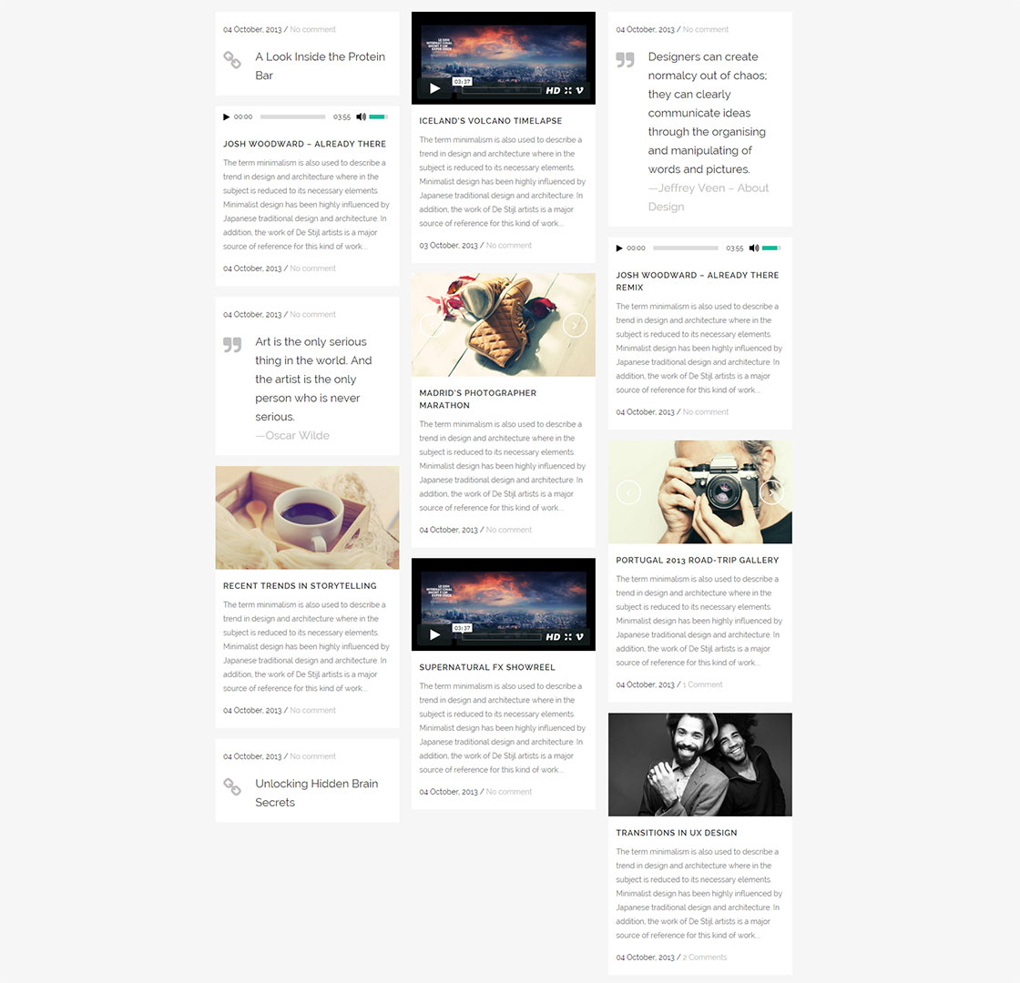
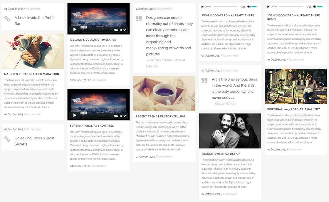
The Blog Masonry shortcode provides the following options:
- Number of Posts - Enter the number of posts you would like to display.
- Order By - Choose how you would like to order the posts. Blog posts can be organized by title or date.
- Order - Choose between ascending or descending order.
- Category Slug - If you would like to show blog posts from certain categories, enter the category slugs here, separated by commas. Alternatively, to display all categories, leave this field empty.
- Text length - Enter the number of characters, spaces included, that you would like to display per post excerpt.
- Title Tag - You can choose a heading style to apply to the post titles.
- Display date - Choose whether to display the date. The date will be displayed in the format d M, Y (e.g 01 June, 2015).
- Display comments - Choose whether to display the number of comments the post has.
11.4.3 Blog Slider
The Blog Slider shortcode lets you display your blog posts within a slider on any page.
When using the Blog Slider, it is recommended that you upload all your posts’ featured images in the same size in order to achieve the best looking layout.
The Blog Slider provides two types of layouts: the default Carousel layout

and the Simple layout
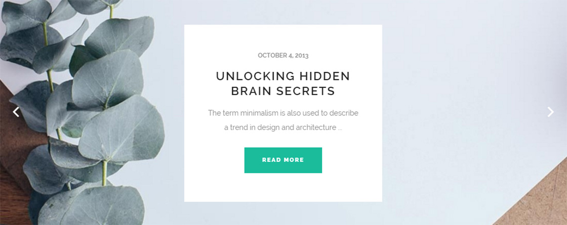
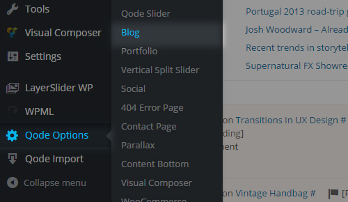
Global styling options for the Blog Slider shortcode can be found in Qode Options -> Blog -> Blog Slider.
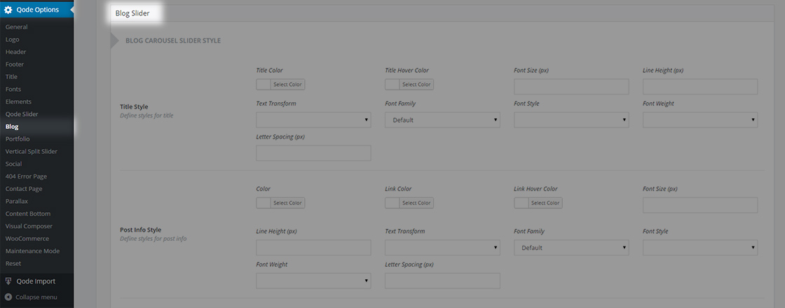
When setting a Blog Slider shortcode on a page on your website, the following options are available:
- Slider Type- Choose the type of Blog Slider you would like to use. When using the Carousel type, multiple posts can be visible at the same time, while with the Simple Blog Slider type only one post is visible at a time (it will be stretched to the holder width). With both types it is possible to manually scroll between posts.
- Post Info Position- Choose a position for the post info. It can be either visible on hover (Default) or always visible at the bottom of the featured image (Bottom).
- Image size– Set the proportions you would like blog images to be displayed in. You can choose between Landscape, Portrait, Original and Custom. The landscape size is 800 x 600 pixels, which means that if the uploaded featured image is bigger than 800 x 600 pixels it will be cropped. However, this doesn’t mean the image will be displayed in that size on your page. The actual size depends on few more factors (like the screen size, the number of posts displayed, etc.). Portrait size is 600 x 800 pixels. If you choose the Custom size option, two more fields will become available:
- Image Width- Set a width for the image.
- Image Height- Set a height for the image.
- Order By– Select how to order your blog posts. Blog posts can be ordered by Menu Order, Title, or Date.
- Order– Choose between ascending and descending order.
- Number– Set the number of blog posts to display in the blog slider.
- Number of Blog Posts Shown– Choose the number of posts that will display at once across the full width of the screen (less will be shown on smaller screens, due to responsiveness). This option is only available for the Carousel type of Blog Slider.
- Category– If you would like to show blog posts from certain categories, enter the category slugs here, separated by commas. Alternatively, to display all categories, leave this field empty.
- Selected Projects– If you would like to display only certain posts in the blog slider, enter the IDs of those posts here.
- Info Box Color – Set a background color for the info box that holds the post title, publishing date, author etc.
- Show Category Names– Choose whether to display the category names on your blog slider.
- Category Name Color– Set a color for your category names.
- Show Date– Choose "Yes" if you would like the date to be displayed on your posts. The date will be displayed in the following format: M d, Y (e.g June 15, 2015).This option doesn’t affect the date when the Carousel type of Blog Slider is selected and Post Info Position is set to Bottom.
- Date Color– Set a color for the date.
- Title Tag– Set the heading tag for the post title.
- Title Color– Set the color for the post title.
- Show Comments- Set this option to "Yes" if you would like to display the number of post comments in your post info. This option is only available when the Post Info Position is set to
- Comments Color- Set a color for the comments post info.
- Prev/Next navigation– Select whether you would like the previous and next navigation arrows to be displayed.
- Extra class name– If you would like to style this particular blog slider differently, you can use this field to add an extra class name to it and then refer to that class name in your custom css.
When you choose the Simple Blog Slider type, you receive a few additional options:
- Show Author - Set this option to "Yes" if you would like to show the author’s name.
- Author Color - Set a color for the author's name.
- Show Excerpt - Set this option to "Yes" if you would like to display the post excerpt.
- Excerpt Length - Define the length of the post excerpt.
- Show Read More Button – Set this option to “Yes” if you would like to display a “Read More” button on the slider.


