When the basic setup is finished it’s time for creating your content. Here we will go through setting up pages while in the next chapters we will introduce posts and portfolios.
10. PAGES AND PAGE TEMPLATES
Here we have explained how to set up your home page and define if you want your home page to be a blog listing page or a static front page. Now, let’s go through the process of creating a page.
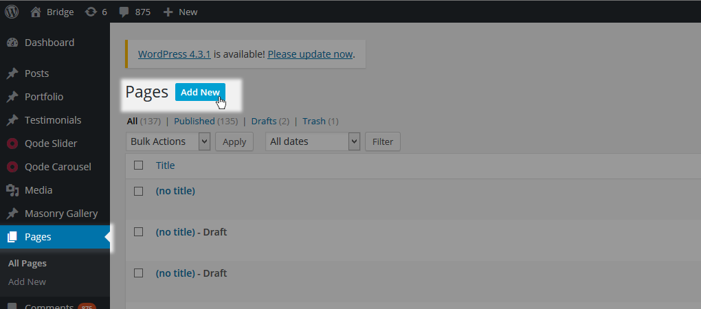
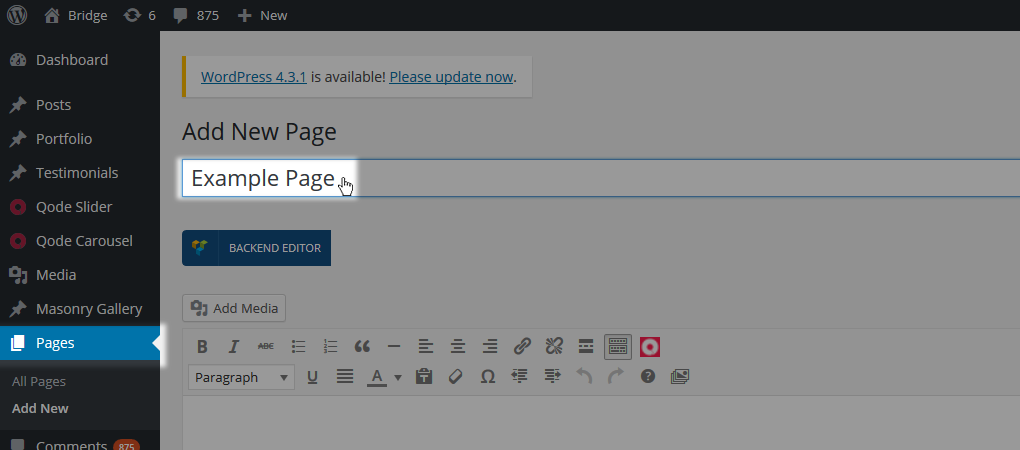
To create a new page, navigate to WP Admin -> Pages > Add New. Enter a title for your page in the text field near the top of your screen.
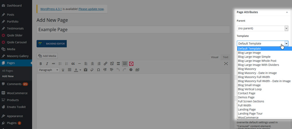
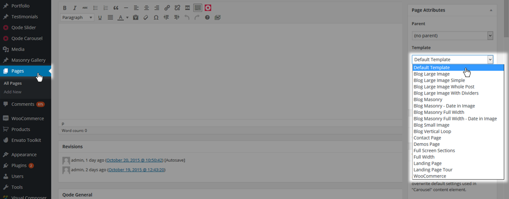
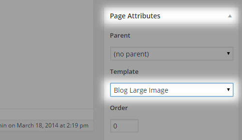
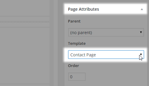
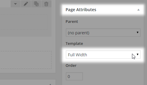
Then, choose some template for your page in the dropdown menu on your right called Page Attributes.
Below the content area we have local page settings defined in Qode metaboxes. Any settings you define here will override the global settings you've set in Qode Options. It is generally a good practice to set up the look of your site on a global level, and then override the settings on the page level where necessary. This approach will save you a lot of time and will provide you with a solid foundation for further styling your site.
Now let's start adding elements to your page. Make sure that you're in the backend editor.
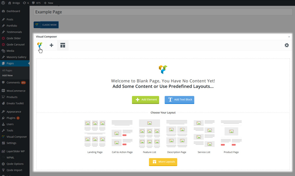
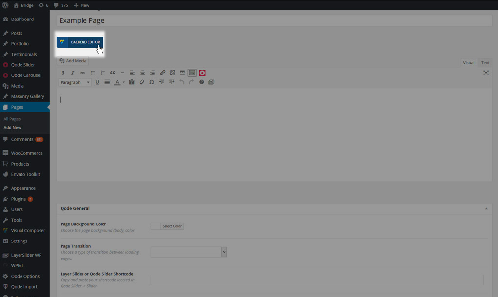
If the blue button on the top left says BACKEND EDITOR, click it to enable WPBakery. Once you're in backend editor mode, the button will say CLASSIC MODE (hinting at the mode you’ll go into on click).
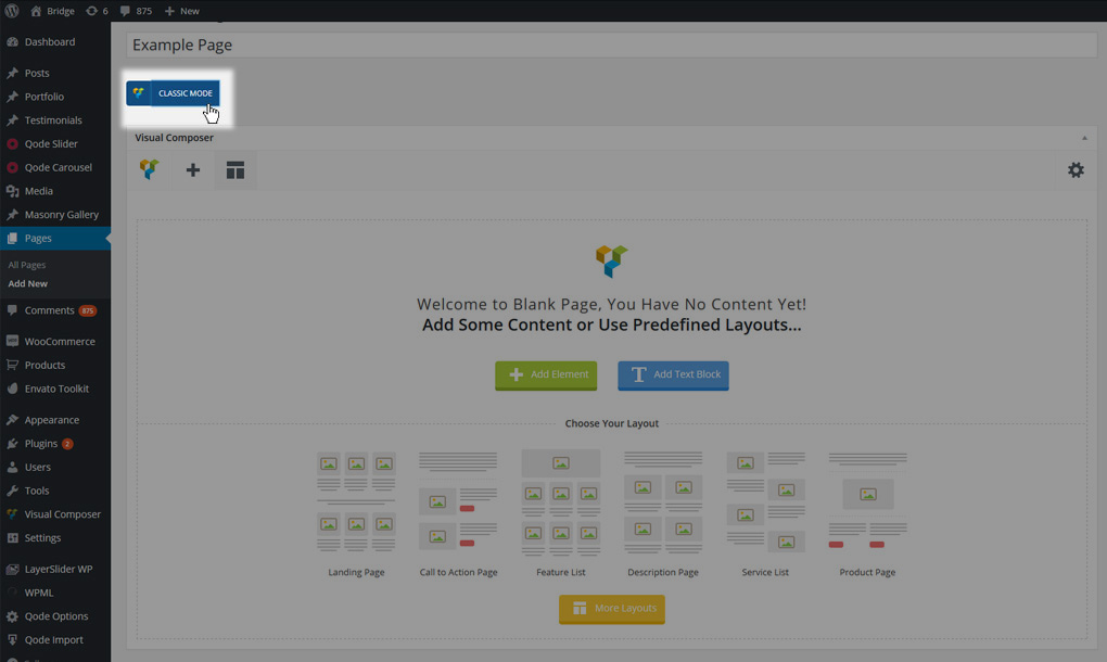
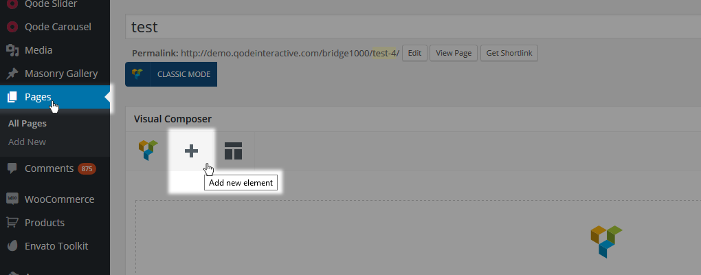
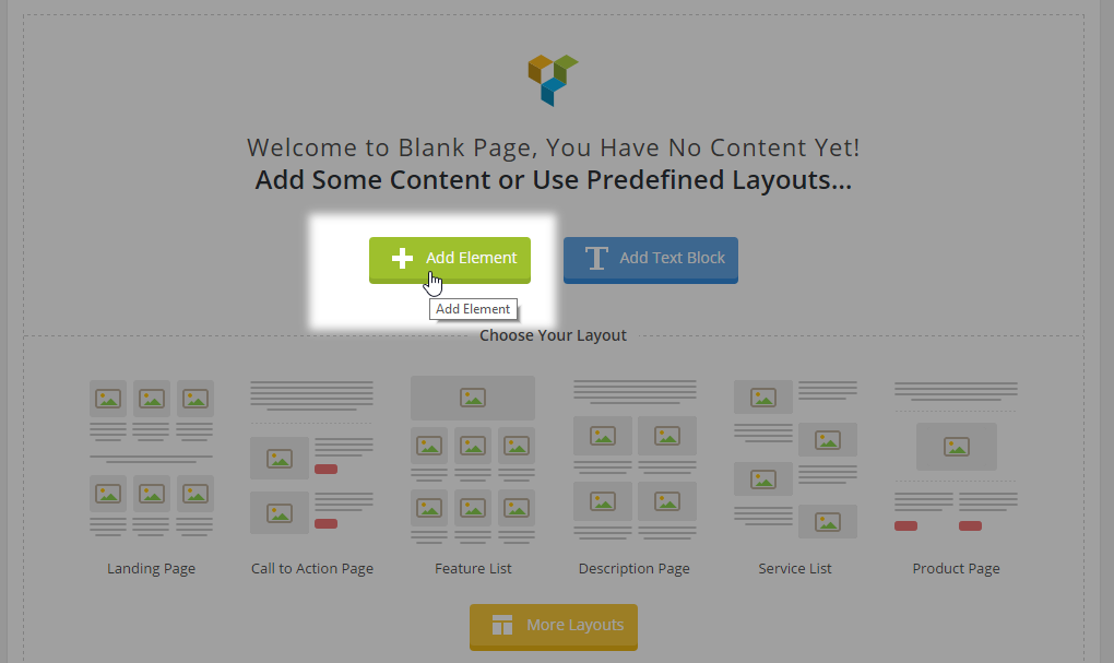
You can now click on "Add Element" and start building your page.
10.1. Basic Page Setup
Our theme comes with predefined page templates that can be used for different purposes to meet your creative ideas. Page templates define the type of the page that will be used and they are as follows:
- Default Template
- Blog Large Image
- Blog Large Image Simple
- Blog Large Image Whole Post
- Blog Large Image With Dividers
- Blog Masonry
- Blog Masonry – Date in Image
- Blog Masonry Full Width
- Blog Masonry Full Width – Date in Image
- Blog Small Image
- Blog Vertical Loop
- Contact Page
- Full Screen Sections
- Full Width
- Landing Page
Additionally, if you have the WooCommerce plugin installed you will get a WooCommerce page template dedicated particularly for WooCommerce default pages.
Notes: If you’re going to create a One-Page Site you should use either the Full Width or Default page templates.
Notes: The Landing page template doesn’t display a Header or Footer.
Each of these templates will be addressed in greater detail later on. For now let’s see what the page structure looks like section by section
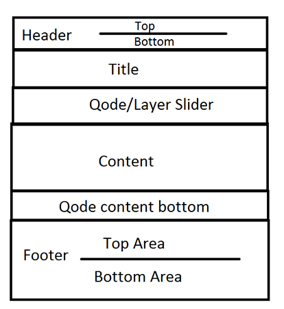
The next few page-level sections are meant to serve as a page options knowledge base that you can turn to at any time, whether you’re looking to get more familiar with Bridge settings or you’re after that one particular soft touch to make your website stand out.
10.1.1. General Page-Level Settings
The settings listed in the Qode metaboxes under the content editor will override the global settings set in WP Admin -> Qode Options. Leaving a setting blank will revert to the global value from Qode Options.
We’ll cover the general settings first, listed in the Qode General metabox:
- Page background color: This setting will be applied for page background color
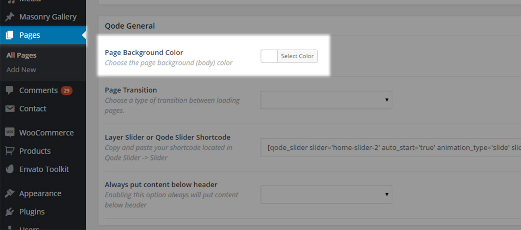
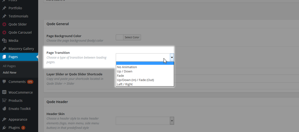
- Page transition: If you have Page Transition enabled globally in Qode Options and want for some pages to have different loading or transitioning, you can set that here.
- Layer Slider or Qode Slider Shortcode: As you can see on our page structure, any page can contain a Slider that is always placed below the header but before the content. This element is implemented through said field.
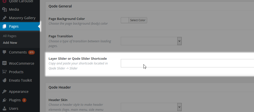
Important: This is the only right way for inserting a Qode Slider on your page, while the Layer Slider can be also placed in the page content area using the LayerSlider shortcode.
In order to display a slider using this field, all you have to do is paste the shortcode of the desired slider into this field.
- Qode Slider -

- Layer Slider -

How to get slider shortcodes that should be pasted inside this field?
- For Qode Slider
- Navigate to WP Admin -> Qode Slider -> Sliders

- Navigate to the page you would like to display your slider on, and paste the shortcode in the Qode Slider and Layer Slider shortcode field

- For Layer Slider
- Navigate to WP Admin -> Layer Slider WP -> All Sliders
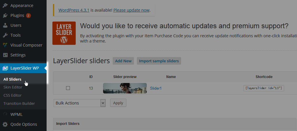
- Copy desired slider shortcode
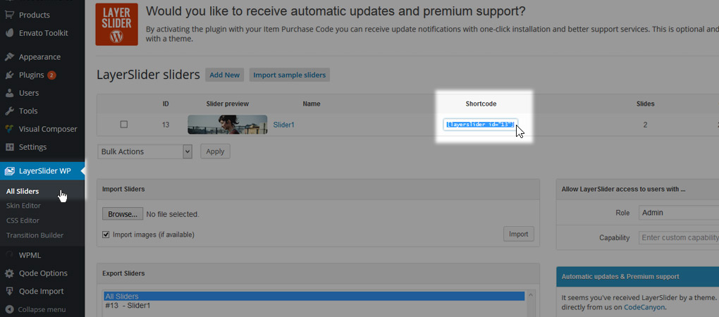
- Navigate to the page you would like to display your slider on, and paste the shortcode in the Qode Slider and Layer Slider shortcode field

- Always put content below header: The Bridge Header behaves dynamically - If it has some transparency set, the Title (if enabled) or Qode/Layer slider (if set) will be pulled below it so the header will overlap it.
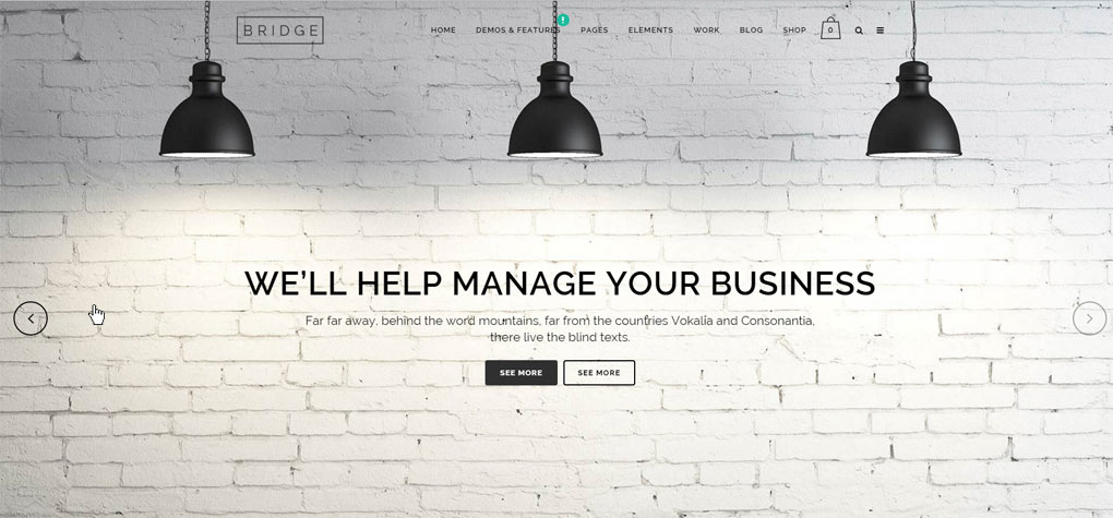
- If you don’t like this effect you can disable it using this setting which will place all elements (title – slider – content) below the header.
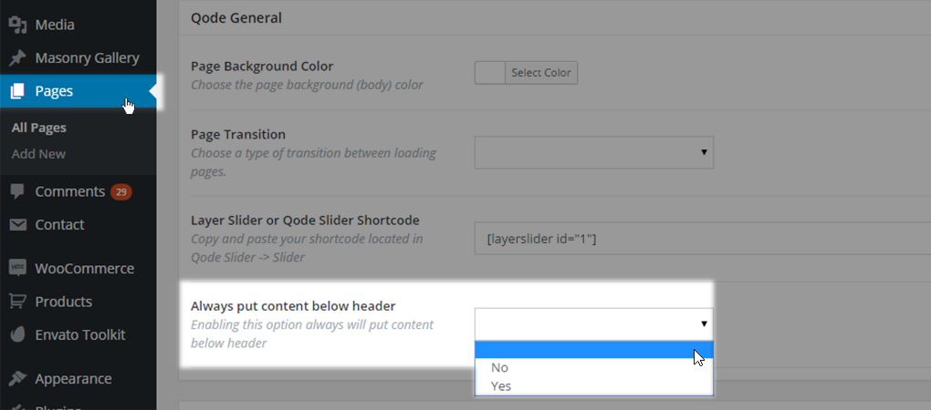
Setting this option to Yes will put all page elements below header, while No will disable that.
10.1.2. Header Settings on a Page-Level
The header has a lot of options as explained in this part of documentation but some of them can be overridden on the page itself. All the page-to-page header settings are listed under the Qode Header section on your page. Here’s an overview of each one:
- Header Skin: If you want for a particular page to have a different header skin - other than what has been set in Qode Options -> Header, this field lets you define that.
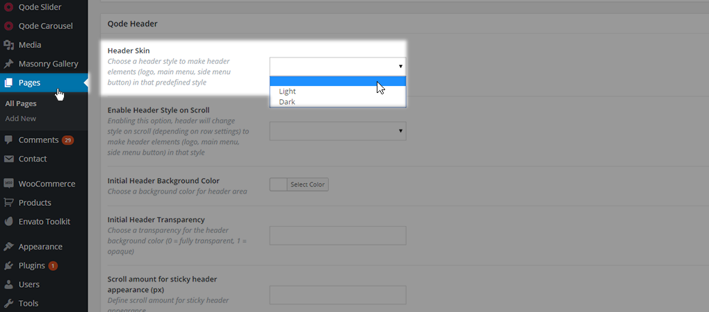
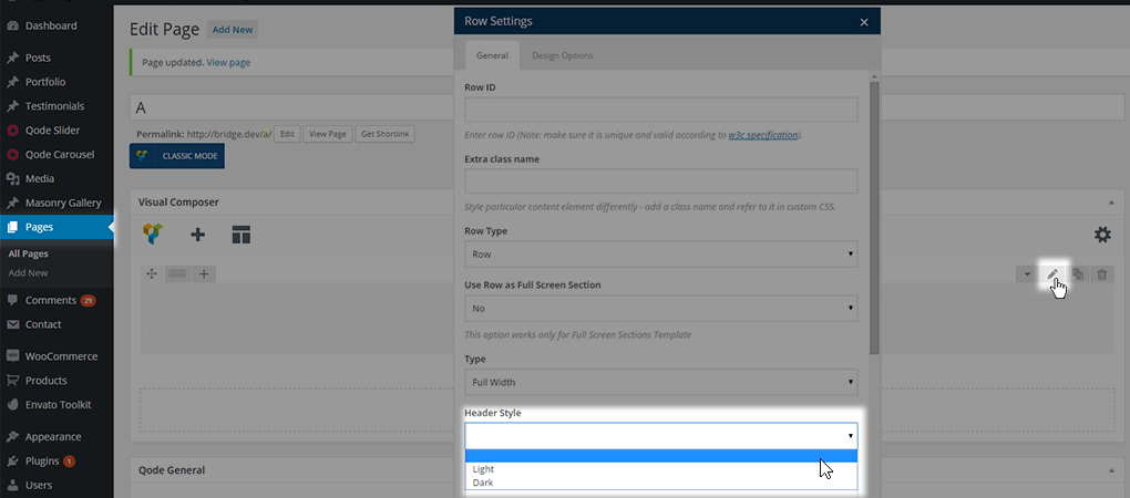
Leaving this field empty means this page header will use the default setting, while setting either the light or dark setting will set that type of header skin only for the page where settings are being made
- Enable Header Style on Scroll: In the Bridge WordPress theme, the header style can also be applied in relation to a specific page row. Similar to the header skin setting, this setting provides the possibility to change the header style based on the row element that is currently covered by Header
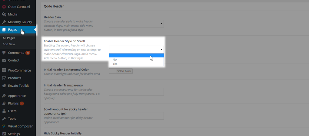
Leaving this field empty means this page header is using the default setting. Setting this field to Yes will change the header style based on row settings, while setting it to No will disable that functionality.
- Initial Header Background Color: Changes color of the header background for this page
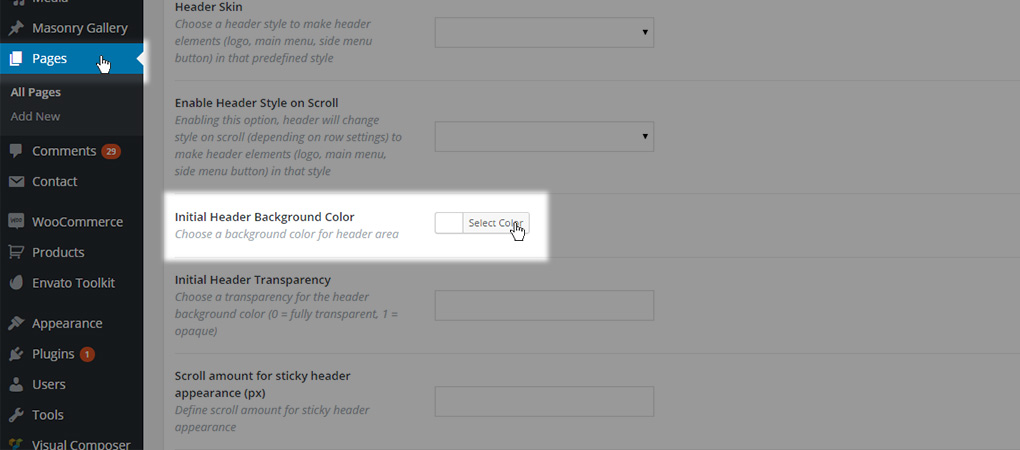
This will affect both header areas: header top and header bottom.
- Initial Header Transparency: Defines the header transparency for this page. Also affects both the header top and bottom area. This field can take values from 0 to 1. (use dot (‘.’) for decimal point)
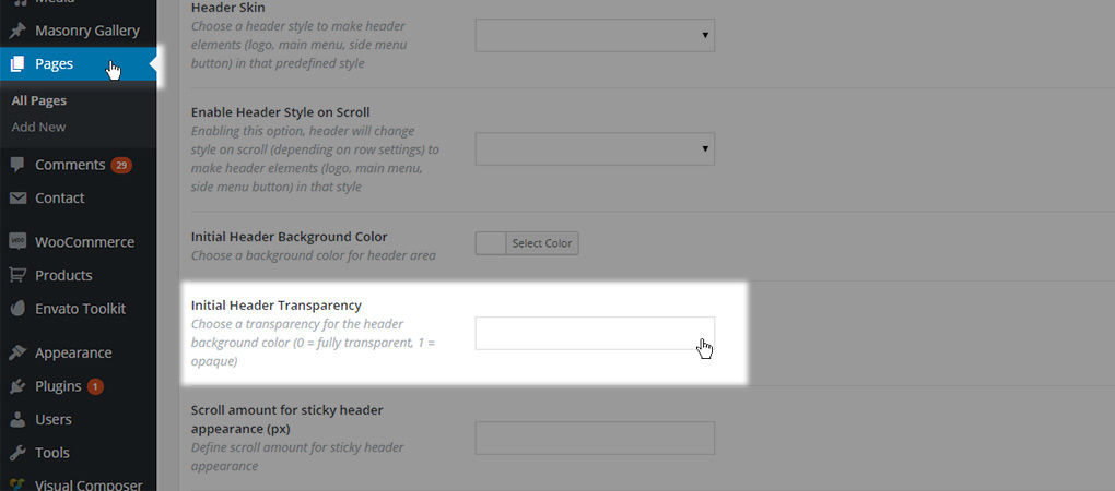
- Scroll Amount for Sticky Header Appearance (px): Defines the distance needed to scroll from the top of a page for the sticky header to appear. Value should be entered without the unit (for example enter 500 for 500px)
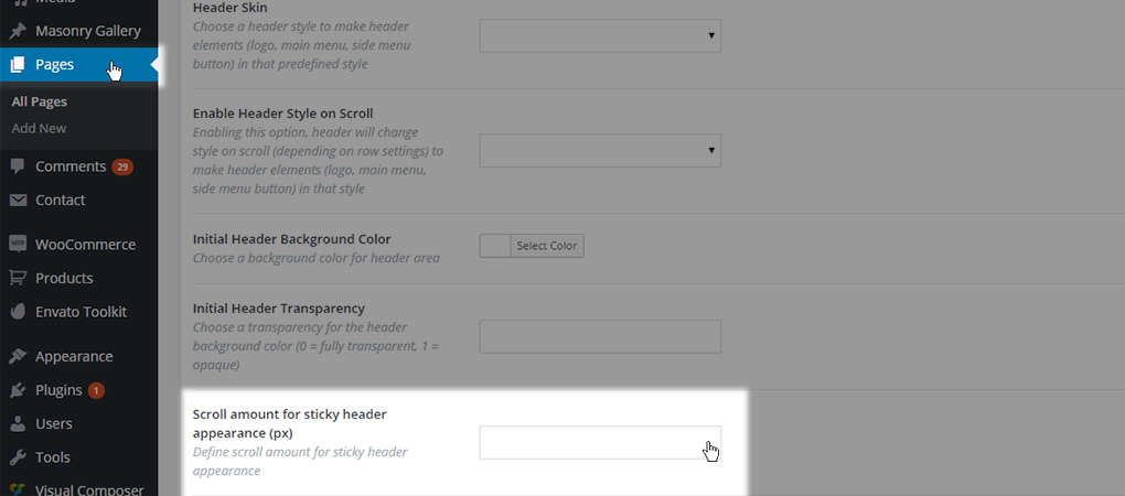
Note: This setting is applied only if Sticky header type has been set inside header settings.
- Hide Sticky Header Initially: This setting will hide the header section when the page is idle - not scrolled. The header will appear after the scroll action based on the value set for Scroll Amount for Sticky Header Appearance -
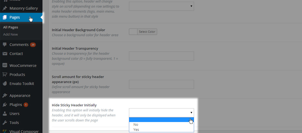
Leaving this field empty means the page header is using the default setting from Qode Options, while setting this field to Yes will hide header initially and No will disable that behaviour.
10.1.3. Title Area Settings on a Page-Level
Now, let’s cover the basic Qode Title settings applied on a page-level. These settings let you override the defaults made in Qode Options -> Title. Let’s go through all the page-by-page options:
- Don’t Show Title Area - Are you looking to hide or modify the title area on a page you are building?

You can use one of these three values:
- Default - The global setting from Qode Options -> Title will be used, but extra options will become available so you can override some of the global ones
- Pattern Overlay Image - This image will be used as a title background image but as a repeating pattern

- No - Selecting this value enables the same extra option fields for defining page title area. If the title area is enabled in general settings then values set in the fields below will let you override any general setting. However, if the title area is disabled by default, we recommend using this setting to display the title area on this particular page.
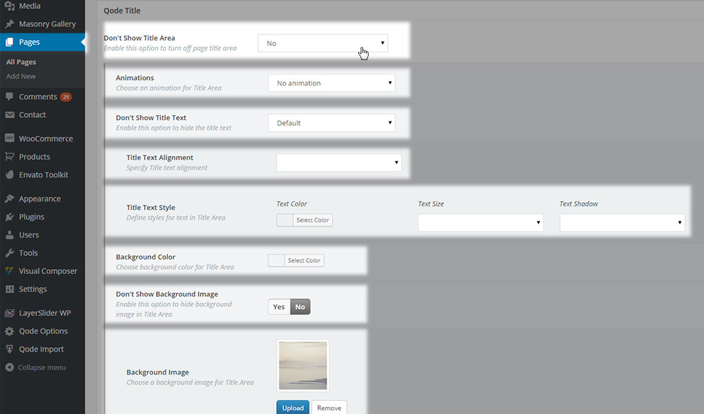
- Yes - Use this setting to hide the title area on a particular page.

If you chose to display a title on your page (i.e. - deciding not to hide it) you’ll get extra options listed. We will now go through each of them:
- Animations – choose whether to enable an animation effect for the title area.
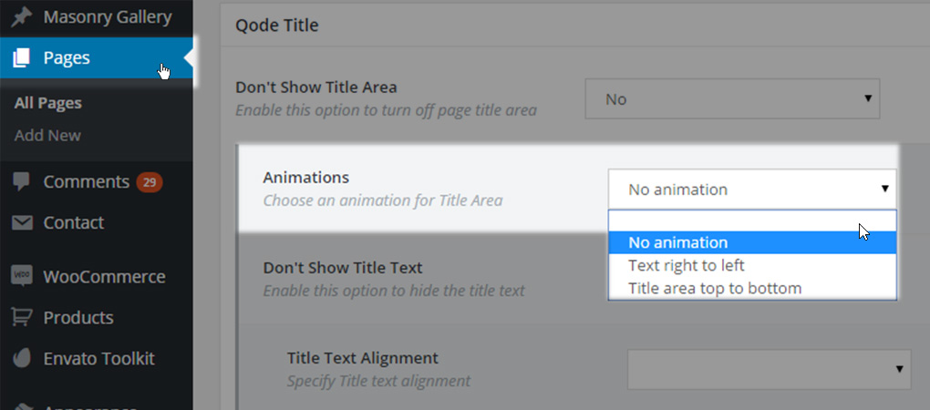
You can select one of following options
- Empty value – The default value from Qode Options -> Title -> Animations will be used
- No animation – No animation will be set
- Text right to left – Title text will appear from right to left
- Title area top to bottom – The entire title area will appear from top to bottom
- Don’t show title text – This option lets you hide the title text and leave only the title background image visible. You can choose one of the following options:
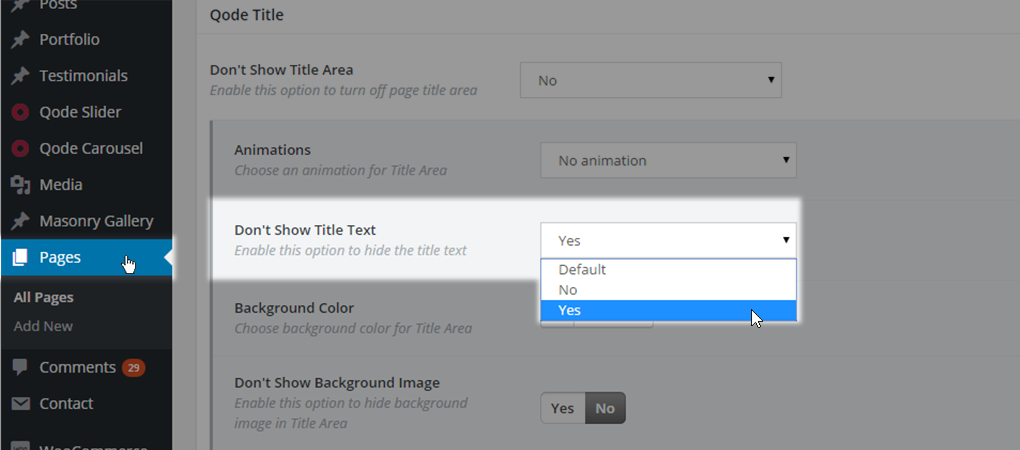
- Default – The default value from Qode Options -> Title -> Don’t show title text option will be used.
- No – Text will be displayed and additional options will appear below

- Title text alignment – choose between default (empty value), left, right or center

- Text color -

- Text size - choose between default (empty value), left, right or center
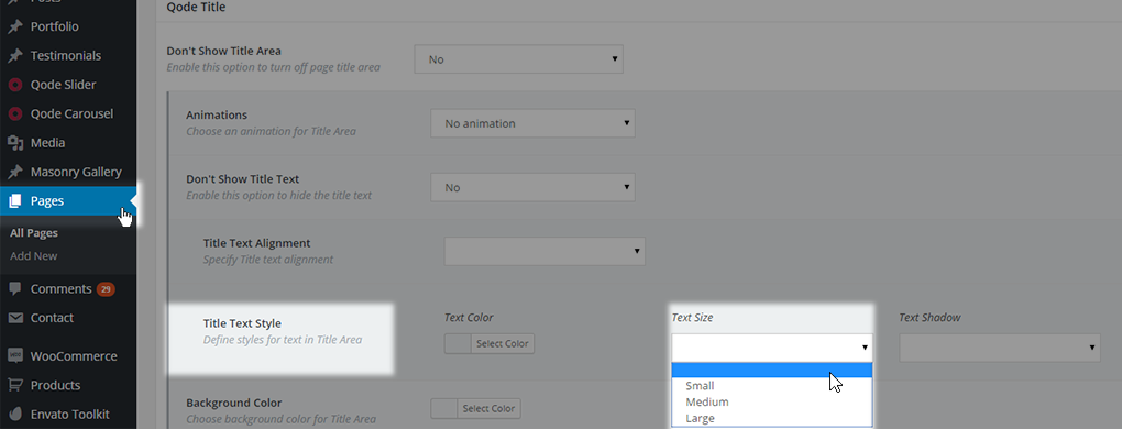
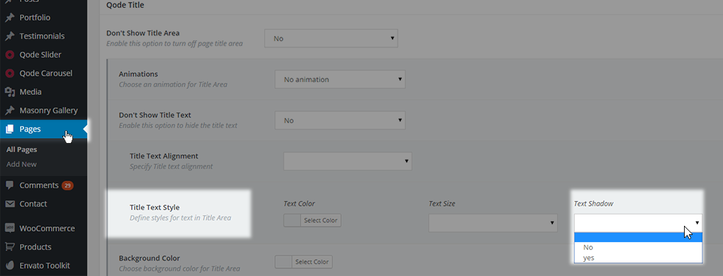
- Text shadow - choose between default (empty value), left, right or center
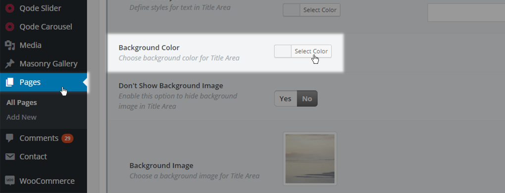
- Background color – Choose if you want your title area to have a background color. This color will be seen if there is no title image set or the title image is of smaller height than the title area itself
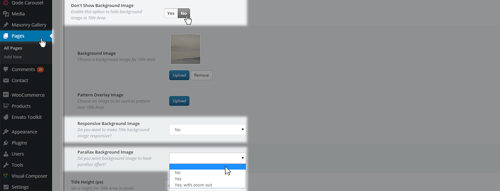
- Don’t Show Background Image – You can choose between two values:
- Yes – Background Image will not be displayed
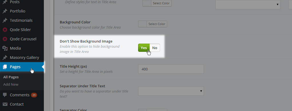
- No– Background Image will be displayed and additional options will appear
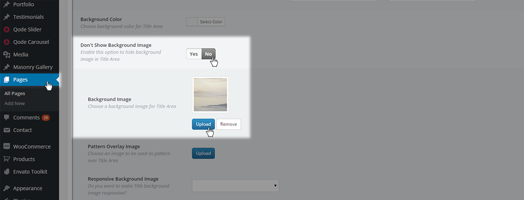
- Background image – Choose a background image to be displayed in the title area. This image will be the background image for title text

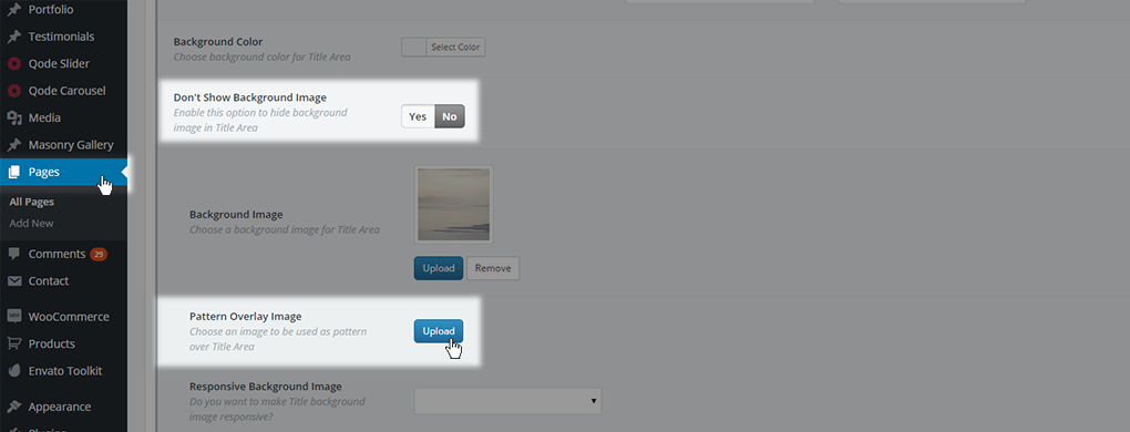
- Patter Overlay Image - This image will be used as a title background image but as a repeating pattern
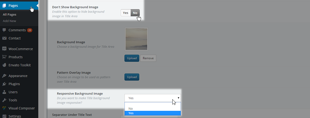
- Responsive Background Image – You can set if you want your title image to be responsive across different devices. You can choose between three values: default (empty value), Yes or No. If you choose not to have a responsive background image, new option will appear for Parallax Background Image
- Parallax Background Image – Choose if you want to have a parallax effect applied to your title image. You can choose between four values: default (empty value), No, Yes, and Yes, with zoom out.
- Title Height (px) – Define the desired title height.
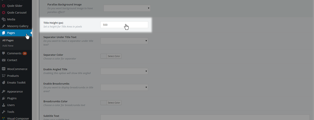
The value should be set as absolute numeric value, omitting px at the end (- for example 500). This value will override the global setting setting from Qode Options -> Title.
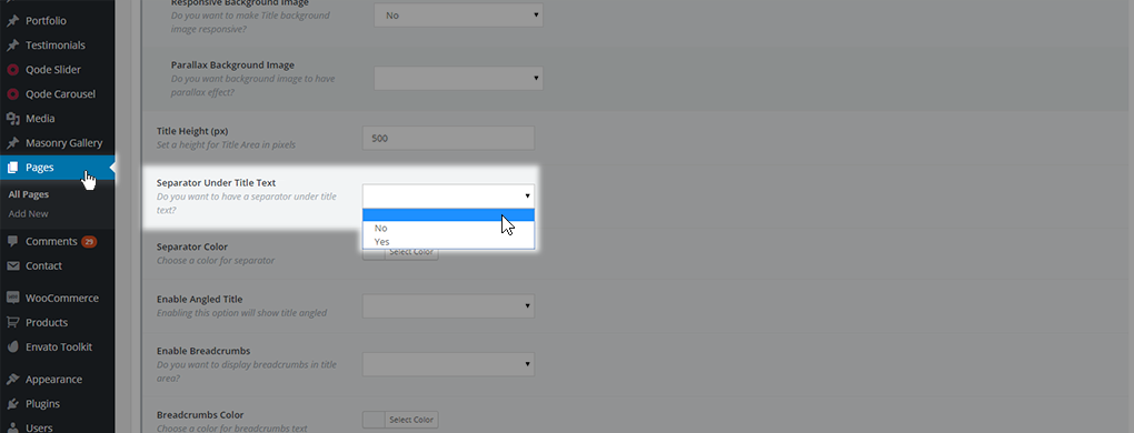
- Separator Under Title Text – Set this option if you want to have a separator element displayed under the title text. You can chose one of the three values: default (empty value), No to hide it, or Yes to display it.
- Separator color – Set the desired separator color if you have a separator element enabled either in Qode Options -> Title, or on the particular page only.
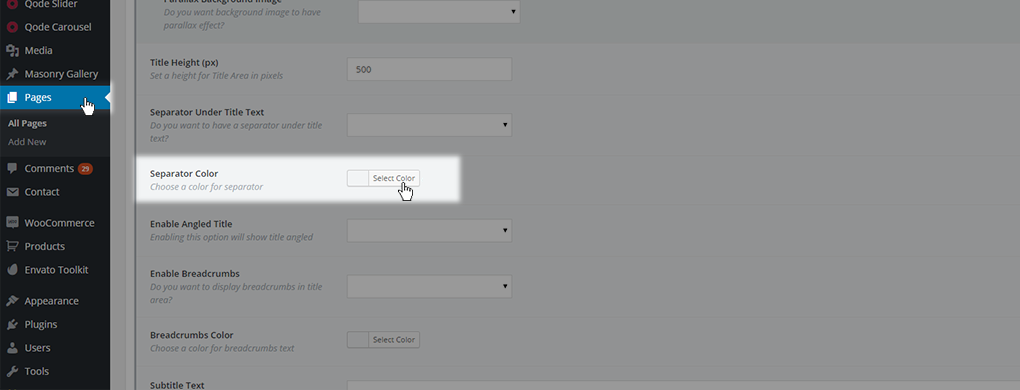
This color will override the one set in Qode Options -> Title
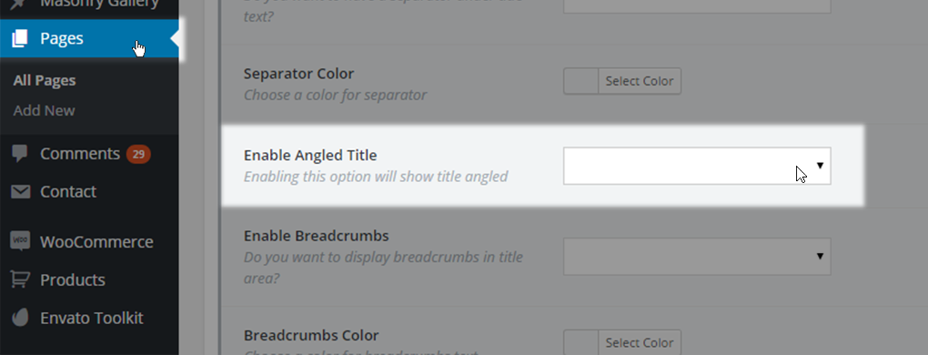
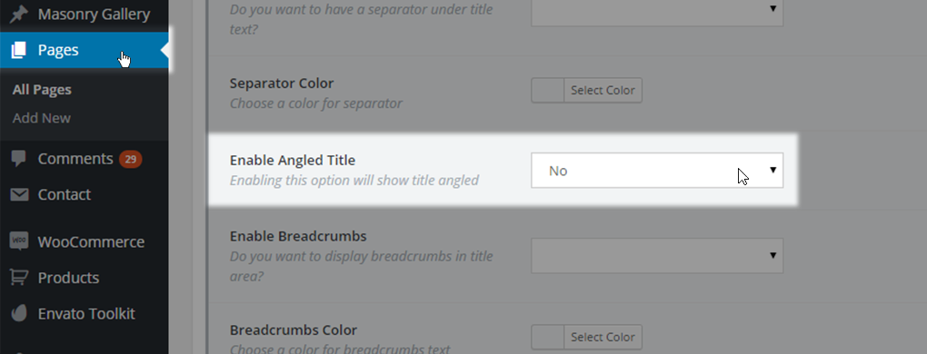
- Enable Angled Title - By using this option you can enable or disable an angled title area, which is a styled empty space at the very bottom of the title area. You can choose one of three options
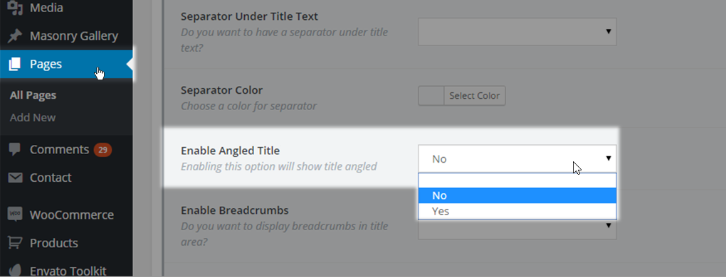
- Empty value – The default value from Qode Options -> Title -> Enable Angled Title will be used
- No – The angled title will not be displayed. This overrides settings from Qode Options -> Title -> Enable Angled Title if it is set to yes initially
- Yes – Angled title will be used and a panel with extra settings for the angled title will be displayed.
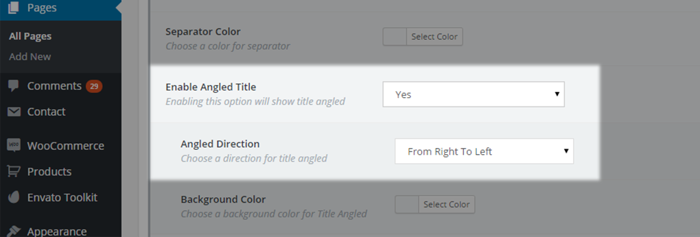
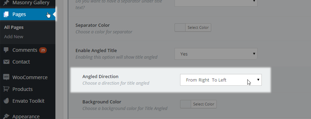
- Angled direction - you can choose a direction for your angled title. You can choose one of three values
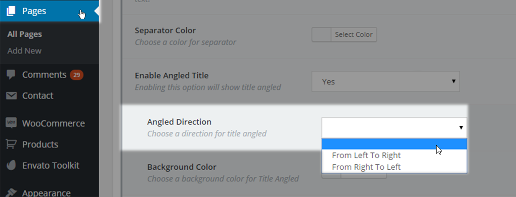
- Empty value – the default value from Qode Options -> Title will be used

- From Left To Right – direction and space will decrease from left side of title to right

- From Right To Left – direction and space will decrease from right side to left
- Background color – set background color for the angled area

- Enable Breadcrumbs – choose if you want to have breadcrumbs enabled on your page. Breadcrumbs represent a structure-like path from the homepage to your current page. You can choose one of three values

- Empty value – default value from Qode Options-> Title will be used

- No – breadcrumbs won’t be displayed in this page title area

- Yes – breadcrumbs will be displayed

- Breadcrumbs Color - Choose a color for the breadcrumbs text. If no color is chosen then the color set inside Qode Options -> Title will be used

- Subtitle text – area in which you can enter the text that will be displayed below the title text inside the title area.

- Subtitle text color – choose a color for the subtitle text

- Spacing After title - Additionally, no matter which option you chose two more fields are available and they represent the Spacing After title setting. The first field lets you specify a spacing value in px (no need for typing in the px, just enter the absolute numeric value) while the second one is a dropdown for selecting if this rule should be applied on mobile header as well.

10.1.4. Qode Content Bottom
If you need a widget area to provide you with some extra space for additional content between the page content area and the footer area, then you can use the Qode Content Bottom area.
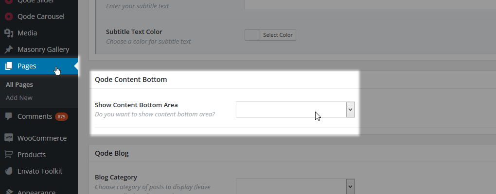
To populate the Content Bottom area you should use widgets - set through WP Admin -> Appearance -> Widgets.
This area can also be defined as a general property via Qode Options.
If you leave an empty value the default settings from Qode options will be used. No will disable the content bottom area, while Yes will enable this area on a page and trigger some extra options for the page you are setting it on
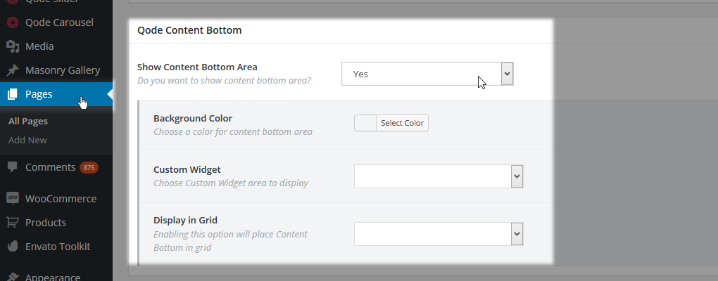
- Background color – Background color for the Content Bottom area
- Custom widget – Widget area to be displayed (previously created in WP Admin -> Appearance -> Widgets
- Display in Grid – Choose whether this area should be displayed as a grid element or in full width
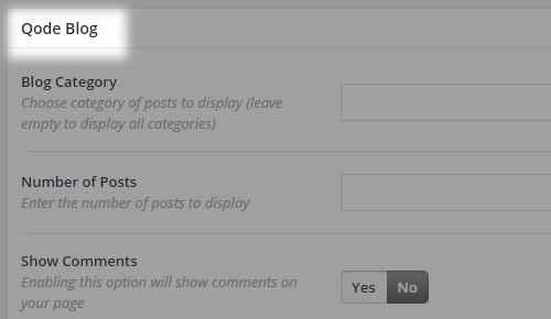
10.1.5. Qode Blog
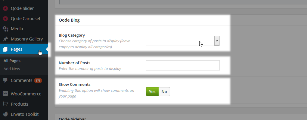
This setting is used if your page is set to use some of the Blog Template settings. Through this section you can define:
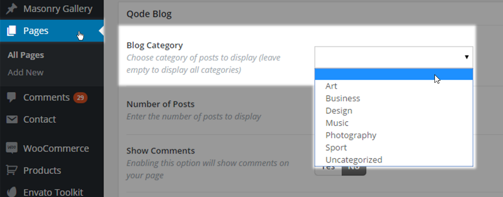
- Blog Category - In this field you can choose one of your post categories to be displayed. By setting the field value to empty, all categories will be displayed.

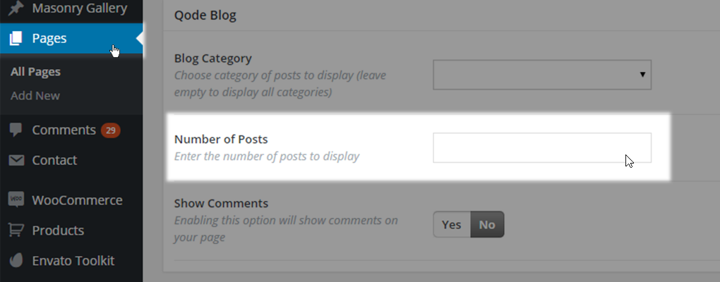
- Number of Posts - Choose the number of posts to be displayed on your page. To display all, leave the field blank.
- Show comments - This option will allow you to show comments on your Page
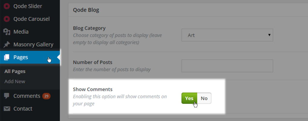
Note: Comments are available only for the Default template, Full Width template and Landing Page template.
10.1.6 Qode Sidebar
In this section you can define if your page is going to showcase a sidebar beside your content area

You can choose one of these five predefined layouts:
- Default – When no sidebar is used
- Sidebar 1/3 right – When sidebar is placed on right side of page taking 1/3 of its width
- Sidebar 1/4 right - When sidebar is placed on right side of page taking 1/4 of its width
- Sidebar 1/3 left - When sidebar is placed on left side of page taking 1/3 of its width
- Sidebar 1/4 left - When sidebar is placed on left side of page taking 1/4 of its width
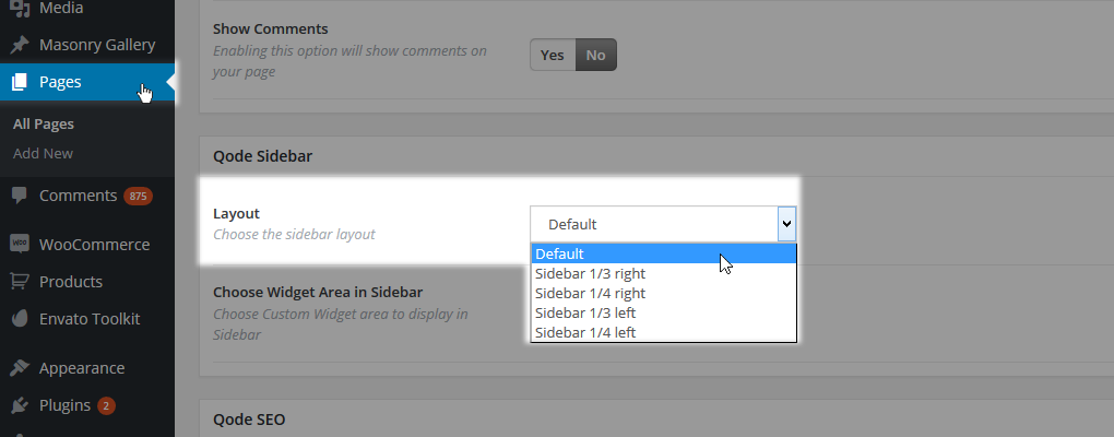
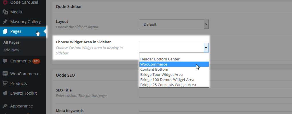
Upon selecting a layout for your sidebar, the default Sidebar Page widget area is used. If you want a different widget area to be used you need create a custom widget area first in WP Admin -> Appearance -> Widgets
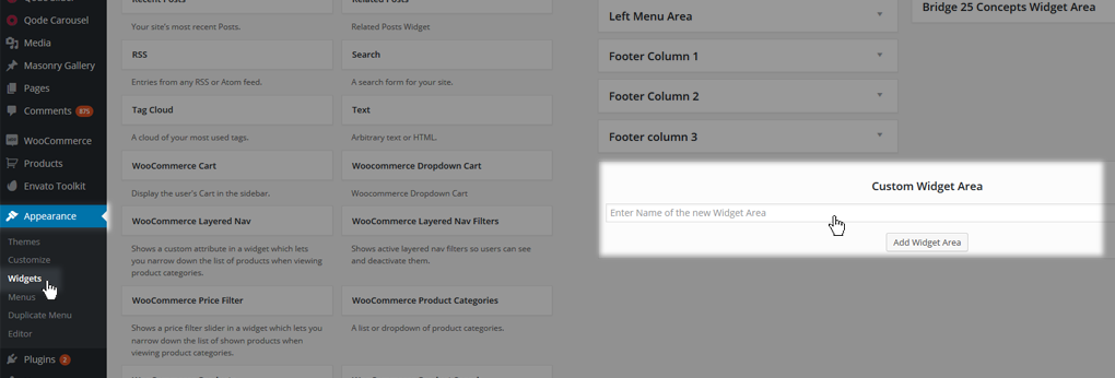
assign one or more widgets to it and select it from this dropdown.
10.1.7. Qode SEO
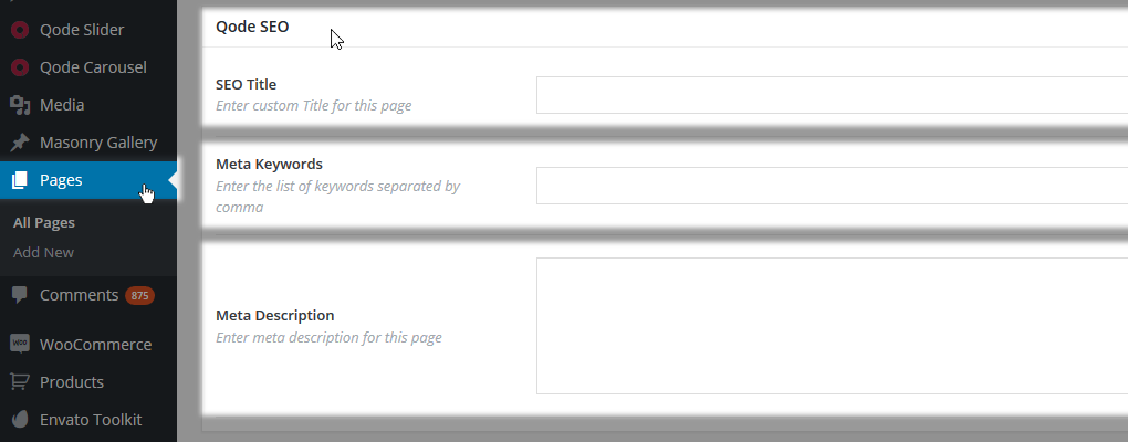
If you’re not using one of the plugins to handle your SEO and Social Sharing you can use our Qode SEO fields and define:
- SEO title – Custom title for page rendered by search engines
- Meta keywords – A list of keywords you want to assign to your page. Words should be divided with commas.
- Meta description – Meta description for your page.
RELATED LINKS:
https://wordpress.org/plugins/nextgen-facebook/ - SHARING FB
10.2 Page Templates Overview
In this part we will cover the usage of predefined page templates. There are two main types of templates:
- Blog templates (Blog Large Image, Blog Masonry, Blog Small Image and Blog Vertical Loop)
- Non-Blog templates (Default Template, Full Width, Full Screen Sections, Contact page, Landing page and WooCommerce template)
All settings for blog related templates can be found in Qode Options -> Blog. When using a blog template, on a page itself the user can set if all post categories should be displayed or just a particular one.
If this field is left empty, then all categories will be displayed.
Also, you can specify a number of posts to be displayed on a page
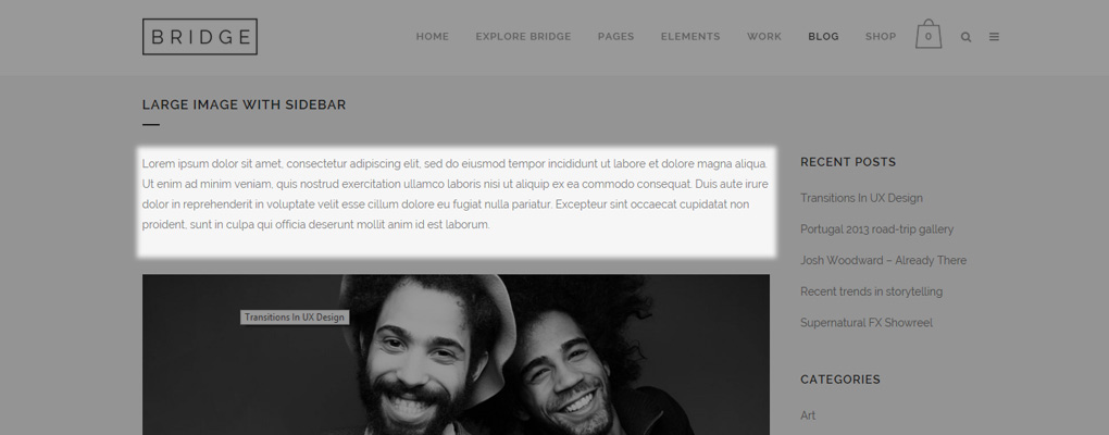
Note: Any content you add from the back-end to a page that has a Blog template set will be displayed before the post listing.
10.2.1. Default Template and Adding Content
This page template represents the very basis - A page has this template by default.
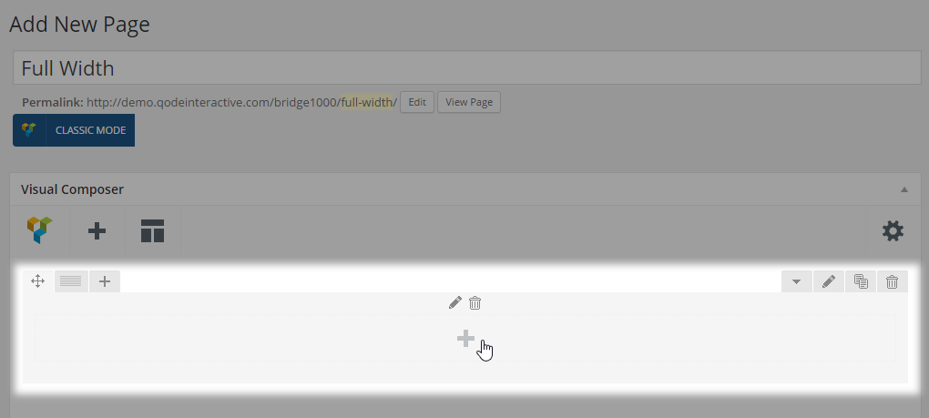
With this template the content will always be in grid. The content is added to WPBakery row elements which are the main container elements you will work with. You can add content to a row by clicking on the plus icon and adding any shortcode you like.
You can also set the layout of each row you add (how many columns the row should have) by hovering over the Custom layout icon on the upper left and choosing a column division layout.
Please note that WPBakery doesn’t support five columns layout.
10.2.2. Blog Large Image Templates
This blog listing template consists of a large featured image (set for each post) centered on the page, and styled post info below the featured image. There are a few variations:
10.2.2.1. Blog Large Image
This template displays a featured image, a left-aligned post excerpt below it with additional info about the author, time and date of the post, as well as comments and social sharing info.
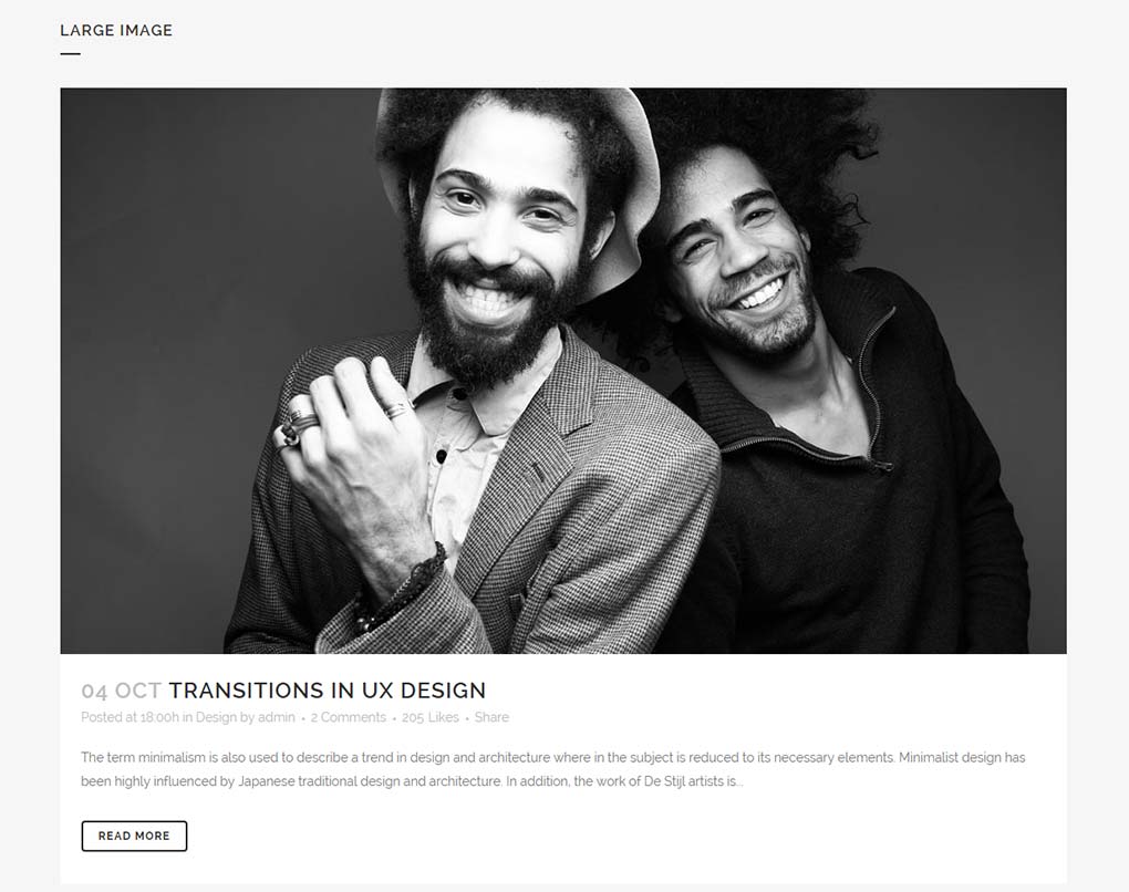
In order to set this type of layout please select Blog Large Image from the Template dropdown under the Page Attributes area of the page you’re currently editing.
Afterwards, you should set the parameters inside the Qode Blog metabox to list the posts appropriately.
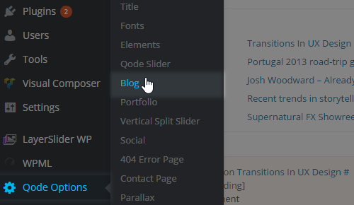
Apart from setting these parameters on a page-level basis, additional options for this template can be found in Qode Options -> Blog -> Blog Large Image Style section:

10.2.2.2. Blog Large Image Simple
This template displays a featured image, a centered post excerpt and a post publishing date.
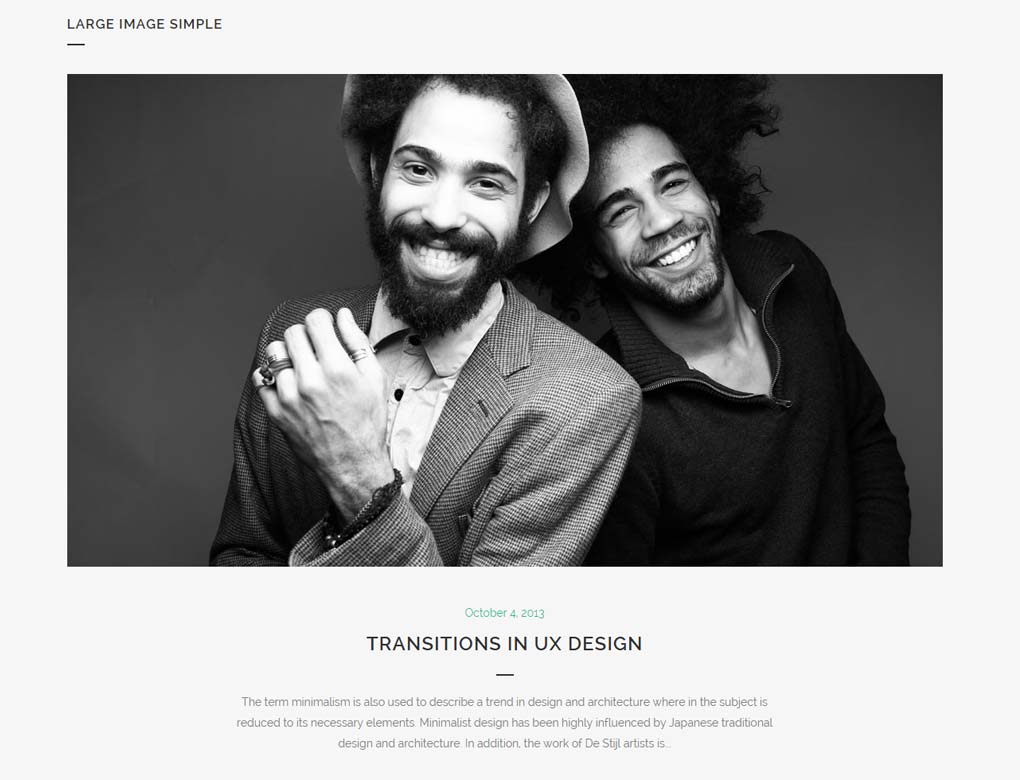
In order to set this type of layout please select Blog Large Image Simple from the Template dropdown under the Page Attributes area of the page you’re currently editing.
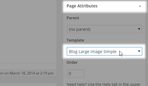
Afterwards, you should set the parameters inside the Qode Blog metabox to list the posts appropriately.

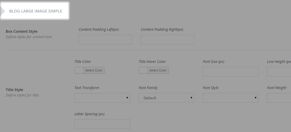
Apart from setting these parameters on a page-level basis, additional options for this template can be found inside Qode Options -> Blog -> Blog Large Image Simple Style section:

10.2.2.3. Blog Large Image Whole Post
The following template is very similar to the Blog Large Image template as the layout is the same, only instead of having a post excerpt, the whole post is listed.
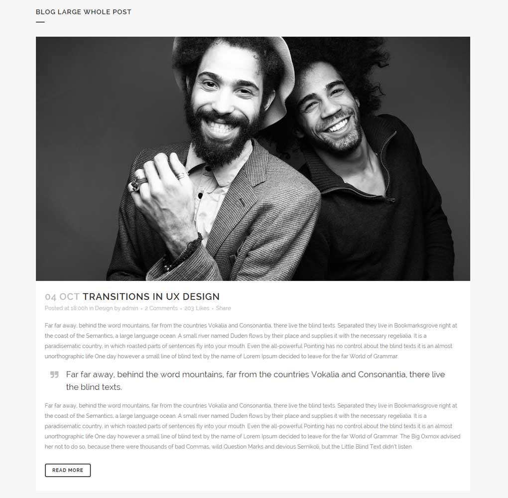
In order to set this type of layout please select Blog Large Image Whole Post from the Template dropdown under the Page Attributes area of the page you’re currently editing.
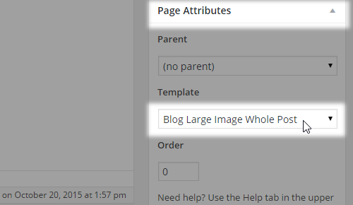
Afterwards, you should set the parameters inside the Qode Blog metabox to list the posts appropriately.

Apart from setting these parameters on a page-level basis, additional options for this template can be found inside Qode Options -> Blog -> Blog Large Image Style section:

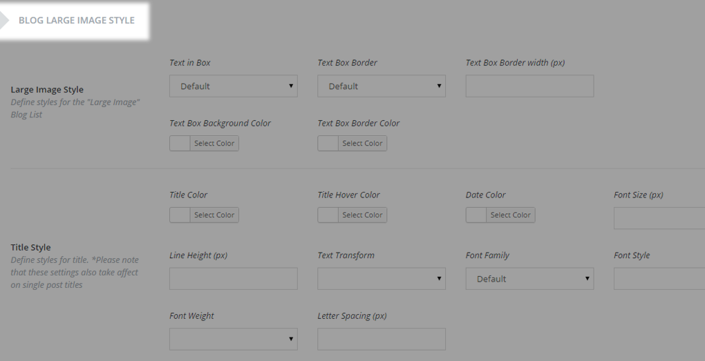
10.2.2.4. Blog Large Image With Dividers
Similarly to Blog Large Image, this template features the same post info and content structure - additionally styled with separators.
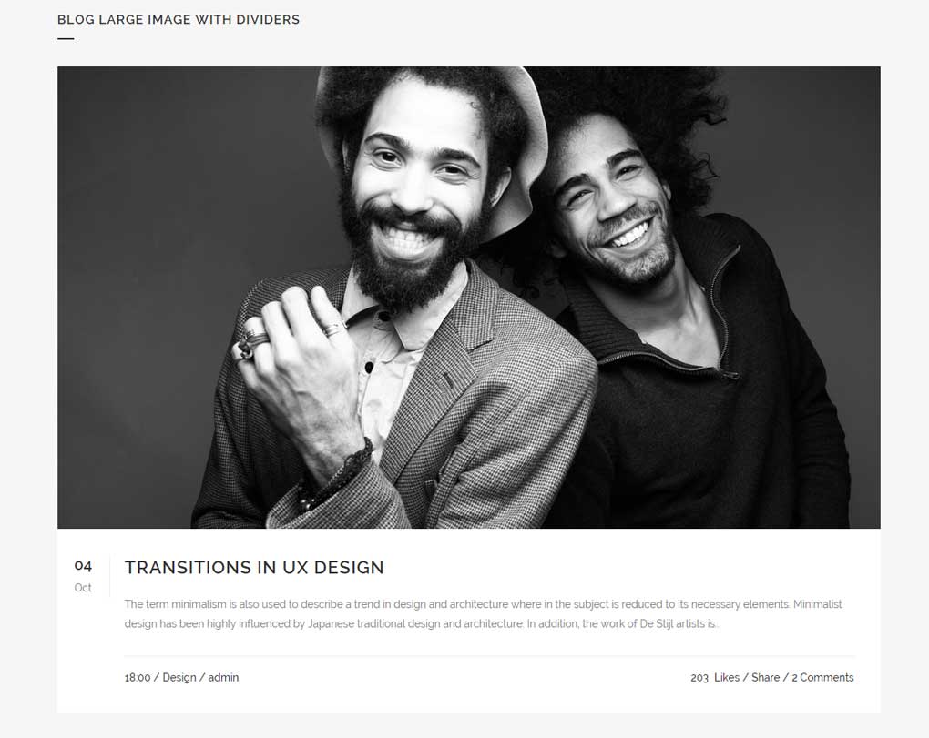
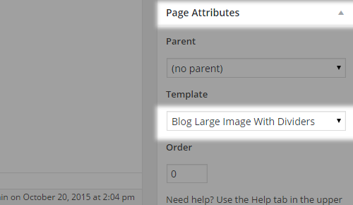
In order to set this type of layout please select Blog Large Image With Dividers from the Template dropdown under the Page Attributes area of the page you’re currently editing.
Afterwards, you should set the parameters inside the Qode Blog metabox to list the posts appropriately.

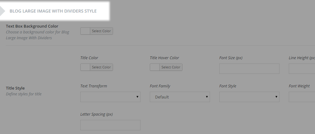
Apart from setting these parameters on a page-level basis, additional options for this template can be found inside Qode Options -> Blog -> Blog Large Image With Dividers Style section:

10.2.3. Blog Masonry Templates
These blog templates consists of posts’ featured images with a short description (excerpt) for each post. The layout is organized in boxes that rearrange on browser resize. There are a few variations.
10.2.3.1. Blog Masonry
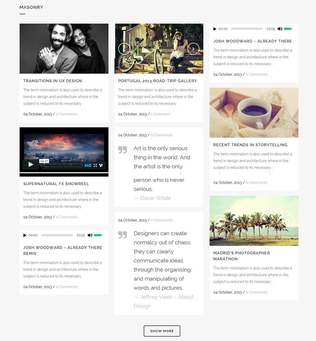
This is the most basic masonry template. Featuring a mosaic-like layout with a featured image of each post, post description (excerpt), date and comments info. Posts are displayed in a masonry styled manner inside the grid (max-width: 1100px).
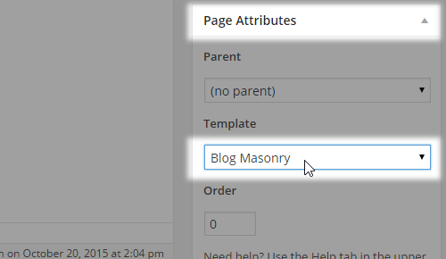
In order to set this type of layout please select Blog Masonry from the Template dropdown under the Page Attributes area of the page you’re currently editing.
Afterwards, you should set the parameters inside the Qode Blog metabox to list the posts appropriately.

Apart from setting these parameters on a page-level basis, additional options for this template can be found inside Qode Options -> Blog -> Blog Masonry Style section:


10.2.3.2. Blog Masonry – Date in Image
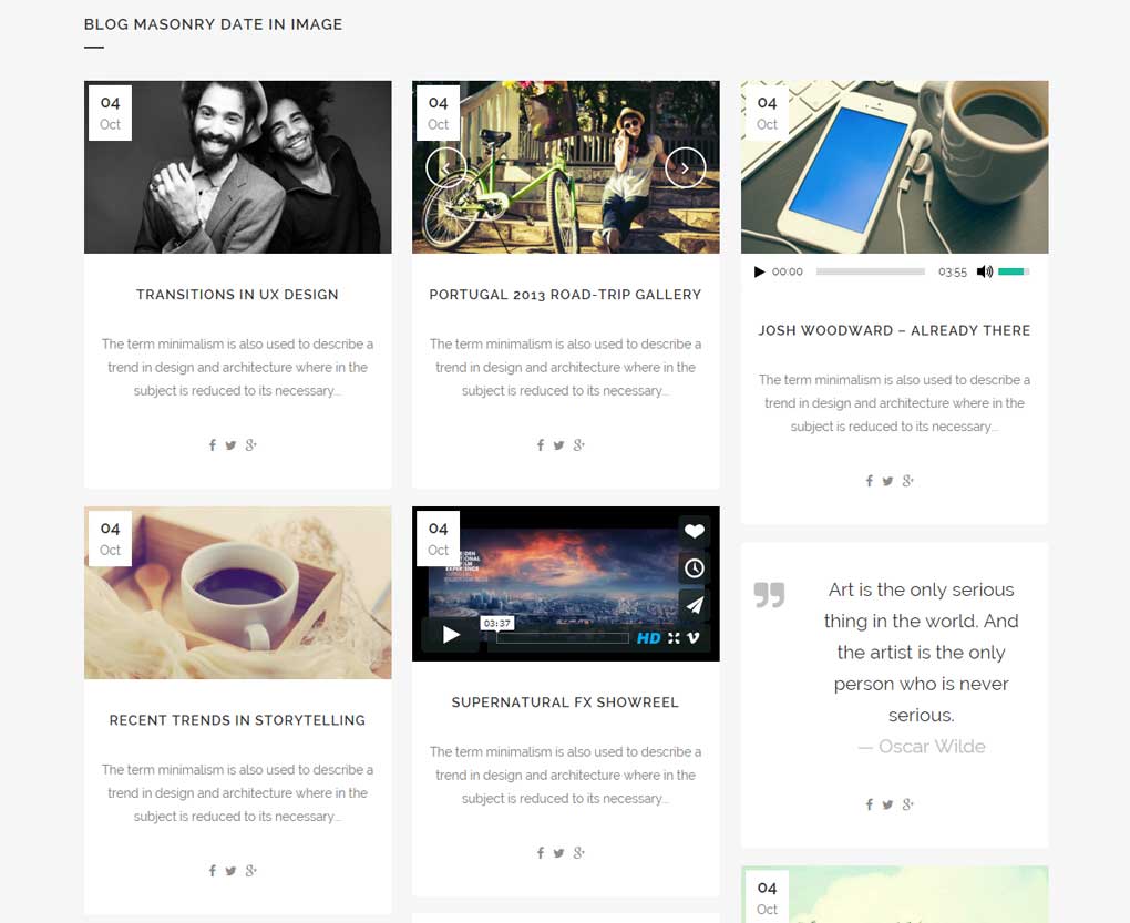
Derived from the basic Blog Masonry layout template, posts are displayed in a masonry arrangement with the date displayed over the featured image.
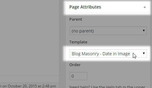
In order to set this type of layout please select Blog Masonry - Date in Image from the Template dropdown under the Page Attributes area of the page you’re currently editing.
Afterwards, you should set the parameters inside the Qode Blog metabox to list the posts appropriately.

Apart from setting these parameters on a page-level basis, additional options for this template can be found inside Qode Options -> Blog -> Masonry – Date in Image Style section:


10.2.3.3. Blog Masonry Full Width
This template is the same as the main Blog Masonry layout, except the posts and entire blog listing section are set in full width.
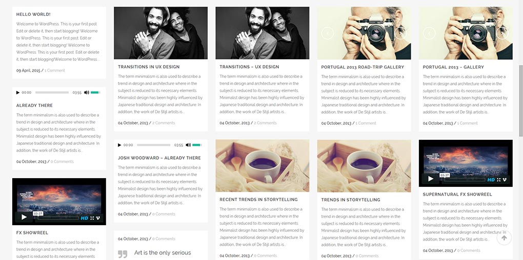
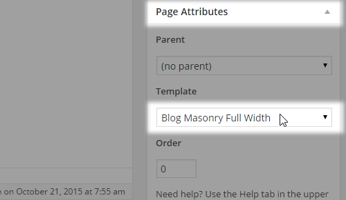
In order to set this type of layout please select Blog Masonry Full Width from the Template dropdown under the Page Attributes area of the page you’re currently editing.
Afterwards, you should set the parameters inside the Qode Blog metabox to list the posts appropriately:

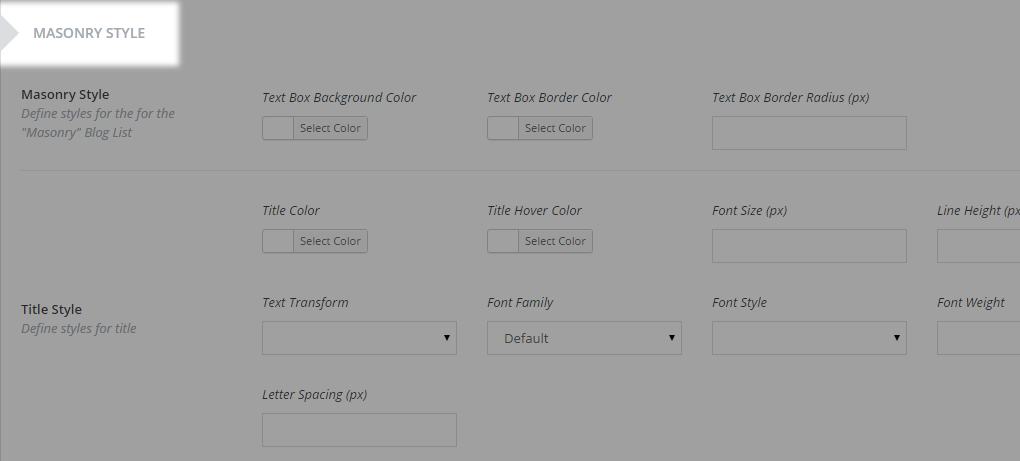
Apart from setting these parameters on a page-level basis, additional options for this template can be found inside Qode Options -> Blog -> Masonry Style section.

10.2.3.4. Blog Masonry Full Width – Date In Image
Similarly to Blog Masonry - Date In Image the layout sets date info over the featured image, but this variation puts the whole blog list in full width.
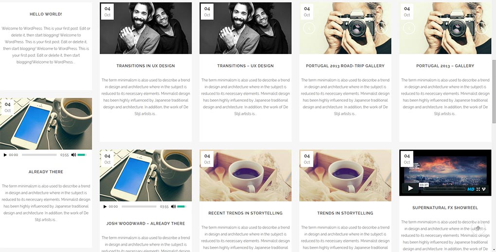
In order to set this type of layout please select Blog Masonry Full Width - Date in Image from the Template dropdown under the Page Attributes area of the page you’re currently editing.
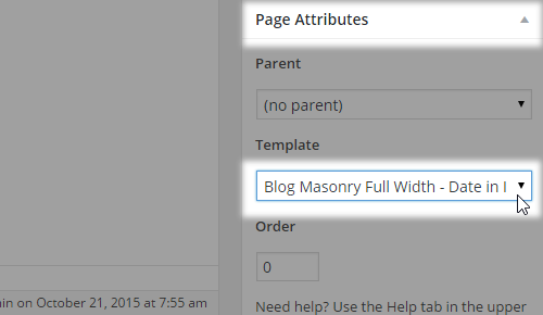
Afterwards, you should set the parameters inside the Qode Blog metabox to list the posts appropriately:

Apart from setting these parameters on a page-level basis, additional options for this template can be found inside Qode Options -> Blog -> Masonry – Date in Image Style section:

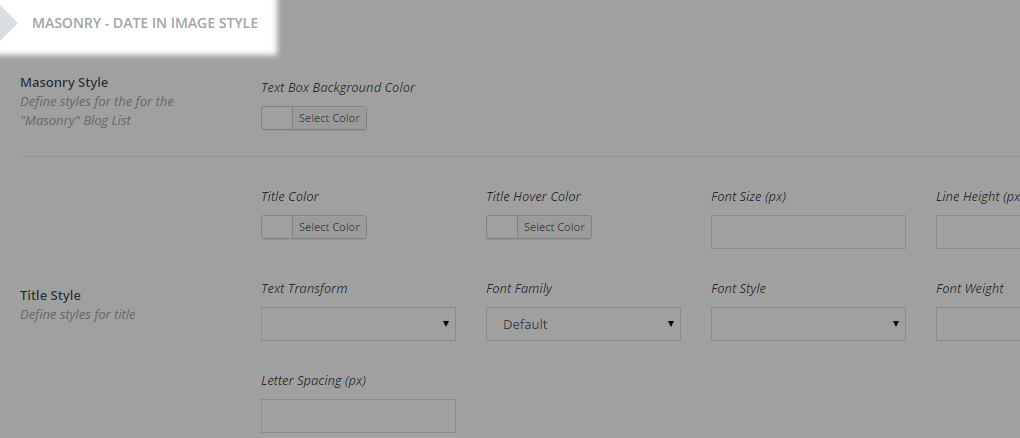
10.2.4. Blog Small Image
If you prefer a more compact blog list, this layout may catch your interest. It is a basic image-on-the-left / description-on-the-right kind of a layout where you have the post excerpt, date, author, comments and sharing info displayed.
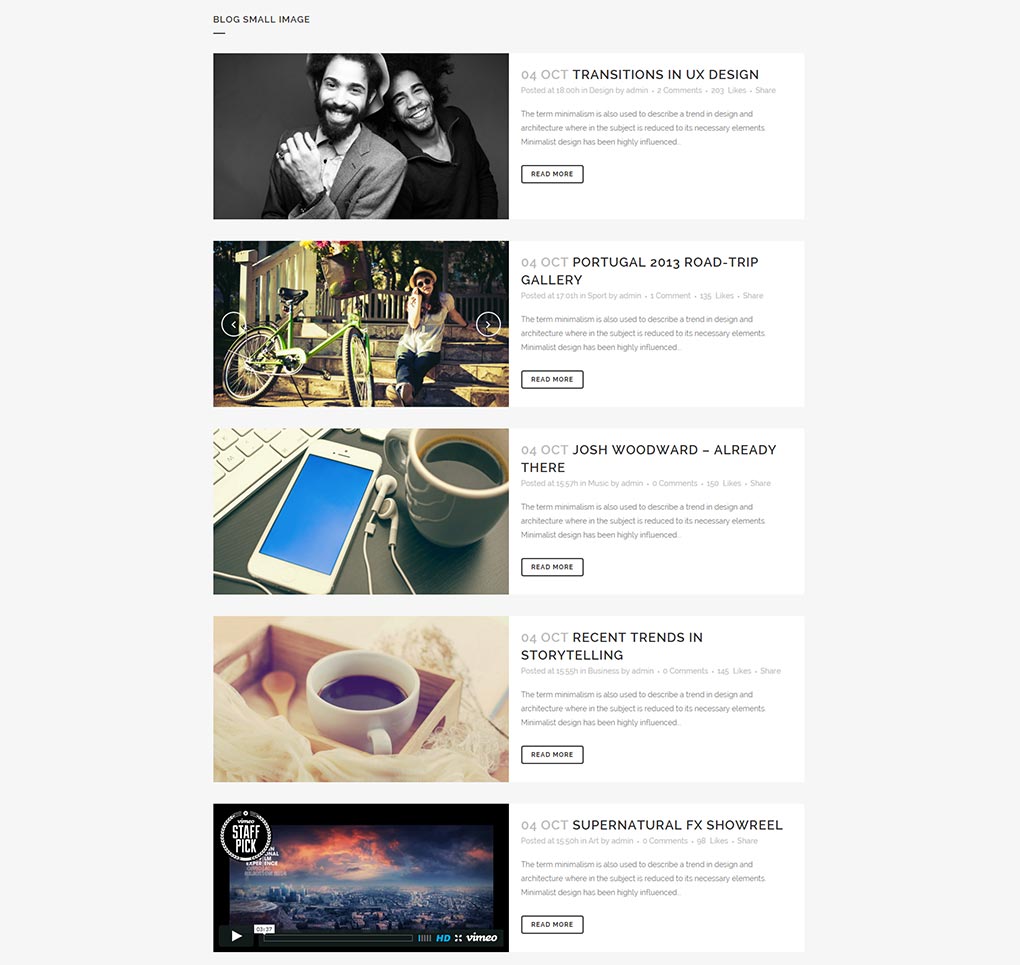
In order to set this type of layout, please select Blog Small Image from the Template dropdown under the Page Attributes area of the page you’re currently editing.
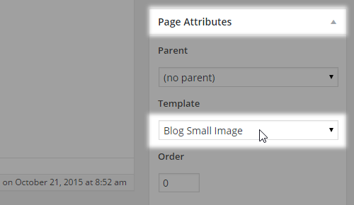
Afterwards, you should set the parameters inside the Qode Blog metabox to list the posts appropriately:

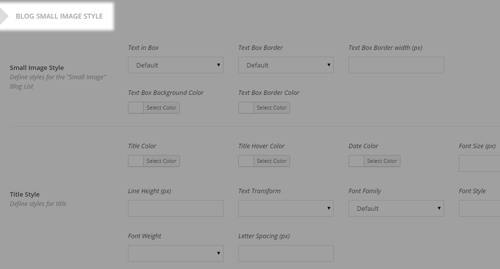
Apart from setting these parameters on a page-level basis, additional options for this template can be found inside Qode Options -> Blog -> Blog Small Image Style section:

10.2.5. Blog Vertical Loop
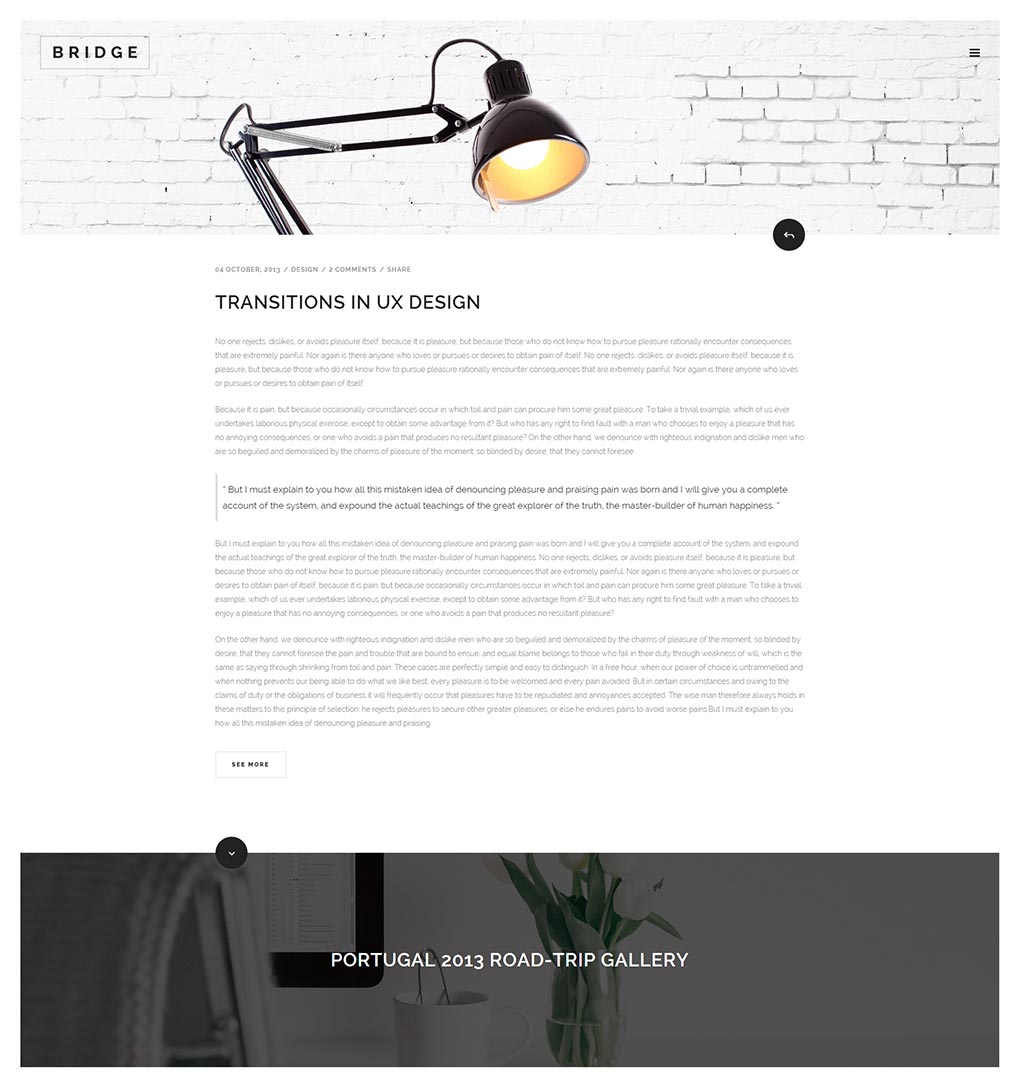
This is a very engaging and modern blog listing template that consists of an entire post displayed as the main content, and the featured images of both previous and next posts displaying at the top and at the bottom of the page - respectively. This way you can easily navigate onto the next/previous post.
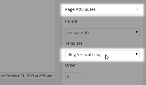
In order to set this type of layout please select Blog Vertical Loop from the Template dropdown under the Page Attributes area of the page you’re currently editing.
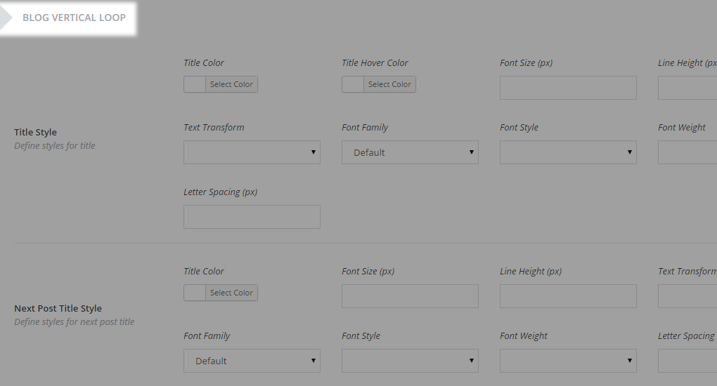
Apart from setting these parameters on a page-level basis, additional options for this template can be found inside Qode Options -> Blog -> Blog Vertical Loop Style section:

10.2.6. Contact Page
To set up a contact page on your website, you can use our built-in page template – Contact Page. With this template you can have your contact page ready in just a few minutes. Once you select this template from the Templates dropdown under the page attributes and save changes, you should add the content to the page and style it.
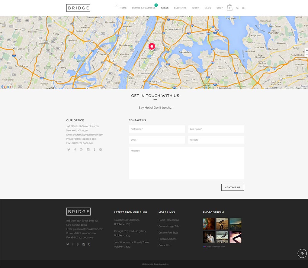
Any content added to this page template from the content editor will be displayed in grid - 1100px wide. Please note that if you’re using the Contact Form feature, the content will be positioned within the left half of the whole page and the contact form itself will be placed on the right.
10.2.6.1 Setting Up Google Map
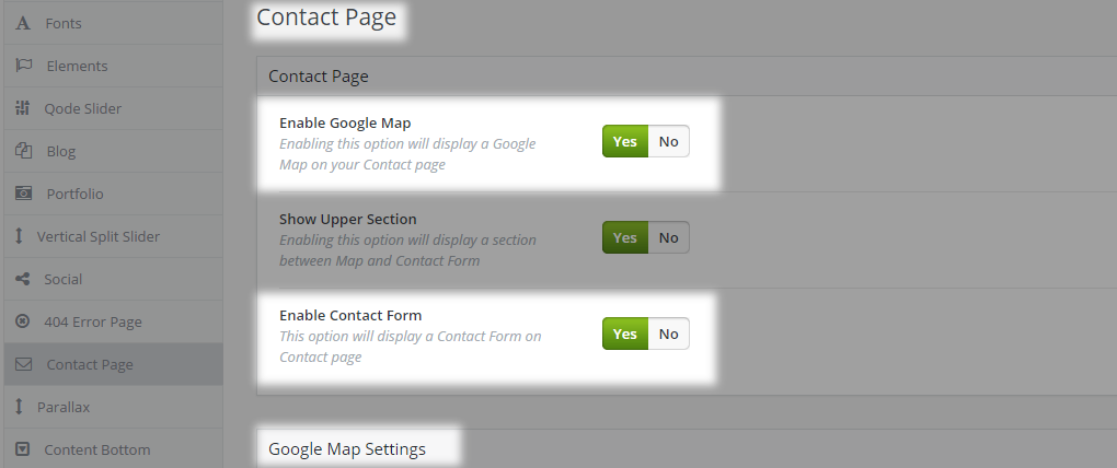
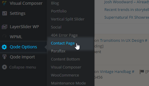
To set up your contact form properly, please navigate to WP admin -> Qode Options -> Contact Page.

You can choose whether to Enable Google Map, which supports up to 5 different addresses, and/or whether to Enable Contact Form. Upon enabling Google Map feature, a new group of options will become visible below – Google Map Settings.
First, you need to set Google Map Address. You can enter the whole address or use the exact coordinates instead – it is up to your preference. However, please note that the address you enter might not be displayed at the exact location as on maps.google.com - due to complex alghoritms used for locating the address. Also, it might be that your address is not available in Google Maps database. So, Google refers to the closest available address. Please test this beforehand by using this software:
Use latitude and longitude to define the closest available coordinates to your desired location.
Note: To setup Google Map on its own, you can use Google Map shortcode related link in combination with some other page template, using the WPBakery element.
The second option under Google Map Settings is to upload a Pin image for addresses you have previously entered.
Note: all map addresses will have the same pin image.
If you omit uploading an original pin image, the default one will be used.
You can also set Map Height. In case you leave this field blank, then the height will take the default value of 450px.
Note: Google Map used within the Contact Page template has to be full width and it can’t be changed from Qode Options.
Zoom Map on Mouse Wheel is a neat option to improve UX. It lets you trigger the scrolling of the map on the mouse wheel scroll action. If you enable this option the map will be scrollable.
Note: This option doesn’t have any effect on touch devices. The map isn’t scrollable on them.
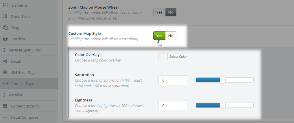
Finally, you can use Custom Map Style to give a personal touch to how your map will render on the front-end - you have the possibility to style the map with an overlay color of your choice for which you can choose saturation and lightness.
10.2.6.2 Upper Section Settings
In WP Admin -> Qode Options -> Contact Page you can enable Show Upper section.
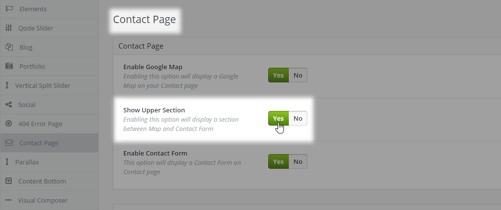
This section allows you to set a dedicated Title and Subtitle and modify their alignment. If you choose to display this section, both title and subtitle will be displayed. The default title value is “Get In Touch With Us” while the default value for subtitle is “Say Hello”. In order to change these phrases just enter some values in the Title and Subtitle fields.

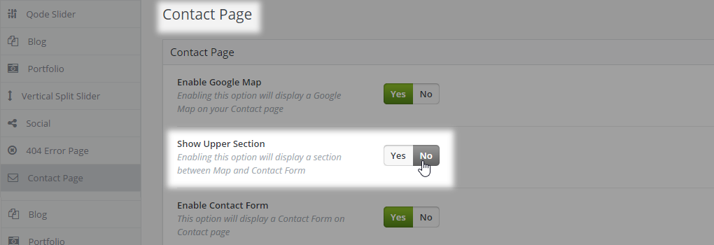
You can always hide this whole section by selecting No for the Show Upper Section option. However if you want to remove the subtitle only, just enter some white space into the Subtitle text field and Save Changes. That way, only the title will be visible above the contact form.
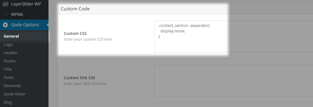
To hide the separator below the title, you should copy this code to Qode Options -> General -> Custom Code -> CSS:
.contact_section .separator{
display:none;
}
10.2.6.3 Contact Form Settings
The last thing left to set up is the contact form itself. Our contact form has five input fields: First Name, Last Name, Email, Website and Message.
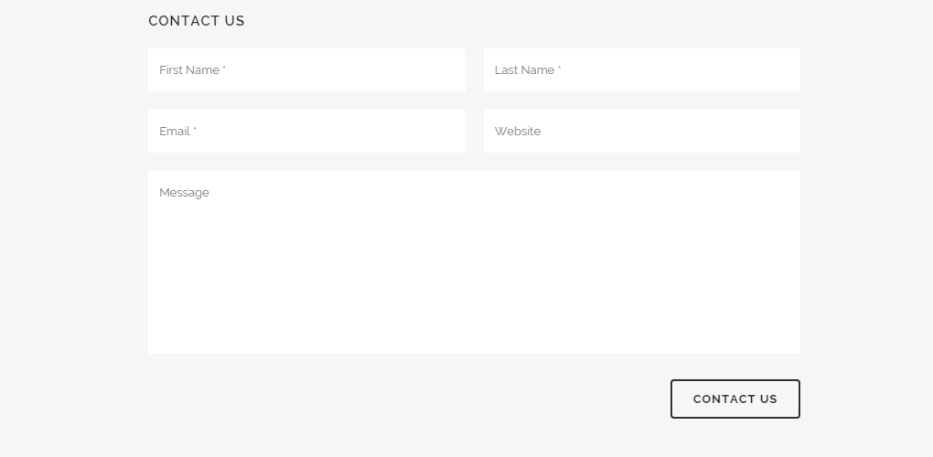
The layout of the contact form is predefined, except that you can remove the Website input field which is the only field that isn’t required.
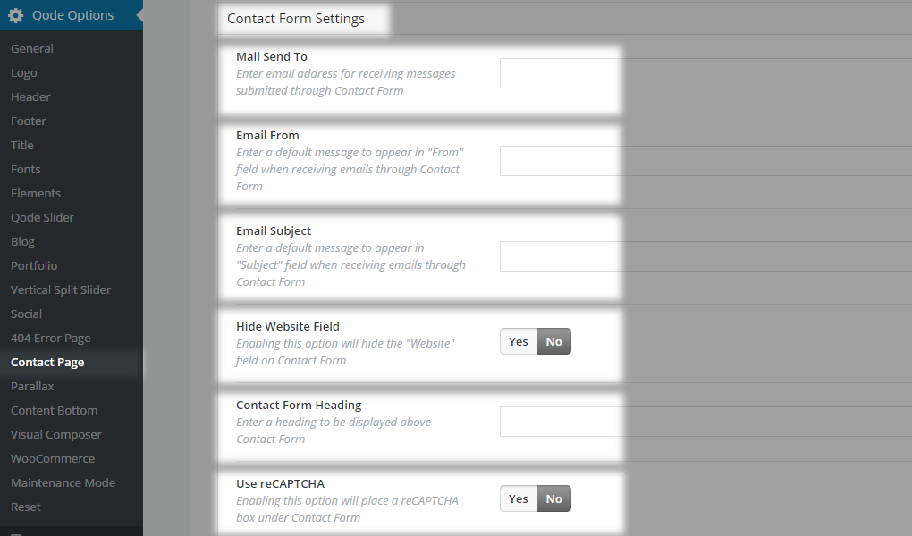
Under Qode Options -> Contact Page -> Contact Form Settings you should enter your email address in the Mail Send To input field. This email address is the email address where all contact form entries will be sent to. Please make sure that the email address is valid and that uses only the English alphabet (other charsets such as Cyrillic, Hebrew, etc aren’t supported).
In the Email From field you should enter a default address to appear when receiving emails through Contact Form - e.g. mysite@wordpress.org .
However this way you will not be able to reply to subscriber’s email address. In order to change this, some modifications of the php file are necessary. Navigate to theme root folder/includes/ajax_mail.php and after line #29:
$headers .= "From: '".$_POST['name']." ".$_POST['lastname']."' <".$email_from."> " . "\r\n";
add this code:
$headers .= "Reply-To: <" . $_POST['name'] . "> " . $_POST["email"]."\r\n";
Save and re-upload the file back to your server.
In the Email Subject input field enter a default message to appear as the Subject of each contact form entry in your inbox.
We recommend you not leave any of these three fields empty.
With the Hide Website Field you can remove the website field from your contact form.
If you would like to add a heading above the contact form, enter some text in the Contact Form Heading field. - e.g. Contact Us.
To protect your site against bots and spam you should enable reCaptcha with the Use reCaptcha option. The reCaptcha that is used in Bridge is Google reCaptcha. When you enable it you will be required to enter private and public key
By default, Google Map, Upper Section and Contact Form are enabled.
To test if the contact form works properly, open your contact page and enter some values in it.
Press the “Contact Us” button. If everything works properly you will get the following message: “THANK YOU! Your email was successfully sent. We will contact you as soon as possible.”
If not then you will see an Email Server Problem. Before sending a ticket to our support team please make sure that you have a valid email address entered in both Mail Send To and Email From input fields. To translate theme related labels (Contact Form included) we recommend using the CodeStyling Localization plugin or PoEdit.
Note: If you enable Page Transitions for your contact page and reCaptcha, then reCaptcha will be in focus on page load (which means that the page will be scrolled to reCaptcha on load).
If you don’t want to use the Contact Page template, then you can instead use some plugin like Contact Form 7 to create your contact form and add it to any page with any other page template.
10.2.7. Full Screen Sections
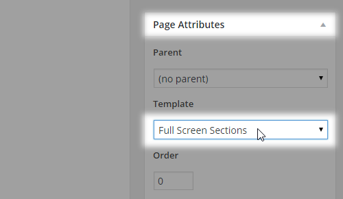
This template gives you the ability to create full screen sections on your page as on this demo. When site visitors scroll, the entire section scrolls with the view-port and takes them to the next section. To use this template, select Full Screen Sections from the Template dropdown under the Page Attributes field -
Next, make sure that you are using the WPBakery back-end editor and not the Classic editor.
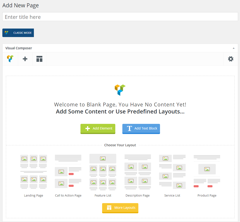
Click on Add Element and choose Row from the popup window.

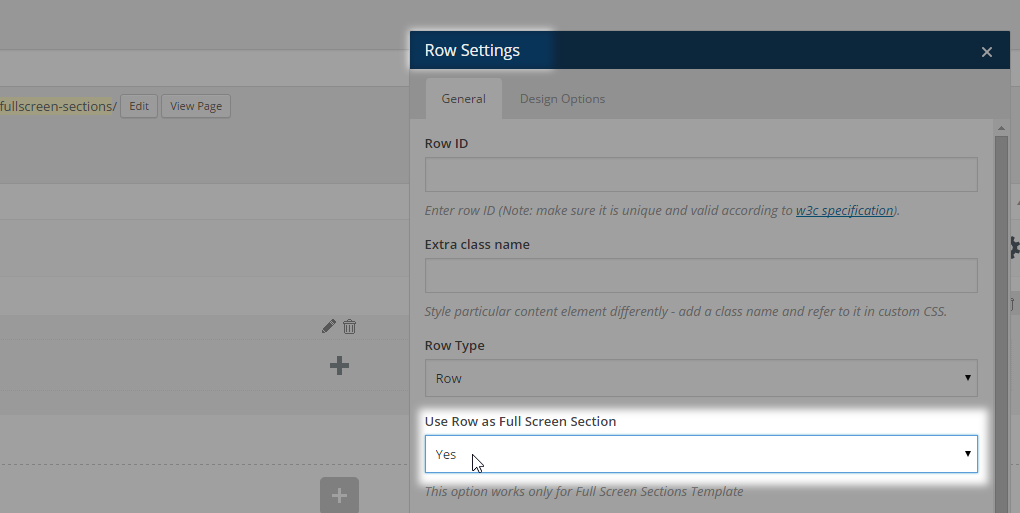
The list of options for this shortcode will be displayed. Under Row Type you should select Row and under Use Row as Full Screen Sections choose Yes. -
Now you can start adding shortcodes to that row.
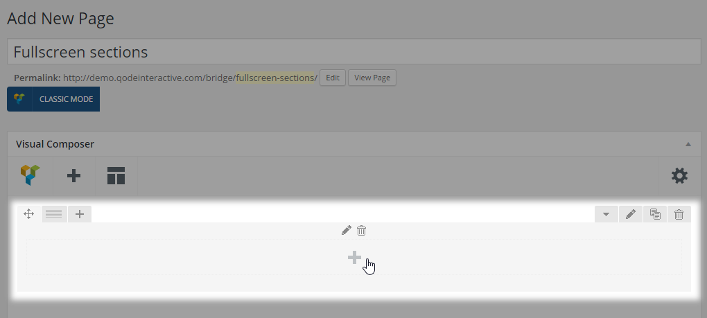
That row will be the first full screen section. If you want to create another one just repeat the steps above.
Note: If you are using this template, the footer will not be visible on the page, so you should create it manually from the bottom full screen section. Also, please have in mind that you can’t use Ajax Page Transitions in conjunction with this template.
10.2.8. Full Width
Using this template lets you have a modern styled layout that is either completely or partially in full width.
First make sure that you are using WPBakery’s back end editor and not editing in Classic Mode.

Select Full Width from the Template dropdown.
Click on Add Element and choose Row from the popup window.

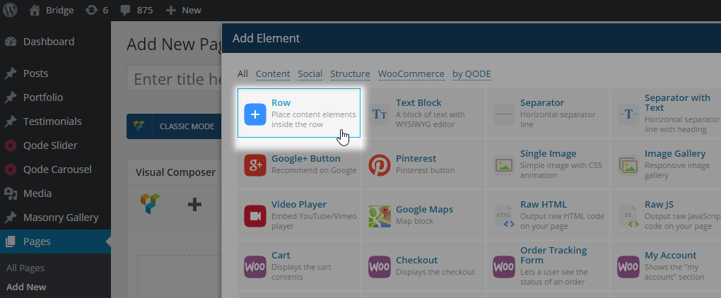
The most important option under Row Settings for this template is Type which can have one of the two values: In Grid or Full Width. Choosing one of these options defines how the content will be displayed. If you choose In Grid, the row’s content will stay within grid (1100px) and by choosing Full Width your content will take the full width of the screen.
Note: In case you can’t find this option you should change the Row Type option to Row and then click on Save changes.
Now you can add content to that row by clicking on the plus (“+”) sign and adding any shortcode you like.
You can also choose the layout for each row (how many columns it should have) by hovering over the Custom layout icon in the upper left corner of the row and choosing the one you like.
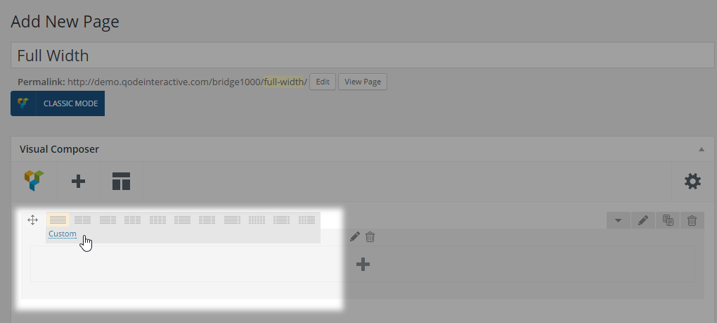
Note: Please have in mind that WPBakery doesn’t support five columns layout.
If you want to add another row just repeat the steps described above. With this template you can have both full width and in grid content, while with the Default page template content has to be in grid.
10.2.9 Landing Page
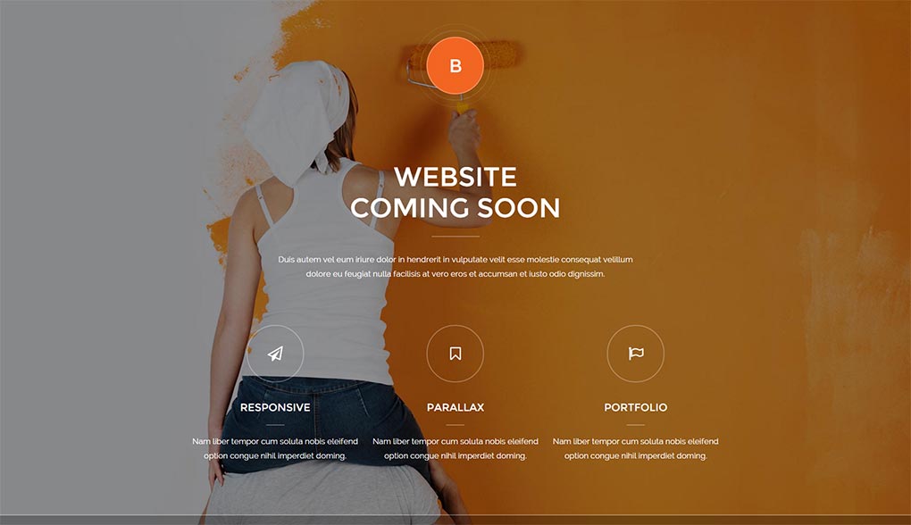
Its recommended usage is for the entrance page of your site, or in case you have your website under construction. This template can come in handy by not allowing visitors to navigate further - A ‘Coming Soon’ page for Maintenance Mode on your site. Maintenance mode can be set under Qode Options -> Maintenance Mode. When enabling this feature, you need to specify a ‘Coming Soon’ page. It is required that this page uses the Landing page template.
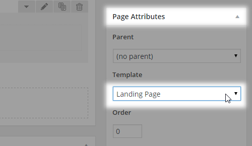
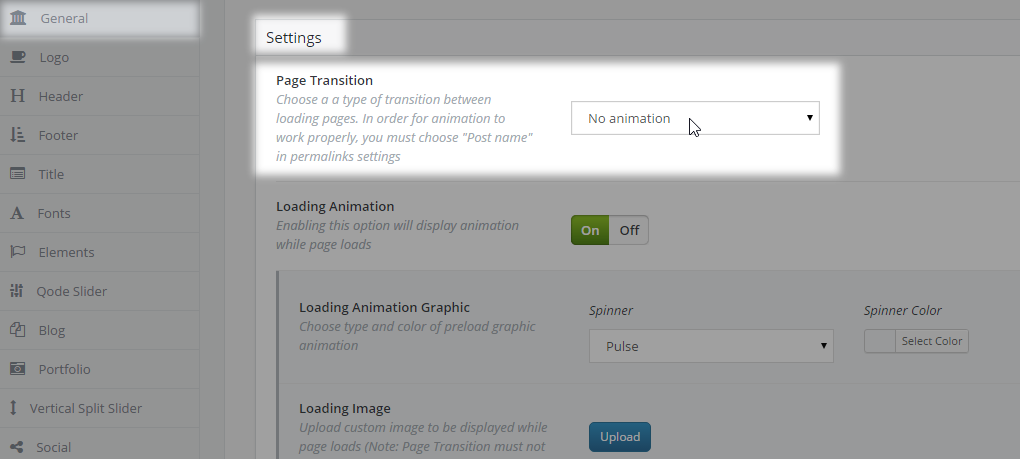
If you are using this page for your entrance (landing) page, then page transitions for your website should be turned off. This can be done in Qode Options -> General -> Page transition by setting this field value to No animation.
Note: This template is not recommended for homepage usage on a ‘live’ website, as the navigation would be omitted.
10.2.10. WooCommerce
This page template should be set only for the page that are going to be used as your default shop page. This page is set in WP Admin -> WooCommerce -> Settings -> Products -> Display
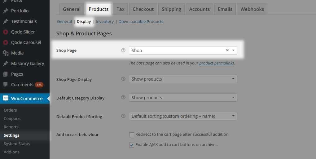
Please note that if the page is set to private you will not be able to select that page as the shop page or any other woocommerce page.
When using this template there is no need to add woocommerce elements on the shop page as it will render the product list by default with a predefined layout. On the other hand, if you’re looking to add some content, you can add it through the WPBakery backend editor or classic editor and it will be displayed on the page before the actual product list.
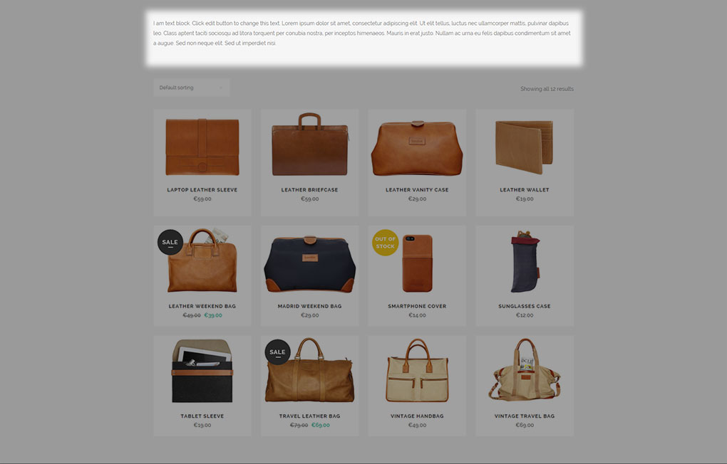
For further customization of WooCommerce pages you should navigate to Qode Options -> WooCommerce.
If you have installed the woocommerce plugin and you are planning to import demo content with a shop section, then you shouldn’t click on Install WooCommerce Pages that is displayed on top of your admin panel
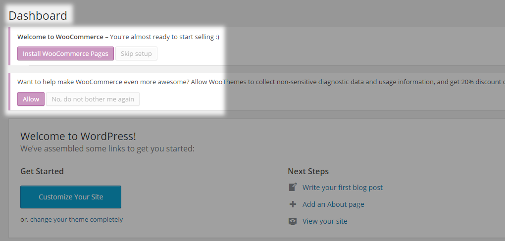
For all additional pages that you’d like to use for custom shop lists etc. where you’d add content through WPBakery and shortcodes, you should use either the Default or Fullwidth templates instead of the native WooCommerce template.
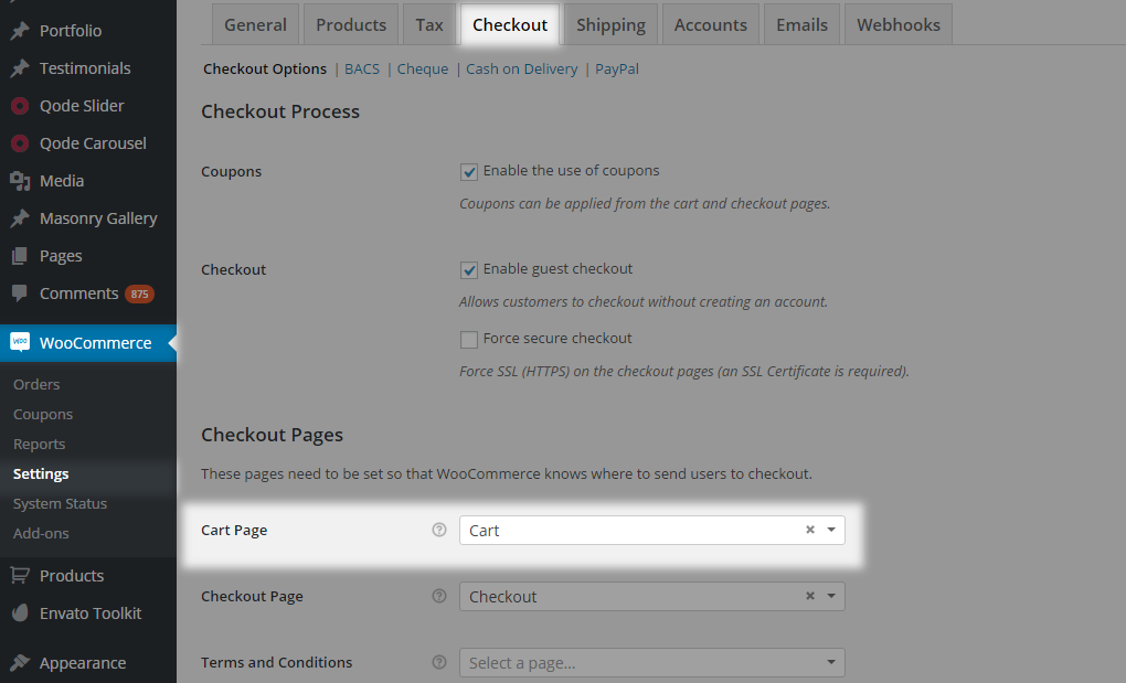
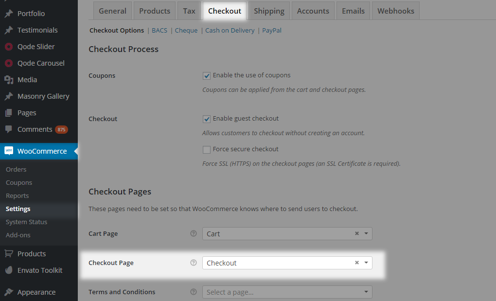
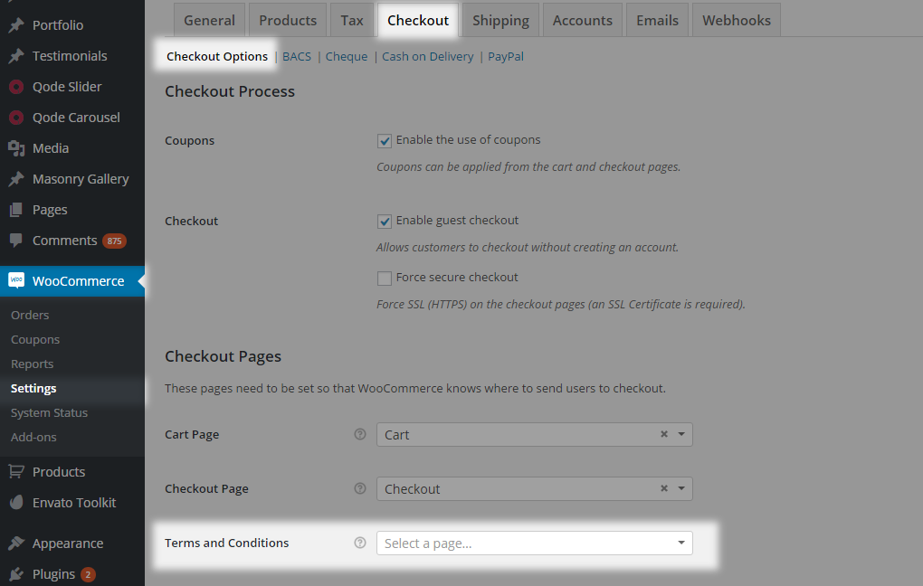
To assign the default WooCommerce pages to work properly you need to set those pages in the following way:
- Cart Page - this is set under WP Admin -> WooCommerce -> Settings -> Checkout -> Checkout Options -> Cart Page
- Checkout Page - this is set under WooCommerce -> Settings -> Checkout -> Checkout Options -> Checkout Page
- Terms and Conditions - this is set under WP Admin -> WooCommerce -> Settings -> Checkout -> Checkout Options -> Terms and Conditions
- My Account Page - this is set under WP Admin -> WooCommerce -> Settings -> Accounts -> My Account Page
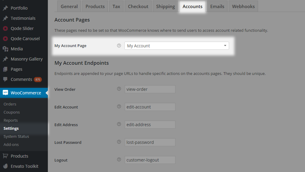
To get a more customized WooCommerce layout we recommend using the Default or Full Width page template with WooCommerce shortcodes.
10.2.11. One Page Layout
One Page websites aim to provide the perfect amount of information for a user to make a decision and act upon it. More often than not, the key to a proper one page setup is in the styling itself as you can see on our demos.
The main feature of single page websites is that they have no additional pages (like about, services, contact etc.) and are meant to remove as much “clutter” as possible, thereby focusing the user’s attention on the most important content. Bridge gives you the opportunity to create one page sites easily. In order to achieve this, you should first choose one of the following templates from the Template dropdown:
01 Default
02 Full width
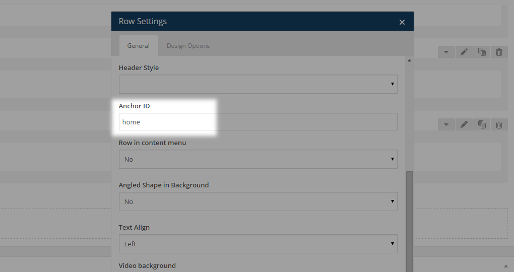
What will provide the one page functionality are anchors. Anchors are HTML tags that provide linking. In this case anchors will let you link to a section on your page. The first step in achieving the one page effect is assigning Anchor IDs to WPBakery Row elements, placed inside the page content. These Rows should be used as content holders - meaning you should place a part of the content within each of them.
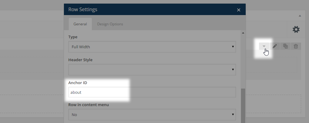
Each row container needs to have a unique Anchor ID (without the ‘#’ symbol).
After assigning anchor IDs to your rows it’s time for the next step – creating a menu with anchor links. In order to achieve this, please navigate to WP Admin -> Appearance -> Menus and click create new menu. Give your menu a name and, click Save Menu
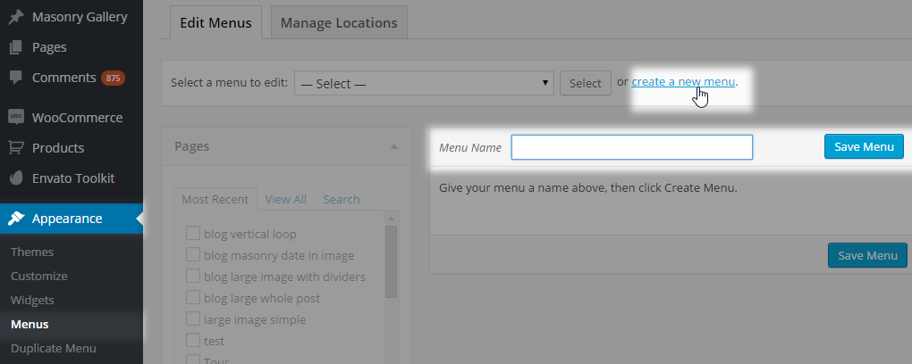
Start creating menu items. You should add a single page menu item from the list on your left-hand side. This page needs to be set as your main - front-page, in WP Admin -> Settings -> Reading.
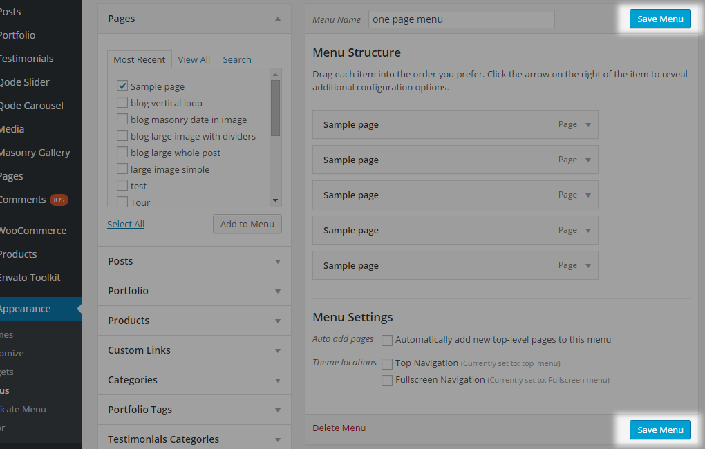
You should add this page menu item to your menu as many times as you have row containers on your home page - one menu item for each Anchor ID. For example, having five rows with anchors you should add the page five times
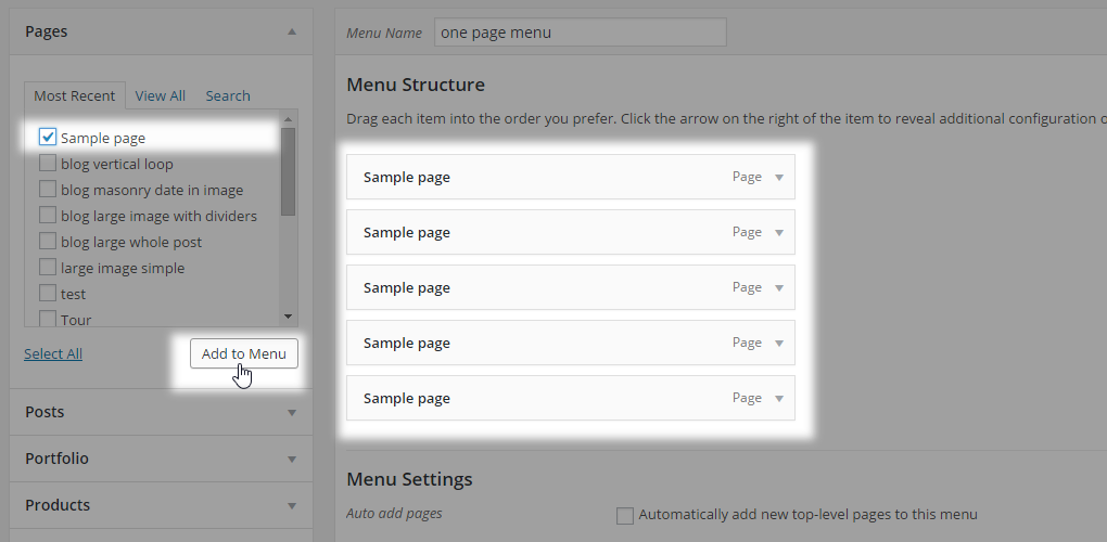
Then, edit menu items one by one by setting the Navigation Label to a desired name and entering the anchor you want each item to scroll to
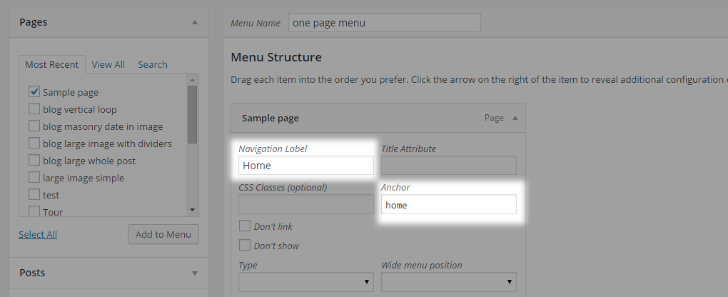
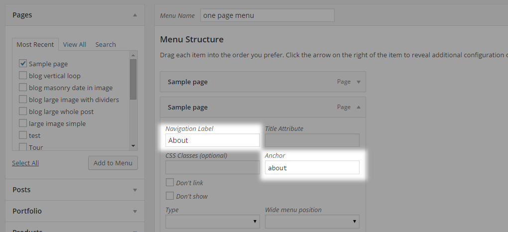
Repeat this process for each anchor
When you are finished with creating anchor links click Save menu
Lastly, go to Manage Locations and assign your menu to the top navigation area. Which navigation area will be displayed inside the locations depends on the header type you have chosen. Save changes.

To use a combination of a one page layout with anchoring functionality and other ‘basic’ page layouts, you need to modify your menu items to have them structured in a certain way. Navigate to WP Admin -> Appearance -> Menus and create menu items as custom links instead of pages. Inside the URL field, enter the full URL address followed by an anchor link. Fill in the desired label for that menu item and leave the anchor field empty.
For example:
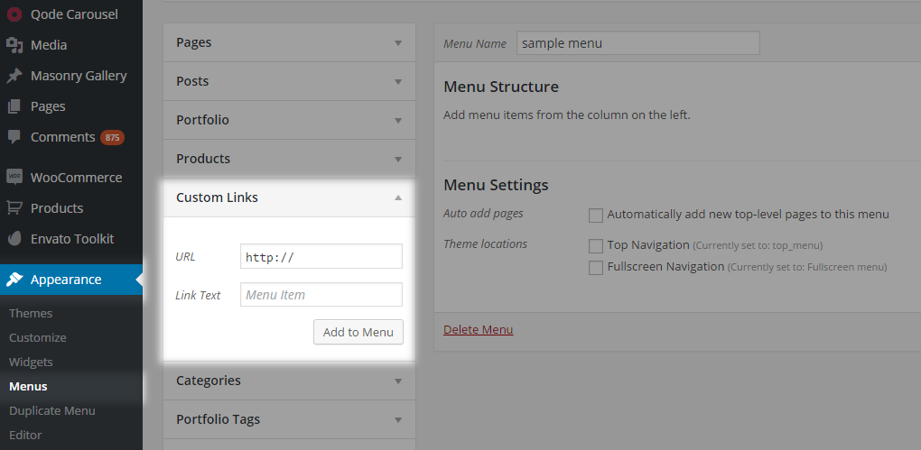
Common issues with anchoring setup
How to create an anchor link that will scroll down to a section on a page from a link located on the page?
Please go to WP Admin -> Pages -> Add Page/Your Page and add a Text Block shortcode. Inside the shortcode editor add your anchor link. Switch back from Visual editor to Text view and add class="anchor" inside the anchor HTML tag and save. Anchor links need to be with a starting hash symbol. Example (#anchor_link).
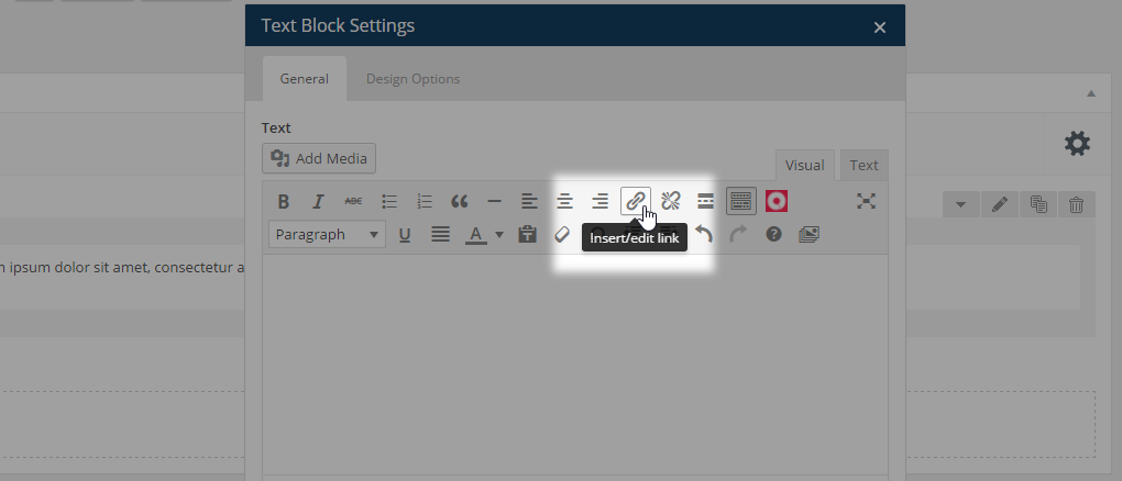
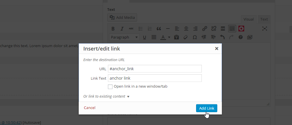
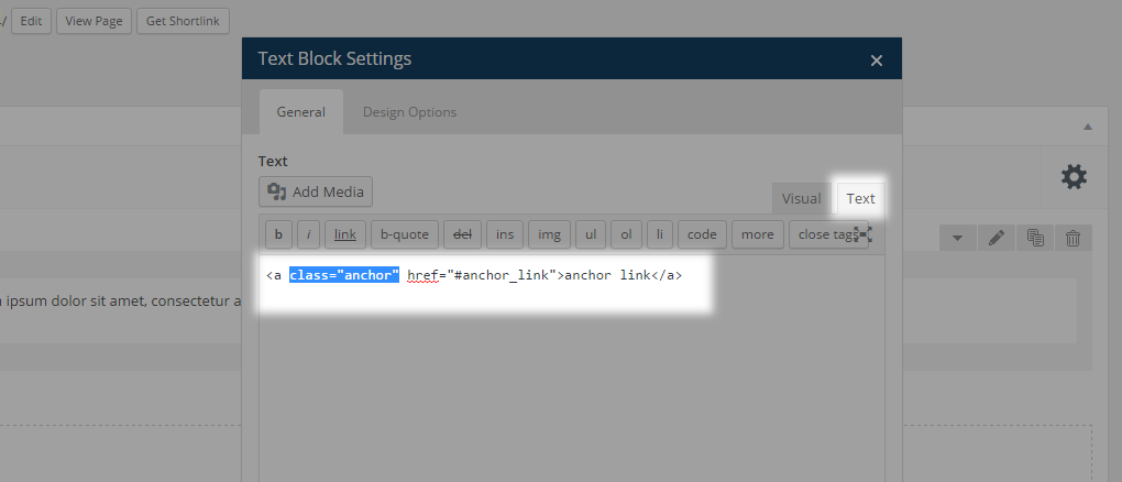
Then, add a Row shortcode which you’ll scroll to and inside the Row shortcode options you will find the Anchor ID option, fill in your anchor link and save. For example, enter anchor_link. This link needs to be without the starting hash symbol.
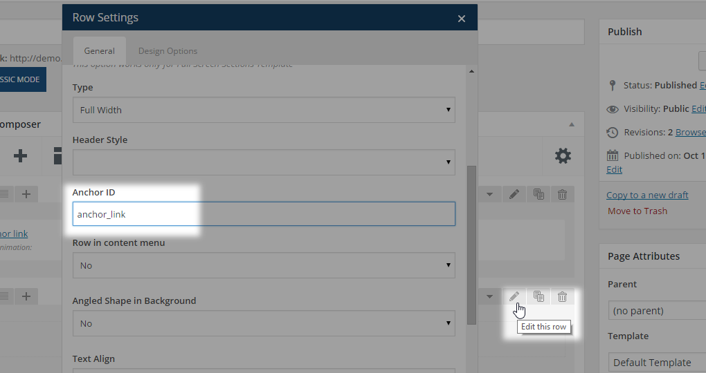
The created row is just a holder you’re going to scroll down to. You’re now ready to add elements inside that row to create a section with your original content.
Add your elements inside the row and save.
Video example
Why anchor links don’t work on my site? But when I double click on menu items it scrolls me down to the anchor section?
First go to WP Admin -> Appearance -> Menus -> Your Menu. Edit menu items and check the anchor field and your anchor links. Your anchor links need to be without the hash symbol.
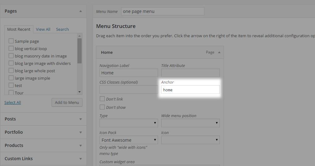
Then, go to WP Admin -> Pages -> Your page and edit the Row shortcodes where you’ve added anchor links. Find the Anchor ID field and check if you’ve added your anchor links without hash symbol (#), if not just add your anchor links without this mark and save.
If you still have the problem just submit a ticket to our support forum in regards to this issue (please include your WordPress credentials in the ticket) and our support team will debug the problem.
Clicking on anchor link jumps to anchor sections without the animation? Anchor links are not scrolling smoothly.
Please navigate to WP Admin -> Pages -> Your Page. Edit the Row shortcodes where you’ve added anchor links and check if you’ve filled in your anchor links inside the Row ID or inside the Anchor ID section.

If you’ve added the anchor link inside the Row ID field then just cut it and paste it into the Anchor ID field instead and save. The anchor link needs to be added without the hash symbol (#)
10.2.12 404 Error Page
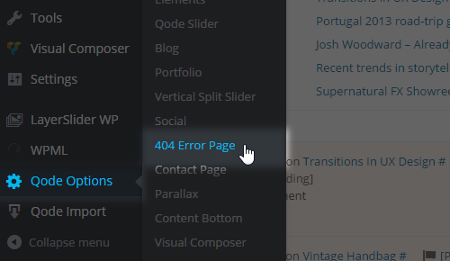
This page template is displayed once a missing URL is referred to in the address bar. The 404 page comes with a predefined layout. There are a few options in Qode Options -> 404 Error Page which you can use to adjust this page to fit your needs.
