The Following options will be present for all portfolio types:
12. Portfolio
Image Color Overlay - Set a color for the hover overlay. This option does not apply to the "Default" portfolio type.
Order By - Portfolio items can be organized by menu order, title, or date.
Order - Choose between an ascending or descending order.
Filter - You can show or hide the category filter, which is displayed on top of the portfolio list.
Lightbox - Enable or disable the lightbox effect.
Show View Button - Set this option to "No" if you would like to hide the "View" button from your portfolio list items.
Show Load More - Enable or disable the Load More button.
Number - Here you can define the number of portfolio items you wish to display on the page. Enter -1 to display them all.
Category - If you want to show portfolio items from one specific category, enter the category slug here. Alternatively, to display all categories, leave this field empty.
Selected Projects - If you want to list specific portfolio items, enter their project IDs here, separated by commas. The project ID for each item can be found in the item’s URL when editing that single portfolio item.
Show Title - Choose if you would like the portfolio item title to be visible or not.
Title Tag - You can choose a heading style to apply to the project titles (from h2 to h6).
Title Color - Set a color for the title.
Title Font Size (px) - Set a font size for the title.
Enable Separator Below Title - You can choose to have separators appear under portfolio item titles. Enabling this option will open the Separator Color option where you can choose your desired color.
Show Categories - Choose if you would like the portfolio item categories to be visible or not.
Category Name Color - Set a color for the category name
Beside the options above, other options may appear depending on the portfolio type being used, so although most of the options are self explanatory we are still going to list them and note for which specific portfolio types they are available:
Standard,Standard No Space, Hover Text, Hover Text No Space, Masonry(Pinterest) with space, Masonry(Pinterest) with space (image only), Alternating Sizes portfolio types:
Columns - The portfolio list can be set to 1, 2, 3, 4, 5 or 6 columns
Standard and Standard No Space portfolio types:
Box Background Color - Here you can choose a background color for the text box
Box Border - Here you can choose a border color for the text box
Portfolio Loading Type - Choose how you would like you portfolio list to appear on screen on load (Fade - one by one, Fade - diagonal, Slide from top - diagonal)
Image Proportions - You can choose featured image proportions here.
Text align - Choose between left, centered, or right text alignment.
Hover Text portfolio type:
Frame - Choose if you would like to display a monitor frame around each portfolio image.
Hover Text No Space and Justified Gallery portfolio types offer the same options as the standard portfolio type minus the “box background”, “border” and “text align” options.
Masonry without space and Masonry with space portfolio type:
Grid Size - You can use either a 4 or 5 column grid layout. With the 4 column grid, 4 small images can fit in one row, or if large images are being used, 2 large images will fit (a large image takes the width of 2 small ones). Likewise, with the 5 column grid, 5 small images can fit in a single row.
Masonry(Pinterest) with space, and Masonry(Pinterest) with space (image only) portfolio types:
Spacing between items (px) - Define a spacing to display between the portfolio items in your portfolio list. Provide only the value (without px at the end).
Justified Gallery portfolio type:
Row Height (px) - Set a desired row height, but note that it may vary depending on the proportions of the images used, so if you want to have a specified row height, make sure that the featured images for each portfolio item are the same sizes.
Last Row Behavior - Defines whether to justify the last row, align it, or hide it.
Justify Threshold (0-1) - Despite of the available space, if left, right, or center alignment has been chosen for the Last Row Behavior, the threshold value will determine the amount of justification for the items inside the last row.
12.1.Portfolio Single
The Portfolio is created as a custom post type and it can be found as a menu item within the WordPress back end admin menu. Adding Portfolio items is done the same way as creating blog posts. A Featured image is displayed for each portfolio item in portfolio lists. You can choose between 7 different layouts for each of your portfolio items. These layouts are listed in the “Choose portfolio single view” field. The images that are displayed on Portfolio single pages are added through the “Portfolio Images” link, which is located below the editor.
How to create a Portfolio single project
When you wish to create a Portfolio single page you should navigate from your User Dashboard to Portfolio > Add new
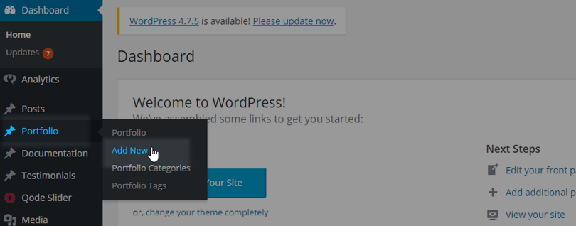
This will create a new Portfolio page which you can customize as you wish.
Featured image
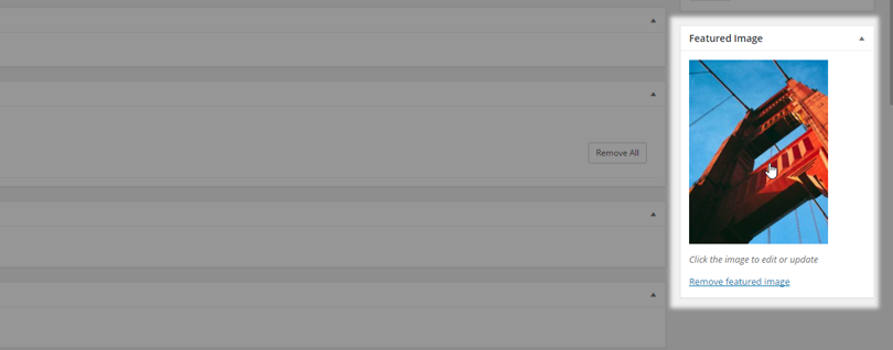
After you have added a Title to your portfolio item, you should add a Featured image. This is important because only that way the Portfolio single item will be visible on Portfolio lists.
Press the “Set featured image”
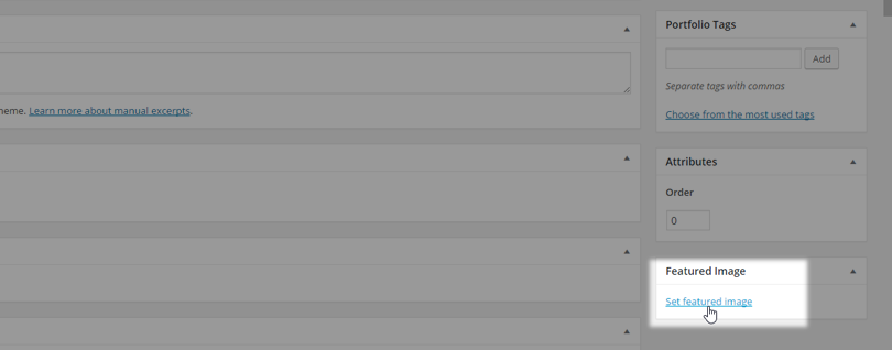
and then you can upload a Featured Image from your Media library or from your computer:
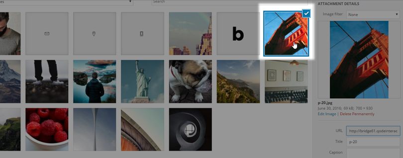
When you have selected your desired image, press “Set featured image”:
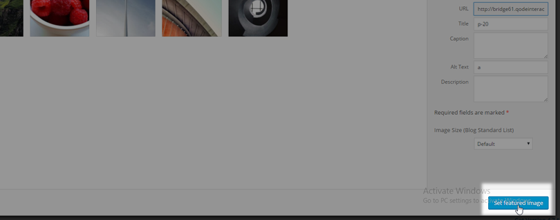
and you will get a Featured Image:
Qode Portfolio Images (multiple upload)
When you create a Portfolio single item, you probably want to display your work, and sometimes you will want to display more than one image for a single portfolio item. So, if you have multiple pictures which you wish to presents in one Portfolio item, you have the option Qode Portfolio Images (multiple upload). With this option you can import more than one image in a single step. To do so:
- Press the “Upload” buton
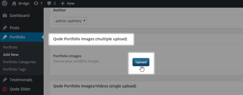
- Choose “Add to gallery”
- Choose the images you wish to upload
- Click the “Add to gallery” button
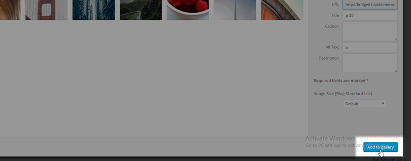
This way you will create a gallery for your Portfolio item. You can choose the layout for your gallery for each Portfolio Item in the “Portfolio Type” field.
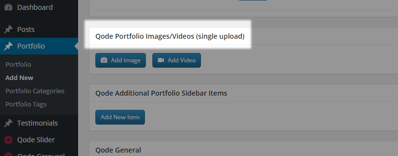
Qode Portfolio Images/Videos (single upload)
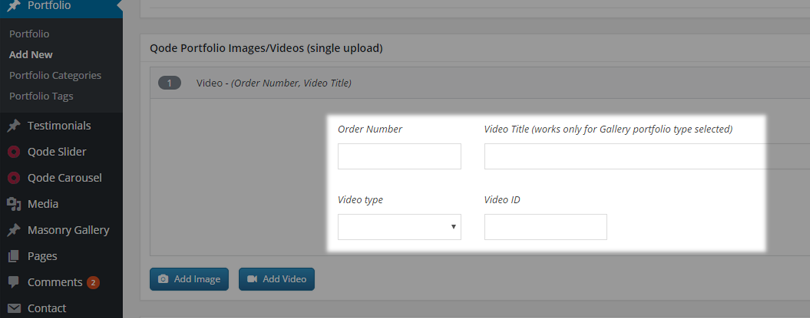
Our theme also allows adding videos together with images. Please note that when adding a new Portfolio image/video item, if you want the video to display, you should leave the image field empty. In the Video field if you choose “Vimeo” or “Youtube” you should just paste the videos ID. If you choose “self hosted” video, you should select a video from your media library that you want to display on your portfolio page.
Here is an example of how you can add videos and images in a specific order to a portfolio item:
- First we upload an image with the Order number 1
- Secondly we upload a video with the Order number 2
- In the end we again upload an image with the Order number 3
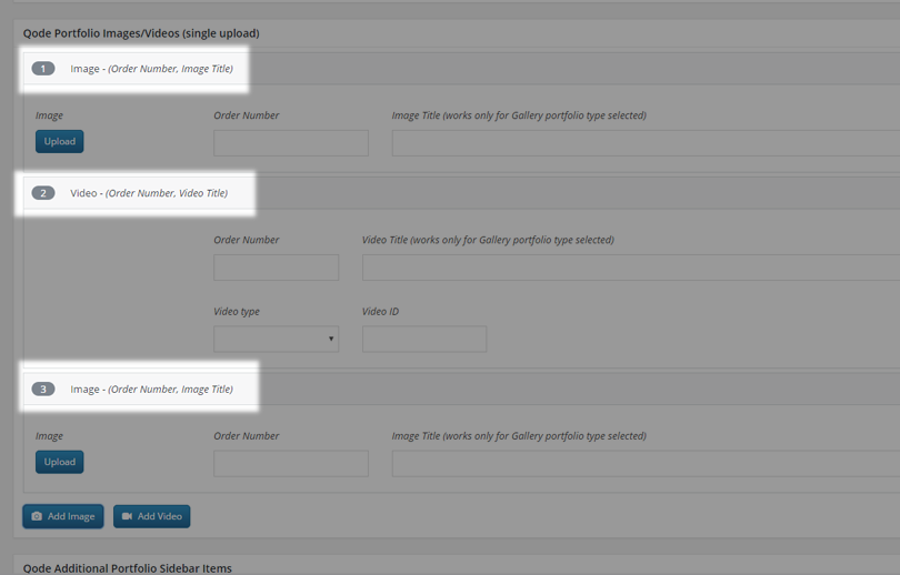
This way you will get gallery with mixed images and videos in one Portfolio item.
Qode Portfolio General
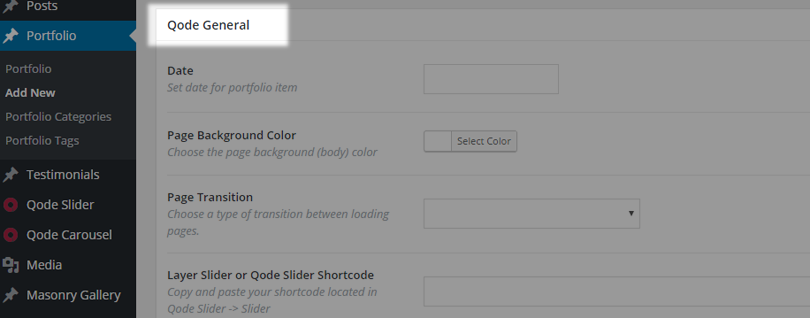
On the Portfolio single item page you have certain Qode custom fields. Most of these fields are the same as on ordinary pages, but you also have the Qode Portfolio General set of options:
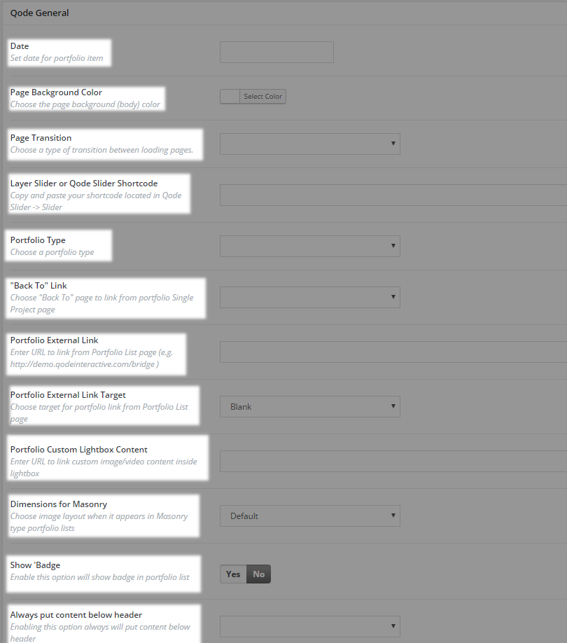
With all these options you can set a desired look of your Portfolio single item page. We will now go through all these options for you with explanation and screenshots.
Qode Portfolio General – Date
In this field you can set the date when you created your portfolio item
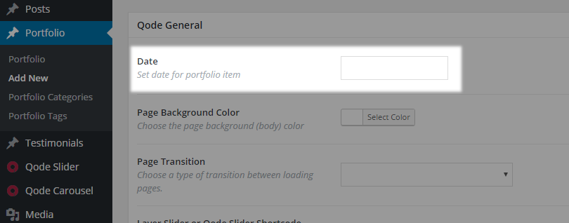
, and this date will be displayed in the Custom field section in your Portfolio item
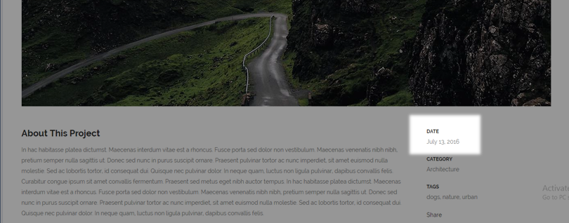
Qode Portfolio General - Portfolio type
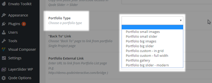
Each Portfolio single page has an option with which you can choose the layout of that Portfolio page (Portfolio Type).

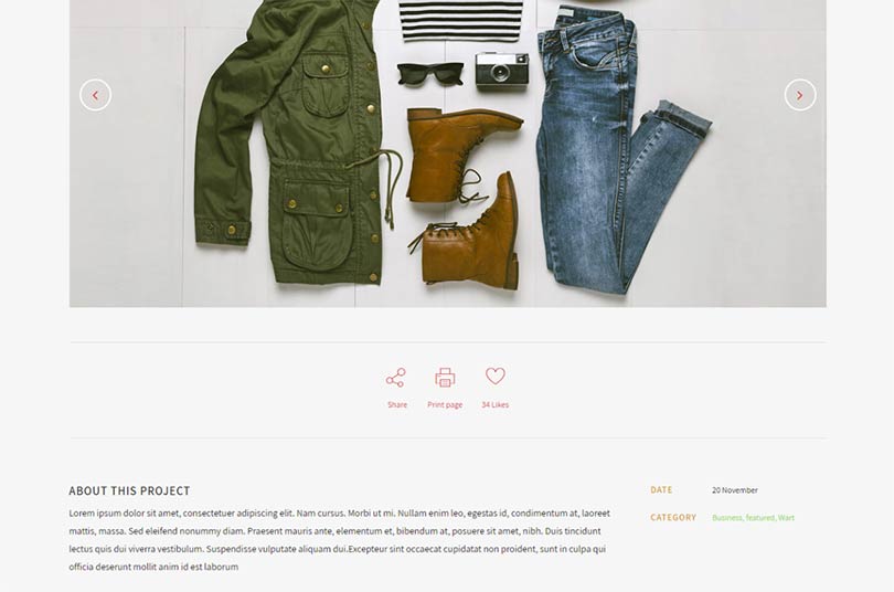
So you can choose between eight different Portfolio types
- Portfolio small images
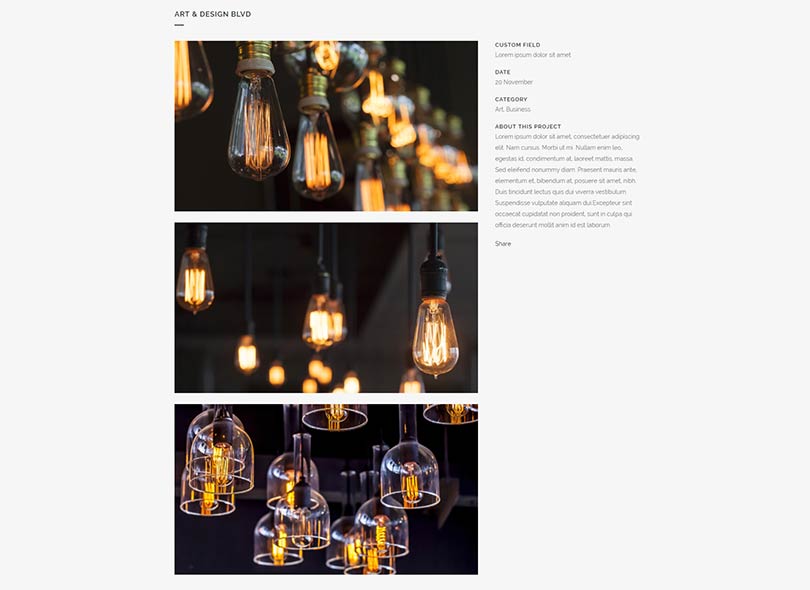
- Portfolio small slider

- Portfolio big images
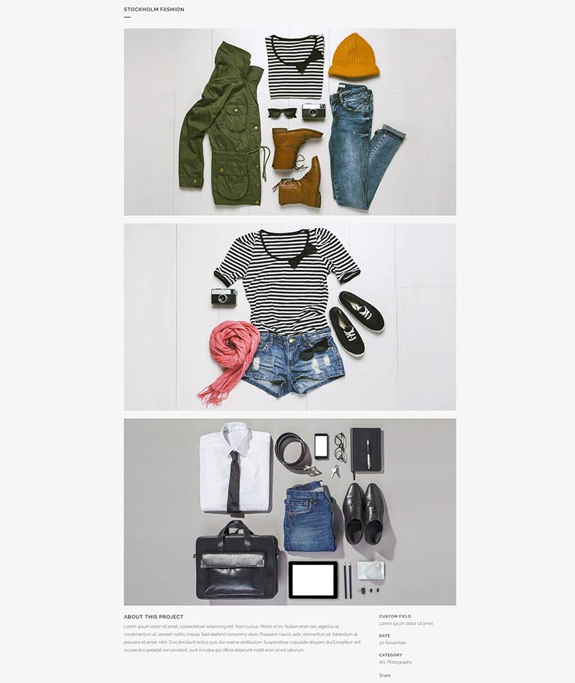
- Portfolio big slider
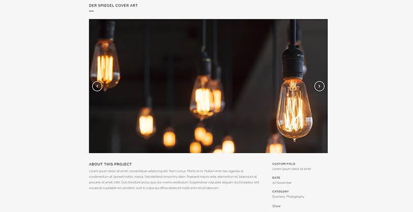
- Portfolio custom – in grid
- Portfolio custom – full width
- Portfolio gallery
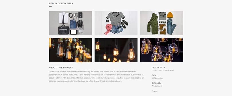
- Portfolio big slider – modern
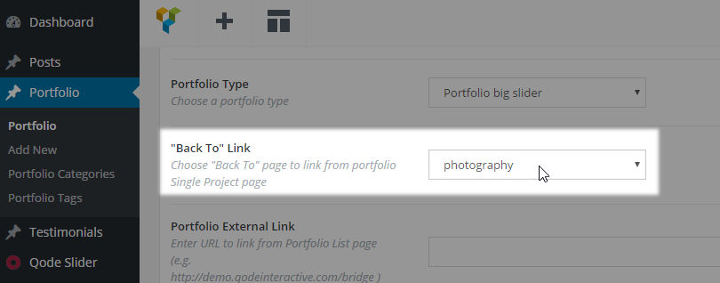
Qode Portfolio General - "Back To" Link
You can use this option if you decide to have an inner navigation through your portfolio items. If you have inner navigation through your portfolio items, there is a button on each portfolio page which leads back to the portfolio list. If you would like that button to lead to some other page, you can input the link to the page you would like it to lead to here:
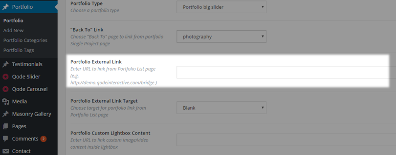
Qode Portfolio General - Portfolio External Link
You can paste an external link in this field if you wish for this specific Portfolio item to lead to some other url address other than the Portfolio single page.
Qode Portfolio General - Portfolio External Link Target
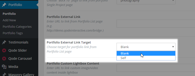
You can choose whether you would like to open your external link in the same browser tab (choose “Self”) or if you wish to open the link in new browser tab (choose “Blank”)
Qode Portfolio General - Portfolio Custom Lightbox Content
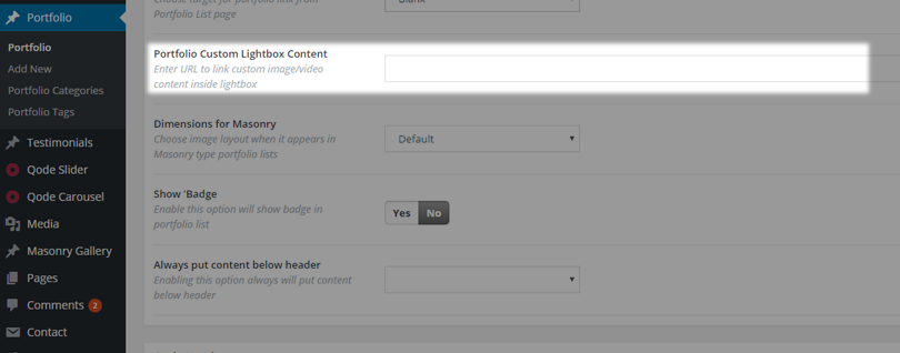
In this field you can paste an external link of some images or a url of some video which you wish to present in the Lightbox instead of the portfolio featured image.
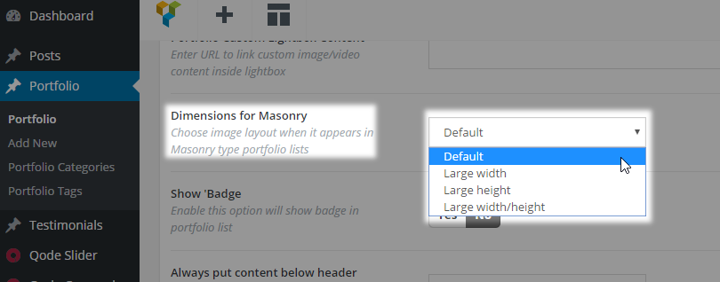
Qode Portfolio General - Dimensions for Masonry
If you trying to achieve the masonry 'mosaic effect' for your Portfolio page you need to be able to crop your images to various predefined dimensions for masonry. Here are the border values for each cropping variant. So you need to upload images in these dimensions or larger.
portfolio_masonry_regular - 500x500 px
portfolio_masonry_wide - 1000x500 px
portfolio_masonry_tall - 500x1000 px
portfolio_masonry_large - 1000x1000 px
Then you need to manually create this mosaic and set the right image to the right place. In order to achieve a similar layout like in your desired demo, this 'mosaic' masonry requires carefully ordered portfolio thumbnails.
In the “Dimensions for Masonry” field, you should set a predefined size that corresponds to the dimensions of your image:
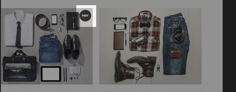
Qode Portfolio General - Show 'Badge
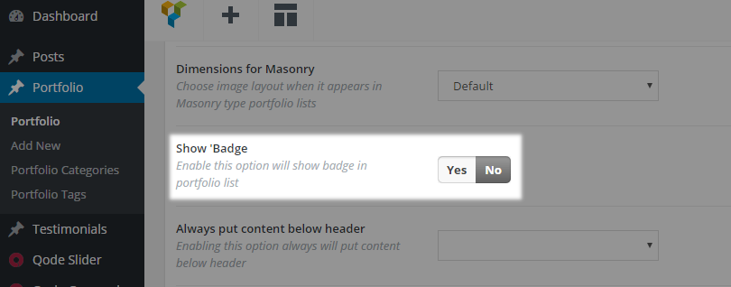
Enable this option will show a badge on this Portfolio item in portfolio lists
Sorting Your Portfolio Items
You can categorize your portfolio items by adding tags or categories to them. Here is how you can achieve this:
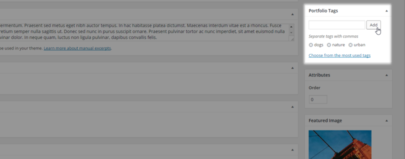
Portfolio Tags
You can create Portfolio Tags in the Portfolio Tags field on the right side of your screen.
Tags provide a useful way to group related posts together and to quickly tell readers what a post is about. Tags also make it easier for people to find your content. Tags are similar to, but more specific than, categories. The use of tags is completely optional.
Portfolio Categories
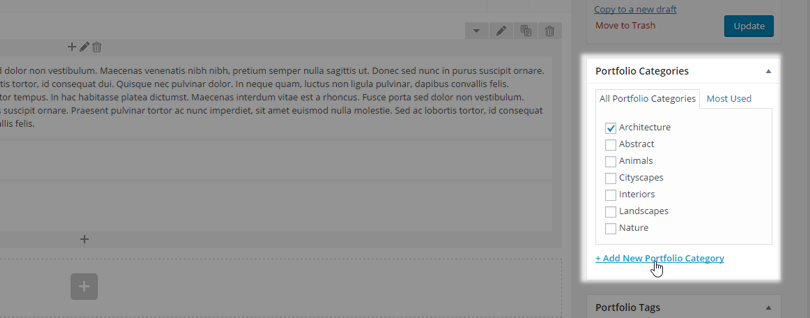
You can create Portfolio Categories and add a portfolio item to a category in the Portfolio Categories field on the right side of the screen. This is a great way to link similar portfolio items together.
12.2 Portfolio List
The Portfolio List WPBakery element is a shortcode which allows you to display your portfolio items on a page
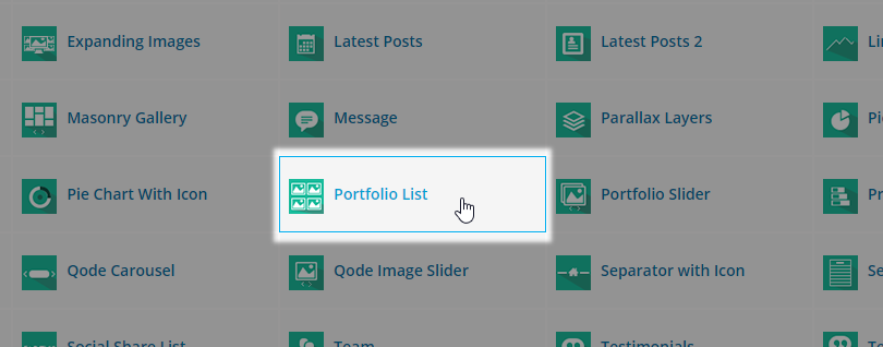
Depending on whether you want to present your portfolio in full width or in grid, the most important thing is to choose an appropirate page template. See the page and page templates section for more information:
http://bridge.qodeinteractive.com/documentation/10-pages-and-page-templates/.
When it comes to portfolio list options, there are many options which are available for the portfolio list element
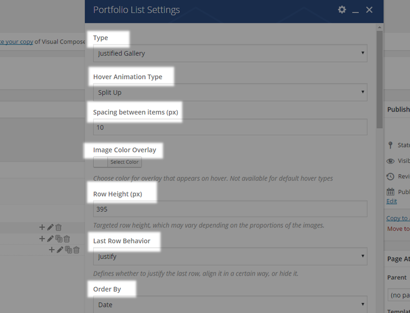
and we are going to describe them in the following section. But the most important options among them are Type, and Hover Animation Type. These two options will always be present, and others may vary according to the portfolio type being used. We will list all of the options for all portfolio type below, but it is important to understand that some options will only be available for specific portfolio types. For example, choosing the Hover Text portfolio type, for example, will hide the Box Background Color and Border Color options, since a box for which the color and border can be set will not be present. However, there will be a new option, Frame, where users can choose Monitor Frame, or No Frame. These are very small differences, but this example is a very important one for giving you an overall understanding of the portfolio list element and its usage.
The available Portfolio list options are as follows:
12.2.1Type
Type - this option allows users to choose a layout for a portfolio list. There are several layouts to choose from and according to the selected portfolio type, there will be several different sets of options available. All available portfolio types are listed below:
- Standard
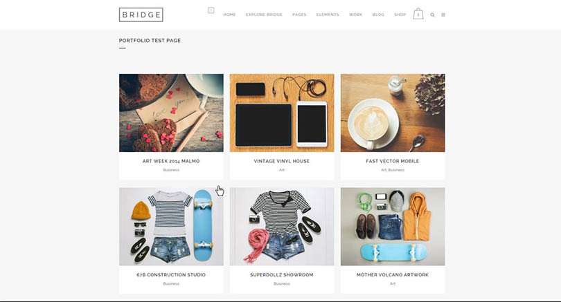
- Standard No Space
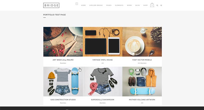
- Hover Text
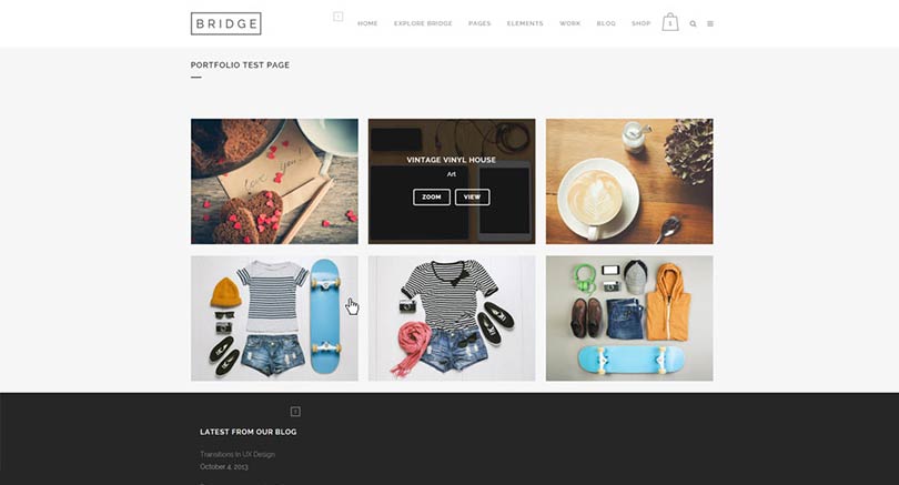
- Hover Text No Space
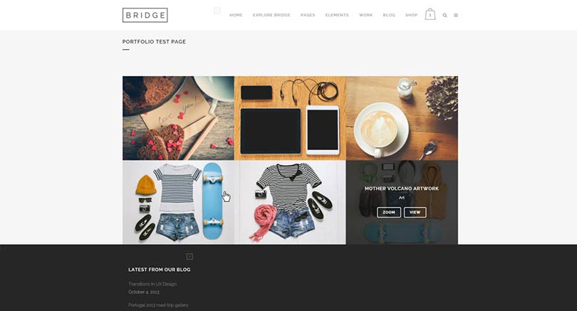
- Masonry without space

- Masonry with space
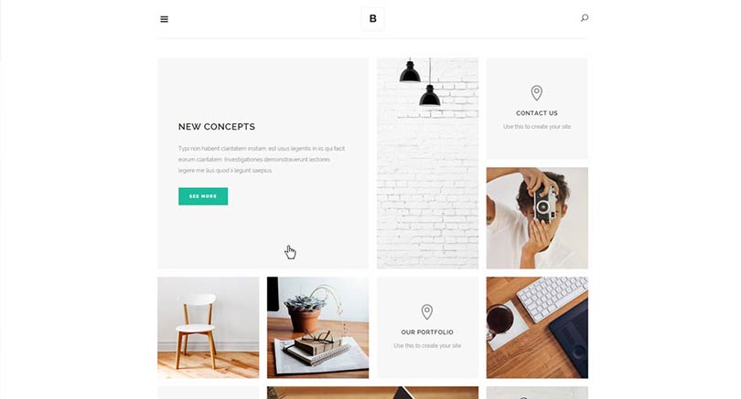
- Masonry(Pinterest) with space
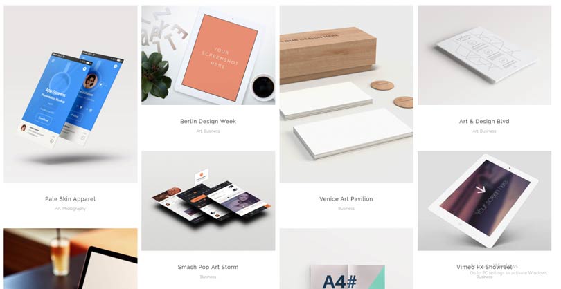
- Masonry(Pinterest) with space (image only)
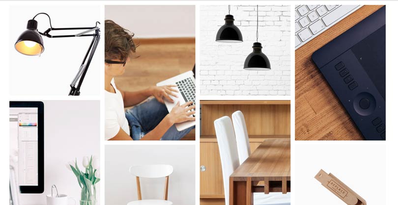
- Justified Gallery

- Alternating Sizes
12.2.2Hover Animation Type
Hover Animation Type - Here you can choose a hover animation for the items in your portfolio list. Beside the Default hover animation type, you can choose from one of the following animations:
- Subtle Vertical
- Image Subtle Rotate & Zoom
- Image & Text Zoom
- Cursor Change
- Thin Plus Only
- Slow Zoom
- Split Up
The most important thing here is to understand that these are hover animation types, which means that they will only be visible on hover, when the mouse pointer enters a portfolio item on the list. This also means that effects which are not supported by the browser on touch devices will not occur, and on such devices single portfolio page will be loaded immediately, without any effect.
12.2.3Other options
The Following options will be present for all portfolio types:
Image Color Overlay - Set a color for the hover overlay. This option does not apply to the "Default" portfolio type.
Order By - Portfolio items can be organized by menu order, title, or date.
Order - Choose between an ascending or descending order.
Filter - You can show or hide the category filter, which is displayed on top of the portfolio list.
Lightbox - Enable or disable the lightbox effect.
Show View Button - Set this option to "No" if you would like to hide the "View" button from your portfolio list items.
Show Load More - Enable or disable the Load More button.
Number - Here you can define the number of portfolio items you wish to display on the page. Enter -1 to display them all.
Category - If you want to show portfolio items from one specific category, enter the category slug here. Alternatively, to display all categories, leave this field empty.
Selected Projects - If you want to list specific portfolio items, enter their project IDs here, separated by commas. The project ID for each item can be found in the item’s URL when editing that single portfolio item.
Show Title - Choose if you would like the portfolio item title to be visible or not.
Title Tag - You can choose a heading style to apply to the project titles (from h2 to h6).
Title Color - Set a color for the title.
Title Font Size (px) - Set a font size for the title.
Enable Separator Below Title - You can choose to have separators appear under portfolio item titles. Enabling this option will open the Separator Color option where you can choose your desired color.
Show Categories - Choose if you would like the portfolio item categories to be visible or not.
Category Name Color - Set a color for the category name
Beside the options above, other options may appear depending on the portfolio type being used, so although most of the options are self explanatory we are still going to list them and note for which specific portfolio types they are available:
Standard,Standard No Space, Hover Text, Hover Text No Space, Masonry(Pinterest) with space, Masonry(Pinterest) with space (image only), Alternating Sizes portfolio types:
Columns - The portfolio list can be set to 1, 2, 3, 4, 5 or 6 columns
Standard and Standard No Space portfolio types:
Box Background Color - Here you can choose a background color for the text box
Box Border - Here you can choose a border color for the text box
Portfolio Loading Type - Choose how you would like you portfolio list to appear on screen on load (Fade - one by one, Fade - diagonal, Slide from top - diagonal)
Image Proportions - You can choose featured image proportions here.
Text align - Choose between left, centered, or right text alignment.
Hover Text portfolio type:
Frame - Choose if you would like to display a monitor frame around each portfolio image.
Hover Text No Space and Justified Gallery portfolio types offer the same options as the standard portfolio type minus the “box background”, “border” and “text align” options.
Masonry without space and Masonry with space portfolio type:
Grid Size - You can use either a 4 or 5 column grid layout. With the 4 column grid, 4 small images can fit in one row, or if large images are being used, 2 large images will fit (a large image takes the width of 2 small ones). Likewise, with the 5 column grid, 5 small images can fit in a single row.
Masonry(Pinterest) with space, and Masonry(Pinterest) with space (image only) portfolio types:
Spacing between items (px) - Define a spacing to display between the portfolio items in your portfolio list. Provide only the value (without px at the end).
Justified Gallery portfolio type:
Row Height (px) - Set a desired row height, but note that it may vary depending on the proportions of the images used, so if you want to have a specified row height, make sure that the featured images for each portfolio item are the same sizes.
Last Row Behavior - Defines whether to justify the last row, align it, or hide it.
Justify Threshold (0-1) - Despite of the available space, if left, right, or center alignment has been chosen for the Last Row Behavior, the threshold value will determine the amount of justification for the items inside the last row.
12.3 Portfolio Slider
The Portfolio Slider WPBakery element is a shortcode that lets you present your portfolio items as an interactive slideshow which viewers can navigate through.
There are many options which let you easily customize the portfolio slider. Here is an explanation of what each of these options does:
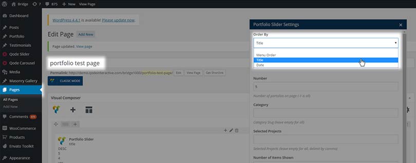
Order By - Portfolio items can be organized by menu order, title, or date. The menu order is a custom order which users can create for their portfolio items, as seen in this screenshot:
Order - You can also choose between ascending or descending order. This is useful in combination with order by date.
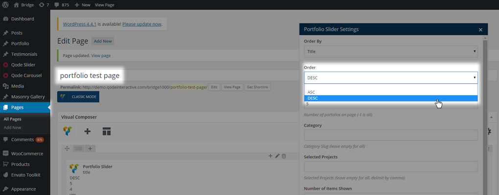
Number - Here you can define the number of portfolio items you wish to display on a page. Enter -1 to display them all.
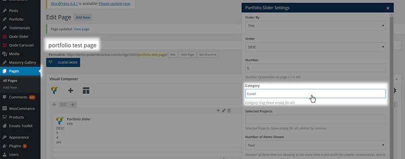
Category - If you want to show portfolio items from one specific category, enter the category slug of that category here. Alternatively, to display all categories, leave this field empty. You can define the slug for each portfolio category by navigating to Portfolio > Portfolio Categories, and then clicking on your desired category. Then you can define the slug in the “slug” field, as see in this screenshot:
Selected Projects - If you want to list specific portfolio items, enter the project IDs of those items, separated by commas. The project ID of each portfolio item can be found in its URL. For example, in www.yoursite.com/wp-admin/post.php?post=164&action=edit, the ID is 164.
Number of Items Shown - Set the number of portfolio items that will be shown at the same time in full width (on smaller screens, due to responsiveness, there will be less items shown).
Lightbox - Enable or disable the lightbox effect.
Title Tag - You can choose a heading style to apply to the project titles.
Separator - You can enable a separator to appear between the project title and category. This applies to the text viewers see on image hover.
Hide "View" Button - Set this option to "Yes" if you would like to hide the "View" button.
Image Proportions - You can choose your image proportions here. We recommend using Landscape (500x380) for faster page loading time.
Prev/Next Navigation - You can show or hide the navigation buttons.
12.4 Global Portfolio Options
In this section we will describe all the available global portfolio options in detail.
All global settings related to single portfolio items and portfolio shortcodes can be found in Qode Options -> Portfolio. The options are arranged into two sections: Portfolio Single Project and Portfolio List.
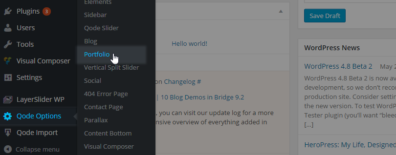
12.4.1Portfolio Single Project
In the following section we will go through all the available options, but we will explain in detail only those options that are not already addressed in the Portfolio Single Project part of this documentation.
- Portfolio Type (Choose a default type for Single Project pages)
- Portfolio Small Images
- Portfolio Small Slider
- Portfolio Big Image
- Portfolio Big Slider
- Portfolio Custom - In Grid
- Portfolio Custom - Full Width
- Portfolio Gallery
- Portfolio Big Slider - modern
- Likes (Enabling this option will turn on "Likes")
- On/Off
If you enable Likes you’ll see the number of likes displayed on each single portfolio page

- Lightbox for Images (Enabling this option will turn on lightbox functionality for projects with images.)
- Yes/No
- Lightbox for Videos
- Yes/No
- Number of Columns:
- two, three or four columns
- Sidebar Layout:
- No sidebar
- Sidebar 1/3 right
- Sidebar ¼ right
- Sidebar 1/3 left
- Sidebar ¼ left
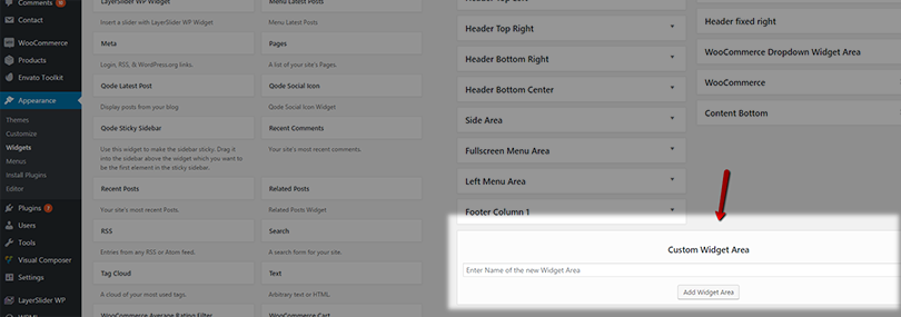
- Sidebar to display (Choose a sidebar to display on Single Project pages) – Choose one of your already created custom widget areas to display as a sidebar on portfolio single pages
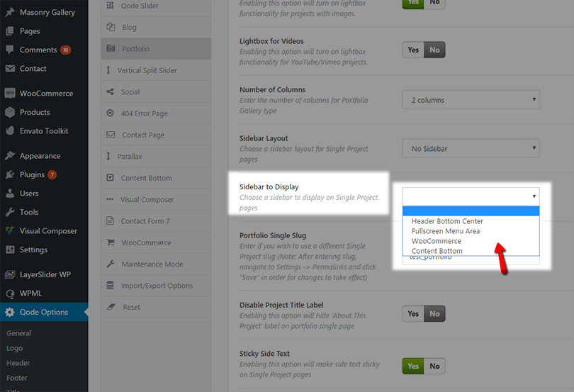
You could make your own custom widget area in Appearance > Widgets > Custom Widget area > Add widget area
- Portfolio Single Slug - Enter if you wish to use a different Single Project slug (Note: After entering slug, navigate to Settings -> Permalinks and click "Save" in order for changes to take effect). The default slug for single portfolio items is “portfolio_page” and the whole link to a portfolio single item looks something like this:
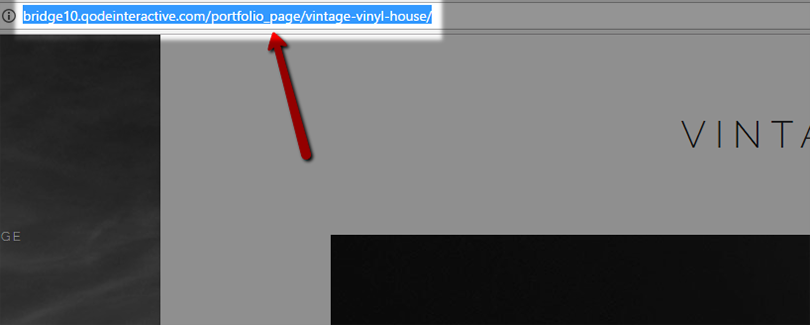
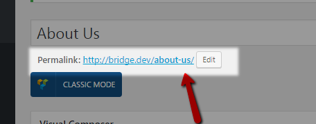
Now, if you input, for example, “projects” in the Portfolio Single Slug” field, you’ll get this link instead:
Please, note that the string you input in this field needs to be unique. So you cannot add a slug if the same slug is already being used as a page slug. So, just make sure that the slug you’ve chosen is not a part of any of your pages’ permalinks.
- Disable Project Title Label (Enabling this option will hide the 'About This Project' label on portfolio single pages)
- Yes/No
If you choose Yes, you’ll hide the title area on single portfolio items.
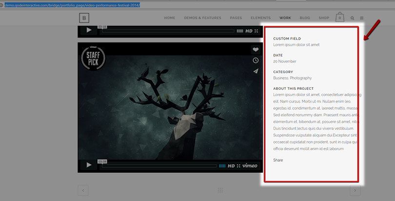
- Sticky Side Text (Enabling this option will make side text sticky on Single Project pages)
- Yes/No
Here are examples of single portfolio items in which you can see this floating effect on the content in the portfolio project’s sidebar:
So, enabling this option makes sure that the info on the side is always visible in your viewport
- Enable Comments (Enabling this option will display comments on portfolio single page)
- Yes/No
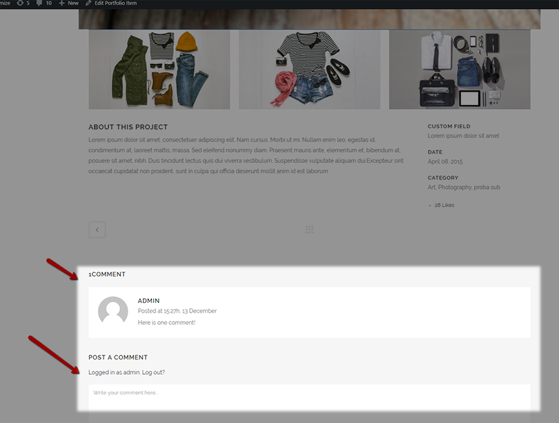
- Enable Related Portfolios (Enabling this option will display related portfolios on portfolio single page).
- Yes/No
Enable this option if you would like to display related portfolio items at the bottom of your single portfolio pages:
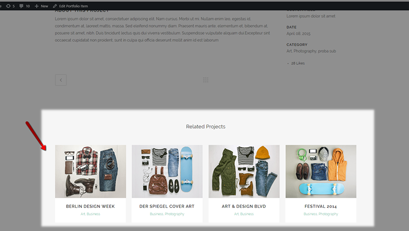
Portfolios are related by portfolio category.
- Image proportion (Select image proportion for related portfolio items.);
- Original
- Portrait
- Landscape
- Square
If you enable related portfolio items, you can use this option to set desired image sizes for the featured images of related portfolio items.
- Show Title on Navigation (Enabling this option will display title and categories on portfolio single navigation):
- Yes/No
Here is what it looks like when this option is enabled

So, there are titles of single projects displayed, as well as links to the portfolio categories of those single projects.
- Enable pagination through same category (Enabling this option will make portfolio pagination sort through current category.)
- Yes/No
If you enable this option, the pagination in single portfolio items will navigate only through items within the same category as the portfolio item that is currently being viewed.
12.4.2Portfolio List
PORTFOLIO LIST:
Here are the global options for Portfolio List shortcodes.
- Overlay Style:
- Overlay Color
- Overlay Opacity (values 0-1)
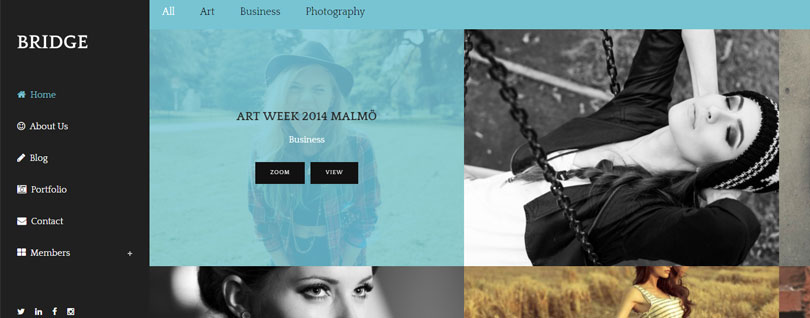
Here you can see an example of a portfolio with a blue semi-transparent overlay:
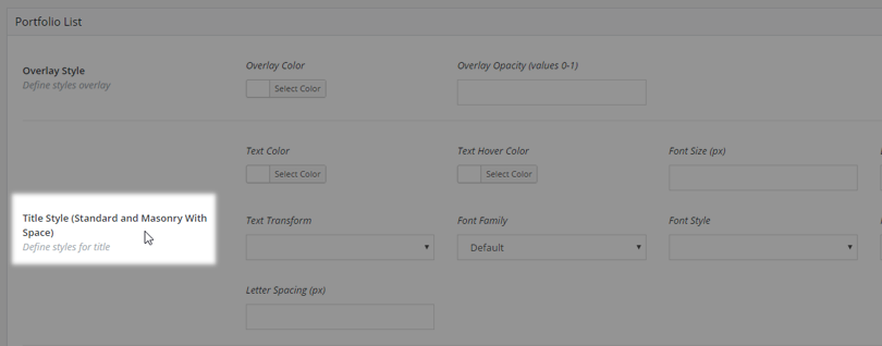
- Title Style (Standard and Masonry With Space)
Here you can set styles for portfolio item titles when they are displayed in “Standard” and “Masonry with Space” portfolio lists.
- Category Style (Standard and Masonry With Space)
Here you can set styles for portfolio item category text when it is displayed in “Standard” and “Masonry with Space” portfolio lists.
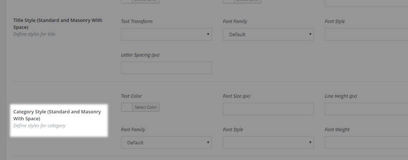
- Title Style (Hover Text, Masonry Without Space, Masonry With Space (only image) and Justified Gallery)
Here you can set styles for portfolio item titles when they are displayed in “Hover Text”, “Masonry Without Space”, “Masonry With Space (only image)” and “Justified Gallery” portfolio lists.
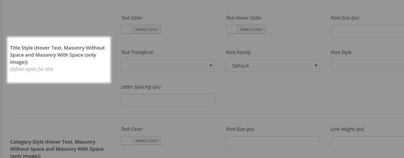
- Category Style (Hover Text, Masonry Without Space, Masonry With Space (only image) and Justified Gallery)
Here you can set styles for portfolio item category text when it is displayed in “Hover Text”, “Masonry Without Space”, “Masonry With Space (only image)” and “Justified Gallery” portfolio lists.
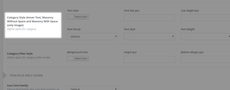
- Category Filter Style
Here you can set styles for the portfolio list category filter.
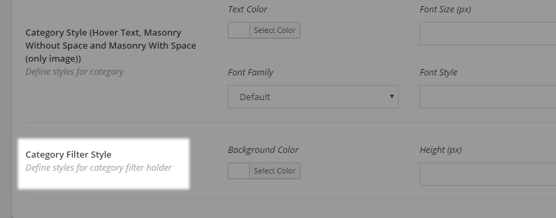
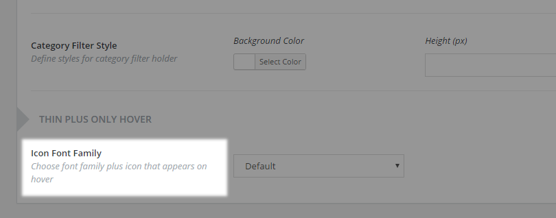
- Icon Font family
Here you can choose a font family to use for the plus (+) icon that appears on hover on portfolio items when using the “Thin Plus Only” hover type.
