22. Custom Shortcodes

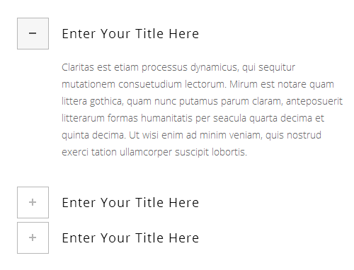
Style - Accordion, Toggle, Boxed Accordion and Boxed Toggle
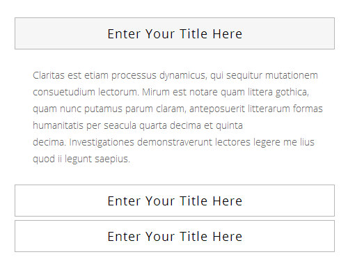
Boxed Toggles
- Title - Title label for accordion section heading
- Title Color - Chose color for the Accordion title
- Background Color - Chose color for the Accordion background
- Title Tag - h2, h3, h4, h5 and h6
Qode Accordion
- Style - Choose a style for the accordion.
When you have added the Accordion element to your page, you can start adding Accordion Tabs inside it, and setting the following options for each one:
General
- Title - Input a title for the tab.
- Title Tag - Choose a heading tag for the title.
- Icon Pack - If you would like to display an icon alongside the title, choose an icon pack to use here.
- Icon - Choose an icon to display.
Content Design
-
- Content Background Image - Set a background image for the tab content.
- Content Padding - Input a padding for the content. Input the padding in a "top right bottom left" format (e.g. 10px 15px 10px 15px).
Now you can add content inside the Accordion Tab
Image Gallery
Gallery type - Chose between Flex slider fade, Flex slider slide, Nivo Slider and Image grid
Image Gallery Flexslider, Nivo Slider
Image Gallery with Frame
Image Gallery Image Grid

- Auto rotate slides - Choose a delay in seconds between each slide animation or disable auto rotation.
- Images - Upload or select gallery images
- Image size - Enter image size. Example: thumbnail, medium, large, full or other sizes defined by current theme. Alternatively, enter image size in pixels: 200x100 (Width x Height). Leave empty to use "thumbnail" size.
- On click - Choose image behaviour on click
- Extra class name - If you wish to style particular content element differently, then use this field to add a class name and then refer to it in your css file.
- Enable Drag - Set this option to "Yes" if you would like to enable drag functionality on the image gallery (the images can be dragged left and right with the mouse pointer).
- Show Direction Navigation - Set this option to "Yes" if you would like to enable navigation arrows on the gallery slider.
- Show Control Navigation - Set this option to "Yes" if you would like to show navigation bullets below the gallery slider.
- Pause on Hover - Set this option to "Yes" if you would like the gallery slider to pause when hovered over.
- Frame - Choose wheather or not your images should appear in frame
- Choose Frame - Choose here frame type for your images
- Default
- Frame 1
- Frame 2
- Column Number - Set a number of columns when using the "Image Grid" Type.
- Grayscale Images - Set this option to "Yes" if you would like to enable an effect where your images are grayscale and then gain color on hover. This option only applies when using the "Image Grid" Type.
- Spaces Between Images - Set this option to "Yes" if you would like to enable a space between images when using the "Image Grid" Type.
Advanced Image Gallery
You can use this shortcode to create an advanced image gallery.
- Gallery Type - Choose a layout for the gallery.
- Enable Fixed Image Proportions - Set this option to "Yes" to force predefined image proportions for your masonry list. This option will apply the image proportions you set in the Image Size field for each image in your Media Gallery.
- Images - Upload your images.
- Image Size - Set a size for the images.
- Enable Image Shadow - Set this option to "Yes" if you would like to enable a shadow effect on the images.
- Image Behavior - Choose how the images will behave when they are clicked on.
- Number of Columns - Choose a number of columns to place the images in.
- Space Between Items - Choose a spacing between items in the gallery
Row
Row is container element to which you can add other elements (shortcodes). This element can be full width or in grid. With CSS Animation you can set entering animation for this element and with Transition Delay you can set delay for chosen CSS Animation. Anchor ID is used in our anchor functionality. You can add row ID which can be referenced in main menu Anchor ID field.
- Extra class name - If you wish to style particular content element differently, then use this field to add a class name and then refer to it in your CSS file.
- Row Type - Choose here row type
- Row - simple row
- Parallax - is our simple and easy plugin for creating image parallax effects when scrolling the page. If you set the parallax row to display full width, you can also choose to set the content for parallax rows to be in grid or full width in the "Content Width" field, and set the side padding when the content is set to full width.
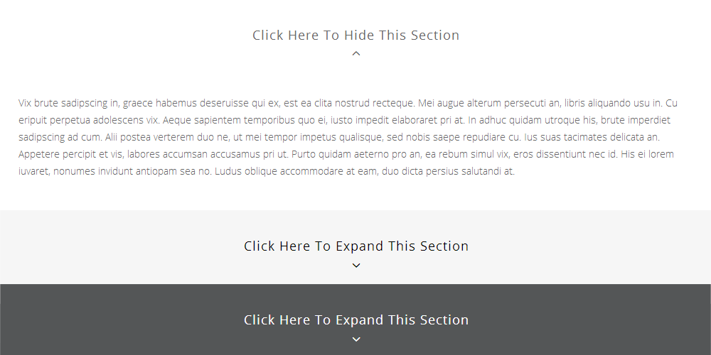
- Expandable - is full width container element which is initially closed. This element has two buttons which open / close this section when clicked. You can add every shortcode to this container element
-
- More Label - Give name to More Label (for example: "Click for More")
- Less Label - Give name to Less Label (for example: "Click for Less")
- Label Color - Choose text color for label More/Less
- Label Hover Color - Choose text hover color for label More/Less
- Label Position - Choose a text alignment for the More/Less labels
- Content Menu - This is a menu built from page sections and can be used to create one page websites. Unlike top navigation, you can place the Content menu anywhere on your page. To create one, follow these steps:
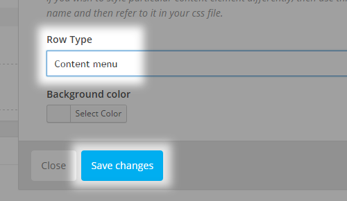
- Add a row shortcode where you wish the Content menu to go. Edit this row and select "Content menu" under "Row Type." Click on "Save changes."
- Add another row shortcode to your page. This row will be a menu item in the Content menu.
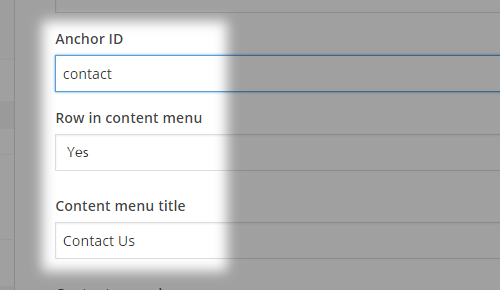
- Click on the "Edit this row" button and choose "Yes" under "Row in content menu."
- Enter a menu label for this row in "Content menu title." In "Content menu icon," you can optionally choose an icon to appear next to this menu item.
- Fill in the "Anchor ID" field. This is required in order to link the menu item to this specific row. We recommend using lowercase letters and underscores (if necessary).
- Repeat steps 2-5, as required.
- Use Row as Full Screen Section - Set this option to "Yes" if you would like to use this row as a full screen section when using the "Full Screen Sections" template.
- Type - Choose between "Full Width " and "In Grid".
- Header Style - Set the header style (dark/light) for the header when scrolling over this row. For this option to work "Enable Header Style" needs to be set to "Yes" (either in Qode Options > Header, or in page options)
- Anchor ID - Set an anchor ID for the row.
- Row In Content Menu - Set this option to "Yes" if you would like to add this row to the content menu (expained above).
- Angled Shape in Background - Set this option to "Yes" if you would like to make the row angled.
- Angled Shape Position - Choose whether you would like the top, bottom, or both borders of the row to be angled.
- Angled Shape Direction - Set a direction for the angled shape.
- Text Align - Set the text alignment for the row.
- Video Background - Set this option to "Yes" if you would like to use a video background in the row.
- Video Overlay - Set this option to "Yes" if you would like to use an pattern overlay image on the video.
- Video Overlay Image (pattern) - Upload the pattern image for the video overlay.
- Video Background - Input links to your video file in all three required formats (webm, mp4, ogv).
- Video Preview Image - Set a preview image for the video while loading.
- Video Overlay - Set this option to "Yes" if you would like to use an pattern overlay image on the video.
- Background Image - Set an image to use for the row background.
- Set Background Image as Pattern - Set this option to "Yes" if you would like to use the background image as a pattern.
- Full Screen Height - This option is only available if you chose "Parallax" in the Row Type field. Set this option to "Yes" if you would like your parallax row to take up the full height of the screen.
- Vertically Align Content to Middle - Set this option to "Yes" if you would like to vertically align the content of your parallax section to the middle of the screen.
- Section Height - This option is only available if you chose "Parallax" in the Row Type field. Here you can define the height of your parallax section.
- Parallax Speed - This option is only available if you chose "Parallax" in the Row Type field. You can define the speed of the parallax effect in this field.
- Background Color - Set a background color for the row.
- Border Bottom Color - Set a color for the bottom border of the row.
- Padding - Set a value for the left and right padding (in percentages).
- Padding Top - Set a top padding.
- Padding Bottom - Set a bottom padding.
- CSS Animation - Set a css entering animation for the elements in the row.
- Transition Delay - Set a delay time for the animation (in milliseconds)
Separator

- Type - Choose between Normal, Transparent and Small. If Small separator is chosen, you can set its width.
- Color - For Normal and Small, choose separator line color
- Transparency - For Normal and Small enter separator transparency (for example 0.4)
- Thickness - Enter separator height in pixels
- Top Margin - Enter top margin in pixels
- Bottom Margin - Enter bottom margin in pixels
Separator with Text
- Title - Enter the text (title) that belongs to separator
- Title position - Choose the positon for title on separator line
- Border - Choose whether you like your title have a border
- Border color - Choose color for your title border
- Background color - Choose title background color
- Title color - Choose text color for the title
Separator with Icon
- Icon - Choose an icon to be displayed.
- Color - Chose a color for the icon and the separator.
- Opacity - Set the opacity level on a scale of 0 to 1, where 0 is fully transparent and 1 is opaque
Empty Space
- Height - Set a height for the empty space.
- Extra Class Name - If you wish to style particular content element differently, then use this field to add a class name and then refer to it in your CSS file.
- Background Image - Set a backgorund image for the empty space.
- Image Repeat - Choose if you would like the background image to be repeated
Tabs
Style - Choose here style for the Tabs
- Horizontal Center
- Horizontal Left
- Horizontal Right
- Boxed
- Vertical Left
- Vertical Right
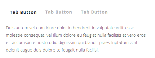
Horizontal Left
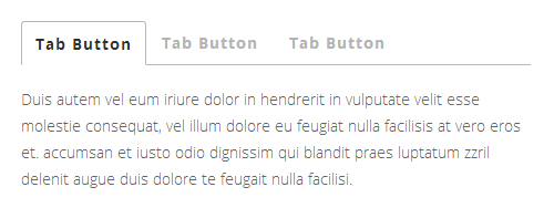
Tabs boxed
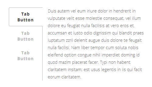
Tabs vertical left
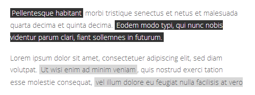
Highlights
Portfolio List
Portfolio Lists enable you to present your portfolio on a page.
- Type - You can choose between six layouts - standard, standard no space, hover text, hover text no space, masonry without space, masonry with space, masonry (pinterest) with space, masonry (pinterest) with space (image only), and justified gallery.
Portfolio Standard
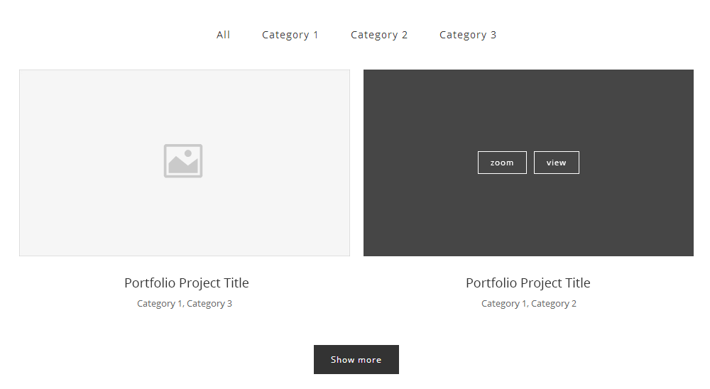
Portfolio Hover Text
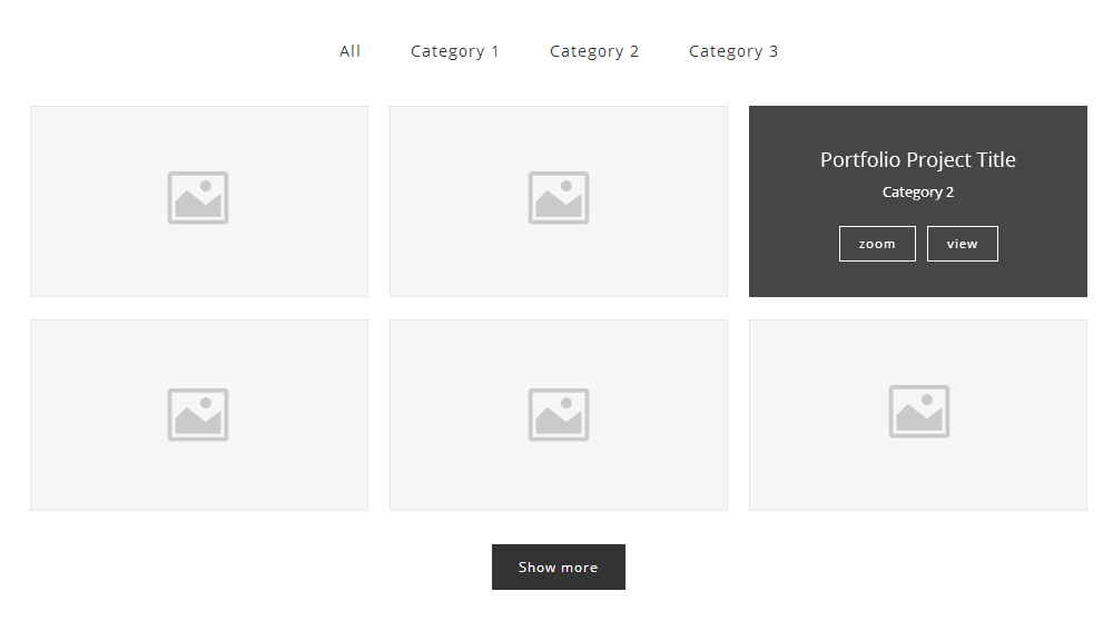
Portfolio Hover Text No Space
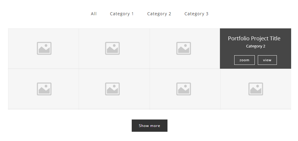
- Hover Animation Type - Choose a hover animation for the portfolio list.
- Spacing Between Items - Set spacing between items when using the Masonry (pinterest) With space Portfolio Type.
- Box Background Color - Applies when Standard and Masonry (pinterest) with space types are selected. Here you can choose a background color for the text box.
- Box Border - You can enable a border to appear around the text box.
- Columns - The portfolio list can be divided into 2, 3, 4, 5 or 6 columns.
- Portfolio Loading Type - Choose how you would like you portfolio list to load.
- Image Proportions - You can choose your image proportions here.
- Image Color Overlay - Set a color for the hover overlay. This option does not apply to the "Default" portfolio type.
- Row Height - Applies when the Justified Gallery portfolio type is selected. Set a height for the portfolio list rows.
- Last Row Behaviour - Applies when the Justified Gallery portfolio type is selected. Choose a behavior for the last row in your portfolio list.
- Justify Threshhold - Applies when the Justified Gallery portfolio type is selected. If the last row takes up more than this portion of the available width, it will be justified despite the defined alignment. Enter 1 to never justify the last row.
- Grid Size - Applies when Masonry without space type is selected. You can use either a 4 or 5 column grid layout. With the 4 column grid, 4 small images can fit across one row, or if large images are being fitted, 2 large ones will fit (a large image takes the width of 2 small ones). Likewise, with the 5 column grid, 5 small images can fit across a row.
- Order By - Portfolio items can be organized by menu order, title, or date.
- Order - Choose between ascending or descending order.
- Filter - You can show or hide the category filter, which is displayed on top of the page.
- Filter Color - Set a color for the filter.
- Filter Order By - Choose how to order the items in the filter.
- Enable Number of Items in Filter - Set this option to "Yes" if you would also like to show the number of items in each filter category.
- Lightbox - Enable or disable the lightbox effect.
- Show View Button - Set this option to "No" if you would like to hide the "View" button from you portfolio list items.
- Show Load More - Enable or disable the Load More button.
- Number - Here you can define the number of portfolio items you wish to display on the page. Enter -1 to display them all.
- Category - If you want to show portfolio items from one specific category, enter the category slug here. Alternatively, to display all categories, leave this field empty.
- Selected Projects - If you want to list specific portfolio items, enter their project IDs, separated by commas. The project ID can be found in the URL when editing the single portfolio item. For example, in www.yoursite.com/wp-admin/post.php?post=164&action=edit, the ID is 164.
- Show Title - Choose if you would like the portoflio item title to be visible or not.
- Title Tag - You can choose a heading style to apply to the project titles.
- Title Color - Set a color for the title.
- Title Font Size - Set a font size for the title.
- Text align - Choose between left, centered, or right text alignment.
- Enable Separator Below Title - You can choose to have separators appear under portfolio item titles.
- Separator Color - Set a color for the separator.
- Show Categories - Choose if you would like the portoflio item categories to be visible or not.
- Category Name Color - Set a color for the category name.
Portfolio Slider
The Portfolio Slider enables you to organize your portfolio items as an interactive slideshow which viewers can navigate through.

- Order By - Portfolio items can be organized by menu order, title, or date.
- Order - You can also choose between ascending or descending order.
- Number - Here you can define the number of portfolio items you wish to display on the page. Enter -1 to display them all.
- Category - If you want to show portfolio items from one specific category, enter the category slug here. Alternatively, to display all categories, leave this field empty.
- Selected Projects - If you want to list specific portfolio items, enter their project IDs, separated by commas. The project ID can be found in the URL when editing the single portfolio item. For example, in www(dot)yoursite(dot)com/wp-admin/post.php?post=164&action=edit, the ID is 164.
- Number of Items Shown - Set the number of portfolio items that will be shown at the same time in full width (on smaller screens/sizes, due to responsiveness, there will be less items shown).
- Lightbox - Enable or disable the lightbox effect.
- Title Tag - You can choose a heading style to apply to the project titles.
- Separator - You can enable a separator to appear between project title and category. This applies to text viewers see on image hover.
- Hide "View" Button - Set this option to "Yes" if you would like to hide the "View" button.
- Image Proportions - You can choose your image proportions here. We recommend using Landscape (500x380) for faster page loading time.
- Prev/Next Navigation - You can show or hide the navigation buttons.
Parallax Layers
You can use this shortcode to create an image composed of separate layers that follow the movement of the mouse.
- Layers - Upload your separate layers here.
- Full Screen Height - Set this option to "yes" if you would like the image to have a full screen height.
- Height - Define the height of the image.
- Content - Enter content to appear of the image layers. This content will be displayed as final (top) layer over all other layers
Counter
Counters are great for communicating information in the form of numbers.
- Type - You can choose between Zero or Random Counter.
- Zero Counters start from zero and count up to the specified number.
- Random Counters will display a random set of numbers before arriving to specified number.
- Box - You can fit the counter into a boxed layout.
- Box Border Color - Choose a color for box border, if boxed layout is enabled.
- Position - Choose between left, centered, or right alignment for the counter content.
- Digit - Enter the number you want the counter to arrive at.
- Font Size - Choose a font size (in pixels) for the counter number.
- Font Weight - You can set the boldness of the counter number.
- Font Color - Choose a color for the counter number.
- Text - Enter text you want to be displayed below counter number.
- Text Size - Enter a text size (in pixels).
- Text Font Weight - You can set the boldness of the font.
- Text Transform - You can choose a text transform style.
- Text Color - Choose a color for the text.
- Separator - You can enable a separator to appear between digit and text.
- Separator Color - Choose a color for the separator.
- Separator Transparency - Enter a value between 0 (fully transparent) and 1 (opaque)
Cover Boxes
Cover Boxes allow you to give a preview of your content in an interactive way, inviting viewers to follow the links and read more.

- Active Element - Enter the number of the cover box that you want to be active upon page load.
- Image - Upload your image here.
- Title - Enter the cover box title.
- Title Color - Choose title color.
- Text - Enter accompanying text here.
- Text Color - Choose text color.
- Link - Enter full URL of the link.
- Link Label - Enter link label here (for example, "Read More").
- Target - You can choose where the link will open:
- Self - it opens in the same tab the user was on.
- Blank - it opens in a new tab.
- Read More Button Style - Enable this option if you want the link to be displayed as a button. Otherwise, it will display as a hyperlink.
Icon List Item
They allow you to make lists using icons, rather than numbers or bullets.
- Icon Pack - Choose an icon pack to use.
- Icon - Choose an icon to be displayed.
- Icon Type - You can choose between icon with border (Circle) and icon without border (Transparent).
- Icon Size - Set a size for the icon.
- Icon Color - Choose a color for the icon.
- Icon Background Color - Choose a color for the icon background (only works if Icon Type is Circle).
- Icon Border Color - Choose a color for the icon border (only works if Icon Type is Circle).
- Title - Enter title here. This will be the content of the list.
- Title Color - Choose a color for the title.
- Title size - Enter a size for the title (in pixels).
- Title Font Weight - Set a font weight for the title.
- Margin Bottom - Set a bottom margin for this element.
Call to Action
Call to Actions allow you to display bold messages on your page, inviting viewers to follow a link.
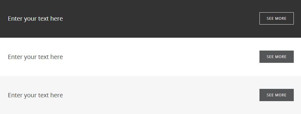
- Full Width - You can choose whether the Call to Action box will go across full width of the page, or be fitted inside a grid.
- Content in grid - You can choose whether content—text, icon, button—will go across full width of the page, or be fitted inside a grid.
- Type - The content can be text only (Normal) or text with an icon (With Icon).
- Icon - Choose an icon to be displayed.
- Icon Size - The icon can be small, medium, or large.
- Icon Color - Choose a color for the icon.
- Custom Icon - Alternatively, if you want to use a custom icon, upload it here.
- Background Color - Choose a color to be applied to the Call to Action box.
- Background Image - If you want to use an image for the box background, upload it here.
- Border Color - Choose a color for the box border.
- Padding Top - If you want to set your own padding, enter it here. This is the space (in pixels) between the text and the upper edge of the box.
- Padding bottom - If you want to set your own padding, enter it here. This is the space (in pixels) between the text and the bottom edge of the box.
- Default Text Font Size - Enter the size of the text (in pixels).
- Text Font Weight - You can set the boldness of the font.
- Text Letter Spacing - Use this option to specify the space between letters.
- Show Button - You can choose whether to show or hide button.
- Button Size - You can choose from one of the predefined button sizes.
- Button Text - Enter button text here.
- Button Link - Enter full URL of the button link.
- Button Target - You can choose where the link will open:
- Self - it opens in the same tab the user was on.
- Blank - it opens in a new tab.
- Button text color - Choose a color for the button text.
- Button hover text color - Choose a hover color for the button text.
- Button Background Color - Choose a color for the button background.
- Button Hover Background Color - Choose a hover color for the button background.
- Button Border Color - Choose a color for the button border.
- Button Hover Border Color - Choose a hover color for the button border.
- Content - Enter text to appear in the Call to Action here. You can optionally stylize it using the built-in text editor.
Blockquote
They're a great way to make a section of text stand out on your page
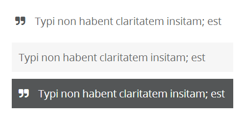
- Text - Enter blockquote text here.
- Text Color - Choose a color for blockquote text.
- Width - Content width can be reduced from original size (enter the percentage of reduction).
- Line Height - Define the amount of space in between lines of text (in pixels).
- Background Color - Choose a color for the blockquote background.
- Border Color - Choose a color for the blockquote border.
- Show Quote Icon - You can enable or disable the quotations icon.
- Quote Icon Color - Choose a color for the quotations icon.
Button
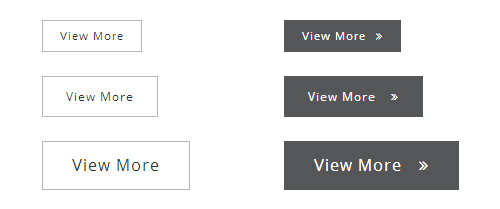
Buttons are a widely used element on the web and can be used for a multiple of purposes.
General
- Size - You can choose from one of the predefined button sizes.
- Style -Choose between a default and white button style.
- Text - Enter button text here.
- Icon - You can choose an icon to be displayed in the button.
- Link - Enter full URL of the button link.
- Link Target - You can choose where the link will open:
- Self - it opens in the same tab the user was on.
- Blank - it opens in a new tab.
- ID - Set a unique ID attribute for the button.
- Hover Type - Choose a hover type for the button.
- Color - Choose a color for the button text.
- Hover Color - Choose a hover color for the button text.
- Background Color - Choose a color for the button background.
- Hover Background Color - Choose a hover color for the button background.
- Border Color - Choose a color for the button border.
- Hover Border Color - Choose a hover color for the button border.
- Enable Button Background Gradient - Set this option to "Yes" to enable a gradient on the button background.
- Text Align - Choose between left, centered, or right text alignment.
- Margin - You can enter margins for the button in a top, right, bottom, left format (example: "25px 50px 25px 50px").
- Border Radius - Enter a border radius number (in pixels) if you want your button to have rounded corners.
Design Options
- Font Family - Choose a font family for the button text.
- Font Size - Set a size for the text.
- Letter Spacing - Set letter spacing for the text.
- Text Transform - Choose a text transform style.
- Font Style - Choose between normal and italic font styles.
- Font Weight - You can set the boldness of the font.
Image With Text
This shortcode allows you to quickly add an image with text on your page.
- Image - Upload your image here.
- Title - Enter a title for the image.
- Title Color - Choose a color for the title.
- Title Tag - You can choose a heading style to apply to the title.
- Content - Enter text here. You can optionally stylize it using the built-in text editor.
Image with Icon and Text
With this shortcode you can add an image with icon and text to your pages.
- Image - Upload your image.
- Margin Below Image - Set a bottom margin for the image.
- Icon Pack - Choose an icon pack to use.
- Icon - Choose an icon to use.
- Icon Size - Choose a predefined size for the icon.
- Icon Shape Size - Set a size for the icon background shape.
- Icon Custom Size - Set a custom size for the icon.
- Title - Input a title.
- Title Tag - Choose a heading tag for the title.
- Text - Input some text
Message
They allow you to display hints, warnings, or any other messages that you wish to communicate to your viewers.

- Type - The message can contain either text only (Normal) or text with an icon (With Icon).
- Icon - Choose an icon to be displayed.
- Icon Size - The icon can be small, medium, or large.
- Icon Color - Choose a color for the icon.
- Icon Background Color - Choose a color for the icon background.
- Custom Icon - Alternatively, if you want to use a custom icon, upload it here.
- Background Color - Choose a color to be applied to the message box.
- Border - You can enable or disable a border around the message box.
- Border Width - Enter a size (in pixels) for the border width.
- Border Color - Choose a color for the box border.
- Close Button Color - Choose a color for the close (X) button.
- Content - Enter text to appear in the message box here. You can optionally stylize it using the built-in text editor.
Numbered Process
You can use this shortcode to display your work or creative process.
- Number of Process Items - Choose a number of process items to display.
- Space Between Process Items - Choose a predefined space between the items.
- Line Between Process Items - Choose a style for the line between the items.
- Line Skin - Choose a skin for the line between the items.
When you have set up your Numbered Process shortcode, you can start adding Numbered Process Items inside it and setting the following options for each one:
General
- Image - Upload an image for this item.
- Number - Input a number.
- Title - Input a title.
- Title Tag - Choose a heading tag for the title.
Design Group
- Number Color - Set a color for the number.
- Number Background Color - Set a background color for the number.
- Title Position - Choose a position for the title.
- Title Color - Set a color for the title.
- Border Color - Set a color for the border.
- Border Width - Set a width for the border
Pie Chart
They are great for communicating information in a visual and easy to understand manner.
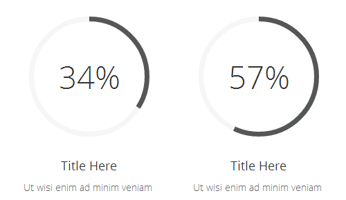
- Percentage - Enter the percentage number.
- Percentage Color - Choose a color for the percentage number.
- Percentage Font Size - Choose a font size for the percentage number.
- Percentage Font Weight - You can set the boldness of the percentage number font.
- Bar Active Color - Choose a color for the active part of the pie chart.
- Bar Noactive Color - Choose a color for the no-active part of the pie chart.
- Pie Chart Line Width - Enter a width for the pie chart line (in pixels).
- Title - Enter title here.
- Title Color - Choose a color for the title.
- Title Tag - You can choose a heading style to apply to the title.
- Text - Enter accompanying text here.
- Text Color - Choose a color for the text.
- Separator - You can enable a separator to appear between title and text.
- Separator Color - Choose a color for the separator.
Pie Chart With Icon
They are great for communicating information in a visual and easy to understand manner.
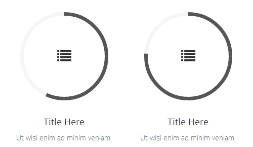
- Percentage - Enter the percentage number.
- Bar Active Color - Choose a color for the active part of the pie chart.
- Bar Noactive Color - Choose a color for the no-active part of the pie chart.
- Pie Chart Line Width - Enter a width for the pie chart line (in pixels).
- Title - Enter title here.
- Title Color - Choose a color for the title.
- Title Tag - You can choose a heading style to apply to the title.
- Icon - Choose an icon to be displayed inside the pie chart.
- Icon Size -You can choose from one of the predefined icon sizes.
- Icon Color - Choose a color for the icon.
- Text - Enter accompanying text here.
- Text Color - Choose a color for the text.
Pie Chart 2 (Pie)
They are great for communicating information in a visual and easy to understand manner.
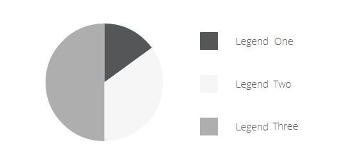
- Width - Enter a width for the pie chart (in pixels).
- Height - Enter a height for the pie chart (in pixels).
- Legend Text Color - Choose a color for legend text.
- Content - In this section, you can edit parts of the pie chart - percentages, colors, legend labels - as well as add or remove data.
Pie Chart 3 (Doughnut)
They are great for communicating information in a visual and easy to understand manner.
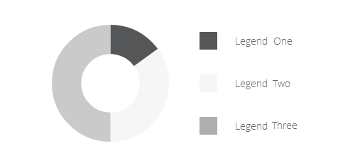
- Width - Enter a width for the pie chart (in pixels).
- Height - Enter a height for the pie chart (in pixels).
- Legend Text Color - Choose a color for legend text.
- Content - In this section, you can edit parts of the pie chart—percentages, colors, legend labels—as well as add or remove data
Progress Bar - Horizontal
They are great for communicating a large amount of information in a visual and easy to understand manner.
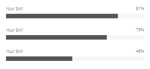
- Title - Enter title here.
- Title Color - Choose a color for the title.
- Title Tag - You can choose a heading style to apply to the title.
- Percentage - Enter the percentage number.
- Percentage Color - Choose a color for the percentage number.
- Percentage Font Size - Choose a font size for the percentage number.
- Percentage Font Weight - You can set the boldness of the percentage number font.
- Active Background Color - Choose a color for the active part of the bar.
- Active Border Color - Choose a border color for the active part of the bar.
- Inactive Background Color - Choose a color for the inactive part of the bar.
- Inactive Background Color Transparency - Enter a value between 0 (fully transparent) and 1 (opaque). This works if field above isn't empty.
- Enable Background Gradient - Set this option to "Yes" if you would like to enable a gradient for the background of active items.
- Progress Bar Height - Enter a height for the progress bar (in pixels).
- Progress Bar Border Radius - Enter a border radius number (in pixels) if you want your bar to have rounded corners.
Progress Bar - Vertical
They are great for communicating a large amount of information in a visual and easy to understand manner.
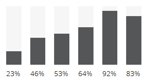
- Title - Enter title here.
- Title Color - Choose a color for the title.
- Title Tag - You can choose a heading style to apply to the title.
- Title Size - Alternatively, enter title size here (in pixels).
- Bar Color - Choose a color for the active part of the bar.
- Bar Border Color - Choose a color for the bar border.
- Background Color - Choose a color for the inactive part of the bar.
- Top Border Radius - Enter a border radius number (in pixels) if you want your bar to have rounded corners.
- Percent - Enter the percentage number.
- Percentage Text Size - Enter a text size (in pixels) for the percentage number.
- Percentage Color - Choose a color for the percentage number.
- Text - Enter accompanying text here.
Progress Bar - Icon
They are great for communicating a large amount of information in a visual and easy to understand manner.
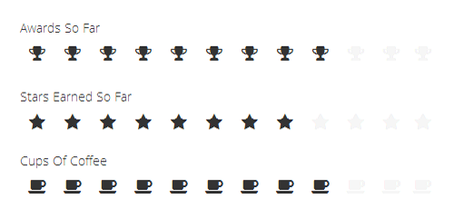
- Number of Icons - Enter the number of icons you want to appear in the progress bar.
- Number of Active Icons - Enter the number of icons to appear active.
- Type - You can choose between Normal, Circle, or Square icon type.
- Icon - Choose an icon to be displayed.
- Size - You can choose from one of the predefined icon sizes.
- Custom Size - Alternatively, enter a custom icon size here (in pixels).
- Icon Color - Choose a color for inactive icons.
- Icon Active Color - Choose a color for active icons.
- Background Color - Choose a background color for inactive icons (only for Square and Circle types).
- Background Active Color - Choose a background color for active icons (only for Square and Circle types).
- Border Color - Choose a border color for inactive icons (only for Square and Circle types).
- Border Active Color - Choose a border color for active icons (only for Square and Circle types).
Line Graph
If you wish to present your information in a more mathematical way, the Line Graph is a great choice.
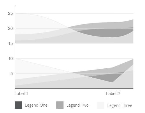
- Type - You can choose whether your line graph will have rounded or sharp edges.
- Width - Enter a width for the line graph (in pixels).
- Height - Enter a height for the line graph (in pixels).
- Custom Color - Choose a color for the x and y axis values.
- Scale Steps - Enter the number of steps which will appear on the y axis.
- Scale Step Width - You can enter the difference between two y axis steps here.
- Labels - Enter labels, separated by commas, for the x axis values here.
- Content - In this section, you can edit parts of the line graph—colors, legend labels, and data points.
Qode Pricing Tables
They're a great way to present your business' pricing packages.
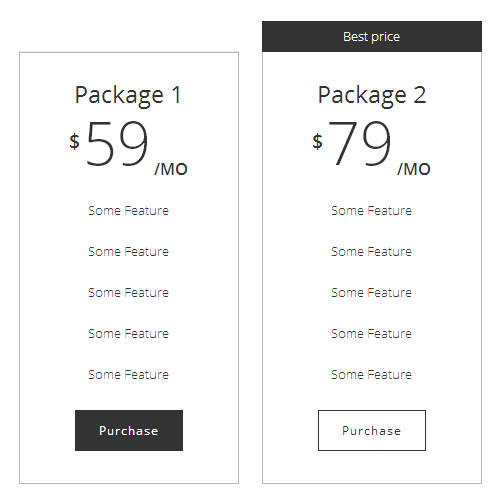
- Columns - Choose the number of pricing tables you want to display in a row.
Once you've added the Pricing Table holder, you can add pricing table elements inside it, and edit the following fields:
- Type - Choose between a Standard and Advanced Pricing Table type.
- Image - Upload an image for the Adnvanced Pricing Table type.
- Title - Name your pricing plan here.
- Title Tag - Choose a heading tag for the title.
- Subtitle - Input a subtitle for the advanced pricing table type.
- Short Info - Input a short description for the advanced pricing table type.
- Additional Info - Input additional information for the advanced pricing table type.
- Price - Enter the price.
- Currency - Enter a currency symbol.
- Price Period - Set a billing frequency (monthly, yearly, etc.).
- Show Button - You can choose whether to show or hide the button.
- Button Text - Enter button text here.
- Button Link - Enter full URL of the button link.
- Button Target - You can choose where the link will open:
- Self - it opens in the same tab the user was on.
- Blank - it opens in a new tab.
- Button Size - You can choose from one of the predefined button sizes.
- Active - If you want to emphasize this pricing table, turn this option on.
- Active Text - Enter the active label text here (for example, "Best Choice").
- Content - List your pricing plan features here. You can optionally stylize them using the built-in text editor
Social Share
Social Share enables your viewers to share your page via social networks.
- Show Share Icon - Set this option to "Yes" if you would like to display the "Share" icon.
Custom Font
If you need to use text styling that's not in one of the predefined heading or paragraph styles, you can do this by using the Custom Font shortcode.
- Font Family - Enter a font family name from the massive Google font collection (previously selected in Qode options > General > Design Style > Font Family) or some of the system font (Arial, Verdana, Times New Roman).
- Font Size - Enter font size here (in pixels).
- Line Height - Define the amount of space in between lines of text (in pixels).
- Font Style - Choose between normal and italic font styles.
- Text Align - Choose between left, centered, or right text alignment.
- Font Weight - You can set the boldness of the font.
- Color - Choose a text color here.
- Text Decoration - You can choose Underline, Overline, or Line Through.
- Text Shadow - You can enable a text drop shadow.
- Letter Spacing - Use this option to specify the space between letters.
- Background Color - Choose a text background color.
- Padding - You can enter padding for the text in a top, right, bottom, left format (example: "25px 50px 25px 50px").
- Margin - You can enter margins for the text in a top, right, bottom, left format (example: "25px 50px 25px 50px").
- Border Color - You can choose a color for the text border.
- Border Width - Enter the border width (in pixels).
- Content - Enter your text here.
- Enable Type Out Effect - Set this option to "Yes" if you would like to enable an effect where a certain word or string of words is typed out on the screen, then deleted and replaced by another word or string or words.
- Position of Type Out Effect - Enter the position of the word after which you would like to display type out effect (e.g. if you would like the type out effect after the 3rd word, you would enter "3").
- Typed Color - Set a color for the typed out text.
- Typed Endings - Here you can add the words or strings of words you would like typed out.
Dropcaps

- Type - Normal, Square and Circle
- Letter - Enter initial letter here
- Font Size - Set a font size
- Letter Color - Choose color for initial letter
- Background Color - (Only When Type are Square or Circle)
- Border Color - (Only When Type are Square or Circle)
List - Ordered
Lists are a great way to organize information and present it to potential customers.
- Content - You can enter list items and stylize them using the built-in text editor.
List - Unordered
Lists are a great way to organize information and present it to potential customers.
- Style - You can choose whether to have circles or numbers next to your list items.
- Number Type - You can choose between numbers inside circles or numbers with a transparent background.
- Animate List - Enable this option if you want the list to fade in upon page load.
- Font Weight - You can set the boldness of the font.
- Content - You can enter list items and stylize them using the built-in text editor.
Icon
Widely used on the web, icons are great for communicating all sorts of information.

- Icon - Choose an icon to be displayed.
- Size - You can choose from one of the predefined icon sizes.
- Custom Size - Alternatively, enter a custom icon size here (in pixels).
- Custom Shape Size - Enter a custom size (in pixels) for the surrounding shape of the icon (for square and circle icon types).
- Type - You can choose between Normal, Circle, or Square icon type.
- Icon Color - Choose a color for the icon.
- Icon Hover Color - Set a hover color for the icon.
- Border Radius - Enter a border radius for square icon type in pixels.
- Position - Choose between left, centered, or right icon alignment.
- Border - You can enable a square border around icon (for Square and Circle icon types).
- Border Color - Choose a color for the border (for Square icon type).
- Border Width - Set a width for the border (for Square icon type).
- Background Color - Choose a color for the icon background (for Square and Circle icon types).
- Hover Background Color - Set a hover color for the icon background.
- Margin - You can enter margins for the icon in a top, right, bottom, left format (example: "25px 50px 25px 50px").
- Icon Animation - You can choose to have the icon animate once upon page load.
- Icon Animation Delay (ms) - If you want to delay the animation and not have it immediately upon page load, enter the delay time in milliseconds.
- Link - Enter full URL of the icon link.
- Use Link as Anchor - Check the "Use this icon as Anchor" checkbox if you would like to use the icon as an anchor link instead of a regular link.
- Target - You can choose where the link will open:
- Self - it opens in the same tab the user was on.
- Blank - it opens in a new tab
Social Icons
Want to invite your viewers to follow you on social networks? Social Icons will make this easy.
- Type - You can choose between Circle, Square, or Normal icon type.
- Icon - Choose an icon to be displayed.
- Use Custom Size - You can set a custom icon size, or choose from one of the predefined sizes.
- Custom Size - Enter a custom icon size here (in pixels).
- Custom Shape Size - Enter a custom size (in pixels) for the surrounding shape of the icon (for square and circle icon types)
- Size - Choose from one of the predefined icon sizes.
- Link - Enter full URL of the icon link.
- Target - You can choose where the link will open:
- Self - it opens in the same tab the user was on.
- Blank - it opens in a new tab.
- Border Radius - Enter a border radius for square icon type in pixels.
- Icon Color - Choose a color for the icon.
- Icon Hover Color - Choose a hover color for the icon.
- Background Color - Choose a color for the icon background.
- Background Hover Color - Choose a hover color for the icon background.
- Background Color Transparency - Enter a value between 0 (fully transparent) and 1 (opaque).
- Border Width - You can set the icon border width (in pixels).
- Border Color - Choose a color for the border.
- Border Hover Color - Choose a hover color for the border.
- Icon Margin - You can enter margins for the icon in a top, right, bottom, left format (example: "25px 50px 25px 50px")
Icon With Text
This shortcode allows you to easily add icons with text to your page.
- Box Type - You can choose between Normal (no box) or Icon In a Box.
- Icon Pack - Choose an icon pack to use.
- Icon - Choose an icon to be displayed.
- Image - Alternatively, upload an image to be displayed.
- Icon Type - You can choose between Normal, Circle, or Square icon type.
- Icon/Image Position - Choose a position for the icon in relation to accompanying title and text.
- Icon Margin - You can enter margins for the icon in a top, right, bottom, left format (example: "25px 50px 25px 50px").
- Icon Size - You can choose from one of the predefined icon sizes.
- Use Custom Icon Size - Choose "Yes" if you want to use a custom icon size.
- Custom Icon Size inside a circle or square - Enter a custom icon size here (in pixels).
- Custom Icon Margin - This applies to the Left and Left From Title icon positions. Here you can set the spacing between icon and text (example: "15").
- Icon Color - Choose a color for the icon.
- Icon Hover Color - Set a hover color for the icon.
- Enable Icon Gradient - Set this option to "yes" to enable a gradient effect on the icon.
- Icon Animation - You can choose to have the icon animate once upon page load.
- Title - Enter accompanying title here.
- Title Tag - You can choose a heading style to apply to the title.
- Title Color - Choose a color for the title.
- Title Font Weight - Set a font weight for the title.
- Separator - Set this option to "Yes" to enable a separator.
- Separator Color - Set a color for the separator.
- Separator Top Margin - Set a top margin for the separator.
- Separator Bottom Margin - Set a bottom margin for the separator.
- Separator Width - Set a width for the separator.
- Text - Enter accompanying text here.
- Text Color - Choose a color for the text.
- Link - If you want to have an accompanying hyperlink, enter the full URL here.
- Link Text - Enter text for the hyperlink.
- Link Color - Choose a color for the hyperlink.
- Target - You can choose where the link will open:
- Self - it opens in the same tab the user was on.
- Blank - it opens in a new tab.
- Link Icon - Choose "Yes" to make the icon a clickable link.
Latest Posts
This shortcode allows you to display your latest blog posts on a page.
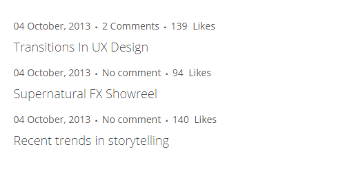
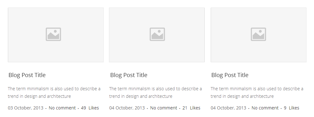
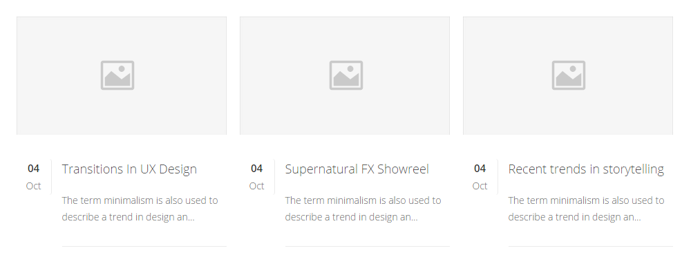
- Type - Choose a layout type for blog post display (Image on the Left, Minimal, Boxes, Image on the Left - boxed)
Image on the Left
Minimal
Boxes
Boxes With Dividers
- Set First Post as Feature - Choose if you would like to show the first post as featured post. This option is only available if you have selected "Image on the Left - Boxed" latest posts type.
- Number of Posts - Enter the number of posts you want display.
- Number of Columns - You can choose number of columns for Boxes and Boxes with Dividers types.
- Number of Rows - Choose the number of rows to use for the Boxes and Boxes with Dividers types.
- Text from edge - For the Boxes type, text can run across full width of the box, or it can have padding on the sides.
- Order By - Blog posts can be organized by title or date.
- Order - Choose between ascending or descending order.
- Category Slug - If you want to show blog posts from certain categories, enter the category slugs here, separated by commas. Alternatively, to display all categories, leave this field empty.
- Text length - Enter the number of characters, spaces included, that you want to display per post.
- Title Tag - You can choose a heading style to apply to the post titles.
- Display category - Choose whether to display the category tag.
- Display date - Choose whether to display the date.
- Display comments - Choose whether to display number of comments.
- Display like - Choose whether to turn on "likes."
- Display share - Choose whether to enable social sharing
Latest Posts 2
You can use this shortcode to display a list of your blog posts on any page on your website.
General
- Number of Posts - Enter the number of posts you want display.
- Number of Columns - You can choose number of columns for Boxes and Boxes with Dividers types.
- Order By - Blog posts can be organized by title or date.
- Order - Choose between ascending or descending order.
- Category Slug - If you want to show blog posts from certain categories, enter the category slugs here, separated by commas. Alternatively, to display all categories, leave this field empty.
- Text length - Enter the number of characters, spaces included, that you want to display per post.
- Title Tag - You can choose a heading style to apply to the post titles.
- Display Featured Images - Set this option to "Yes" if you would like to display the featured images of your blog posts.
- Image Size - Choose a size for the featured image.
- Image Width - Set a width for the featured image if you chose the "Custom" option in the Image Size field.
- Image Height - Set a height for the featured image if you chose the "Custom" option in the Image Size field.
- Image Size - Choose a size for the featured image.
Design Options
- Title Color - Set a color for the title.
- Separator Color - Set a color for the separator.
- Excerpt Color - Set a color for the post excerpt text.
- Post Info Color - Set a color for the post info text.
- Post Info Separator Color - Set a color for the post info separator.
- Background Color - Set a background color for your posts.
Blog Masonry
This shortcode allows you to display your latest blog posts in masonry style.
- Number of Posts - Enter the number of posts you want displayed.
- Order By - Blog posts can be organized by title or date.
- Order - Choose between ascending or descending order.
- Category Slug - If you want to show blog posts from certain categories, enter the category slugs here, separated by commas. Alternatively, to display all categories, leave this field empty.
- Text length - Enter the number of characters, spaces included, that you want to display per post.
- Title Tag - You can choose a heading style to apply to the post titles.
- Display date - Choose whether to display the date.
- Display comments - Choose whether to display number of comments.
Image With Text Over
Image With Text Over allows you to display interactive images.

- Width - You can choose how much of the row's width will the image take up.
- Image - Choose an image to upload.
- Image Shader Color - Set a shader color for the image overlay. You can also set an opacity for the color using the "Alpha" slider in the color picker panel.
- Image Shader Hover Color - Choose a hover color for the image overlay.
- Icon - Choose an icon to be displayed over the image.
- Icon Size - You can choose from one of the predefined icon sizes.
- Icon Color - Choose a color for the icon.
- Title - Enter title to be displayed over the image here.
- Title Color - Choose a color for the title.
- Title Size - Enter a size for the title (in pixels).
- Title Tag - You can choose a heading style to apply to the title.
- Content - Enter text which will be displayed on image hover. You can optionally stylize it using the built-in text editor.
Image Hover
Image Hover allows you to display interactive images.
- Image - Choose an image to upload.
- Hover Image - Choose a hover image to upload. This image will be seen once viewers hover over the original image.
- Link - If you want the image to have a link, enter its full URL here.
- Target - You can choose where the link will open:
- Self - it opens in the same tab the user was on.
- Blank - it opens in a new tab.
- Animation - You can choose to have the image animate once upon page load.
- Transition delay - If you want to delay the animation and not have it immediately upon page load, enter the delay time in milliseconds.
Team
This shortcode allows you to easily present your team.
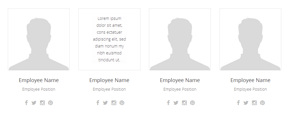
- Type - Choose a type for your team element.
- Image - Choose your team member image.
- Name - Enter his/her name.
- Title Tag - You can choose a heading style to apply to the title.
- Name Color - Set a color for the team member name.
- Position - Enter his/her position.
- Position Color - Set a color for the team member position.
- Description - Enter accompanying text here. This will be seen on image hover.
- Background Color - Choose a background color for the team box.
- Overlay Color - Set an color for the team overlay.
- Box Border - You can choose to have a border around the team box.
- Show Separator - You can enable a separator to appear under the Position text.
- Separator Color - Set a color for the separator.
- Social Icons Color - Set a color for the social icons.
- Social Icon - Choose a social icon to be displayed.
- Social Icon Link - Enter full URL of the social icon link.
- Social Icon Target - You can choose where the link will open:
- Self - it opens in the same tab the user was on.
- Blank - it opens in a new tab.
Service Table
They're a great way to present the services your business offers.
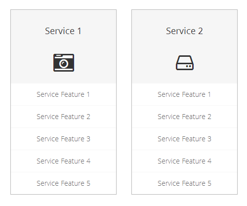
- Title - Name your service table here.
- Title Tag - You can choose a heading style to apply to the title.
- Title/Title Icon Color - Choose a color to be applied to the title and icon.
- Title Background Type - Choose whether you want the title background to have an image or solid color.
- Title Background Color - Choose a color for the title background.
- Background Image - Choose an image for the title background.
- Background Image Height - Enter a height (in pixels) for the background image.
- Icon - Choose an icon to be displayed.
- Icon Size - You can choose from one of the predefined icon sizes.
- Custom Size - Alternatively, enter a custom icon size here (in pixels).
- Content Background Color - Choose a color for the content background.
- Border Around - You can enable or disable a border around the service table.
- Border Width - You can set the border width (in pixels).
- Content - List your service table features here. You can optionally stylize them using the built-in text editor.
Qode Clients
This shortcode allows you to quickly make a display of your clients.
- Columns - Choose the number of clients you want to display in a row.
- Hover Effects - Choose a hover effect for the clients element.
- Switch Effect - Choose a switch effect when using the "Switch Images" hover type.
- Disable Clients Separators - Set this option to "Yes" if you would like to disable separators on the client elements.
Once you've added the Qode Clients holder, you can add elements inside it, and edit the following fields:
- Image - Choose your client image here.
- Link - Enter full URL for the image link.
- Link Target - You can choose where the link will open:
- Self - it opens in the same tab the user was on.
- Blank - it opens in a new tab.
Animated Icons with Text
The icons flip and text is revealed once viewers hover over the icons.
- Columns - Choose the number of icons you want to display in a row.
Once you've added the Animated Icons with Text holder, you can add elements inside it, and edit the following fields:
- Title - Enter a title here.
- Title Tag - You can choose a heading style to apply to the title.
- Text - Enter text here.
- Icon - Choose an icon to be displayed.
- Icon size - Enter a size for the icon (in pixels).
- Icon Color - Choose a color for the icon.
- Icon Background Color - Choose a color for the icon background.
- Border Color - Choose a color for the icon border.
- Icon Color on hover - Choose a color for the icon on hover.
- Icon background Color On Hover - Choose a color for the icon background on hover.
- Border Color On Hover - Choose a color for the icon border on hover.
- Enable Link - Set this option to yes if you would like to input a link for the icon to lead to.
- Link - Input the link you wish to use.
- Link Target - Set the target for the link.
Qode Process Holder
This is a great way to let potential customers find out more about what your business does, and how it does it.
- Columns - Choose the number of process items you want to display in a row.
- Line between Process - You can enable or disable a horizontal line to appear between your process items.
Once you've added the Qode Process Holder, you can add process items inside it, and edit the following fields:
- Type - You can choose to have an icon, image, or text appear in the process circle.
- Background Process Color - Choose a background color for the process circle.
- Background Process Transparency - Enter a value between 0 (fully transparent) and 1 (opaque).
- Border Process Color - Choose a border color for the process circle.
- Border Process Width - Enter the border width (in pixels).
- Icon - Choose an icon to be displayed (applies to the Icon in Process type).
- Size - You can choose from one of the predefined icon sizes.
- Icon Color - Choose a color for the icon.
- Image - Choose an image to be displayed (applies to the Image type).
- Text in Process - Enter text to appear in the process circle (applies to the Text in Process type).
- Text in Process Tag - You can choose a heading style to apply to the text.
- Text in Process Size - Alternatively, enter text size here (in pixels).
- Text in Process Color - Choose a color for the text.
- Text in Process Font Weight - You can set the boldness of the font.
- Link - Enter full URL for the process circle link.
- Link Target - You can choose where the link will open:
- Self - it opens in the same tab the user was on.
- Blank - it opens in a new tab.
- Title - Enter accompanying title here.
- Title Tag - You can choose a heading style to apply to the title.
- Title Color - Choose a color for the title.
- Text - Enter accompanying text here.
- Text Color - Choose a color for the text.
Qode Pricing List
This shortcode allows you to easily present your prices.

Once you've added the Qode Pricing List holder, you can add Pricing List Items inside it, and edit the following fields:
- Title - Enter a title for the pricing list.
- Title Color - Choose a color for the title.
- Title Font Size - Enter a font size for the title (in pixels).
- Title Tag - Alternatively, you can choose a heading style to apply to the title.
- Text - Enter the body text here.
- Text Color - Choose a color for the text.
- Text Font Size - Enter a font size for the text (in pixels).
- Price - Enter the price here. You can include any currency symbol.
- Price Color - Choose a color for the price.
- Price Font Size - Enter a font size for the price (in pixels).
Advanced Pricing List
You can use this shortcode to create an advanced pricing list.
General
- List Title - Input a title for the list.
- Pricing Items - Here you can add items to the list.For each item you can set a title, a description, and a price.
Style
- List Title Tag - Choose a heading tag for the list title.
- List Title Alignment - Choose an alignment for the list title.
- List Title Margin Bottom - Set a bottom margin for the list title.
- List Title Color - Set a color for the list title.
- Line Style - Choose a style for the line between item titles and prices.
- Line Color - Set a color for the line between item titles and prices.
- Item Title Tag - Choose a heading tag for the item titles.
- Item Title Color - Set a color for the item titles.
- Item Description Color - Set a color for the item description text.
Qode Elements Holder
The Qode Elements Holder allows you to display any combination of elements in an organized column structure.

- Background Color - Choose a background color for the elements holder.
- Columns - Choose the number of elements you want to display in a row.
- Columns Proportion - If you choose to use two columns in the elements holder, you can set their proportions here.
- Width & Responsiveness - You can use the Width & Responsiveness tab to define at which breakpoint the Elements Holder will switch to one column, and set an alignment in responsive mode.
Once you've added the Qode Elements Holder, you can add Elements Holder Items, and edit the following fields:
- Background Color - Choose a background color for the elements holder item.
- Background Image - Set a background image for the elements holder item.
- Padding - You can enter padding for the element in a top, right, bottom, left format (example: "25px 50px 25px 50px").
- Vertical Alignment - Set a vertical alignment for the Elements Holder Item.
- Horizontal Alignment - Set a horizontal alignment for the Elements Holder Item.
-
Advanced Scroll Animations – Choose "Yes" if you wish to use your own CSS animations. You can choose when the animations will start and end in the "Animation Start Position" and "Animation End Position" fields. Please note that you must fill out both of the following fields in order for them to work. You can enter any CSS.
- Start Animation Style – Enter the starting animation style (example: opacity:1; transform:scale(1);).
- End Animation Style – Enter the ending animation style (example: opacity:0; transform:scale(2);).
Now that you've added the element holder item, you can add any element from the list of shortcodes.
Qode Image Slider
The Qode Image Slider is a great way to showcase your images.
- Images - Here you can upload images to be displayed in the slider.
- On Click - Choose image behavior on click.
- Slider Height - Define slider height in pixels.
- Navigation Style - You can choose between light or dark navigation buttons.
- Highlight Active Image - Choose "Yes" if you wish to highlight the active image by whiting out the others.
- Highlight Inactive Color - Set a color for the overlay of inactive images.
- Highlight Inactive Opacity - Set an opacity for the overlay of inactive images.
Countdown
The Countdown shortcode allows you to present a timer on your page which counts down to some event of your choice.
- Year, Month, Day, Hour, Minute - Use these fields to specify how far away is your event, in order to set the timer.
- Month, Day, Hour, Minute, and Second Labels - If you wish to use labels other than the default "Months," "Days," etc., you can enter them here. You can also enter separate labels for singular variants.
- Color - Choose a color to be applied to the digits, labels, and separators (if enabled).
- Digit Font Size - Enter a font size (in pixels) for the digits.
- Label Font Size - Enter a font size (in pixels) for the labels.
- Font Weight - Choose a font weight to be applied to the digits and labels.
- Show separator - You can enable a separator to appear between digits and labels.
Qode Vertical Split Slider
Blog Slider
- Slider Type - Choose the type of slider you would like to use.
- Auto Start - Set this option to "Yes" if you would like to enable automatic changing of slides in the blog slider.
- Post Info Position - Choose a position for the post info.
- Image size – Set the proportions you would like blog images to display in.
- Image Width - Set a width for the image if you choose "Custom" image size.
- Image Height - Set a height for the image if you choose "Custom" image size.
- Order By – Select how to order your blog posts. Blog posts can be ordered by Menu Order, Title, or Date.
- Order – Choose between ascending and descending order.
- Number – Set the number of blog posts to display in the blog slider.
- Number of Blog Posts Shown – Choose number of posts that will display across full width of the screen (less will be shown on smaller screens, due to responsiveness).
- Category – If you would like to display only certain posts in the blog slider, input the category slugs of the categories you would like to display in this field, delimited by commas. Leave the field empty to display all categories.
- Selected Projects – If you would like to display only certain posts in the blog slider, enter the IDs of those posts here.
- Info Box Color – Set a color for the info box.
- Show Category Names – Select whether you would like to display category names on your blog slider.
- Category Name Color – Set a color for your category names.
- Day Color - Set a color for the Day post info.
- Day Font Size - Set a font size for the Day post info.
- Mont Color- Set a color for the Month post info.
- Month Font Size - Set a font size for the Month post info.
- Show Date – Choose "Yes" if you wish the date to be displayed.
- Date Color – Set a color for the date.
- Show Author - Set this option to "Yes" if you would like to show the author name.
- Author Color - Set a color for the author's name.
- Title Tag – Set the heading tag for the post title.
- Title Color – Set the color for the title.
- Show Excerpt - Set this option to "Yes" if you would like to display the post excerpt.
- Excerpt Length - Define the lenght of the post excerpt.
- Show Comments - Set this option to "Yes" if you would like to display the number of post comments in your post info.
- Comments Color - Set a color for the comments post info.
- Show Read More Button - Set this option to "Yes" if you would like to show the "Read More" button.
- Prev/Next navigation – Select whether you would like the previous and next navigation to be displayed.
- Extra class name – If you wish to style this particular blog slider differently, you can use this field to add an extra class name to it and then refer to that class name in your css file.
Qode Google Map
- Address 1-5 - Use these fields to input up to 5 addresses to display on your map.
- Map Height - Define a height for your map.
- Pin - Upload a custom pin image to use on your map.
- Snazzy Map Style - Set this option to "Yes" if you would like to enable the snazzy map style for your maps. You can then go to www.snazzymaps.com to find a map style and input the code for that style into the field below.
- Snazzy Map Code - Input the code from www.snazzymaps.com to add a predefined style for your google map.
- Custom Map Style - Set this option to "Yes" if you would like to define a custom style for your map.
- Color Overlay - Choose a color for the map overlay.
- Saturation - Set a saturation level, from -100 (least saturated) to 100 (most saturated).
- Lightness - Set a lightness level, from -100 (darkest) to 100 (lightest).
- Map Zoom - Set a zoom level for the map, from 0 (whole world) to 19 (individual buildings).
- Zoom Map on Mouse Wheel - Set this option to "Yes" if you would like the user to be able to zoom in and out on the map with their mouse wheel.
Qode Animation Holder
You can use this element to animate other shortcodes. To do this, simply place the shortcode you would like to animate into the Animation Holder.
- Animation Type - Choose an animation type.
- Animation Delay - Set a delay time (in seconds) for the animation.
Qode Video Box
- Video Link - Input a link to the video you would like to display in the video box.
- Image - Upload an image to display before the video starts playing.
Product List - Elegant
General
- Per Page - Choose how many products you would like to display per page.
- Columns - Choose how many columns you would like to display the products in.
- Category Slug - If you would like to display products from only certain categories, you can enter the category slugs here, separated by commas.
- Order By - Choose how you would like to order the products.
- Order - Choose between ascending and descending order.
- Product Title Tag - Choose a heading tag for the product titles.
Design Options
- Holder Padding - Set padding for the product holder in a top, right, bottom, left format (i.e. 10% 0 10% 0).
- Separator Color - Set a color for the separator.
- Price Color - Set a color for the price.
- Price Font Size - Set a font size for the price.
- Button Size - Choose a predefined size for the button.
- Button Hover Type - Choose a hover type for the button.
Product List - Masonry
You can use this shortcode to display shop items in a masonry layout.
General
- Per Page - Choose how many products to show per page.
- Columns - Choose the number of columns to display the products in.
- Category Slug - If you would like to display products from only certain categories, please enter the category slugs here, seperated by commas.
- Order By - Choose how you would like to order the products.
- Order - Choose between an ascending and descending order.
- Product Title Tag - Choose a heading tag for the product title.
- Image Proportions - Choose in what proportions you would like to display your product images.
- Show Separator - Set this option to "Yes" if you would like to display a separator.
Design Options
- Hover Background Color - Choose a background color to appear on hover.
- Category Color - Choose a color for the category text.
- Separator Color - Choose a color for the separator.
- Price Color - Choose a color for the product price.
- Price Font Size - Set a font size for the price
Product List - Pinterest
You can use this shortcode to display shop items in a pinterest style layout.
General
- Per Page - Choose how many products to show per page.
- Columns - Choose the number of columns to display the products in.
- Category Slug - If you would like to display products from only certain categories, please enter the category slugs here, seperated by commas.
- Order By - Choose how you would like to order the products.
- Order - Choose between an ascending and descending order.
- Product Title Tag - Choose a heading tag for the product title.
Design Options
- Hover Background Color - Choose a background color to appear on hover.
- Category Color - Choose a color for the category text.
- Separator Color - Choose a color for the separator.
- Price Color - Choose a color for the product price.
- Price Font Size - Set a font size for the price.
Qode Horizontal Marquee
You can use the Horizontal Marquee element to create a interactive presentation that can contain any shortcode.
- Height - Set a height for the Horizontal Marquee.
- Spacing - Set a spacing between marquee items.
- Behavior - Choose a behavior for the marquee.
- Enable Appear Effect - Set this option to "Yes" if you would like to enable an appear effect when scrolled to the horizontal marquee. This option is only available if you have selected the "Loop" behaviour for the marquee.
After you have set up the Horizontal Marquee element, you can start adding Horizontal Marquee items into it, and setting the following options:
- Width - Set a width for the item (in pixels).
- Vertical Alignment - Choose a vertical alignment for the content of the item.
Now you can add any other shortcode into the Horizontal Marquee item.
Qode Preview Slider
You can use this shortcode to create a slider in which each slide displays a main image, and a preview image that is set in a frame. After you have added the Preview Slider to your page, you can start adding Preview Slider Items into it. Each Preview Slider Item functions as a slide, and you can set the following options for each one:
- Main Image - Set a main image for the slider.
- Preview Image - Set a preview image for the slider.
- Link - Input a URL for the slide to lead to when clicked.
- Link Target - Choose whether the link will open in a new browser tab ("self") or the same one ("blank").
Qode In-Device Slider
- Device - Choose the device in which you would like the slides to be shown.
- Image Titles on Hover? - Set this option to "Yes" if you would like to display the titles of your images on hover.
- Show Navigation Arrows? - Set this option to "Yes" if you would like to display navigation arrows on the slider.
- Autostart Slideshow - Set this option to "Yes" if you would like the slides to change automatically.
- Time Between Slides - Set the amount of time (in milliseconds) you would like to pass before the slide changes.
After you have set up the in-device slider, you can add in-device slider items to it and set the following options for each one:
- Image - Upload an image.
- Title - Enter a title for this slider item.
- Link - If you would like the slider item to lead to some other page when clicked on, add the link URL in this field.
- Link Target - Choose whether you would like the link to be opened in the same tab ("self") or a new one ("blank").
Qode Content Slider
You can use this shortcode to create a slider that can contain any other shortcode or content inside it.
- Auto Rotate - Choose how many seconds you would like to pass before the current slide changes. You can also disable auto rotate here.
- Enable Drag - Set this option to "Yes" if you would like to enable the slides to be draggable.
- Show Direction Navigation - Set this option to "Yes" to enable navigation arrows on the slider.
- Show Control Navigation - Set this option to "Yes" to enable navigation bullets on the slider.
- Pause on Hover - Set this option to "Yes" if you would like to pause the slider auto rotation when the user hovers over the slider with their mouse.
After you have set up the Content Slider, you can add Content Slider Items into it. Each Content Slider Item is a separate slide in the slider, and you can add any shortcode into it.
Qode Twitter Feed
You can use this widget to display your Twitter feed anywhere on your pages. To do this, you first need to go to Qode Options > Social, and click the Connect with Twitter button.
General
- User ID - Input your Twitter user ID. You can find your user ID at the following link: http://mytwitterid.com/
- Number of Tweets - Set the number of tweets to display.
- Show Tweet Time - Set this option to "Yes" if you would like to display the time the tweet was posted
Design Options
- Author Name Color - Set a color for the author name.
- Screen Name and Date Color - Set a color for the author's screen name and the date.
- Text Color - Set a color for the tweet text.
Banner
You can use this shortcode to create a promotional banner.
- Image - Upload the image for your banner.
- Link - Enter a URL link for the banner to lead to.
- Target - Choose whether you would like the link to open in the same browser tab ("Self") or a new browser tab ("Blank").
- Vertical Alignment - Choose a vertical alignment for the banner content.
- Content - Input the text you would like on the banner.
Text Marquee
You can use this shortcode to create a section with text that scrolls across the screen from left to right.
- Title - Input a title for the marquee
- Title Color - Choose a color for the title.
Expanding Images
You can use this shortcode to create an image gallery with one hero image and up to 8 surrounding images, which have an expanding animation when the shortcode comes into the viewport.
General
- Hero Image - Upload the main, central image. This image will be set inside a laptop frame and surrounded by the other images.
- Link - Input a URL for the hero image to link to when clicked on.
- Target - Choose whether the link will open in the same browser tab ("Self") or a new browser tab ("Blank").
- Title - Enter a title for the link.
In the Inner Side Images and Outer Side Images tabs, you can upload the remaining images you would like to display around the hero image, and add a link to each of these images.
Cards Slider Holder
You can use this shortcode to create a slider with tabbed cards. Each card can display its own set of slides. After you have created a Cards Slider Holder, you can start adding Cards Slider shortcodes into it and setting the following options for each one:
- Card Header Image - Upload an image for the card header.
- Card Background Color - Set a background color for the card.
- Slider Images - Upload slider images to use in this card.
- Set Middle Slide as Active on Load - Set this option to "Yes" if you would like the middle slide to be active on load.
- Center Slider - Set this option to "Yes" if you would like to center the slider on your page.
- Border Radius - Set this option to "Yes" if you would like the edges of the slides to be curved.
- Box Shadow - Set this option to "Yes" if you would like to enable a shadow effect on the slider.
- Hover Animaton - Set this option to "Yes" to enable a hover animation on the slides.
- Show Navigation Bullets - Set this option to "Yes" to display navigation bullets on the slider.
Item Showcase
You can use this shortcode to create a showcase for a product or other item. The shortcode consists of a central image, and surrounding icons with text that can be used to describe the central image and provide more information about it.
- Image - Upload an image.
- Image Top Offset - If necessary, input a top offset for the image.
After you have added the Item Showcase shortcode, you can start adding Item Showcase List Items to it and setting the following options:
- Icon Pack - Choose an icon pack to use.
- Icon - Choose an icon.
- Item Position - Choose whether this item will be displayed to the left or right of the central image.
- Item Title - Input a title.
- Item Text - Input some text for this item.
- Item Link - Input a URL link for this item to lead to when clicked on.
- Icon Color - Set a color for the icon.
- Icon Background Color - Set a background color for the icon.
Crossfade Images
You can use this shortcode to create an image that fades into another image when hovered on.
General
- Initial Image - Upload the initial image.
- Hover Image - Upload the image you would like to appear on hover.
- Title - Enter a title.
- Link - Enter a link for the image to lead to.
- Link Target - Choose whether you would like the link to open in the same browser tab or a new browser tab.
Design Options
- Background Color - Choose a background color for the image.
Gradient Icon With Text
You can use this shortcode to create a stylized icon with text. On hover, the icon will switch from a solid color to a gradient.
General
- Icon Pack - Choose an icon pack to use.
- Icon - Choose an icon.
- Title - Input a title.
- Link - Input a link.
- Target - Choose whether you would like the link to open in the same browser tab ("self") or a new browser tab ("blank").
Icon Settings
- Icon Size - Choose a predefined size for the icon.
- Custom Icon Size - Alternatively, set a custom size for the icon.
- Icon Color - Set a color for the icon.
Text Settings
- Title Tag - Choose a heading tag for the title.
- Title Text Transform - Choose a text transform style for the title.
- Title Text Font Weight - Choose a font weight for the title.
- Title Color - Set a color for the title.
Button V2
You can use this shortcode to create a stylized button
General
- Text - Input text to display on the button.
- Link - Input a link for the button to lead to.
- Link Target - Choose whether you would like the link to open in the same browser tab ("self") or a new browser tab ("blank").
- Custom CSS Class - If you wish to style particular content element differently, then use this field to add a class name and then refer to it in your CSS file.
- Icon Pack - Choose an icon pack to use.
- Icon - Choose an icon to use.
Design Options
- Color - Set a color for the button text.
- Hover Color - Set a color for the button text on hover.
- Background Hover - Set a background color for the button.
- Hover Background Color - Set a background color for the button on hover.
- Icon Left Border Color - Set a color for the left border of the icon.
- Hover Icon Left Border Color - Set a color for the left border of the icon on hover.
- Icon Background Color - Set a background color for the icon.
- Icon Background Hover Color - Set a hover color for the icon background.
- Enable Shadow - Set this option to "Yes" if you would like to enable a shadow on the button.
- Enable Icon Gradient - Set this option to "Yes" to enable a gradient overlay on the icon.
- Enable Icon Square - Set this option to "Yes" if you would like the icon background to be a square.
- Font Family - Choose a font family for the button text.
- Font Size - Set a size for the text.
- Font Weight - You can set the boldness of the font.
- Text Transform - Choose a text transform style.
- Font Style - Choose between normal and italic font styles.
- Letter Spacing - Set letter spacing for the text.
- Icon Font Size - Set a font size for the icon.
- Margin - Set a margin for the button. Please input the margin in a topright bottom left format (e.g. 5px 10px 5px 10px).
Advanced Options
- Hover Effect - Choose a hover effect for the button.
- Enable Background Gradient - Set this option to "Yes" to enable a gradient effect on the button background.
Call to Action Section
You can use this shortcode to create a section with a background image, title, text, and call to action.
General
- Section Image - Upload a background image for the section.
- Title - Input a title for the section.
- Description - Input a description for the section.
- Link - Input a link for the call to action button.
- Link Text - Input text to display on the button.
- Link Target - Choose whether you would like the link to open in the same browser tab or a new browser tab.
Design Options
- Background Color - Set a background color for the section.
Advanced Options
- Appear Animation Effect - Set this option to "Yes" if you would like the section to have an animation effect when it comes into the viewport.
Sliding Image Holder
Use this shortcode to create a section with a background image that slides from the right to the left.
- Image - Upload your image. The recommended width of the image is 1920px.
After you have set up the Sliding Image Holder, you can start adding content inside it.
Info Card
You can use this shortcode to create an informative card element.
- Image - Upload an image to display at the top of the card.
- Info Card Background Color - Select the color for the info card background.
- Title - Input a title for the card.
- Title Tag - Set a heading tag for the title.
- Text - Input some text to display on the card.
- Info Card Text Color - Set the color for the info card text.
- Enable Button - Set this option to "Yes" if you would like to display a button on the card.
- Button Link - Input a link for the button to lead to.
- Button Target - Choose whether you would like the button to open in the same browser tab ("Self") or in a new browser tab ("Blank").
- Button Text - Input the text you would like to display on the button.
- Button Background Color - Set a background color for the button.
- Button Height - Set a height for the button.
Info Card with Icon
You can use this shortcode to create an informative card element with an icon.
General
- Image - Upload an image to display.
- Icon Pack - Choose an icon pack to use.
- Title - Input a title.
- Title Tag - Choose a heading tag for the title.
- Text - Input some text to display.
- Link - Input a link for the card to lead to when clicked on.
- Target - Choose whether you would like the link to open in the same browser tab ("Self") or in a new browser tab ("Blank")
Icon Style
- Icon Size - Choose a predefined size for the icon.
- Icon Custom Size - Set a custom size for the icon.
- Icon Shape Size - Set a size for the icon background shape.
- Icon Color - Set a color for the icon.
- Icon Background Color - Set a background color for the icon.
- Hover Icon Color - Set a hover color for the icon.
- Hover Icon Background Color - Set a backround color for the icon on hover
Elliptical Slider
You can use this shortcode to create a stylized slider displaying an image on one side and a curved section with a background color on the other. You can add content in to the curved section.
- Animation Speed - Set a speed (in milliseconds) for the slide animation.
- Autoplay - Set this option to "Yes" if you would like the slider to automatically change slides.
After you have set up the Elliptical Slider, you can start adding Elliptical Slides inside it and setting the following options for each one:
- Image - Upload an image for this slide.
- Elliptical Section Background Color - Set a color for the elliptical section.
Now you can add content into the slide.
Specification List
You can use this shortcode to create a list of specifications for a product.
- Image - Upload an image to display at the top of the list.
- Title - Input a title for the list.
- Title Tag - Set a heading tag for the title.
- List Items - Here you can add items to the list, and set a label and a value for each item. The label will be displayed at the left side of the list, and the value on the right.
- Enable Button - Set this option to "Yes" if you would like to display a button below the list.
- Button Link - Input a link for the button to lead to.
- Button Target - Choose whether you would like the link to open in the same browser tab ("Self") or in a new browser tab ("Blank").
- Button Text - Input the text you would like to display on the button.
- Button Background Color - Set a background color for the button.
- Button Height - Set a height for the button.
Pricing Calculator
You can use this shortcode to create an element listing your products or services which users can use to calculate the total price of the products or services they are interested in.
General
- Title - Input a title for the calculator.
- Title Tag - Choose a heading tag for the title.
- Currency - Input a currency to use.
- Text - Input some text to display beneath the title.
- Pricing Items - Here you can add your items. For each item you can input a title and a price, and choose whether the item will be initially active or not.
- Items Title Tag - Choose a heading tag for the item titles.
- Enable Button - Set this option to "Yes" if you would like to display a button beneath the total price.
- Button Link - Input a link for the button to lead to when clicked on.
- Button Target - Choose whether the link will open in the same browser tab ("Self") or in a new browser tab ("Blank").
- Button Text - Input the text you would like to display on the button
Style
- Border Color - Set a color for the border.
- Left Section Background Color - Set a background color for the left side of the calculator.
- Right Section Background Color - Set a background color for the right side of the calculator.
Comparative Features Table
You can use this element to create a table of your services that allows the user to comapre the features each service offers.
- Columns - Choose how many columns you would like to display the features in.
- Table Title - Input a title for the table.
- Title Tag - Choose a heading tag for the title.
- Feature Title Tag - Choose a heading tag for the feature titles.
- Column Title - Input a title for each of the columns in the table.
- Feature - Here you can add features into the table. For each feature you can input a title and choose in which columns it will be displayed as active.
- Column Link - If you would like to add a link at the bottom of the column, input the link here.
- Target - Choose whether you would like the link to open in the same browser tab ("Self") or in a new browser tab ("Blank").
- Column Link Text - Input the text you would like to display on the link.
- Table Footer Image - Upload an image to display in the table's footer.
- Table Footer Text - Input some text to display in the table's footer.
Advanced Tabs
You can use this shortcode to display certain content in tabs.
- Title Layout - Choose a layout for the tab title.
- Title Tag - Choose a heading tab for the title.
After you have set up the advanced tabs shortcode, you can start adding individual Advanced Tabs inside it and setting the following options for each one:
- Icon Pack - Choose an icon pack to use in the tab title.
- Icon - Choose an icon to display in the tab title.
- Title - Input a title for this tab.
Now you can add any shortcode inside the tab.
Blog Carousel - Titled
You can use this shortcode to display your blog posts in a carousel.
General
- Title - Input a title for the carousel.
- Posts Title Tag - Choose a heading tag for the post's title.
- Image Size - Choose a predefined size for your post's title images.
- Excerpt Lenght - Input the maximum number of characters to display in the post excerpts.
- Number of Blog Posts Shown - Set how many blog posts you would like visible in the carousel at the same time.
Build Query
- Number - Choose how many blog posts you would like to display in the carousel.
- Order By - Choose how you would like to order the posts.
- Order - Choose between an ascending and descending order.
- Category - If you would like to display only posts from certain categories, input the category slugs here. Please delimit the slugs with commas.
- Selected Posts - If you would like to display only certain posts, input the post IDs here. Please delimit the IDs with commas
Style
- Title Background Color - Set a background color for the post titles.
- Title Color - Set a color for the post titles.
Advanced Call to Action
You can use this shortcode to create a call to action that displays an icon and text in the middle of the call to action bar, and which can have a gradient effect and gradient animation.
General
- Call to Action Text - Input the text you would like to display in the call to action bar.
- Call to Action Link - Input the link you would like the call to action to lead to when clicked on.
- Link Target - Choose whether you would like the link to open in the same browser tab ("Self") or in a new browser tab ("Blank").
- Icon Pack - Choose an icon pack to use.
- Icon - Choose an icon to display in the call to action bar.
Design Options
- Color - Set a color for the call to action text.
- Font Size - Set a font size for the call to action text.
- Font Weight - Set a font weight for the call to action text.
- Icon Color - Set a color for the icon.
- Icon Font Size - Set a font size for the icon.
- Font Weight - Set a font weight for the icon.
- Icon Left Margin - Set a left margin for the icon.
- Icon Border Shape - Choose a shape for the icon border.
- Icon Border Shape Size - Set a size for the icon border shape.
- Icon Horizontal Offset Adjust - You can use this field to adjust the icon horizontal alignment with the border shape.
- Icon Vertical Offset Adjust - You can use this field to adjust the icon vertical alignment with the border shape.
- Shortcode Height - Set a height for the call to action bar.
Advanced Options
- Enable Gradient - Set this option to "Yes" to enable a gradient effect on the call to action bar background.
- Enable Gradient Animation - Set this option to "Yes" if you would like the gradient to be animated
Restaurant Menu List
You can use this shortcode to display a list of your restaurant menu items.
General
- Title - Input a title for your restaurant menu list.
- Label - Input a label for your restaurant menu list.
- Sublabel - Input a sublabel for the restaurant menu list.
- Show Featured Image - Set this option to "Yes" to display each item's featured image in the restaurant menu list.
- Skin - Choose a skin for the restaurant menu list.
- Padding - Input padding values for the restaurant menu list.
Query and Layout Options
- Order By - Choose how you would like to order the items in the list.
- Order - Choose between an ascending and descending order.
- Restaurant Menu Category - If you would like to display only items from a certain category, enter the category slug here.
- Number of Restaurant Menu Items - Choose how many items you would like to display in the list. If you would like to display all your items, input "-1".
Restaurant Timeline
You can use this shortcode to create a stylized timeline.
- Restaurant Items - Here you can add individual items to your timeline. Add new items by clicking on the "+" sign. For each item you can set a title, some text, and an image.
Reservation Form
You can use this shortcode to add a reservation form powered by OpenTable to you website.
- OpenTable ID - Input your OpenTable ID.
- Skin - Choose a skin for the reservation form.
Working Hours
You can use this shortcode to display your business's working hours. To set up your working hours, please navigate to Qode Options -> Restaurant.
- Title - Input a title for your working hours section.
- Label - Input a label for your working hours section.
- Sublabel - Input a sublabel for your working hours section.
- Items Title Tag - Choose a heading tag for the titles.
Listing List
You can use this shortcode to display a list of your listing items.
- Skin - Choose a skin to use.
- Listing Type - Choose the type of listing you would like to display.
- Listing Category - Choose the listing category you would like to display.
- IDs of Listed Items - Input the IDs of the listings you would like to display in the list.
- Number of Items - Choose a number of listing items to display in the list.
- Number of Columns - Choose a number of columns in which to display the listing items.
- Space Between Listings - Choose a predefined spacing between listings.
Listing Slider
You can use this shortcode to display your listing items in a slider.
General
- Skin - Choose a skin to use.
- Listing Type - Choose the type of listing you would like to display.
- Listing Category - Choose the listing category you would like to display.
- IDs of Listed Items - Input the IDs of the listings you would like to display in the slider.
- Number of Items - Choose a number of listing items to display in the slider.
- Number of Columns - Choose a number of columns for the listings to be displayed in.
- Space Between Listings - Choose a predefined spacing between listings.
Slider
- Enable Slider Loop - Set this option to "Yes" if you would like the slider to loop back to the first slide after it has displayed the last slide.
- Enable Slider Autoplay - Set this option to "Yes" if you would like the slider to automatically change slides.
- Slide Duration - Input a duration (in milliseconds) to pass before slides automatically change.
- Slide Animation Duration - Input a duration (in milliseconds) for the slide animation to last.
- Enable Slider Navigation Arrows - Set this option to "Yes" if you would like to display navigation arrows on the slider.
- Enable Slider Pagination - Set this option to "Yes" if you would like to display pagination bullets on the slider.
Listing Categories
You can use this shortcode to display your listing categories.
- Listing Type - Choose the listing type whose categories you would like to display.
- Show Only Listed Categories - If you would like to display only certain categories, input the categories you would like to display here.
- Number of Items - Choose a number of categories to display.
Listing Regions
You can use this shortcode to display your listing regions.
- Show Only Listed Regions - Input the names of the regions you would like to display.
- Number of Items - Input how many regions you would like to display.
Listing Search
You can use this shortcode to create a search field for your listings.
- Skin - Choose a skin to use.
- Enable Search by Keyword - Set this option to "Yes" if you would like users to be able to search by keyword.
- Enter Keyword Text - Input the placeholder text you would like to display in the "Keyword" field.
- Enable Search by Type - Set this option to "Yes" if you would like users to be able to search listings by their type.
- Enter Type Text - Input the placeholder text you would like to display in the "Type" field.
- Enable Search by Region - Set this option to "Yes" if you would like users to be able to search by region.
- Enable Search by Price - Set this option to "Yes" if you would like users to be able to search by price.
- Show Price Slider - Set this option to "Yes" if you would like to display a price slider instead of an empty field in which the users need to input their price.
- Enter Price Text - Input the placeholder text you would like to display in the "Price" field.
- Enter Button Text - Input the text you would like to display on the "Search" button (the default text is "Find Listings").
Listing Advanced Search
You can use this shortcode to create an advanced search section for your listings.
- Listing Type - Choose the type of listings you would like to display in the advanced search.
- Number of Items - Choose the number of listing items you would like to display in the advanced search.
- Listing Title - Input a title for the advanced search section.
- Listing Subtitle - Input a subtitle for the advanced search section.
- Enable Load More - Set this option to "Yes" if you would like to display a "Load More" button in the advanced search section.
- Content in Grid - Set this option to "Yes" if you would like to place the advanced search section content in grid.
- Enable Map - Set this option to "Yes" if you would like to display a map in the advanced search section.
- Map in Grid - Set this option to "Yes" if you would like the map to be in grid.
- Enable Keyword Search - Set this option to "Yes" if you would like to allow users to search by keyword.
- Sidebar Banner - Set this option to "Yes" if you would like to display a banner in the sidebar of the advanced search section.
- Banner Image - Upload a banner image to display.
- Banner Text - Input text for the banner.
- Banner Link - Input a link for the banner to lead to when clicked on.
Listing Banner
You can use this shortcode to create a banner specifically stylized to fit in with listing layouts.
- Background Image - Upload a background image for the banner.
- Icon Pack - Choose an icon pack to use.
- Icon - Choose an icon to use.
- Number - Input a number to display on the banner.
- Title - Input a title for the banner.
- Link - Input a link for the banner to lead to when clicked on.
- Link Target - Choose whether the link will open in the same browser tab ("Self") or in a new browser tab ("Blank").
- Skin - Choose a skin for the banner.
Listing Blog List
You can use this shortcode to create a blog list specifically stylized to fit in with listing layouts.
- Category - Input the category slugs of the categories you would like to display in the blog list. Please delimit the category slugs with commas. If you would like to display all posts from all categories, leave this field empty.
- Number - Input the number of posts you would like to display.
- Order By - Choose how you would like to order the posts in the list.
- Order Type - Choose between an ascending and descending order.
- Title Tag - Choose a heading tag for the title.
Listing Testimonials
You can use this shortcode to display your testimonials in a layout specifically stylized to fit in with listing layouts.
- Category - Input the category slugs of the categories you would like to display. Please delimit the category slugs with commas. If you would like to display all testimonials from all categories, leave this field empty.
- Number - Input the number of testimonials you would like to display.
- Order By - Choose how you would like to order the testimonials.
- Order Type - Choose between an ascending and descending order.
Layout 1
You can use this shortcode to display your posts in a certain layout.
General
- Number of Posts - Set a number of posts to display.
- Number of Columns - Set a number of columns to display the posts in.
- Space Between Items - Set a predefined spacing betwen posts.
- Category - If you would like to display only posts from certain categories, input the categories here.
- Author - If you would like to display only posts from certain authors, input the authors here.
- Tag - If you would like to show only posts with certain tags, input the tags here.
- Include Posts - If you would like to display only certain posts, input the post titles here.
- Exclude Posts - If you would like to exclude certain posts from this layout, input the post titles here.
- Sort - Choose how you would like to sort the posts.
- Offset - Set an offset for the block.
- Show Filter - If you would like to display a filter on this block, set this option to "Yes".
- Filter By - Choose what taxonomy you would like to display in the filter.
- Layout Title - Input a title for this block.
- Layout Title Tag - Set a heading tag for the title.
Post Item
- Title Tag - Choose a heading tag for your posts.
- Image Size - Set a size for your post images.
- Custom Image Width - Input a width for the post images.
- Custom Image Height - Input a height for the post images.
- Display Categories - Set this option to "Yes" if you would like to display the category of your posts.
- Display Excerpt - Set this option to "Yes" if you would like to display an excerpt on your posts.
- Max. Excerpt Length - Set a maximum number of words to display in the excerpt.
- Display Date - Set this option to "Yes" if you would like to display the publication dates of your posts.
- Publication Date Format - Choose a format for the publication date.
- Display Author - Set this option to "Yes" if you would like to display the authors of your posts.
- Display Share - Set this option to "Yes" if you would like to display share buttons on your posts.
- Display Hot/Trending Icons - Set this option to "Yes" if you would like to display "hot/trending" icons on your posts.
Pagination
Display Pagination - Set this option to "Yes" if you would like to display pagination on this layout.
- Pagination Type - Choose the type of pagination you would like to use.
- Amount of Navigation Numbers - Choose how many numbers you would like to display in the pagination.
Layout 2
You can use this shortcode to display your posts in a certain layout.
General
- Number of Posts - Set a number of posts to display.
- Number of Columns - Set a number of columns to display the posts in.
- Space Between Items - Set a predefined spacing betwen posts.
- Category - If you would like to display only posts from certain categories, input the categories here.
- Author - If you would like to display only posts from certain authors, input the authors here.
- Tag - If you would like to show only posts with certain tags, input the tags here.
- Include Posts - If you would like to display only certain posts, input the post titles here.
- Exclude Posts - If you would like to exclude certain posts from this layout, input the post titles here.
- Sort - Choose how you would like to sort the posts.
- Offset - Set an offset for the block.
- Show Filter - If you would like to display a filter on this block, set this option to "Yes".
- Filter By - Choose what taxonomy you would like to display in the filter.
- Layout Title - Input a title for this block.
- Layout Title Tag - Set a heading tag for the title.
Post Item
- Title Tag - Choose a heading tag for your posts.
- Image Size - Set a size for your post images.
- Custom Image Width - Input a width for the post images.
- Custom Image Height - Input a height for the post images.
- Display Categories - Set this option to "Yes" if you would like to display the category of your posts.
- Display Excerpt - Set this option to "Yes" if you would like to display an excerpt on your posts.
- Max. Excerpt Length - Set a maximum number of words to display in the excerpt.
- Display Date - Set this option to "Yes" if you would like to display the publication dates of your posts.
- Publication Date Format - Choose a format for the publication date.
- Display Author - Set this option to "Yes" if you would like to display the authors of your posts.
- Display Share - Set this option to "Yes" if you would like to display share buttons on your posts.
- Display Hot/Trending Icons - Set this option to "Yes" if you would like to display "hot/trending" icons on your posts.
Pagination
Display Pagination - Set this option to "Yes" if you would like to display pagination on this layout.
- Pagination Type - Choose the type of pagination you would like to use.
- Amount of Navigation Numbers - Choose how many numbers you would like to display in the pagination.
Layout 3
You can use this shortcode to display your posts in a certain layout.
General
- Number of Posts - Set a number of posts to display.
- Number of Columns - Set a number of columns to display the posts in.
- Space Between Items - Set a predefined spacing betwen posts.
- Category - If you would like to display only posts from certain categories, input the categories here.
- Author - If you would like to display only posts from certain authors, input the authors here.
- Tag - If you would like to show only posts with certain tags, input the tags here.
- Include Posts - If you would like to display only certain posts, input the post titles here.
- Exclude Posts - If you would like to exclude certain posts from this layout, input the post titles here.
- Sort - Choose how you would like to sort the posts.
- Offset - Set an offset for the block.
- Show Filter - If you would like to display a filter on this block, set this option to "Yes".
- Filter By - Choose what taxonomy you would like to display in the filter.
- Layout Title - Input a title for this block.
- Layout Title Tag - Set a heading tag for the title.
Post Item
- Title Tag - Choose a heading tag for your posts.
- Image Size - Set a size for your post images.
- Custom Image Width - Input a width for the post images.
- Custom Image Height - Input a height for the post images.
- Display Categories - Set this option to "Yes" if you would like to display the category of your posts.
- Display Excerpt - Set this option to "Yes" if you would like to display an excerpt on your posts.
- Max. Excerpt Length - Set a maximum number of words to display in the excerpt.
- Display Date - Set this option to "Yes" if you would like to display the publication dates of your posts.
- Publication Date Format - Choose a format for the publication date.
- Display Author - Set this option to "Yes" if you would like to display the authors of your posts.
- Display Share - Set this option to "Yes" if you would like to display share buttons on your posts.
- Display Hot/Trending Icons - Set this option to "Yes" if you would like to display "hot/trending" icons on your posts.
Pagination
Display Pagination - Set this option to "Yes" if you would like to display pagination on this layout.
- Pagination Type - Choose the type of pagination you would like to use.
- Amount of Navigation Numbers - Choose how many numbers you would like to display in the pagination.
Post Carousel 1
You can use this shortcode to display your posts in a carousel layout.
General
- Number of Posts - Set a number of posts to display.
- Number of Columns - Set a number of columns to display the posts in.
- Space Between Items - Set a predefined spacing betwen posts.
- Category - If you would like to display only posts from certain categories, input the categories here.
- Author - If you would like to display only posts from certain authors, input the authors here.
- Tag - If you would like to show only posts with certain tags, input the tags here.
- Include Posts - If you would like to display only certain posts, input the post titles here.
- Exclude Posts - If you would like to exclude certain posts from this carousel, input the post titles here.
- Sort - Choose how you would like to sort the posts.
- Offset - Set an offset for the carousel.
- Layout Title - Input a title for this carousel.
- Layout Title Tag - Set a heading tag for the title.
Post Item
- Title Tag - Choose a heading tag for your posts.
- Image Size - Set a size for your post images.
- Custom Image Width - Input a width for the post images.
- Custom Image Height - Input a height for the post images.
- Display Categories - Set this option to "Yes" if you would like to display the category of your posts.
- Display Excerpt - Set this option to "Yes" if you would like to display an excerpt on your posts.
- Max. Excerpt Length - Set a maximum number of words to display in the excerpt.
- Display Date - Set this option to "Yes" if you would like to display the publication dates of your posts.
- Publication Date Format - Choose a format for the publication date.
- Display Author - Set this option to "Yes" if you would like to display the authors of your posts.
- Display Share - Set this option to "Yes" if you would like to display share buttons on your posts.
- Display Hot/Trending Icons - Set this option to "Yes" if you would like to display "hot/trending" icons on your posts
Navigation
- Display Navigation - Set this option to "Yes" if you would like to display navigation arrows on the carousel.
- Display Paging - Set this option to "Yes" if you would like to display pagination on this carousel.
Post Slider 1
You can use this shortcode to display your posts in a slider layout.
General
- Number of Posts - Set a number of posts to display.
- Category - If you would like to display only posts from certain categories, input the categories here.
- Author - If you would like to display only posts from certain authors, input the authors here.
- Tag - If you would like to show only posts with certain tags, input the tags here.
- Include Posts - If you would like to display only certain posts, input the post titles here.
- Exclude Posts - If you would like to exclude certain posts from this carousel, input the post titles here.
- Sort - Choose how you would like to sort the posts.
- Offset - Set an offset for the carousel.
- Slider Size - Choose a size for the slider.
- Content in Grid - Set this option to "Yes" if you would like to display the slider content in grid.
- Content Padding - Input padding for the slider content
Post Item
- Title Tag - Choose a heading tag for your posts.
- Image Size - Set a size for your post images.
- Custom Image Width - Input a width for the post images.
- Custom Image Height - Input a height for the post images.
- Display Categories - Set this option to "Yes" if you would like to display the category of your posts.
- Display Excerpt - Set this option to "Yes" if you would like to display an excerpt on your posts.
- Max. Excerpt Length - Set a maximum number of words to display in the excerpt
- Display Share - Set this option to "Yes" if you would like to display share buttons on your posts.
- Display "Read More" Button - Set this option to "Yes" if you would like to display a "Read More" button on your posts.
- Publication Date Format - Choose a format for the post publication date.
Video Layout 1
You can use this shortcode to display your video posts in a certain layout. Please note that this shortcode will only display video posts.
General
- Number of Posts - Set a number of posts to display.
- Number of Columns - Set a number of columns to display your video posts in.
- Space Between Items - Set a predefined spacing betwen posts.
- Category - If you would like to display only posts from certain categories, input the categories here.
- Author - If you would like to display only posts from certain authors, input the authors here.
- Tag - If you would like to show only posts with certain tags, input the tags here.
- Include Posts - If you would like to display only certain posts, input the post titles here.
- Exclude Posts - If you would like to exclude certain posts, input the post titles here.
- Sort - Choose how you would like to sort the posts.
- Offset - Set an offset for the block.
- Show Filter - If you would like to display a filter on this block, set this option to "Yes".
- Filter By - Choose what taxonomy you would like to display in the filter.
- Layout Title - Input a title for this block.
- Layout Title Tag - Set a heading tag for the title.
Post Item
- Title Tag - Choose a heading tag for your posts.
- Display Author - Set this option to "Yes" if you would like to display the authors of your posts.
- Display Share - Set this option to "Yes" if you would like to display share buttons on your posts.
Pagination
Display Pagination - Set this option to "Yes" if you would like to display pagination on this block.
- Pagination Type - Choose the type of pagination you would like to use.
- Amount of Navigation Numbers - Choose how many numbers you would like to display in the pagination.
Video Layout 2
You can use this shortcode to display your video posts in a certain layout. Please note that this shortcode will only display video posts.
General
- Number of Posts - Set a number of posts to display.
- Number of Columns - Set a number of columns to display your video posts in.
- Space Between Items - Set a predefined spacing betwen posts.
- Category - If you would like to display only posts from certain categories, input the categories here.
- Author - If you would like to display only posts from certain authors, input the authors here.
- Tag - If you would like to show only posts with certain tags, input the tags here.
- Include Posts - If you would like to display only certain posts, input the post titles here.
- Exclude Posts - If you would like to exclude certain posts, input the post titles here.
- Sort - Choose how you would like to sort the posts.
- Offset - Set an offset for the block.
- Show Filter - If you would like to display a filter on this block, set this option to "Yes".
- Filter By - Choose what taxonomy you would like to display in the filter.
- Layout Title - Input a title for this block.
- Layout Title Tag - Set a heading tag for the title.
Post Item
- Title Tag - Choose a heading tag for your posts.
- Image Size - Set a size for your post images.
- Custom Image Width - Input a width for the post images.
- Custom Image Height - Input a height for the post images.
- Display Share - Set this option to "Yes" if you would like to display share buttons on your posts.
Pagination
Display Pagination - Set this option to "Yes" if you would like to display pagination on this block.
- Pagination Type - Choose the type of pagination you would like to use.
- Amount of Navigation Numbers - Choose how many numbers you would like to display in the pagination.
Report Sheet
You can use this shortcode to create a report sheet.
- Number of Columns - Choose a number of columns for the report sheet.
- Report Sheet Title - Input a title for the report sheet.
- Title Tag - Choose a heading tag for the title.
- Column Title - Input titles for your columns.
- Columns Title Tags - Choose a heading tag for the column titles.
- Report Sheet Rows - Here you can add your report sheet rows. For each row you can input a title and subtitle for each column you have enabled.
- Row's Title Tag - Set a heading tag for the row titles.
- Row's Subtitle Tag - Set a heading tag for the row subtitles.
- Enable Button - Set this option to "Yes" to display a button below the report sheet.
- Button Text - Input text to display in the button.
- Button Link - Input a link for the button to lead to when clicked on.
Multi-Device Showcase
You can use this shortcode to create a section populated with devices that contain sliding images. Please note that you can only add one Multi-Device Showcase per page.
General
- Title - Input a title for the showcase.
- Subtitle - Input a subtitle for the showcase.
- Button Usage - Choose whether you would like the button to lead to a custom link, or to scroll below the showcase.
- Button Text - Input the text you would like to display on the button.
- Button Link - Input a link for the button to lead to when clicked on.
- Link Target - Choose whether you would like the link to open in the same browser tab or in a new browser tab
Laptop Slider
Here you can add images to the laptop device slider. For each item you can add an image and a link for that image to lead to.
Tablet Slider
Here you can add images to the tablet device slider. For each item you can add an image and a link for that image to lead to.
Phone Slider
Here you can add images to the phone device slider. For each item you can add an image and a link for that image to lead to.
Additional Images
Here you can add images for the remaning devices in the showcase. These images will not be in a slider.
Layout and Behavior
- Animate on Appear - Set this option to "Yes" if you would like to enable a content entry animation on the showcase.
- One Scroll to Content - Set this option to "Yes" if you would like the showcase to scroll down to your page content on one mouse scroll.
- Hide Content Overflow - Set this option to "Yes" if you would like to hide any overflowing content.
Vertical Separator
- Height - Set the height for the vertical separator.
- Width - Set the width for the vertical separator.
- Color - Set the color for the vertical separator.
- Separator Margins - Input the margins for the separator.
Interest Rate Calculator
You can use this shortcode to display a calculator for the interest rates.
General
- Interest Rate Title - Input the title to be displayed at the top of the interest rate calculator.
- Interest Rate Title Tag - Set the heading tag for the title.
- Interest Rate - Input the interest rate in percents.
- Loan Minimum Value - Input the minimum value for the loan slider.
- Loan Maximum Value - Input the maximum value for the loan slider.
- Loan Slider Step - Input the value for the loan slider step.
- Minimum Loan Period - Input the value for the minimum loan period.
- Maximum Loan Period - Input the value for the maximum loan period.
- Period Slider Step - Input the value for the period slider step.
- Currency - Input the currency.
- Period Label - Input the label for the period (e.g. month, year, etc. )
- Enable Button - Set this option to "Yes" if you would like the button to be displayed.
- Button Text - Input the text for the button.
- Button Link - Insert a link to which the button will lead to.
- Button Target - Select the button target.
Style
- Background Color - Set the color for the background.
- Active Color - Set the color of the highlighted elements in the interest Rate Calculator.
- Loan and Period Values Color - Set the color for the loan and period values.
- Labels Color - Set the color for the labels.
- Labels Font Size - Set the font size for the labels.
- Labels Separator Color - Set the color for the labels separator.
- Results Color - Set the color for the results.
- Results Font Size - Set the font size for the results.
Split Scrolling Section
You can use this shortcode to add a captivating two-panel section to any of the pages of your website. The left panel consists of a fixed image, while the right panel can be scrolled through independently. You can add Split Scrolling Section Items to both left fixed and the right scrolling panel and set up the following options for each of them:
- Background Color - Set the color for the background.
- Background Image - Upload an image to be displayed in the background.
- Padding - Insert the padding in the Top Right Bottom Left fashion.
- Content Alignment - Choose the alignment for the content.
- Header/Bullets Style - Choose the predefined styles for the header and bullets.
Tours List
You can use this shortcode to display a list of your Tour items.
General
- Tour List Type - Choose a type of tour list to use. This will define how your tour list will look.
- Number of Columns - Choose a number of columns to display your tour items in.
- Image Proportions - Choose proportions for your featured images in the tour list.
- Image Dimensions - If you chose the "Custom" setting for your image proportions, you can enter the custom image size in this field.
- Space Between Items - Choose a predefined spacing between items in the list.
- Title Tag - Choose a heading tag for the tour titles.
- Text Length - Input the maximum number of words to display in the tour item excerpt.
- Enable Category Filter - Set this option to "Yes" if you would like to enable a category filter on the tour list.
- Enable Load More - Set this option to "Yes" if you would like to enable a "Load More" button on the tour list
Query Options
- Number of Tours per Page - Set the number of tour items to display.
- Order By - Choose how you would like to order your tour items in the list.
- Order - Choose between ascending and descending order.
- Tour Category - If you would like to display tours from just one category, please enter the category slug here. Leave this field empty to display all categories.
- Show only Tours with Listed IDs - If you would like to display only specific tours in the list, enter the IDs of the tours you would like to display in this field.
- Destination Name - If you would like to display only tours from a certain destination, input the destination name here.
Tours Carousel
You can use this shortcode to display your tour items in a carousel slider.
General
- Tour List Type - Choose a type of tour carousel to use. This will define how your tour carousel will look.
- Image Proportions - Choose proportions for your featured images in the tour carousel.
- Image Dimensions - If you chose the "Custom" setting for your image proportions, you can enter the custom image size in this field.
- Space Between Items - Choose a predefined spacing between items in the carousel.
- Title Tag - Choose a heading tag for the title.
- Text Length - Input the maximum number of words to display in the tour item excerpt.
Query Options
- Number of Tours per Page - Set the number of tour items to display.
- Order By - Choose how you would like to order your tour items in the carousel.
- Order - Choose between ascending and descending order.
- Tour Category - If you would like to display tours from just one category, please enter the category slug here. Leave this field empty to display all categories.
- Show only Tours with Listed IDs - If you would like to display only specific tours in the carousel, enter the IDs of the tours you would like to display in this field.
- Destination Name - If you would like to display only tours from a certain destination, input the destination name here
Tours Type List
You can use this shortcode to display types of tours in a list.
- Number of Tour Types - Input how many tour types you would like to display.
- Order By - Choose how you would like to order the tour types.
- Order Type - Choose between an ascending and descending order.
- Chose Hover Color - Chose a hover color for the tour types.
- Split in Two Columns - Set this option to "Yes" if you would like to display the tour types in two columns.
Tours Filter
You can use this shortcode to create an advanced search form for filtering and finding tours and destinations.
- Type - Choose between a vertical and horizontal layout for the filter.
- Skin - Choose a skin for your filter.
- Show Tour Types Checkboxes - Set this option to "Yes" if you would like to display checkboxes showing your tour types. This option is only available for the "Vertical" type of tours filter.
- Number of Tour Types - Choose how many tour types you would like to display. This option is only available for the "Vertical" type of tours filter.
- Filter Full Width - Set this option to "Yes" if you would like the filter to be full width. This option is only available for the "Horizontal" type of tours filter.
- Filter Semi-transparent - Set this option to "Yes" if you would like the filter to be semi-transparent. This option is only available for the "Horizontal" type of tours filter.
Destinations Grid
You can use this shortcode to display your tour items in a carousel slider.
General
- Tour List Type - Choose a type of tour carousel to use. This will define how your tour carousel will look.
- Image Proportions - Choose proportions for your featured images in the tour carousel.
- Image Dimensions - If you chose the "Custom" setting for your image proportions, you can enter the custom image size in this field.
- Space Between Items - Choose a predefined spacing between items in the carousel.
- Title Tag - Choose a heading tag for the title.
- Text Length - Input the maximum number of words to display in the tour item excerpt.
Query Options
- Number of Tours per Page - Set the number of tour items to display.
- Order By - Choose how you would like to order your tour items in the carousel.
- Order - Choose between ascending and descending order.
- Tour Category - If you would like to display tours from just one category, please enter the category slug here. Leave this field empty to display all categories.
- Show only Tours with Listed IDs - If you would like to display only specific tours in the carousel, enter the IDs of the tours you would like to display in this field.
- Destination Name - If you would like to display only tours from a certain destination, input the destination name here
Top Reviews Carousel
You can use this shortcode to create a carousel displaying your top tour reviews.
- Title - Input a title for your carousel.
- Number of Reviews - Choose the number of reviews to display.
- Order by Review Criteria - Choose the review criteria you would like to use in the slider.
Events List
You can use this shortcode to display a list of your events.
General
- Title Tag - Choose a heading tag for your title.
- Button Skin - Choose a skin for the button.
- Text Color - Set a color for the text.
- Border Color - Set a color for the border.
Query and Layout Options
- Number of Events per Page - Set a number of events to display per page. Set this field to "-1" to display all events.
- Order By - Choose how you would like to order your events.
- Order - Choose between ascending and descending order.
- Show Events by Status - Choose which events you would like to display in the list.
- Show Load More - Set this option to "Yes" to show a "Load More" button.
Album
- Album - Choose an album to display.
- Album Skin - Choose a skin for the album
Album Player
- Type - Choose a type of album player.
- Album - Choose an album to play.
- Content in Grid - Set this option to "Yes" if you would like the album content to be in grid.
- Player Background Color - Set a background color for the player.
- Player Button Background Color - Set a background color for the player button.
- Navigation Buttons Background Color - Set a background color for the navigation buttons.
- Skin - Choose a skin for the album player.
Albums List
You can use this shortcode to display a list of your albums.
General
- Album List Template - Choose a template to use for the album list.
- Show Stores - Set this option to "Yes" if you would like to display the online stores in which the album can be purchased. This option os only available when using the "Gallery With Space" template.
- Choose Stores to be Shown - Choose which online stores to display.
Query and Layout Options
- Order By - Choose how you would like to sort your albums.
- Order - Choose between an ascending and descending order for your albums.
- One-Label Albums List - If you would like to display albums from only one label, input the label slug here.
- One-Genre Albums List - If you would like to display albums from only one genre, input the genre slug here.
- One-Artist Albums List - If you would like to display albums from only one artist, input the artist slug here.
- Number of Albums per Page - Choose how many albums you would like to display per page. If you would like to display all of your albums, enter "-1" in this field.
- Enable Image Shadow - Enable shadow effect for images.
- Number of Columns - Choose a number of columns to display the albums in.
- Show Only Albums with Listed ID - If you would like to show only certain albums in the list, enter the album IDs here.
- Show Load More - Set this option to "Yes" to show a "Load More" button.
Course Features
You can use this shortcode to display the key features of a single course.
- Selected Course - Choose a course to display.
- Show Course Duration - Set this option to "Yes" if you would like to display the duration of the course.
- Show Course Units - Set this option to "Yes" if you would like to display the course units (lessons and quizzes).
- Show Course Students - Set this option to "Yes" if you would like to display the max number of students for this course.
- Show Course Passing Percentage - Set this option to "Yes" if you would like to display the required passing percentage for the course.
- Show Course Maximum Retakes - Set this option to "Yes" if you would like to display the maximum number of times a student can retake this course.
Course List
You can use this shortcode to display a list of your courses.
General
- Number of Columns - Set the number of columns in which you would like to display your course list.
- Space Between Courses - Choose a spacing between course items in the list.
- Number of Courses Per Page - Choose how many courses you would like to display per page. Enter "-1" do display all courses on a single page.
- Enable Image - Set this option to "Yes" if you would like to display the featured images of your courses.
- Image Proportions - Choose the proportions of the images in your course list.
- One-Category Course List - If you would only like to display courses from a single category, enter the category slug in this field.
- Show Only Courses with Listed IDs - If you would only like to display certain projects in your course list, enter the IDs of those projects in this field.
- One-Tag Courses List - If you would like to display courses with only a certain tag attached to them, you can enter the tag here.
- Order by - Choose how you would like to order your course items.
- Order - Choose between ascending and descending order.
Content Layout
- Item Style - Choose a style (layout and hover type) for the items in your course list.
- Enable Title - Set this option to "Yes" to display the course titles in the list.
- Title Tag - Choose a heading tag for the titles in your course list.
- Title Text Transform - Choose a text transform style for the title.
- Enable Instructor - Set this option to "Yes" if you would like to display the name of the instructor.
- Enable Price - Set this option to "Yes" to display the prices of your courses.
- Enable Excerpt - Set this option to "Yes" to display the excerpt on your course list.
- Excerpt Length - Set a maximum number of characters to display in the excerpt.
- Enable Students - Set this option to "Yes" if you would like to display the maximum number of students for this course.
- Enable Category - Set this option to "Yes" to display the categories on your course list.
Additional Features
- Pagination Type - Choose a pagination type to use.
- Load More Top Margin - Set a top margin for the "Load More" button when using the "Load More" type of pagination.
- Enable Filter - Set this option to "Yes" to enable a category filter above the course list.
- Enable Article Animation - Set this option to "Yes" to enable a content entry animation for projects in your course list
Course Slider
You can use this shortcode to display your courses in a slider layout.
General
- Number of Course Items - Set the number of course items you would like to display
- Number of Columns - Set a number of courses that will be displayed at the same time in the slider.
- Space Between Course Items - Set a spacing between course items in the slider.
- Image Proportions - Set proportions for your course featured images.
- One-Category Course List - If you would only like to display course from a single category, enter the category slug in this field.
- Show Only Courses with Listed IDs - If you would only like to display certain projects in your course slider, enter the IDs of those projects in this field.
- One-Tag Course List - If you would like to display courses with only a certain tag attached to them, you can enter the tag here.
- Order by - Choose how you would like to order your course items.
- Order - Choose between ascending and descending order.
Content Layout
- Enable Title - Set this option to "Yes" to display the course title in the slider.
- Title Tag - Choose a heading tag for the titles in your course slider.
- Title Text Transform - Set a text transform style for the title.
- Enable Instructor - Set this option to "Yes" if you would like to display the name of the instructor.
- Enable Price - Set this option to "Yes" to display the prices of your courses.
- Enable Excerpt - Set this option to "Yes" to display the excerpt on your course list.
- Excerpt Length - Set a maximum number of characters to display in the excerpt.
- Enable Students - Set this option to "Yes" if you would like to display the maximum number of students for this course.
- Enable Category - Set this option to "Yes" to display the category in your course slider.
Slider Settings
- Enable Slider Loop - If you would like the slider to loop when it comes to the end of the course list, set this option to "Yes".
- Enable Slider Autoplay - Set this option to "Yes" if you would like the slider to automatically change slides.
- Slide Duration - Set a duration time (in milliseconds) for each slide to stay on screen before switching to the next slide.
- Slide Animation Duration - Set a duration time (in milliseconds) for the animation between slides.
- Enable Slider Navigation Arrows - Set this option to "Yes" to enable slider navigation arrows.
- Navigation Skin - Choose between a dark and light skin for the navigation arrows.
- Enable Slider Pagination - Set this option to "Yes" to enable pagination bullets on the slider.
- Pagination Skin - Choose between a dark and light skin for the pagination.
- Pagination Position - Choose a position for the pagination bullets.
Advanced Course Search
You can use this shortcode to display an advanced search form for courses on your website.
General
- Enable Category - Set this option to "Yes" if you would like to let users search by category.
- Enable Instructor - Set this option to "Yes" if you would like to let users search by instructor.
- Enable Price - Set this option to "Yes" if you would like to let users search by price.
Button Style
- Button Text - Input the text you would like to display on the button.
- Button Type - Choose a type of button to use.
- Button Size - Choose a predefined size for the button.
- Button Color - Set a color for the button text.
- Button Hover Color - Set a hover color for the button text.
- Button Background Color - Set a background color for the button.
- Button Hover Background Color - Set a hover color for the button background.
- Button Border Color - Set a border color for the button.
- Button Hover Border Color - Set a hover color for the button border
Course Table
You can use this shortcode to present a list of your courses in a table layout.
General
- One-Category Course List - If you would only like to display course from a single category, enter the category slug in this field.
- Show Only Courses with Listed IDs - If you would only like to display certain projects in your course slider, enter the IDs of those projects in this field.
- One-Tag Course List - If you would like to display courses with only a certain tag attached to them, you can enter the tag here.
- Order by - Choose how you would like to order your course items.
- Order - Choose between ascending and descending order.
Content Layout
- Enable Instructor - Set this option to "Yes" if you would like to display the name of the instructor.
- Enable Price - Set this option to "Yes" to display the prices of your courses.
- Enable Students - Set this option to "Yes" if you would like to display the maximum number of students for this course.
- Enable Category - Set this option to "Yes" to display the categories on your course list.
Instructor
You can use this shortcode to showcase a single instructor.
- Instructor Layout - Choose a layout for the instructor.
- Select Instructor - Choose an instructor to display.
Instructor List
You can use this shortcode to display a list of your instructors.
General
- Number of Columns - Set the number of columns in which you would like to display your instructor list.
- Space Between Instructors - Choose a spacing between instructors in the list.
- Number of Instructors Per Page - Choose how many instructors you would like to display per page. Enter "-1" do display all instructors on a single page.
- One-Category Instructor List - If you would only like to display instructors from a single category, enter the category slug in this field.
- Show Only Instructors with Listed IDs - If you would only like to display certain instructors in your instructor list, enter the IDs of those instructors in this field.
- Order by - Choose how you would like to order your instructors.
- Order - Choose between ascending and descending order.
Content Layout
- Instructor Layout - Choose a layout for the items in the instructor list.
Instructor Slider
General
- Number of Columns in Row - Set the number of columns you would like to display in the slider at once.
- Space Between Instructors - Choose a spacing between instructors in the slider.
- Number of Instructors Per Page - Choose how many instructors you would like to display per page. Enter "-1" do display all instructors on a single page.
- One-Category Instructor List - If you would only like to display instructors from a single category, enter the category slug in this field.
- Show Only Instructors with Listed IDs - If you would only like to display certain instructors in your instructor list, enter the IDs of those instructors in this field.
- Order by - Choose how you would like to order your instructors.
- Order - Choose between ascending and descending order.
- Enable Slider Navigation Arrows - Set this option to "Yes" to display navigation arrows in the slider.
- Enable Slider Pagination - Set this option to "Yes" to display pagination bullets on the slider
Content Layout
Instructor Layout - Choose a layout for the items in the instructor slider
Comparison Slider
You can use this shortcode to create an interactive element that lets users easily switch between a "before" and "after" image.
- Image Before - Upload your "before" image.
- Image After - Upload your "after" image.
- Orientation - Choose how you would like users to slide between the two images.
- Enable Frame - Set this option to "Yes" if you would like the slider to be placed in a frame.
- Default Offset - Set an offset value for the slider.
- Slider Arrows Skin - Set the skin for the slider navigation arrows.


