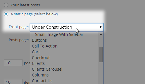
Selecting a static ‘Under Construction’ page as your front-page comes in handy when you’re building your website and are looking for a temporary landing page to notify your visitors that the website is under construction.
4. Quick Setup
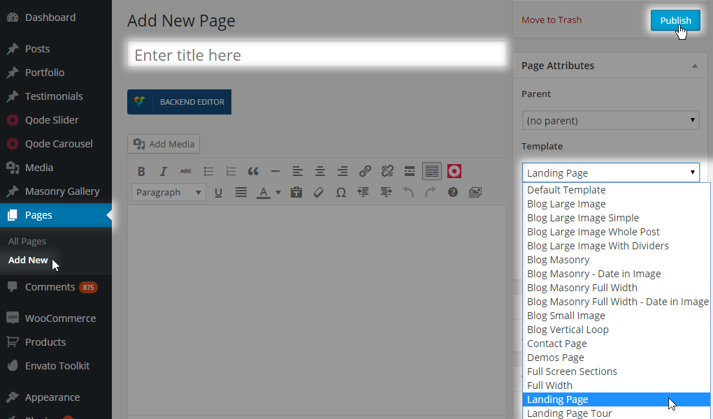
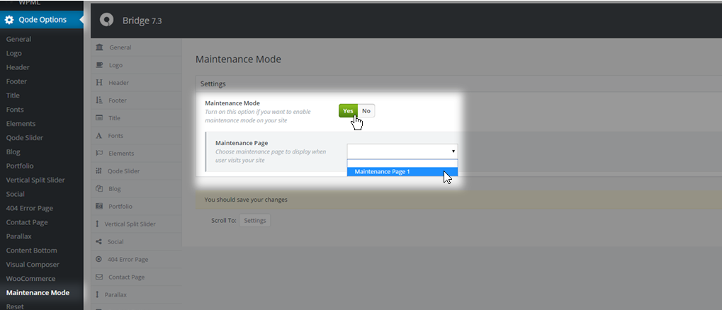
The Bridge theme supports Maintenance mode which displays a Landing Page to visitors of your site. Creating a Landing Page is simple. Navigate to WP Admin -> Pages -> Add New and on the right hand side select ‘Landing Page’ as your Page Template. Add the content that you want (like counter, slider etc…) and publish that page. Next go to Qode Options -> Maintenance Mode, choose Yes and select the page from the available dropdown menu. Only pages that have been set to the ‘landing page’ template will be visible in this dropdown menu.


4.1 Logo
By navigating to WP Admin -> Qode Options -> Logo, you can upload logo images for all Header types.
4.1.1 Logo Size
Logos displayed on your site are limited in size by Header height no matter how big the initial logo image is.
For example, if your logo is 100 pixels in height and your site’s header is 90 pixels high, the logo will slightly shrink in order to fit into the header area (being around 80px). On the other hand, your logo would have the same height (around 80px) even if you upload a logo image that is 700 pixels high.
Important Note: To make your logos retina ready and have them preserve their original aspect ratio, we advise that your logo images are uploaded at two times the height of the header. Meaning if the header is 150 pixels in height, it would require a logo that's 300 pixels high.
4.1.1.1 Logo Size in Vertical Layout
To adjust your logo centering further when using a left menu layout, since the options are not so in-depth you can use CSS. Please paste the following CSS code into WP Admin -> Qode Options -> General -> Custom CSS field:
.q_logo_vertical a {
display:block;
text-align:center;
}

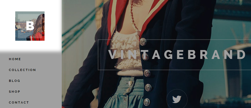
To increase/decrease the spacing between the logo and menu beneath it use this CSS code:
.q_logo_vertical a {
display:block;
margin-bottom: 120px;
}
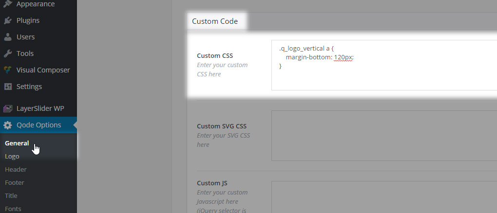
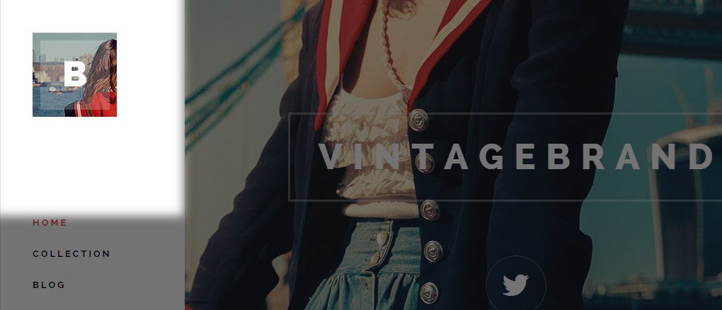
To define a margin use any px value including negative values.
You can also add a top margin to the whole left menu section by using the following CSS:
.q_logo_vertical a {
display:block;
margin-top: 120px;
}
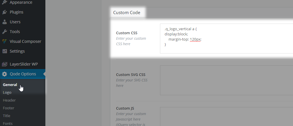
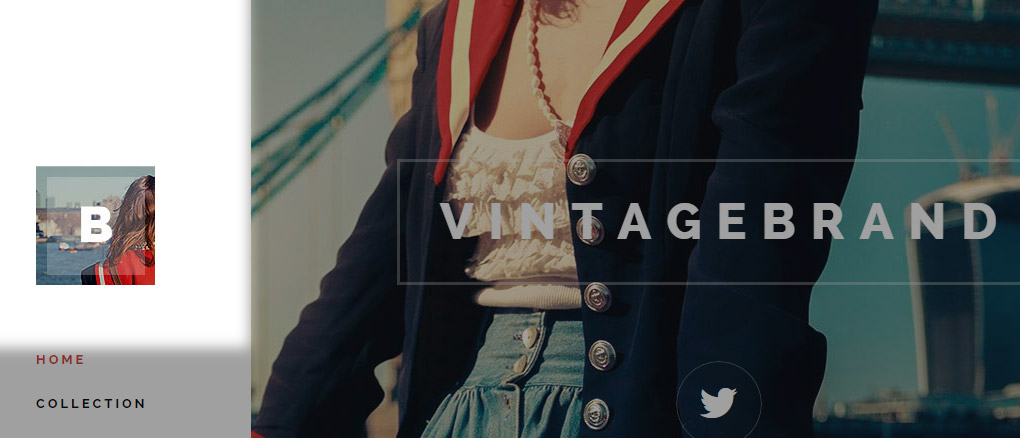
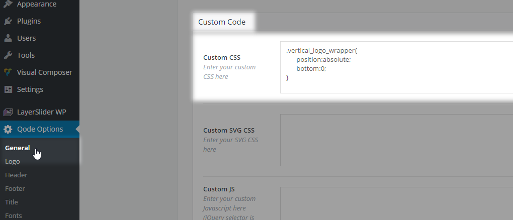
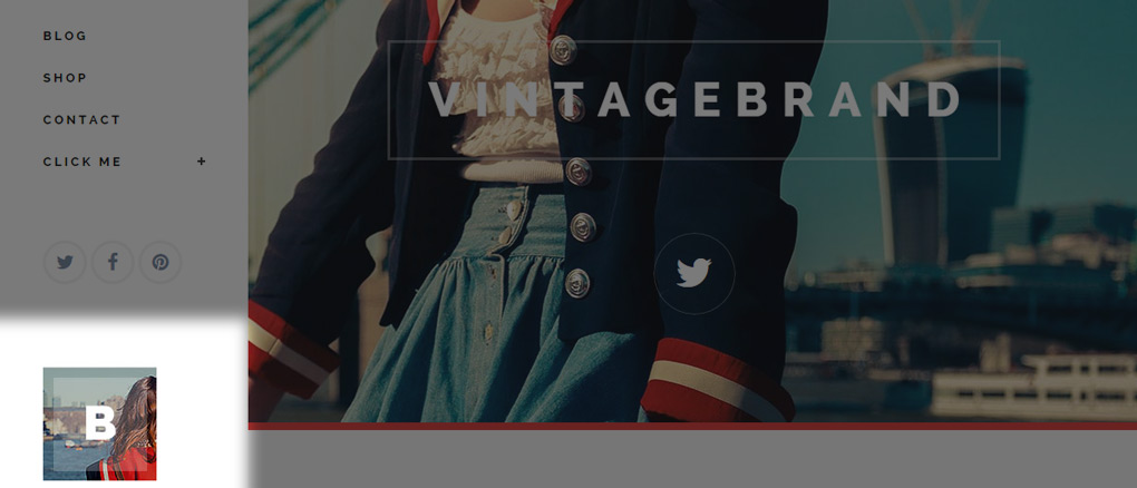
You can also add a top margin to the whole left menu section by using the following CSS:
.vertical_logo_wrapper{
position:absolute;
bottom:0;
}
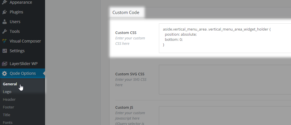
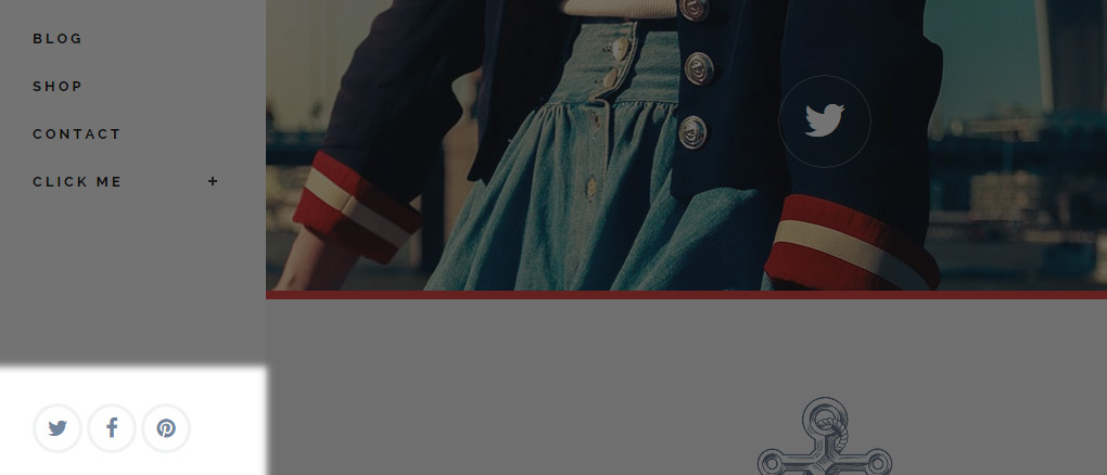
Similarly for the whole vertical widget area:
.aside.vertical_menu_area .vertical_menu_area_widget_holder {
position: absolute;
bottom: 0;
}
4.1.1.2 Textual Logo
If your logo is only text, we suggest to create your logo in an Image Editor for vectors (Adobe Illustrator or Gimp). This is a much better solution than creating a logo in in a photo editor (Adobe Photoshop), because you can create outlines from your text, and when you save your logo and upload it on your site it will be better - sharper than the logo which was created in a photo editor.
For example: When you’re creating a logo in Illustrator you first need to select your logo and then navigate to Type in the top menu and choose Create Outline and then you can save your logo as png.
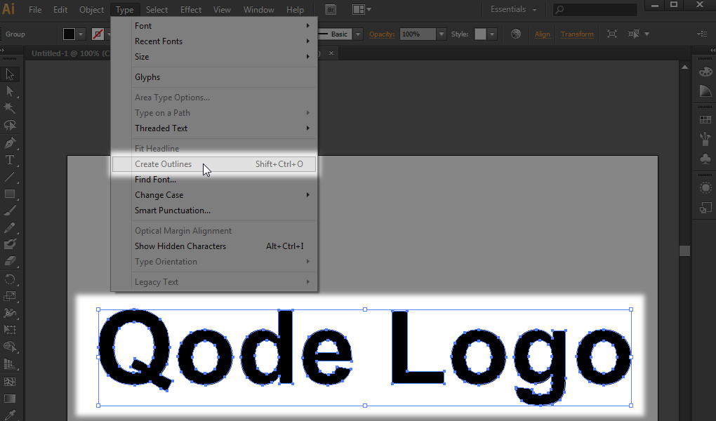
This way your logo will be of a better quality.
4.1.2 Modifying the Logo Size On Mobile
Your site logo can have a dedicated height for touch devices.
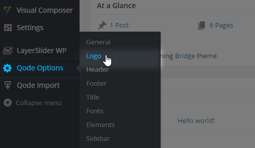
Logo Height For Mobile Header, which defines the logo height on screens that are less than 1000 pixels wide
Logo Height For Mobile Devices, which defines the logo height on screens that are less than 480px
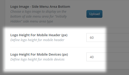
These two metafields shouldn’t be left empty, since otherwise your logo might not be centered properly on touch devices.
To define the logo height for these two breakpoints, simply enter an absolute numeric value and save. For example, to have your logo sized-down to 40px in height on devices whose viewport is 480px wide (and narrower), just enter 40 - omitting the pixel unit.
RELATED LINKS:
4.2 Header
One of the first things you might want to do is to set up the header area. This section contains the logo, menu, search bar, side area, and other optional widget areas.
To set it up, go to Qode Options -> Header from the admin panel. The settings you define here will be the default settings for all pages on your site. If you need help with any of the options, please refer to the Qode Options section of this user guide. Some options, such as header skin and background color, can be overridden on the page/post level by going into that page's back-end editor.
4.2.1 Header Skins
One of the main features of our theme is Header Skin.
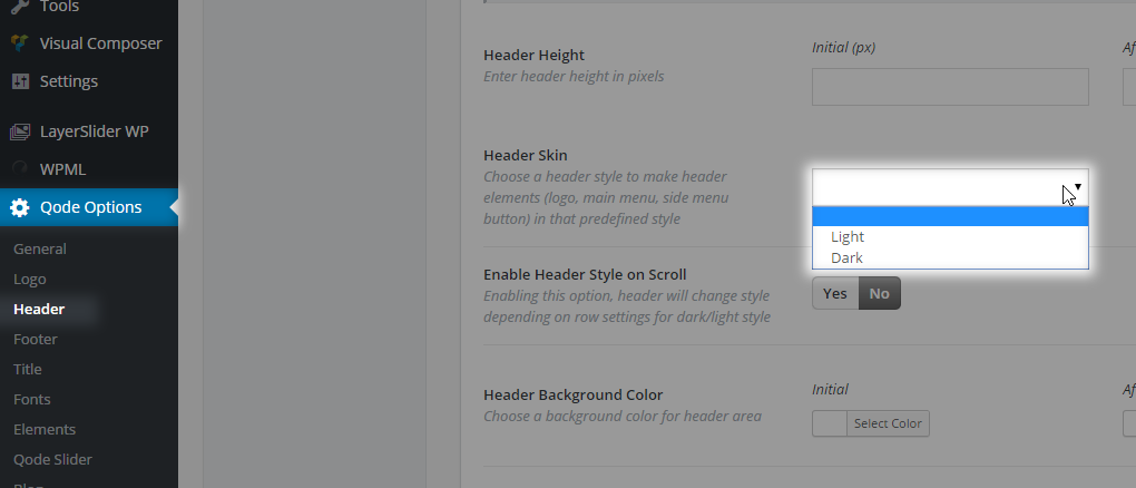
The Light header skin for example is a predefined style which has white-colored menu items and other header elements. It is meant for usage on dark backgrounds. Similarly there's a Dark skin for usage on light backgrounds. These skins are defined globally in WP Admin -> Qode Options -> Header.
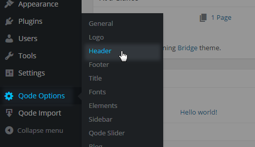
There are three options: Default, Light, Dark. The default header skin will match the design the user sets for the header in Qode Options. Once again, Light and Dark skins come predefined and you can only alter them with some additional CSS code.
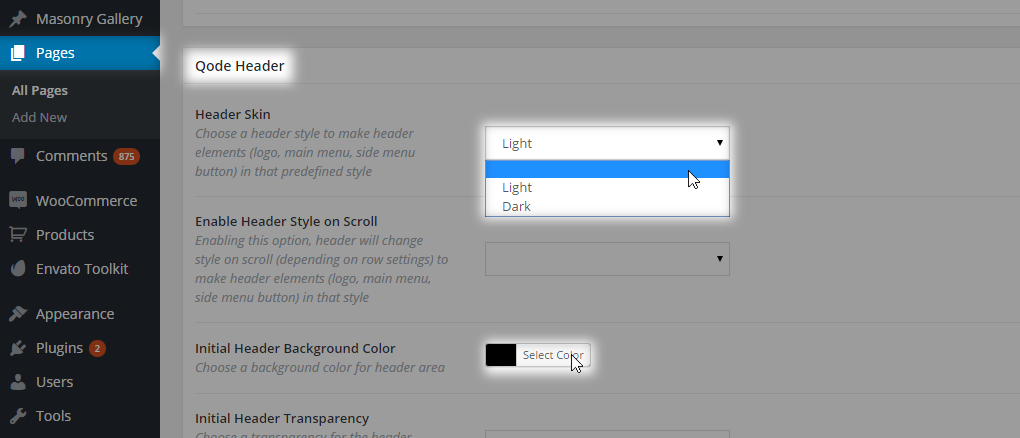
Besides setting this property globally, you can go to each page/post/portfolio item and under the Qode Header metabox define the header skin for this particular case:
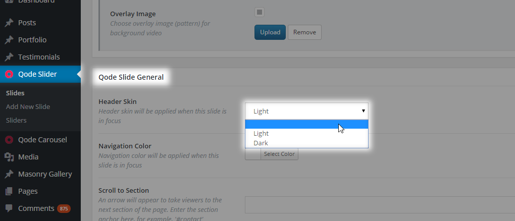
Also, the Qode Slider gives you the option to set a separate header skin on a per-slide basis. More on how it all works - here.
4.2.2 Header Layouts
Bridge supports 2 main Header Positions – on the top of the page and on the left side.
Note: You can use one of these two Header positions.
4.2.2.1 Left Menu – Vertical Layout
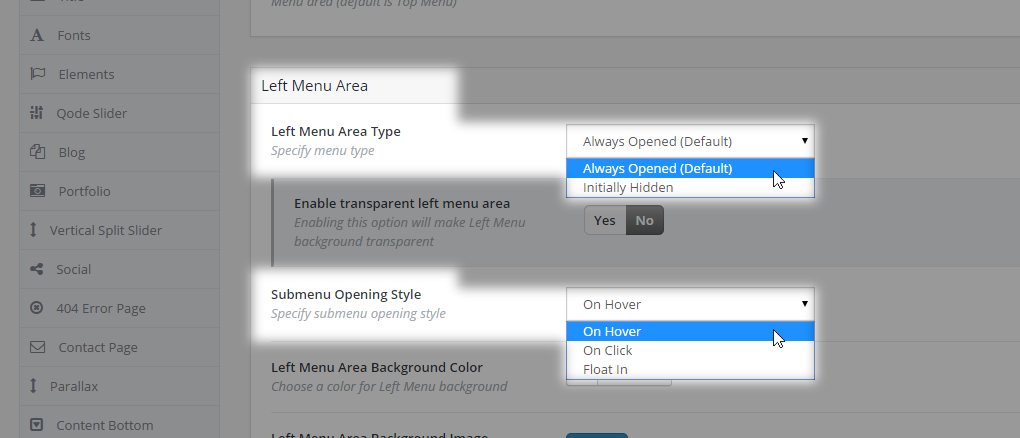
Switching to the left menu provides you with some basic distinctive options that are featured:
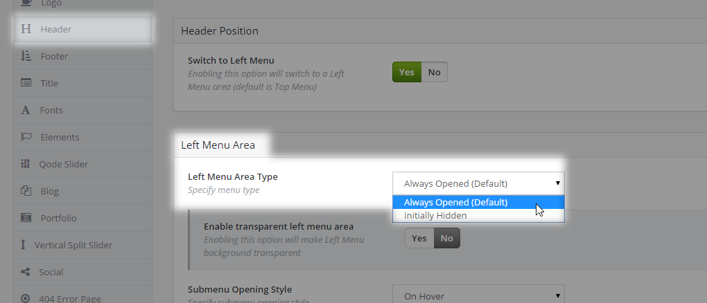
- Left Menu Area Type
Always opened - Constantly visible on your site
Initially hidden - Visible on button click
- Submenu Opening Style
On hover - opening a submenu item on mouse hover
On click - opening a submenu item on mouse click
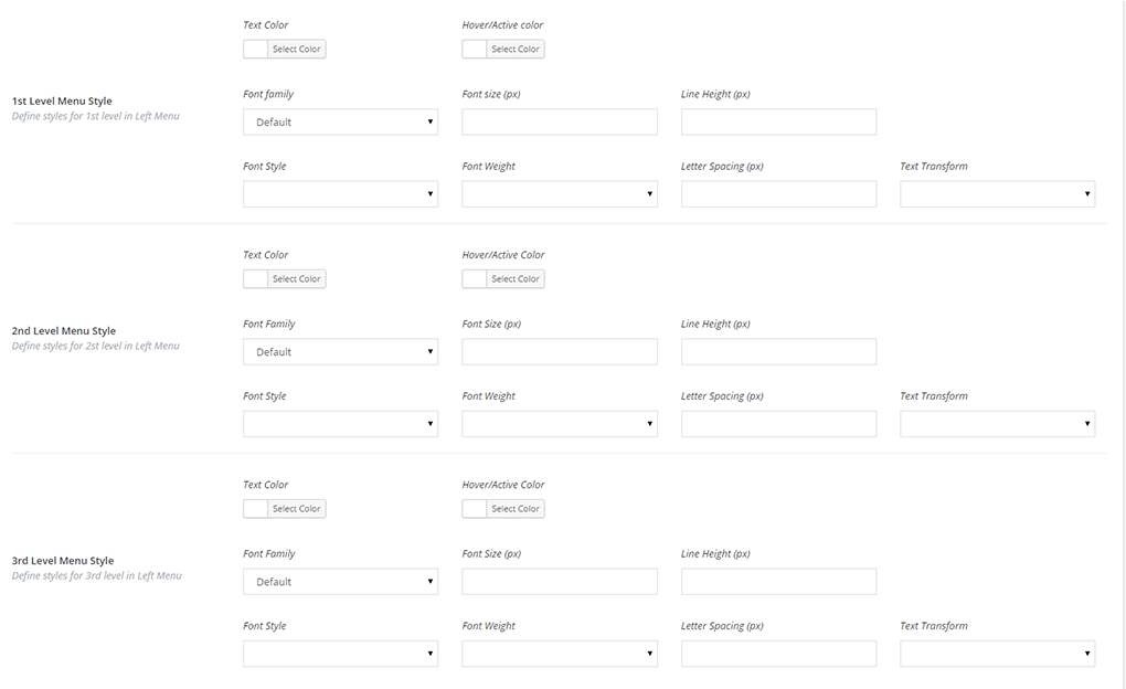
Our theme supports a three levels deep menu structure. In order to style each menu level when using the Left menu layout, use these three meta field sections located under the same Left menu metabox.
4.2.2.2 Top Menu – Horizontal Layout
If the left menu layout isn’t selected, then the horizontal layout will be applied. Using this layout you have several Header Types at your disposal:
- Fixed
- Fixed Minimal
- Fixed Advanced
- Fixed Header Top
- Sticky
- Sticky Expanded
- Sticky Divided
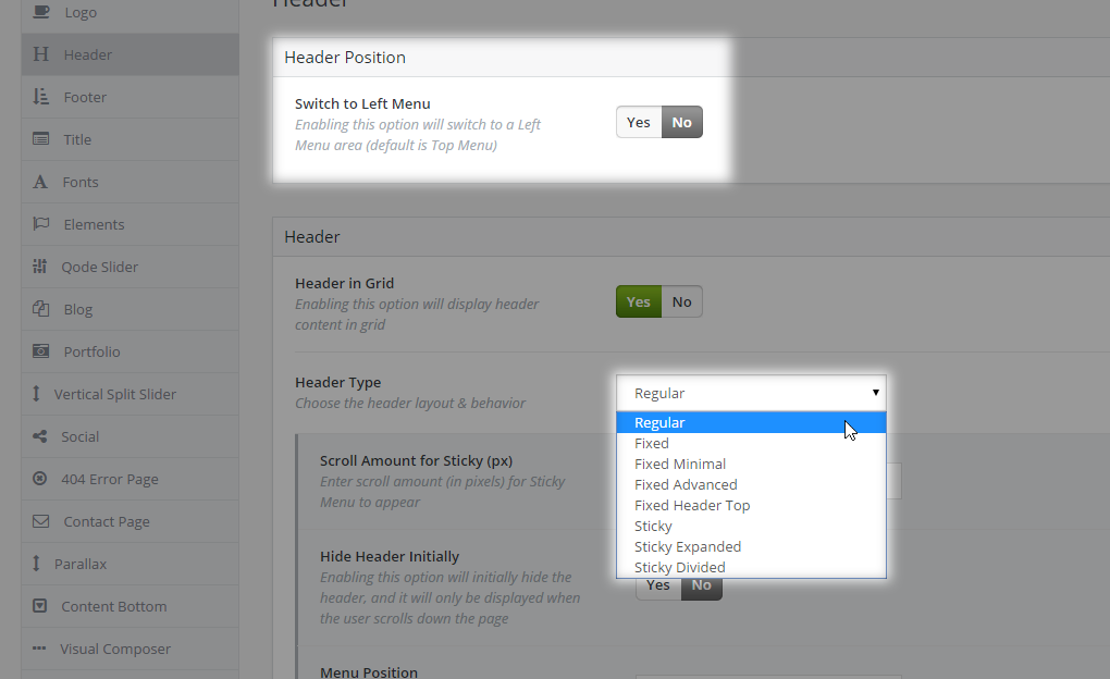
Each of these Header Types carries a set of options which we’ll cover at a later point.
From Qode Options -> Header you can also enable the Full screen menu or Side Area (on the right hand side).
Note: That one excludes the other. These areas are not available when the Sticky Divided menu type is selected.
Content for the Side Area can be added in WP Admin -> Appearance -> Widgets, inside the widget area called Side Area,
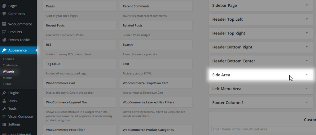
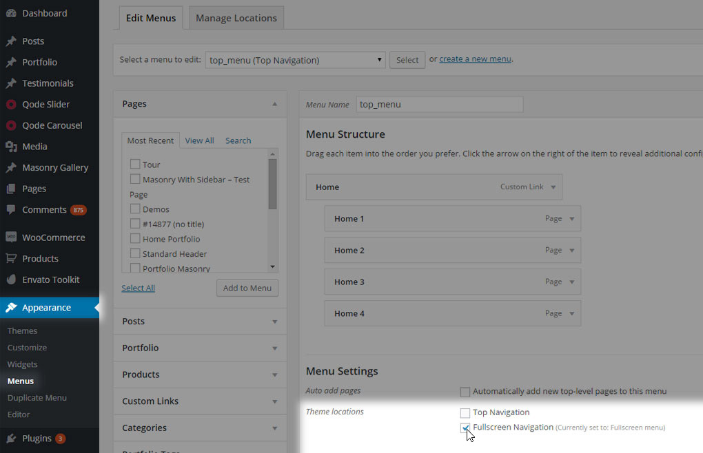
while the Menu for the Full screen menu option can be assigned in Appearance -> Menus, inside the Manage Locations tab,
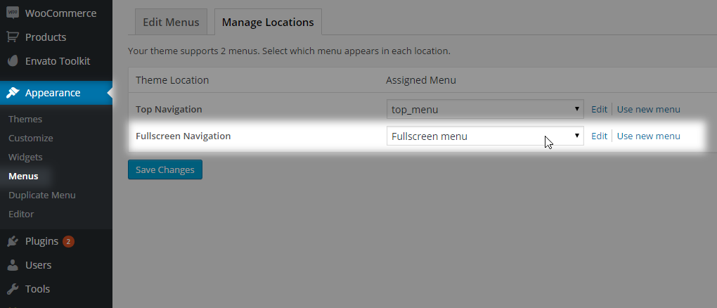
or directly in the Menu Editor.
If you would like to add a phone number or an email at the top of all pages you should enable the Header Top Area. Header Top Area content is added from Appearance -> Widgets -> Header Top Right/Left Area.
4.2.3 Assigning Menus
The Menu section under the Appearance tab in the WordPress Admin panel is where menus are created and assigned to a location in the Bridge theme. For all Header Types except Sticky Divided there are two main menu locations :
01Top Navigation - Appearing at the top as the main menu
02 Full Screen Navigation - Opened from the side button located as a part of the header
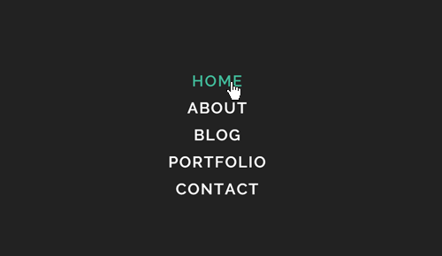
In case the Sticky Divided Header Type is selected, two menus should be created, and in this case instead of a location named Top Navigation there will be:
01 Top Left - menu that will be displayed to the left of the logo
02 Top Right – menu that will be displayed to the right of the logo.
Besides custom links and pages, portfolio single posts, posts, categories, etc. can also be added to menu(s). In case these options aren’t visible on the left hand side, expand the Screen Options (top right corner) and tick the box next to the labels you want to add to the menu.
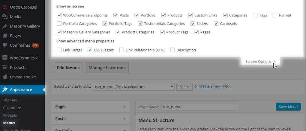
4.2.3.1 Anchoring
Anchors can be set as menu items to trigger the scroll-to functionality. There are two ways of creating anchors in the menu.
01 Creating an anchor item on a multi-page website:
a. Add a page as a menu item, and expand the options for that menu item.
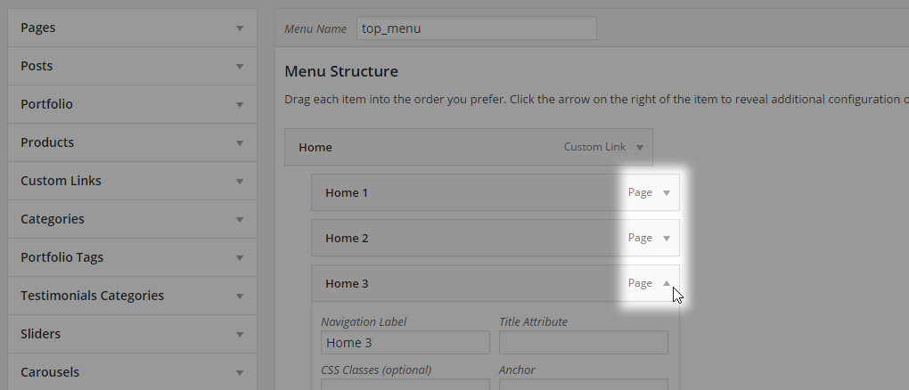
b. Enter the Anchor ID* of the Row section you want the menu item to scroll to without the leading hash symbol (#), in the field labeled Anchor.
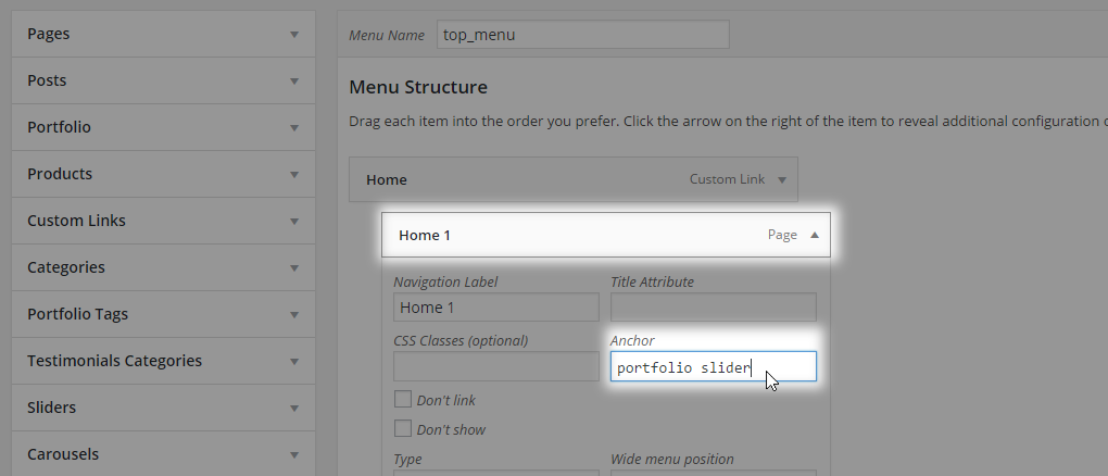
OR
Add a Custom link with the full URL to a specific page and with the desired navigation label. E.g.
http://www.example.com/some-page/#anchor
02 Creating an anchor item on a one-page website:
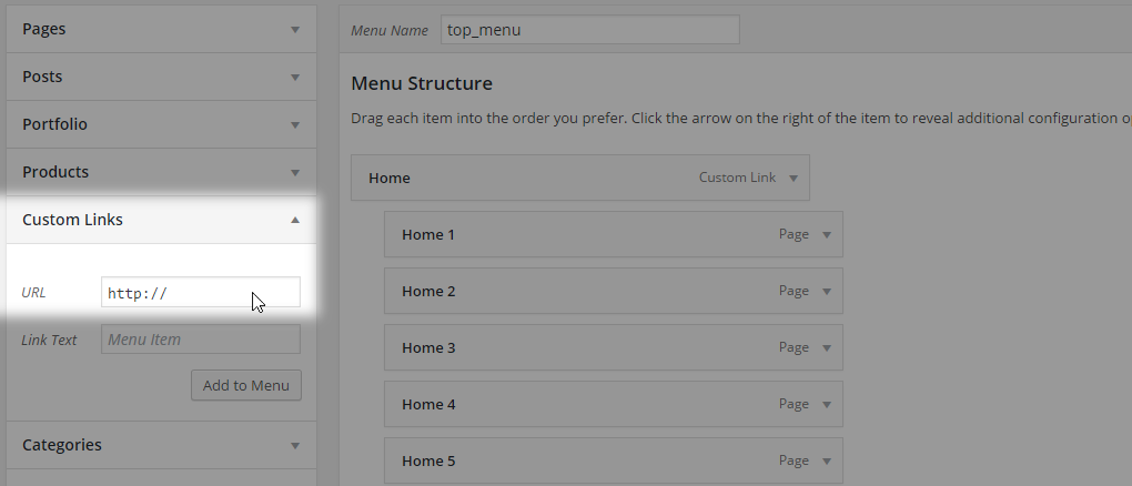
Add a Custom Link and enter the Anchor ID* with the leading hash symbol (#) in the field labeled URL.
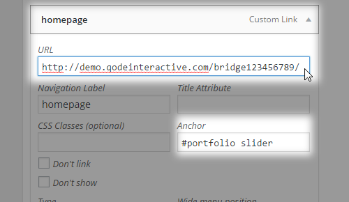
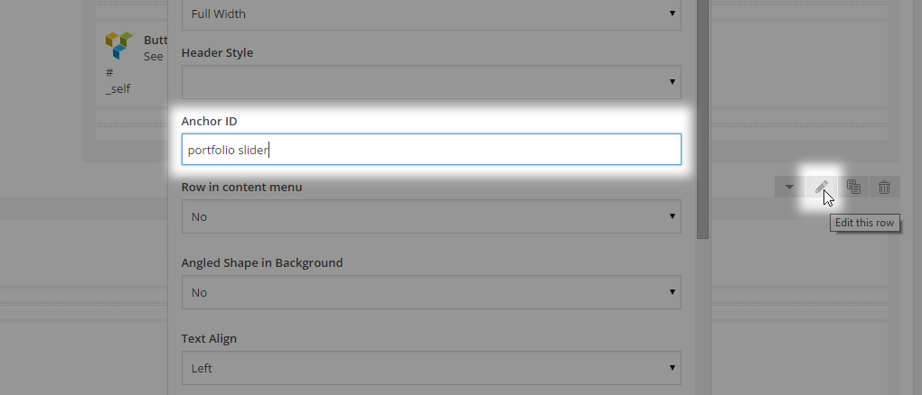
* Anchor ID - A unique Row attribute set under Pages -> Edit Page -> Edit Row -> Anchor ID
Note: Besides using Header menu items for anchoring, you can also use the Content Menu structure, or even some WPBakery shortcodes such as the Icon shortcode.
4.2.3.2 Adding icons to menu item
Icons can be added to menu items easily by pasting an icon HTML code inside the menu item label.
You just need to click on the desired icon and a page with its HTML code will open
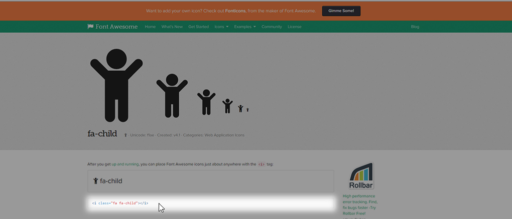
Then copy the code and navigate to WP Admin -> Appearance -> Menus, and expand the desired menu item
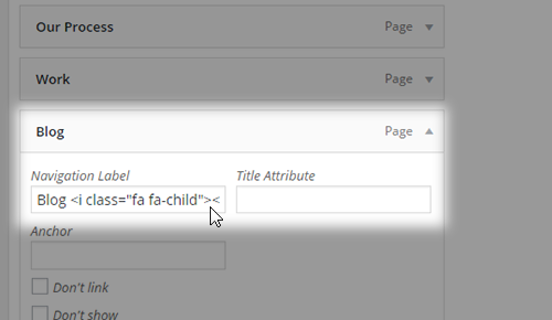
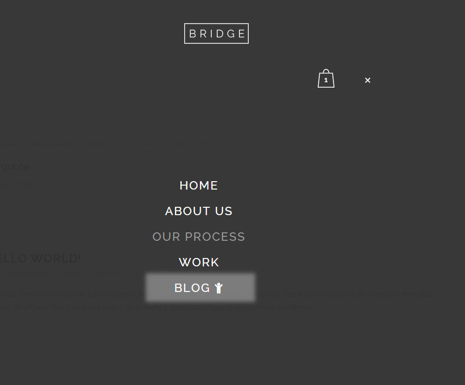
Lastly, paste the icon HTML code inside the menu item navigation label, before or after the item text label (depending where you want to have it displayed).
Here’s the result:
4.3 Footer
If you navigate from your admin dashboard to Qode Options -> Footer, you can see that it is possible to choose two footer types:
01 Uncovering (unveiling) footer - appears gradually on scroll
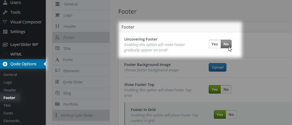
02Regular footer - appears immediately as an integral part of your site content.
Footer Content can be placed either In Grid or Full Width. Note that it is possible to set this option for both the Footer Top area, and/or the Footer Bottom area.
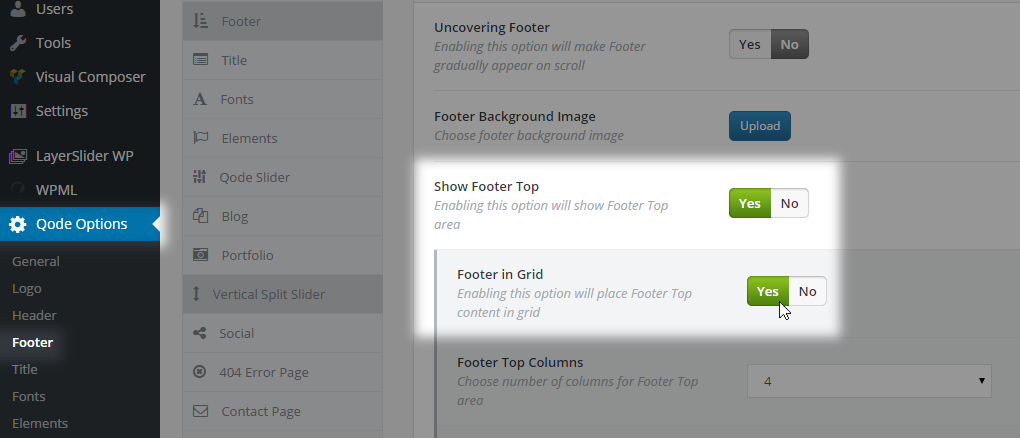
The two major footer content areas are the Footer Top and Footer Bottom. Both can be modified separately.
4.3.1 Widget Areas
The main significance of the Footer area in the Bridge theme is the feature of highly customizable widget areas where you can place your widgets. The footer content is placed into widget areas by navigating to WP Admin -> Appearance -> Widgets. The Bridge theme supports over 10 widget areas by default, and you can also create your own custom widget areas.
Besides adding a default widget into one of the widget areas, you can also use WPBakery shortcodes - e.g. Social Icons. To add a shortcode to a widget area you should go to Pages -> Add New and create a ‘test page’ which you’ll use to create your widget content.
01 Click on the Backend Editor button (if it isn’t already enabled by default) and Add New Element.
02 Choose any shortcode you’d like, fill in the content and styling options, and save the changes.
03 Click on Classic Mode to switch back to the WordPress classic editor. This will allow you to see raw shortcodes.
04 Select the shortcode, copy it
05 Navigate to Appearance -> Widgets. Add a Text widget to the desired Widget Area and paste the shortcode.
06 Save changes and refresh your site.
RELATED LINKS:
4.4 Qode Slider
The Qode Slider gives you a powerful way to create some amazing sliders. It's easy to create, edit, and delete sliders using our custom interface.
For a more comprehensive overview of the Qode Slider, please view Section 8 of this guide
4.5 Homepage
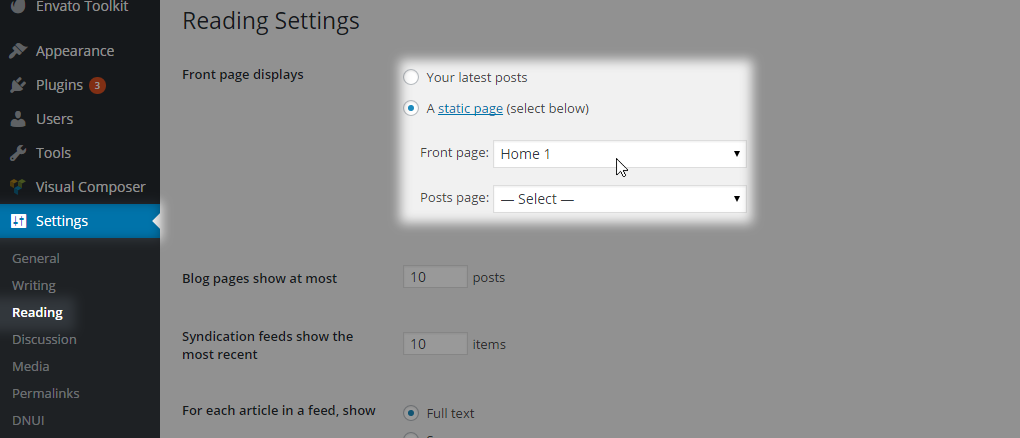
You can assign a page as your site’s homepage in WP Admin -> Settings -> Reading -> Front page. This way a static page with its contents will render when a visitor types your URL in the address bar of a web browser. By selecting the ‘Your latest posts’ option instead, all posts will be displayed - in this way your home page will also serve as your blog list page. To modify its layout and styling, you should go to Qode Options -> Blog and choose a blog template (Blog Small Images, Masonry etc.)
4.5.1 Under Construction
Selecting a static ‘Under Construction’ page as your front-page comes in handy when you’re building your website and are looking for a temporary landing page to notify your visitors that the website is under construction.

The Bridge theme supports Maintenance mode which displays a Landing Page to visitors of your site. Creating a Landing Page is simple. Navigate to WP Admin -> Pages -> Add New and on the right hand side select ‘Landing Page’ as your Page Template. Add the content that you want (like counter, slider etc…) and publish that page. Next go to Qode Options -> Maintenance Mode, choose Yes and select the page from the available dropdown menu. Only pages that have been set to the ‘landing page’ template will be visible in this dropdown menu.
