Navigate to WP Admin -> Qode Options -> General -> Custom CSS field and paste the following code:
6. Header Setup
@media only screen and (min-width: 1000px) and (max-width: 1200px){
nav.main_menu>ul>li>a{
padding: 0 12px;
font-size: 12px;
letter-spacing: 0px;
}
}
Adjust the padding values to your preference.
If the issue persists, please contact our support team through https://helpcenter.qodeinteractive.com/hc/en-us and we’ll see what needs to be modified further.
6.1 Initial Settings
The most important setting for this section is Header Position -> Switch to Left Menu (Yes/No) - This setting lets you choose between the standard header layout which is horizontally positioned on the top of each page, or the Left Menu where the entire header area is located on the left-hand side of the screen and your content/page is right next to it. Please note that these two header types exclude one another.
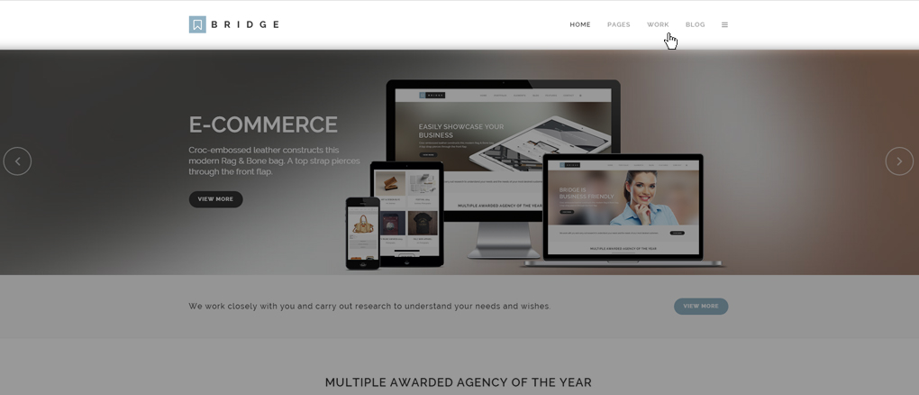
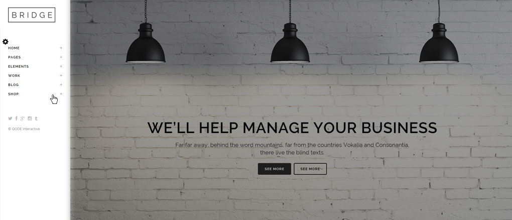
It’s useful to know that we’ve structured the header area to consist of two parts – Header Top and Header Bottom. Will get to how each of these areas works, but for now let’s focus on the Header metabox WP Admin -> Qode Options -> Header -> Header
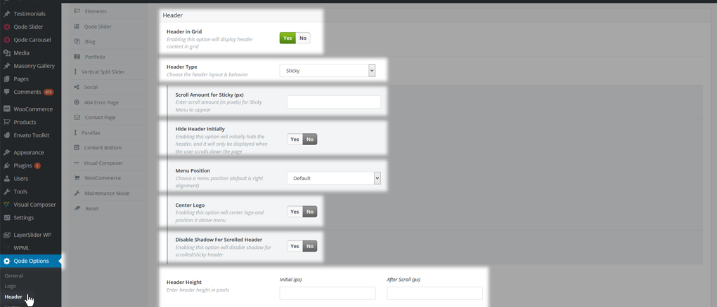
The Header In Grid option enables your header content to be fitted in a centrally positioned fixed grid (max-width of 1100px). Otherwise, the header will be set to full width and get stretched across the entire width of the view-port.
What affects website layout the most is the Header Type - this option defines various layouts and behavior for the header area. Layouts you can choose between are:
01 Regular - This is a standard header that stays on top of the page. When you scroll down, it goes out of view. By default, the logo is aligned left and menu navigation is aligned to the right. This is a good choice if you want a simple look for your site.
02 Fixed - This header stays fixed on top of the page when the page is scrolled – it’s fixed to the browser viewport. By default, the logo is aligned left and menu navigation is aligned to the right. This is a good choice if you want your site visitors to have access to top navigation at all times.
03 Fixed Minimal - This header stays fixed on top of the page when the page is scrolled. The logo is displayed centrally, the full screen menu icon is to the left, and the search icon to the right.
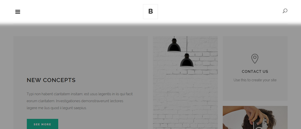
Note: When using this header we advise that you have fullscreen menu and search turned on in Qode Options -> Header
When this header is enabled, the Header Bottom Right Widget Area and Side Area are disabled. This header is a good choice if you want a minimalistic header design.
04 Fixed Advanced - This header stays fixed on top of the page when viewers scroll. But unlike the Fixed header, only the logo is visible on scroll. The menu gets hidden and appears on mouse hover. By default, the logo is above the menu navigation and both elements are centered. This is a good choice for sites with a grid layout.
05 Fixed Header Top - Only the Header Top area stays fixed to the top of the page when users scroll. The logo is displayed in the Header Bottom area - centrally-aligned, while the menu is displayed in the Header Top, along with the Search and Side Area buttons. There is also a Header Bottom Center widget area which displays its content beneath the logo.
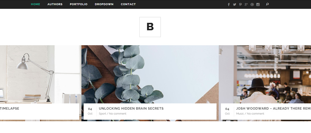
The Full Screen Menu is disabled when this header type is chosen, and only the "Search Covers Header" search type is available.
This header is a good choice if you would like site visitors to have access to the site navigation only upon scroll, without a logo and widgets being displayed around it. It can also be used if you would like a fixed menu on mobile devices.
06 Sticky - This header is very similar to Fixed header type. Initially, the header area is visible and goes out of view when the page is scrolled. It then reappears and remains on top after a certain amount of scroll. By default, the logo is aligned left and the navigation is aligned right, both elements in line. This is a good choice if you have content at the top of your pages which you don't want to get covered by a fixed header immediately.
07 Sticky Expanded - The difference between this header type and the Sticky header is that here, the logo is above the menu navigation and both elements are aligned to the left by default. When the sticky header appears, the logo is aligned left and the navigation is aligned right, both elements in line. Since this was a common layout in the early days of web design, this is a good choice if you want an old-school look.
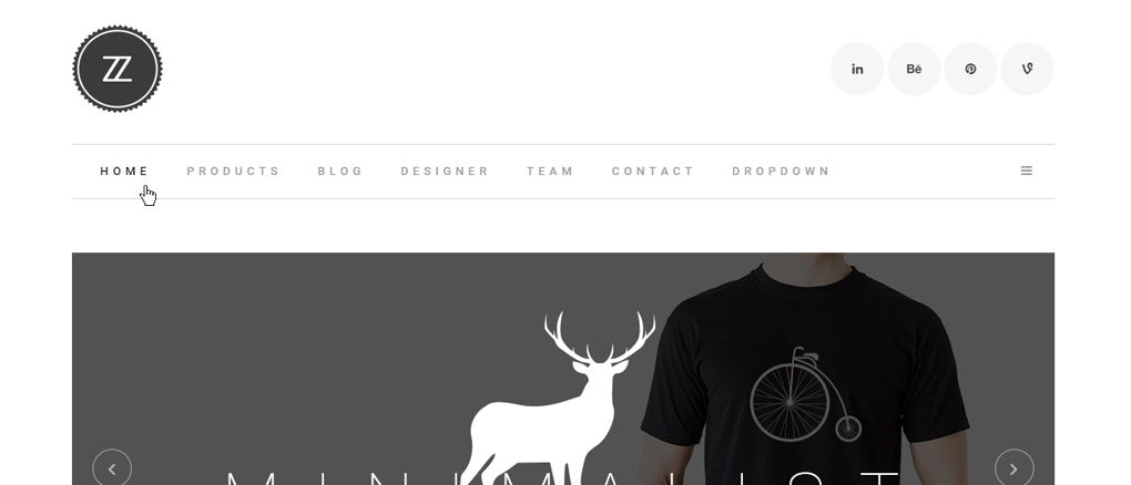
08 Sticky Divided - The difference between this header type and the Sticky header is that here, the logo is centrally positioned and has the menu navigation on both left and right sides. When the sticky header appears, the logo is gone and only the menu stays ‘sticky’ on top. This is a good choice for sites that have their layout in grid.
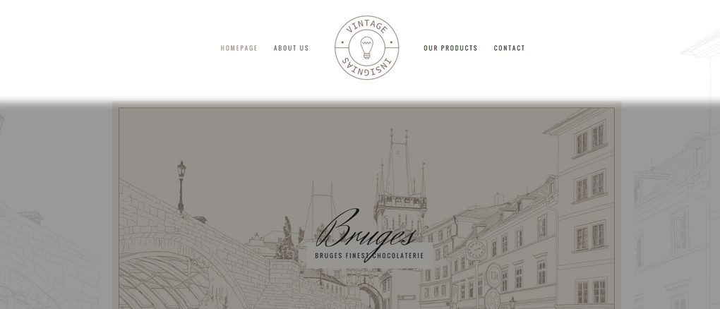
Note: For this header type both Side Area and Full Screen menu are disabled
For each of these header types we’ve implemented additional options to let you modify the initial header layout. For example:
- Regular, Fixed and Sticky header types have options to change the Menu and Logo positioning, and have them Centered instead of the default Left.
- When the page is scrolled and you have either the Regular or Fixed header set, the logo is positioned in the center. If the Sticky header type is set, the logo is positioned on the left side.
- Each of the Sticky header types has the options to let you modify the animation and the way the header appears on the page:
- Scroll Amount for Sticky (px) - This option applies to the sticky header types. Set the amount of scroll (in pixels) after which the sticky header will appear.
- Hide Header Initially - This options allows you to disable the initial header and show it only on scroll.
- Disabled Shadow for Scrolled Header - This option lets you disable the bottom header shadow when the header is scrolled.
6.1.1 Header Skin
Header Skin is a feature that works regardless of the header type you’re using and allows you to set a predefined styling for each header element. There are two of these predefined style groups – Light and Dark. The Light header skin for example has white-colored menu items and is meant for usage on dark backgrounds. Similarly there's a Dark header skin for usage on light backgrounds.
These skins are defined globally in WP Admin -> Qode Options -> Header.
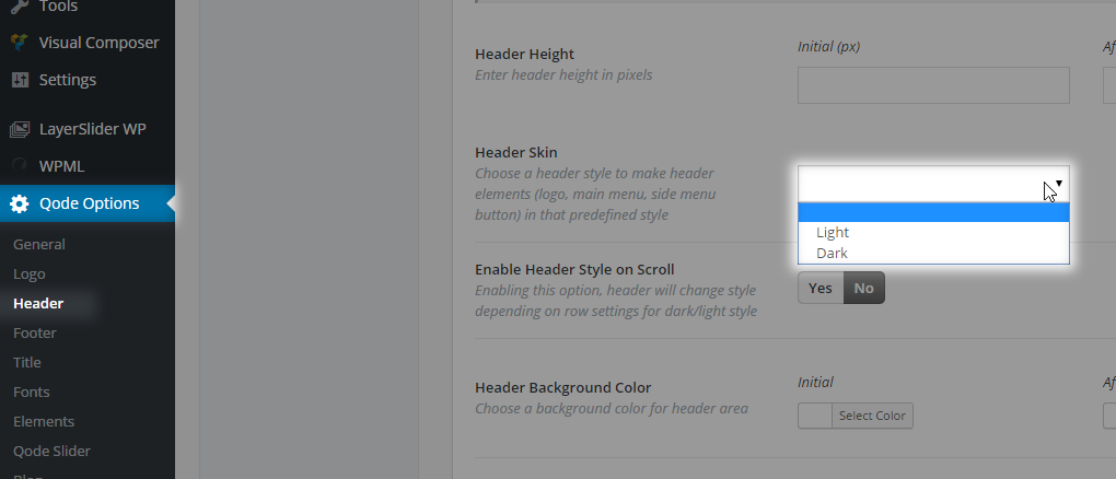
With this option you can change the header skin to Light or Dark when a particular row is in the viewport and the header traverses over it. Another important option for this behavior is that you need to go to WP Admin -> Qode Options -> Header -> Enable Header Style on Scroll and select Yes to enable this feature on your website..
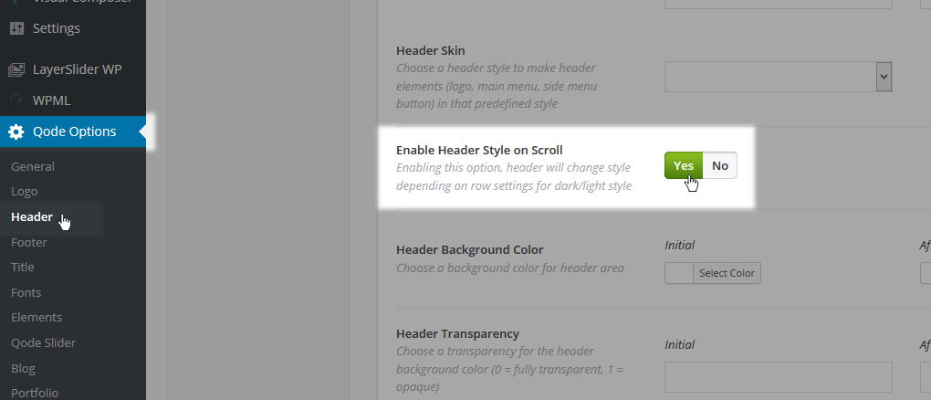
Besides setting the Header skin to Light or Dark you can leave the field empty and have the default header skin applied. The default header skin is meant to match the header style a user defines within Qode Options. Once again, Light and Dark header skins come predefined and you can only alter them with some additional CSS code.
There are several places where you can set the header skin for your site.
01 In Qode Options -> Header -> Header Skin you can set a predefined style for all pages throughout the site.

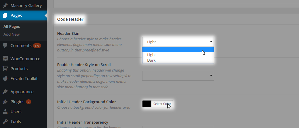
02 Besides setting this property globally you can go to each page/post/portfolio item and under the Qode Header metabox define the header skin for this particular case:
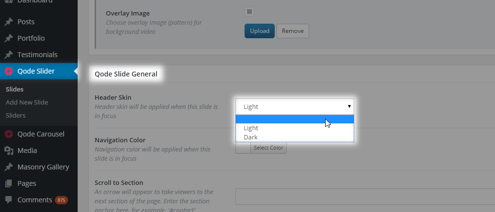
03 You can dedicate a header skin for each Qode Slide. In WP Admin -> Qode Slider -> Sliders -> Edit your slider -> Effect on header (dark/light style) choose Yes to enable the header style change per each slide. If this option is set to Yes, then you can edit each slide and under Qode Slide General -> Header Skin set your desired skin for each slide, and save.
04 You can also dedicate a header skin for each row section by going to edit the row shortcode, and inside the Row shortcode options setting your desired header skin in the Header Style field.
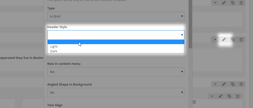
With this option you can change the header skin to Light or Dark when a particular row is in the viewport and the header traverses over it. Another important option for this behavior is that you need to go to WP Admin -> Qode Options -> Header -> Enable Header Style on Scroll and select Yes to enable this feature on your website..
6.1.1.1 I cannot find Header Skin in Qode Options -> Header?
If you’re using the Left Menu layout you need to switch back to the default header position and set a header skin. You can switch back to Left menu afterwards.
6.2 Logo Deep Dive
We will now address the major logo options and settings, and include some usual cases in terms of additional logo adjustments.
6.2.1 How to change logo image?
The logo is a part of the header area of your site. To change the logo image please navigate to Qode Options -> Logo. Here you can upload your logo images for each header type or skin. We’ve implemented several logo image types:
01Logo Image - normal - This logo is used when no header skin is chosen – the Header Skin field is set to blank. We recommend not choosing a header skin in cases where you want to fully customize the header with your own colors. You might want to decide on the look of your header before choosing a logo to upload here.
02Logo Image - Light - This logo is used when the "Light" header skin is chosen. A Light header skin has white navigation text and is typically used on darker header backgrounds. A light colored logo is appropriate for use here, in order to have a clearly visible layout depending on your background. For more information on header skins, see the Header Skin section above.
03Logo Image - Dark - This logo is used when the "Dark" header skin is chosen. A Dark header skin has black navigation text and is typically used on lighter header backgrounds. A dark colored logo is appropriate for use here, in order to have a clearly visible layout depending on your background. For more information on header skins, see the Header Skin section above.
04Logo Image - Sticky Header – This logo image is applied when using the Sticky or Sticky Expanded header type. This logo is visible once the page gets scrolled and the sticky header appears. It's typically a smaller – minimalistic version of the original logo.
05Logo Image - Fixed Advanced - This logo image is applied when using the Fixed Advanced header type. This logo is visible once the page gets scrolled and the fixed header appears. It's typically a smaller version of the original logo.
06Logo Image - Mobile Header - This is the logo the viewer sees when viewing the theme from a mobile device, or a smaller screen (under 1000px wide).
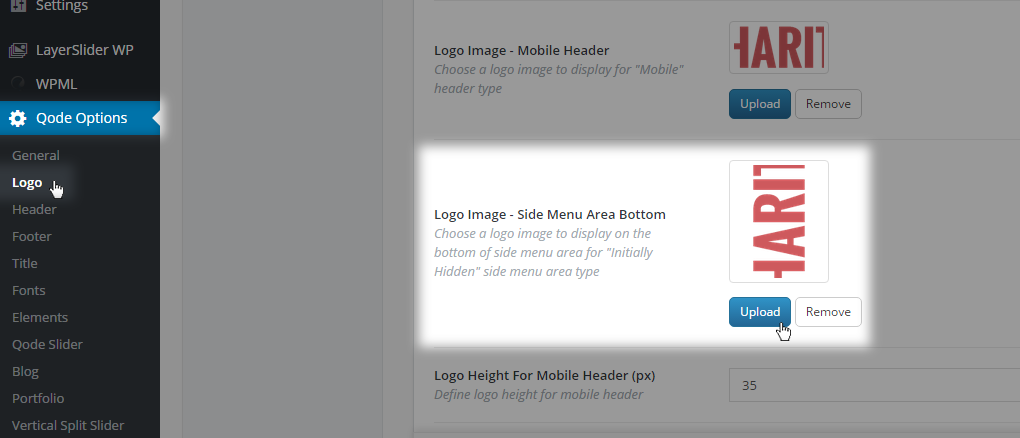
07Logo Image - Side Menu Area Bottom - This logo is displayed at the bottom of the side menu area when the “initially hidden” side menu area type is selected.
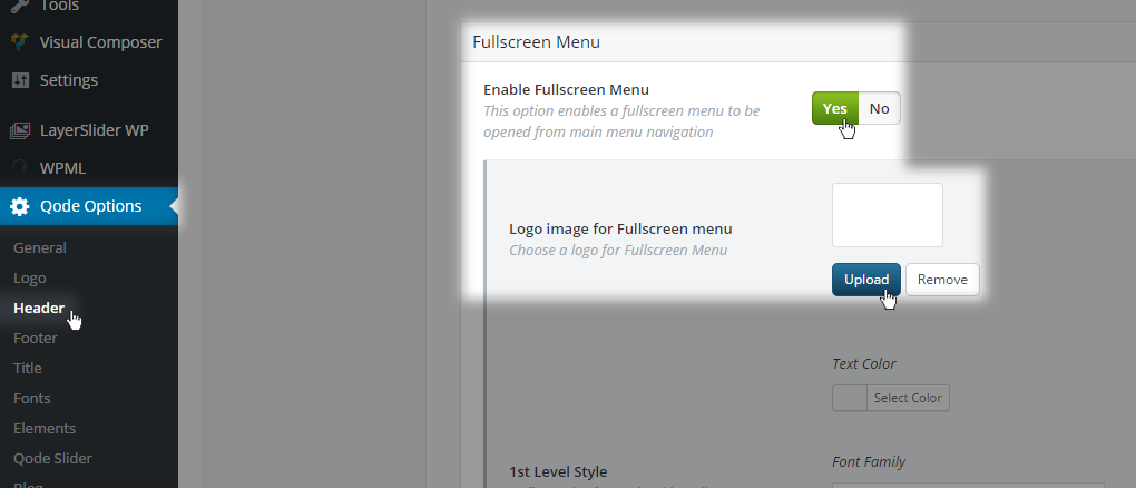
6.2.2 How to change the logo image inside the Fullscreen Menu/Popup menu?
We’ve implemented an additional logo for the Fullscreen Menu inside Qode Options -> Header -> Fullscreen Menu -> Logo image for Fullscreen menu.
6.2.3 Logo image is cut off for Sticky Divided header type?
Please navigate to WP Admin -> Qode Options -> Logo and upload the same logo size inside each logo field and save.
6.2.4 How to have your logo appropriately sized?
Logos displayed on your page are limited in size by the header height. For example, if your logo is 100 pixels in height and your header is 90 pixels high, the logo will slightly shrink in size in order to fit into the header area. The same principle applies to logos that appear in the sticky header; they are limited to the sticky header height.
6.2.4.1 Adjust Logo for Retina Displays
To make your logos retina ready, upload logo images that are twice as high as the header. For example, a header of 90 pixels in height would require a logo image that's 180 pixels high. This principle applies to all logos you upload.
FAQ: What is the proper size for my logo image? Why is my logo too small? etc
We have implemented a JavaScript function which reduces your logo image size to half its size and makes your logo retina ready. Please upload your logo image 2x larger than what you want to actually display on your site. Please note that your logo image can’t be larger than the header section height.
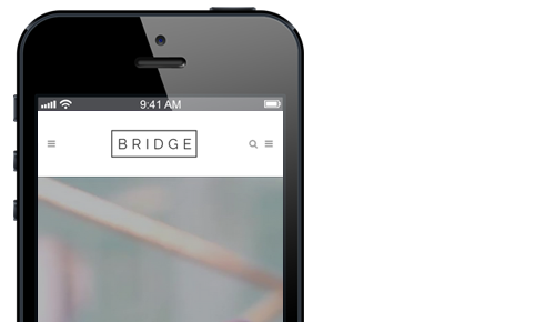
6.2.4.2 Logo image is too large on smaller screens/mobile devices? Logo image overlapping mobile menu button and/or search icon?
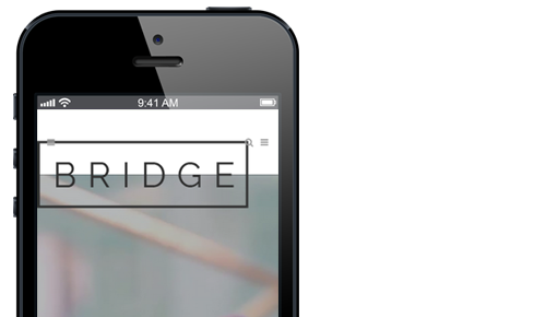
Please go to WP Admin -> Qode Options -> Logo and adjust the following two options:
- Logo Height For Mobile Header (px) - screen size is lower than 1000px
- Logo Height For Mobile Devices (px) - screen size is lower than 480px
Enter a desired height in pixels for these two cases. For example, if you need a 50px high logo set 50 and save.
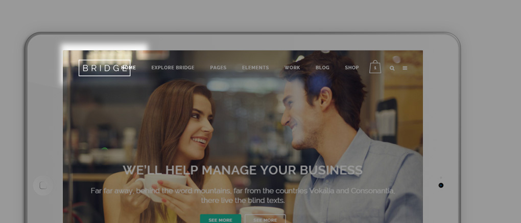
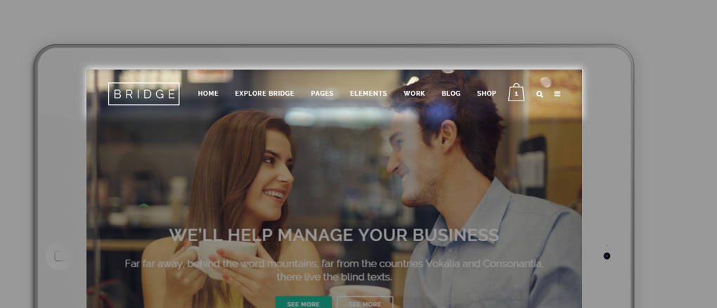
6.2.4.3 Logo overlapping menu items on tablet landscape view?

Navigate to WP Admin -> Qode Options -> General -> Custom CSS field and paste the following code:
@media only screen and (min-width: 1000px) and (max-width: 1200px){
nav.main_menu>ul>li>a{
padding: 0 12px;
font-size: 12px;
letter-spacing: 0px;
}
}
Adjust the padding values to your preference.

If the issue persists, please contact our support team through https://helpcenter.qodeinteractive.com/hc/en-us and we’ll see what needs to be modified further.
6.3 Qode Search
Qode Search is an included feature that lets you look for a specific page/post/portfolio etc. – any part of your content - by typing in a few keywords. The search field will appear in the header area next to the main navigation, and when clicked a search bar will unfold.
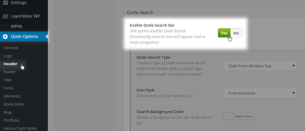
You can further customize it with your own background and text colors.
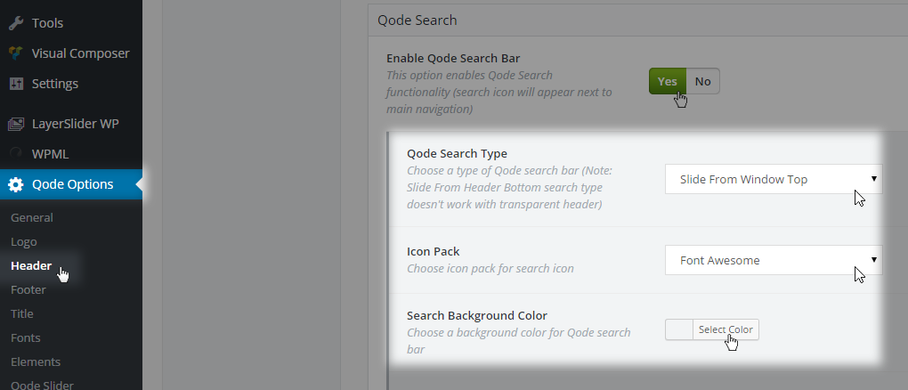
To enable this feature you need to go to WP Admin -> Qode Options -> Header -> Qode Search -> Enable Qode Search Bar - Choose Yes and save.
There are 4 Search layouts to choose from:
01Slide From Window Top - When you click on the search icon, a search field will appear above your header area and will push down the entire content.
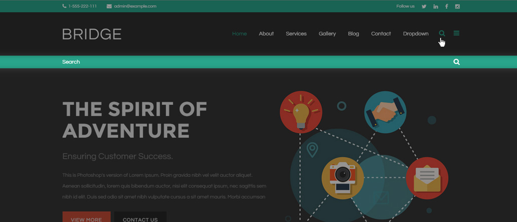
02Slide From Header Bottom - When you click on the search icon, a search field will appear just below that icon and header area.
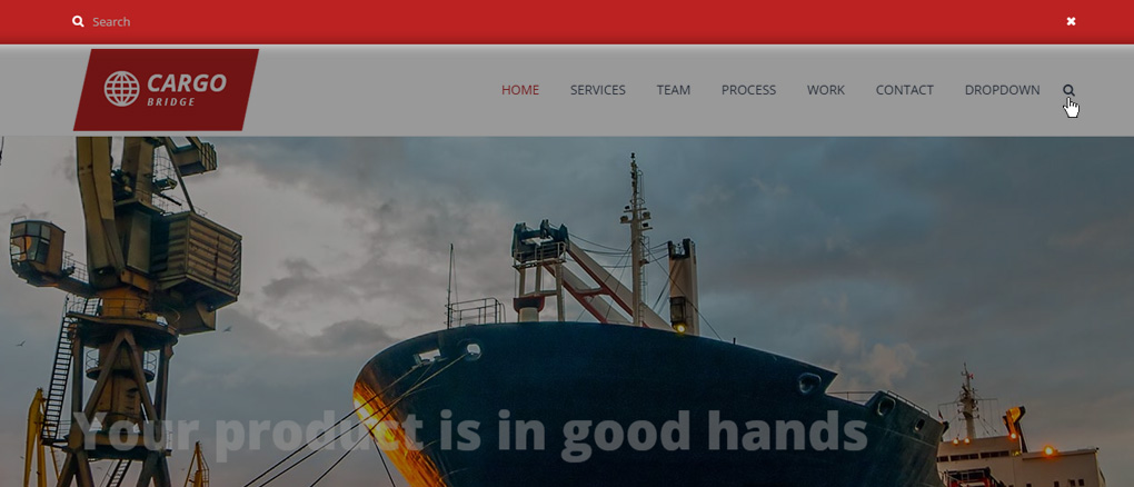
03Search Covers Header - When you click on the search icon, the whole header area will transform into a search field.
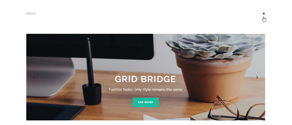
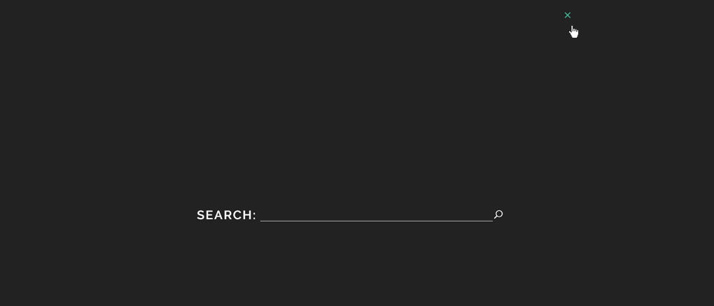
04Fullscreen Search - When you click on the search icon, a search field will pop up as a fullscreen layout over your content.
Note: If you choose the second Search Form - Slide from Header Bottom, the Header Transparency setting must remain unset, or you should set it to 1 to have a solid background header color. For a fully transparent, or a semi transparent header this search form will not appear.
To add additional styling for the search area, please go to Qode Options -> Header->Qode Search, and you will find a lot of options at your disposal like Search Icon color, background color, label and input styles etc.
6.4 Side Area
The Side Area is a specific widget area initially hidden on the right of your content and triggered by a dedicated button in the header.
To enable this feature, please go to Qode Options -> Header -> Side Area -> Enable Side Area - Choose Yes and save. To disable it, choose No.
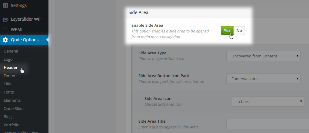
The content is added to the Side Area through widgets. Just go to WP Admin -> Appearance -> Widgets -> Side Area and add/change your widgets.
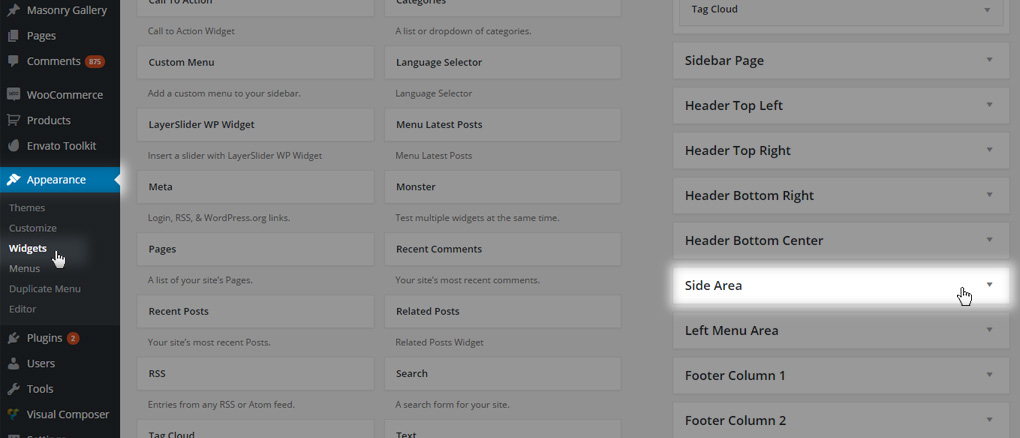
To add styling to the Side Area and define its behavior, navigate to Qode Options -> Header -> Side Area from your WordPress dashboard.
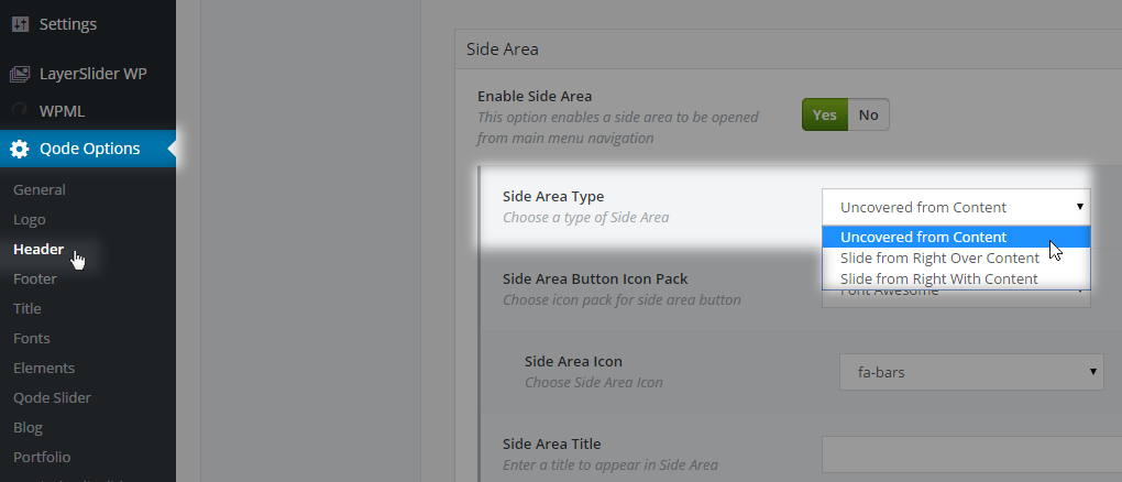
There are three basic types in regards to how this area gets animated on the front-end.
01Uncovered From Content - the Side Area is behind the content, and on icon click the content will be moved to the left side, thereby uncovering the Side Area
02Slide From Right Over Content – on icon click, the Side Area will appear over the content and the content will move slightly to the left side
03Slide From Right With Content – both the content and Side Area will move to the left on icon click, at the same time and with the same speed
Other styling options for this area are as follows:
01Side Area Button Icon Pack - This options lets you choose an Icon Font pack for your Side Area icon
02Side Area Icon - Set a particular icon (three horizontal lines / bars icons / hamburger - by default)
03Side Area Title - You can add a title for your Side Area (above all of its content) when this area is opened
04Background Color - This options allow you to set a background color for this area
05Padding - This options allows you to set your padding values around your side area content. Default values are 30px for each padding direction (top, right, bottom, left)
06Side Area Alignment - This option defines text/elements alignment inside Side Area
07Text - This sections allow you to set your typography style for text inside Side Area
08Title - This sections allow you to set your typography style for the Side Area title
09Choose Icon Style - Set a predefined header skin style for Side Area icons (light or dark)
6.5 Fullscreen Menu
A fullscreen menu icon will appear on the right side of your header and on click, the fullscreen menu will open. It’ll cover the whole content area in the viewport and let you showcase a menu which you previously defined in WP Admin -> Appearance -> Menus.
6.5.1 How to use Fullscreen Menu/Popup Menu?
First go to WP Admin-> Qode Options -> Header -> Fullscreen Menu -> Enable Fullscreen Menu -> Choose Yes and save.
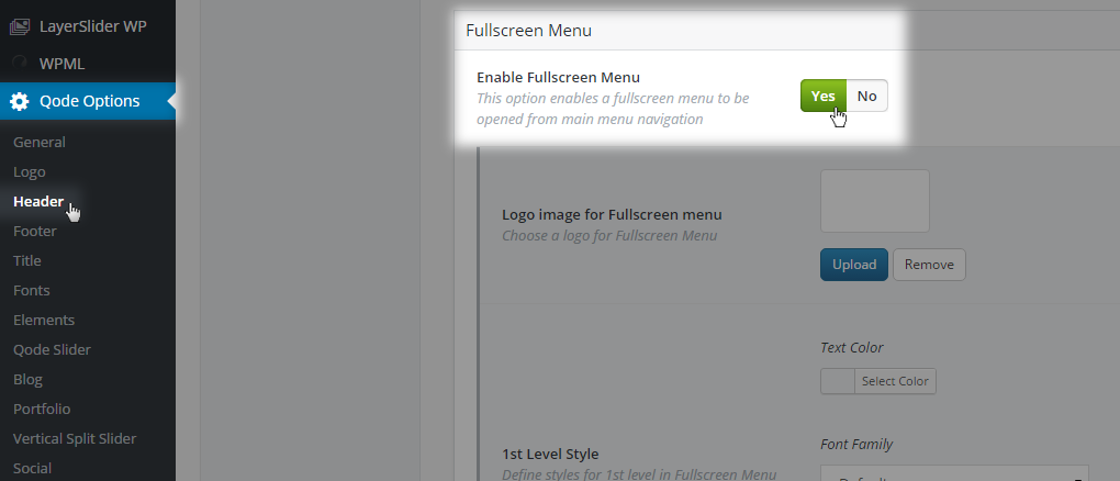
Next, go to WP Admin -> Appearance -> Menus and create a menu. Add menu items to it and after you have finished click on Manage Location, include that menu into Fullscreen Navigation, and save.
6.5.2 How to change Fullscreen Menu/Popup Menu logo image?
Please go to WP Admin-> Qode Options -> Header -> Fullscreen Menu -> Logo image for Fullscreen Menu and upload your logo image and save.

6.5.3 Could the Side Area and Fullscreen Menu work together?
Unfortunately, this is not possible due to the template structure. It’s an either/or situation in this case.
6.5.4. How to change styles for Fullscreen Menu items?
Please go to WP Admin -> Qode Options -> Header -> Fullscreen Menu and here you will find 1st level style and 2nd level style sections. Inside these sections you can find all style-related options for menu items in the Fullscreen Menu.
Other styling options for this area are as follows:
01 Background Color - This options allows you to set a background color for the Fullscreen Menu area when it’s opened
02 Transparency - This options allows you to set background transparency. (0 = fully transparent, 1 = opaque)
6.6 Main Menu Navigation
To be able to link between your pages, you need to create a menu and place it in the appropriate location depending on the header layout you have set.
6.6.1 Creating and Styling Menus
In order to create a menu with menu items we advise that you to have a closer look at the following article on the codex that covers this functionality:
When you’ve created your basic menu structure you can proceed to style menu items.
Depending on the Header layout there are two places where you can perform further styling.
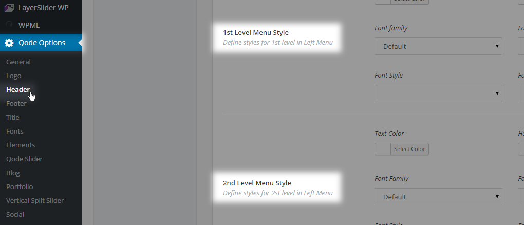
If the header is set to the default Top Navigation, just go to WP Admin-> Qode Options -> Fonts -> Header & Menu and set your styling for each menu level.
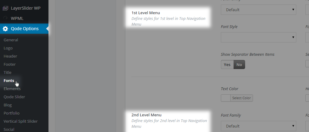
If the Left Menu layout for the header area is enabled, then you just need to go to WP Admin -> Qode Options -> Header -> Left Menu Area and here set the options to style menu items.
6.6.1.1 How to create the Sticky Divided header (centered Logo in between two menus) ?
First go to WP Admin -> Qode Options -> Header -> Header Type, select Sticky Divided, and save.
Then go to WP Admin -> Appearance -> Menus and create your left menu part and right menu part, and add your menu items into them. Then click on Manage Location and include those menus into the left and right menu areas and save.
6.6.1.2 My menu/Widgets have disappeared when I switched to a Child theme?
This is a normal behavior when you’re switching themes because menus and widgets are created on a theme basis so they need to be re-assigned once you’ve switched to a new theme
6.7 Header Styling
Besides using the Header Skin property you can go more in-depth with styling each part of the header area.
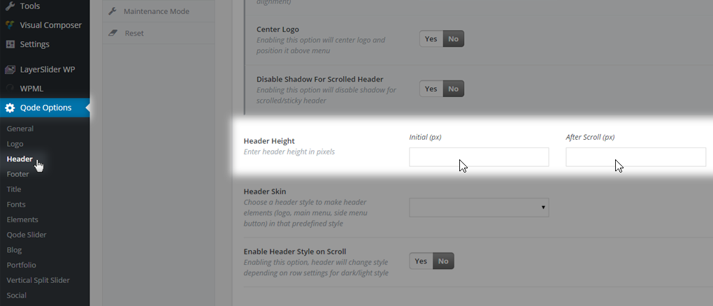
6.7.1 How to change Header Height?
From your WordPress dashboard navigate to Qode Options -> Header -> Header Height.
Enter your values and save.
6.7.2 How to change the Header Background?
From your WordPress dashboard navigate to Qode Options -> Header -> Header Background Color and Header Transparency.
Enter your values and save.
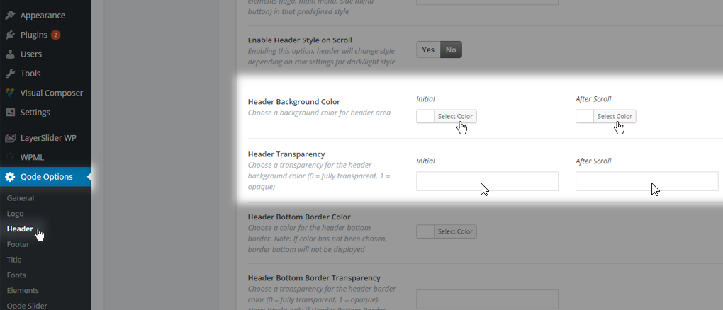
These options carry a global value, meaning they are applied throughout the website.
So, to set the header background style on a page to page basis, navigate to edit that page and in the Qode Header metabox set Header Background Color and Transparency to your desired style.
6.8 Header Widgets
You can use several header widget areas to add additional elements/widgets into your site’s header. To get an overview of all the widget areas at your disposal, please navigate to WP Admin -> Appearance -> Widgets:
01 Header Top Area - This area is a small section that appears at the very top of the page above your logo and menu items. This area is meant for placing widgets/elements (social icons, language selector, text etc.). To enable this area you need to go to WP Admin-> Qode Options -> Header -> Header Top -> Show Header Top Area, choose Yes and save. This area consists of two widgets areas - Header Top Left and Header Top Right. Inside these areas you can place widgets to have them displayed on the front-end.
02 Header Bottom Right Area - This area is located next to your menu items. You can place here a number of widgets/elements, but we suggest adding a text widget, social icons, or the WPML language switcher.
To add widgetized content to this area just go to WP Admin-> Appearance -> Widgets, find this widget area, and add your desired widgets.
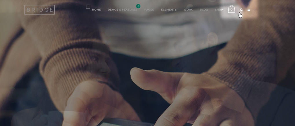
Please note that on smaller screens, like mobile devices and tablet devices (in portrait view), this widget area is disabled because there is not enough space to show it in most cases. However, if you’re eager to display this area on all devices, feel free to submit a ticket to https://helpcenter.qodeinteractive.com/hc/en-us and we’ll send you the needed Custom CSS code in realtion to your website’s front-end.
03 Header Bottom Center Area – Similarly to the Header Bottom Right Area, there’s an existing widget area positioned below the logo and used when the header type is set to Fixed Header Top. Inside this widget area you can add any elements you want, and it will be displayed below your logo image. However, we suggest a simple text widget.
04 Header Fixed Right Area - This widget area is located on the right hand side inside the header area and is in the same line with your logo image. The menu is located under these elements. This widget area is used only as the content of Header Bottom area when the header type is set to Sticky Expanded.
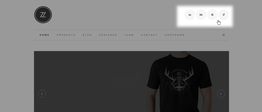
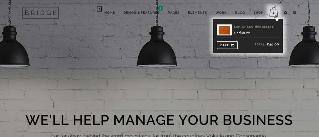
05 WooCommerce Dropdown Widget Area – An area dedicated for the WooCommerce Dropdown Cart widget. It appears next to your menu items. You can drag&drop the WooCommerce Dropdown Cart widget and display a shopping cart icon, so your customers will be able to see all the products they bought from your site.
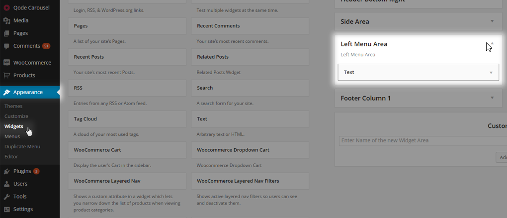
06 Left Menu Area – This widget area is used only when the Left Menu header layout is chosen. Inside this widget area you can add any element you want to show below your logo image, but we suggest adding a simple message inside a text widget or placing social icons. If you’re using WPML, then a language switcher placed in this area would come in handy. Also, adding a Custom Menu might be useful if you’re looking for a specific content structure.

Note: the Sticky Divided Header Type can only have Header Top Left and Right Widget areas. The Shopping cart widget cannot be displayed when using this header type.
6.8.1 How to add Social Icons into Header Top or Header Bottom?
Besides adding a default widget into one of the widget areas, you can also use WPBakery shortcodes - e.g. Social Icons. To add a shortcode to a widget area you should go to Pages -> Add New and create a ‘test page’ which you’ll use to create your widget content.
01Click on the Backend Editor button (if it isn’t already enabled by default) and Add New Element.
02Choose any shortcode you’d like, fill in the content and styling options, and save the changes.
03Click on Classic Mode to switch back to the WordPress classic editor. This will allow you to see raw shortcodes.
04Select the shortcode, copy it
05Navigate to Appearance -> Widgets. Add a Text widget to the desired Widget Area and paste the shortcode.
06Save changes and refresh your site.
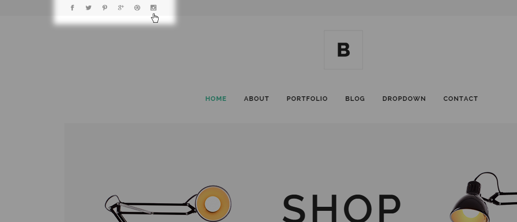
The same principle applies for all widget areas.
6.8.2 How to remove social icons from my menu/header?
Simply go to WP Admin -> Appearance -> Widgets -> Header Top Left/Right, and remove the entire text widget or just the social icons shortcode inside that widget, and save.
The same principle applies for all widget areas.
6.8.3 How to style the Header Top area?
Please navigate to WP Admin -> Qode Options -> Header -> Header Top and here you will find options to style the Background Color and Border Color.
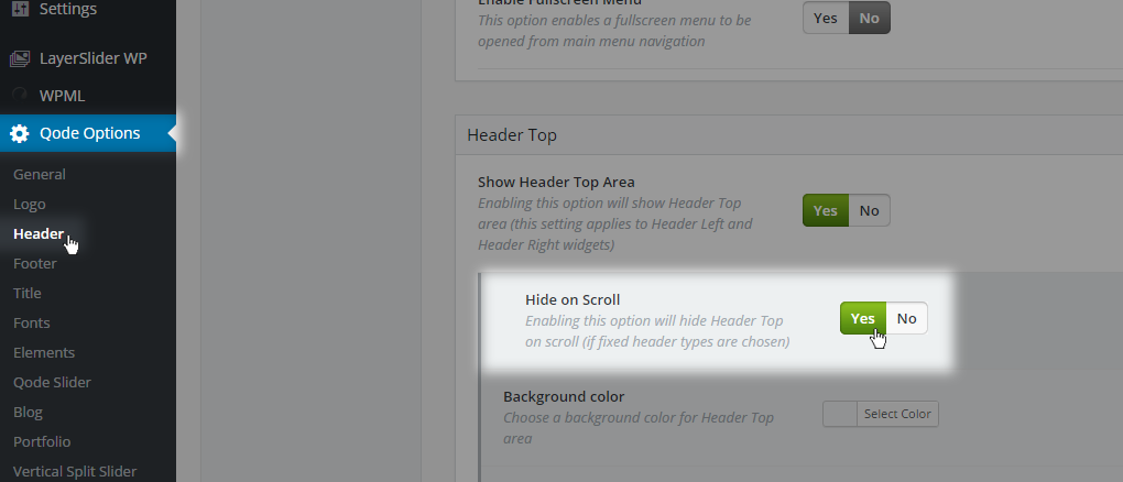
Also, we’ve implemented a Hide on Scroll feature in this section so you can choose to hide/show the Header Top area when you scroll down your site.
6.9 Vertical Header Area – Left Menu Layout
Besides setting a horizontal menu as the default header layout, you can also switch to the Left Menu.
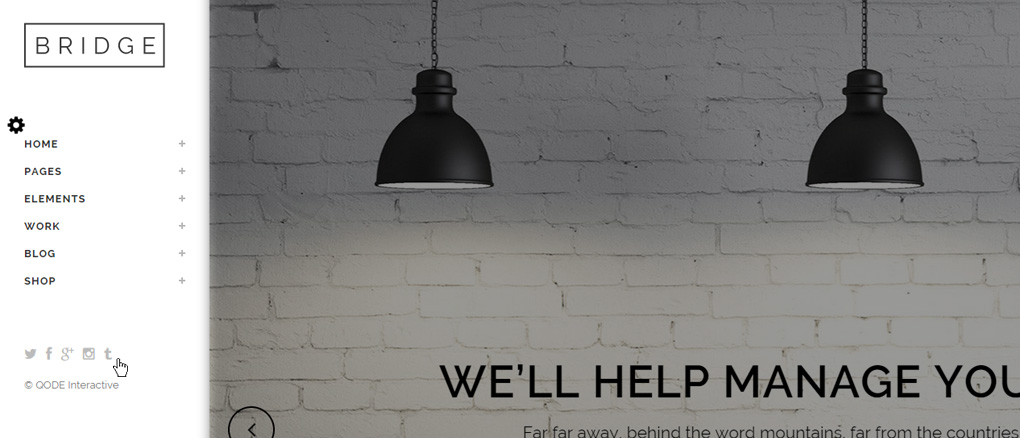
This area also includes a Logo image, Menu Items and a header widget area. To enable this area you need to go to WP Admin -> Qode Options -> Header -> Header Position -> Switch to Left Menu, select Yes and save. Then you will get an additional set of options below that section, which will allow you to choose different layouts and behaviors for that header.
The two most important options for this header layout are:
The two most important options for this header layout are:
01 Left Menu Area Type
02 Submenu Opening Style
Left Menu Area Type is an option where you can choose how the vertical header area will behave and be styled on your site. We’ve implemented two basic layouts to start with:
- Always Opened (Default)
- Initially Hidden
6.9.1 Left Menu Area Type – Always Opened (Default)
When this option is enabled, your header area will always be opened on the left side of your site, and the content will be located right next to it. This feature allows you to set a transparent background color for this area so you can make your Qode or LayerSlider visible behind the header elements. Then, on scroll the area will receive a solid background color or a background image that has previously been set inside Qode Options.
6.9.2 Left Menu Area Type – Initially Hidden
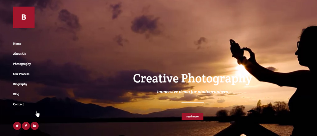
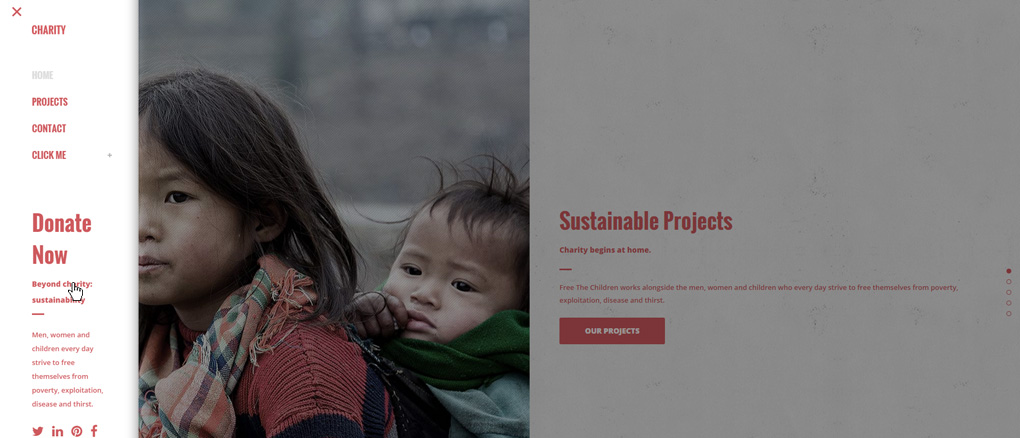
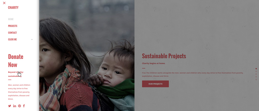
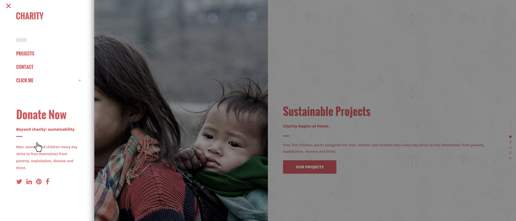
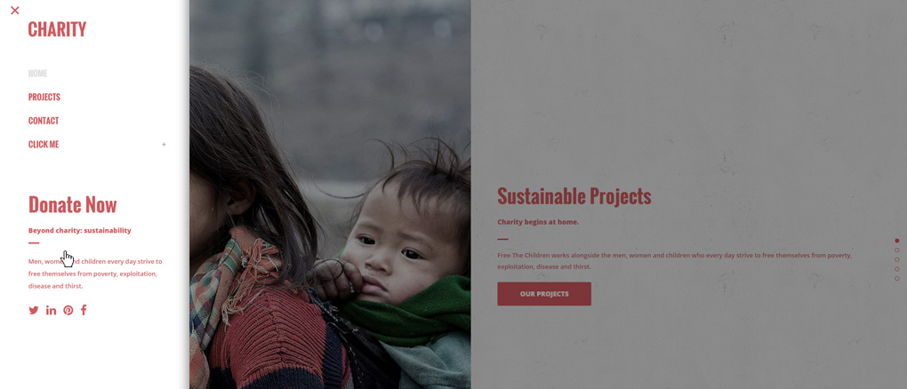
When this option is enabled, the left header area is initially closed, and you only have a menu icon visible. Upon clicking this icon the entire left header becomes visible: displaying a logo, menu items, and widgets – including the logo set for the initially closed left menu area, which is displayed on the bottom of the left menu while closed. You can upload that logo in Qode Options -> Logo -> Logo Image - Side Menu Area Bottom. To define another menu icon, navigate to Qode Options -> Header -> Left Menu Area -> Button Color and Button Margin Top.
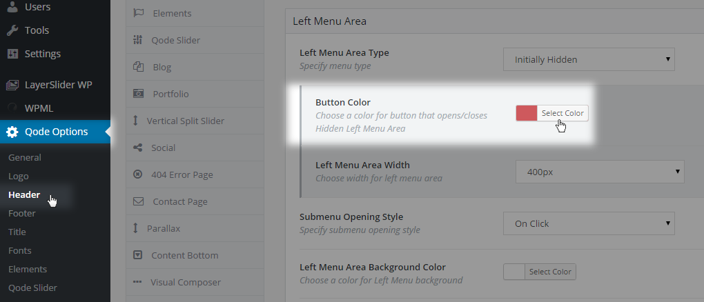
Another setting for this header type that can come in handy is Left Menu Area Width where you can define the size of your left menu area when it's opened. We’ve implemented four predefined widths:
- 260px
- 290px
- 350px
- 400px
6.9.3 Submenu Opening Style
Now let’s take a look at the way submenus open in this vertical layout. Submenus are menu items that are located under a parent menu item. Bridge supports menus that are up to three levels deep. This means that you can have one main level and two submenu levels.
There are three ways of opening submenus:
6.9.4 Styling the Left Menu Area
To style your Left Menu Area please navigate to Qode Options -> Header -> Left Menu Area. Here’ you’ll find various options like:
Left Menu Area Background Color
Left Menu Area Background Image
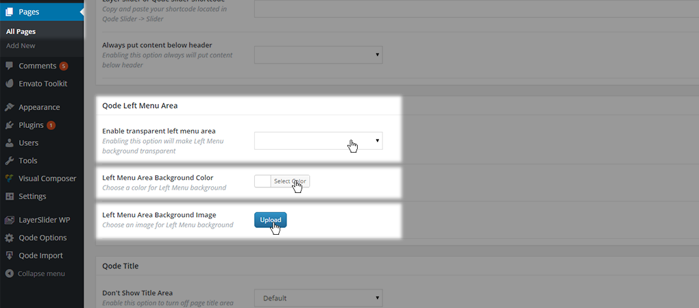
You have the possibility to set a solid, transparent, or image background for your Left Menu Area. And there is two ways to do that - The first is through Qode Options, and the second is on a page level basis. The first approach will set the desired background for all pages on your website, while setting a background property on a page-level will override this setting and be applied to just that page. To set these options for just one page, you need to go to WP Admin -> Pages -> That page -> Qode Left Menu Area, and inside this section you will find these options:
Enable transparent Left Menu Area
Left Menu Area Background Color
Left Menu Area Background Image
Now, to get back to the global options. Apart from setting colors for the whole header area, you can also go more in depth with each item level:
Dropdown Background Color - with this option you can control the background color of the Left Menu ‘Float’ type dropdown
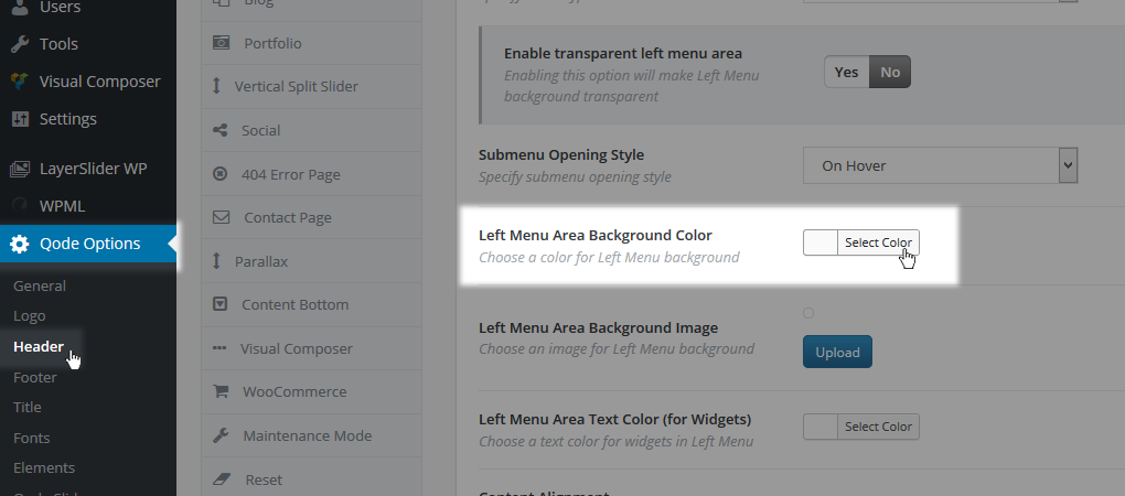
Note: For the best all-around styling we advise using the same background color for left menu area and for sub menus.
Dropdown Alignment - with this option you can control the alignment for the ‘Float’ type dropdown
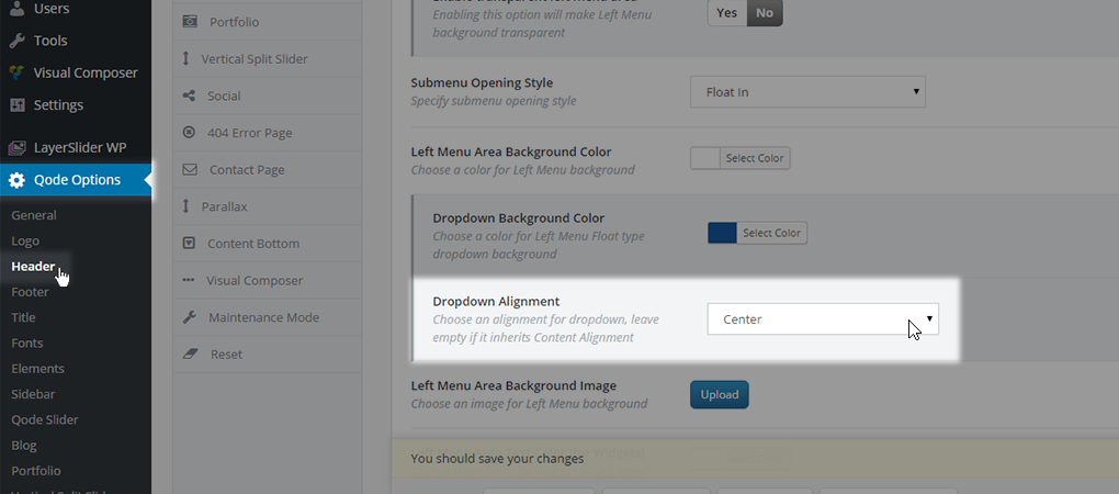
While the options described above only apply to the ‘Float’ type dropdown, you can also control other aspects of the Left Menu Area using the following options:
Content Alignment - with this option you can control your header elements alignment and set all elements to be left, center or right
1st level menu style - with this options you can control styles for your 1st level main menu items
2nd level menu style - with this options you can control styles for your 2nd level main menu items
3rd level menu style - with this options you can control styles for your 3rd level main menu items
6.9.5 Left Menu Widget Area
6.10 Content and Header Overlap
To improve the theme’s UX we’ve included an option that automatically puts content below the header, so there’s no unwanted overlapping.
You can enable this feature in Qode Options -> General -> Design Style -> Always put content below header.
By default (when this option is set to No), if you set a transparency value for the header area, then the header will overlap the content area, so - if the title area were also enabled for example- you’d have a ‘see-through’ header area, and a visible title image beneath it.
But with the Always put content below header option enabled, you’ll manipulate the content positioning, and move the title entire area below the header, so that you get a basic stacking layout.


