Non-related to the height option you are using with previously mentioned options, you can control the slider height on mobile devices for all Qode sliders on your site using the global setting. This option is handy if you want to have more control of the slider height but don’t want to dig into advanced responsiveness and fine tuning
8. QODE SLIDER
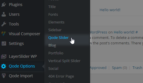
This options is located under Qode Options -> Qode Slider -> General section.
Value set in the field next to Slider Height For Tablet Portrait and Mobile Landscape View (px) label will be applied on browser width between 768px and 480px. This should affect portrait orientated tablet devices and landscape orientated mobile phones.
Value set in the field next to Slider Height For Mobile Devices (px) label will be applied for browser width less than 480px. This should affect portrait orientated mobile phones.
8.1 INTRO
Generally speaking, content above the fold, especially on a home page, is something that will have a huge impact on your site visitors’ first impression and overall experience. The Bridge Wordpress theme comes with the built-in Qode Slider - a powerful tool that can help you create awesome effects at the very top of your page. It's easy to create, edit, and delete sliders and slides using our custom interface.
The Qode Slider can be placed into pages, posts or portfolio items and will be located on top of the page, before the actual content. It has a dual usage. Besides being a regular slider that consists of two or more slides, it can be used as fullscreen section at top of the page in case that it is showcasing only one slide.
Regular slider: http://demo.qodeinteractive.com/bridge62/
Fullscreen section: http://demo.qodeinteractive.com/bridge53/
In the following section of this manual we will walk through the necessary steps in order to create and use the Qode Slider. By the type of media used we can divide slides to those with background images and those with background videos, and we will show you how to create each one of them. Sliders can be in full viewport height or in fixed (pixel-perfect) height, can have animated content and parallax background behavior, can influence header styles etc. Some options are controlled from the graphic interface and some are controlled as a shortcode parameter - manually.
It is important to know that when video background is used, muted video will playback automatically in endless loop, and it is important to mention that playback won’t be paused when the slide is out of focus. Another important thing to know is that the Qode Slider is not a part of the content, which means it won’t be hidden if a password protected post is used. And most importantly – the Qode Slider only supports self-hosted videos.
8.2 CREATING A QODE SLIDER
Navigate to WP Admin -> Qode Slider -> Sliders. To add a new slider just fill in the Name and Slug fields and click on the Add New Slider button:
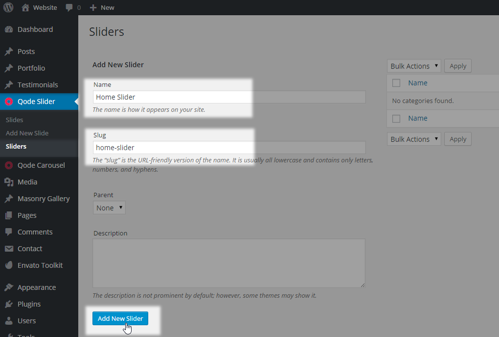
Your slider is now created. Let’s populate it with some slides and then tweak the appearance.
There is also another method of creating a slider right from the slide edit screen, and this will be covered in the next section.
8.3 Creating a Slide With Image Background
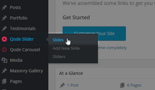
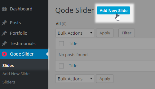
Navigate to Wp Admin -> Qode Slider -> Slides, click on the Add New Slide button:
Enter a title and choose Image as the Slide Background Type in the Qode Slide Type section. On the right hand side of the screen please note the Sliders section where all existing sliders are listed in. Tick the one you wish to assign your current slide to.
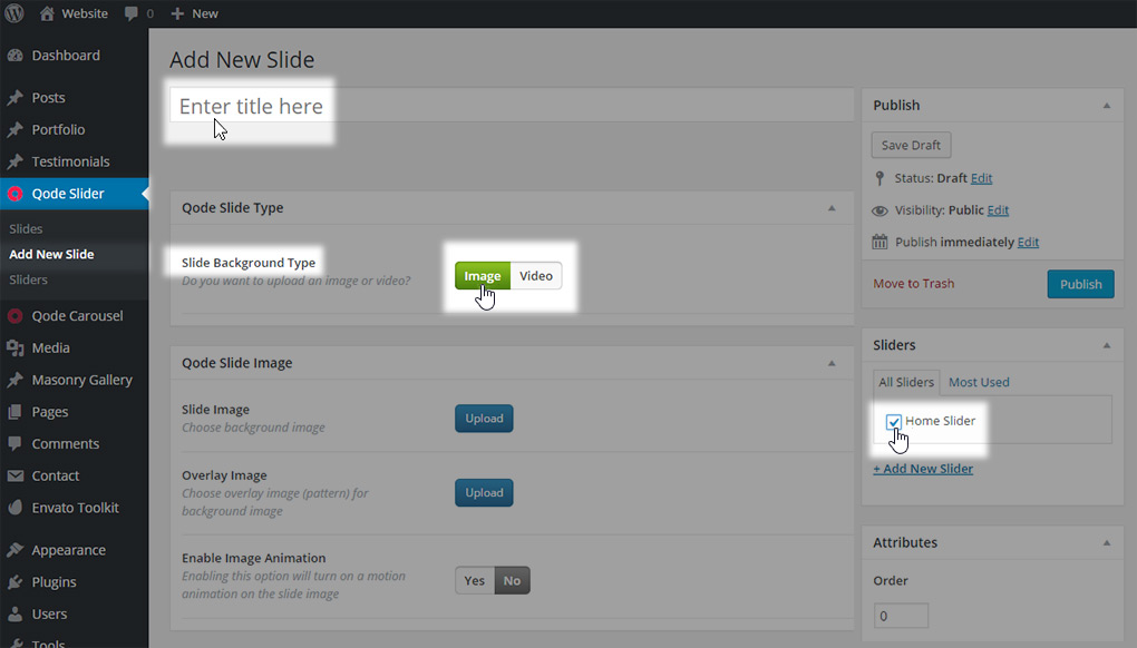
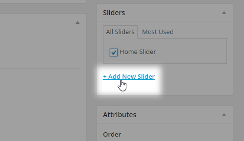
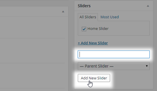
If you want to create a new slider from this screen click on the Add New Slider link. A new dialogue box will appear beneath. Enter the title (from which a slug will automatically be created) and click on the Add New Slider button.


Note: The Slug is a browser friendly URL which identifies a page using human-readable keywords
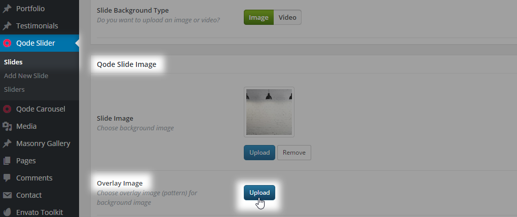
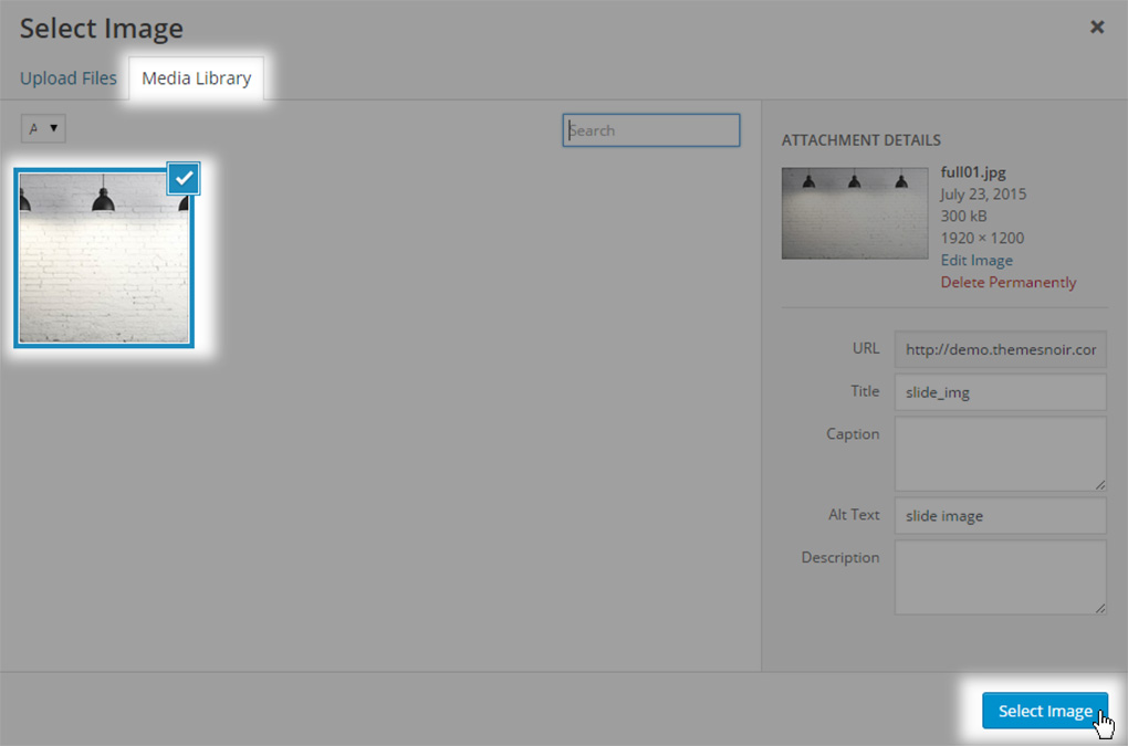
Since we’re creating an image slide, the next thing we need to do is to add the actual image in the Qode Slide Image section. Click on the Upload button next to the Slide Image label. The standard WordPress media dialogue will appear. Choose an existing file from the Media Library tab or upload a new image from the Upload Files tab into your Media library. Select an image and click on the Select Image button.
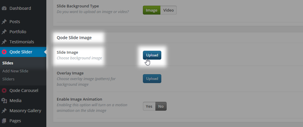
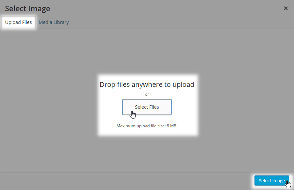
You can optionally set a pattern over each slide to serve as an overlay for the whole slide image. To do that, click on the Upload button next to the Overlay Image label in the Qode Slide Image section. The standard WordPress media dialogue will appear. Choose an existing file from the Media Library tab or upload a new image from the Upload Files tab in your Media library. Select an image and click on the Select Image button.
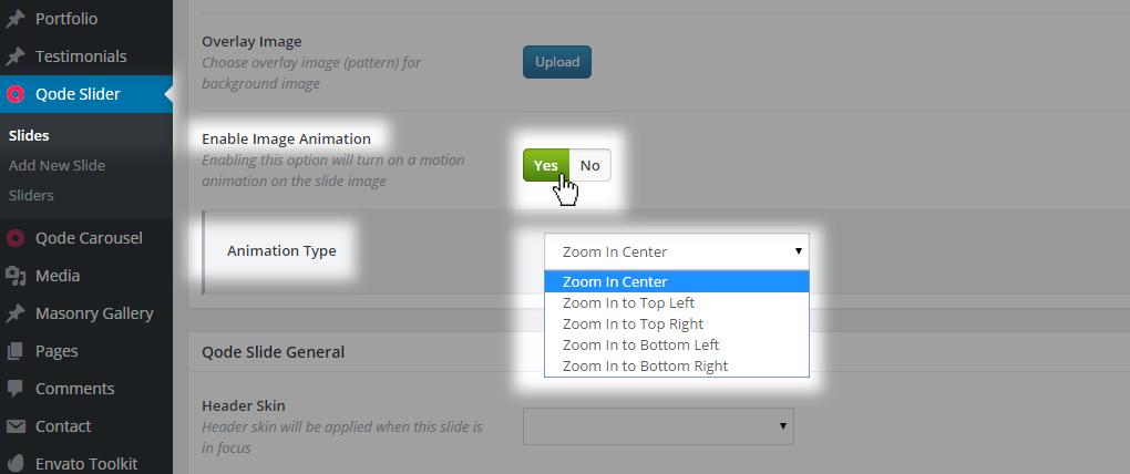
If the Enable Image Animation option is not set to Yes, the slider background image will be static. Otherwise it will be animated with a zoom in effect, and you can choose the zoom direction from the Animation Type dropdown.
8.4 Creating a Slide With Video Background
Navigate to WP Admin -> Qode Slider -> Slides, and click on the Add New Slide button:


Enter a title and choose Video as the Slide Background Type in the Qode Slide Type section. On the right hand side of the screen please note the Sliders section where all existing sliders are listed. Select the one you wish to assign your current slide to.
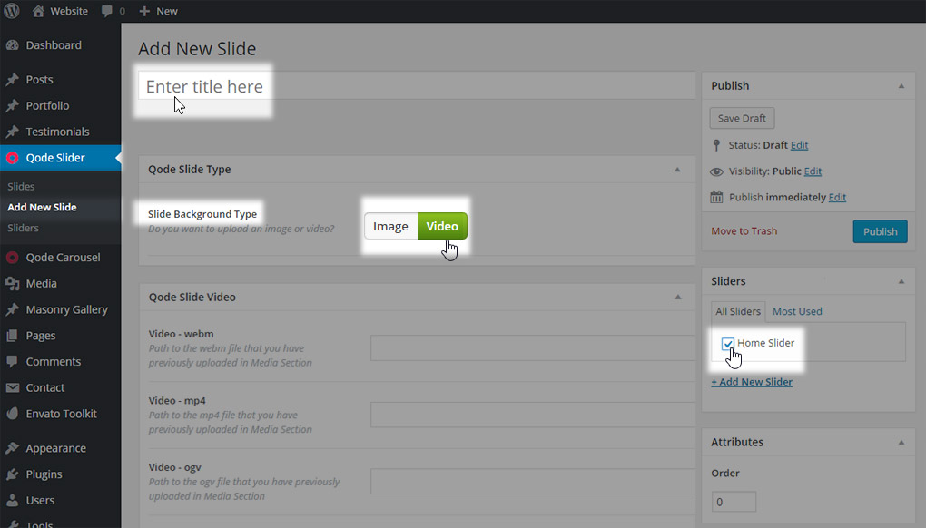

If you want to create a new slider from this screen, click on the Add New Slider link. A new dialogue box will appear beneath. Enter a title (from which a slug will automatically be created) and click the Add New Slider button.
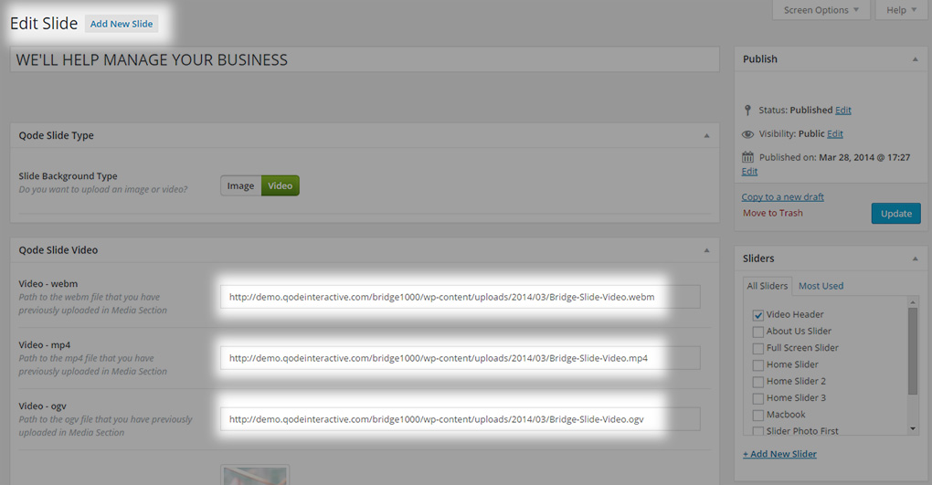
Since we’re creating a video slide, the next thing we need to do is to input links toward our video files in the Qode Slide Video section. Please note, some browsers won’t play certain video files. To make sure your video slide is compatible with all major browsers it is necessary to use all three supported video formats. You can use online-convert.com in order to convert your video files online.
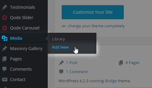
If you have already uploaded your video files to the Media library you can skip the next step. Add video files to Media Library as you would any other media file: navigate to WP Admin -> Media and click on the Add New button:
Navigate to WP Admin -> Media and locate the desired video file. By clicking on the video file, the Attachment Details dialogue will open where you can find video URL. This URL needs to be entered into the Qode Slide Video section. Copy it.
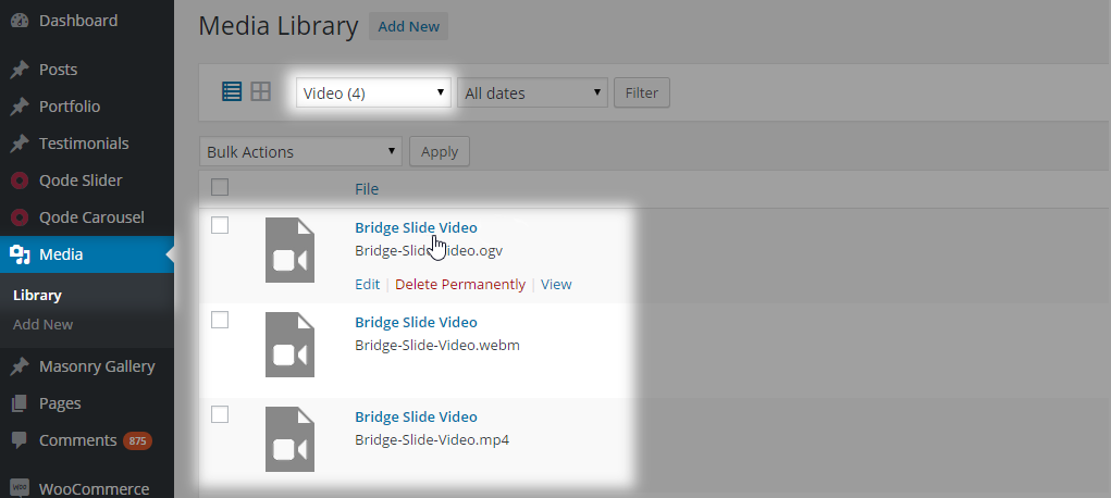
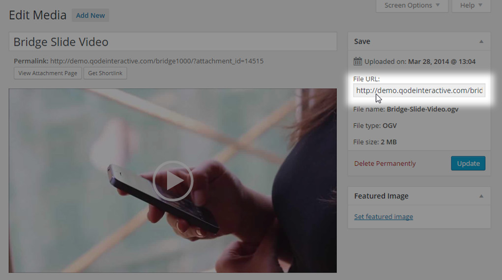
Paste the copied URL of the particular video format into the field next to the matching video format label.
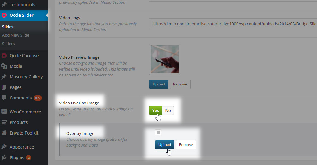
You can optionally set a pattern over a video slide to overlay the whole video. To do this, first set Video Overlay Image to Yes in the Qode Slide Video section, and then click the Upload button next to the Overlay Image label. The standard WordPress media dialogue will appear. Choose an existing media file from the Media Library tab or upload a new image from the Upload Files tab in the Media library. Select an image and click on the Select Image button.
Important: There are three situations when the Qode video slide won’t be visible.
The first one is when your web browser is still buffering the video before the actual playback begins.
The second one is when your website is viewed on mobile devices. Not all mobile devices can playback HTML5 video properly, and in order to make the slider appear uniformly across all mobile devices, video playback is disabled in the JavaScript.
As a fallback for both cases you can use the Video Preview Image feature. Click on the Upload button next to the Video Preview Image label in the Qode Slide Video section. The standard WordPress media dialogue appears. Choose an existing file from the Media Library tab or upload a new image from the Upload Files tab in the Media library. Select an image and click the Select Image button.
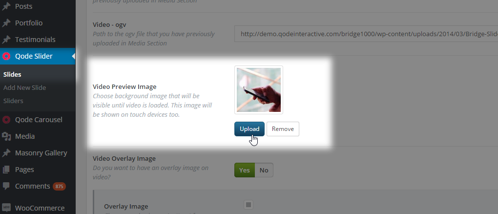
The third situation is when your server doesn’t allow AddType webm or mp4 or ogv to load. To fix that issue please contact your hosting service provider and ask them to enable these formats for your site.
A similar situation that is often seen is “My video works fine in Chrome and IE but doesn’t work in Mozilla”? This has happened because your server doesn't allow webm files. Try to go to your server root, find .htaccess file, open this file and add this line of code below
AddType video/webm .webm
or ask your hosting service provider to do that for you.
8.5 COMMON SETTINGS FOR IMAGE AND VIDEO SLIDES
This section describes all the main settings that can be used to set up and customize your image and video slides.
8.5.1 Slide Content
Slide content consists of:
- Slide Title,
- Slide Subtitle,
- Text,
- Graphic,
- SVG,
- Two Buttons
- Scroll-To Section Link.
This is actually the order of appearance of each element in a slide from top to bottom. All elements except the Slide Title are optional to fill in and use – they won’t be shown if the dedicated fields are left blank.
Slide Title, Subtitle and Text are text fields with various typography options that are pretty straightforward – font size, font family, font weight, font variant, color, line height, letter spacing aka kerning, caps etc.
Elements that can act as links will open the targeted URL in the same window/tab
8.5.1.1 Slide Title
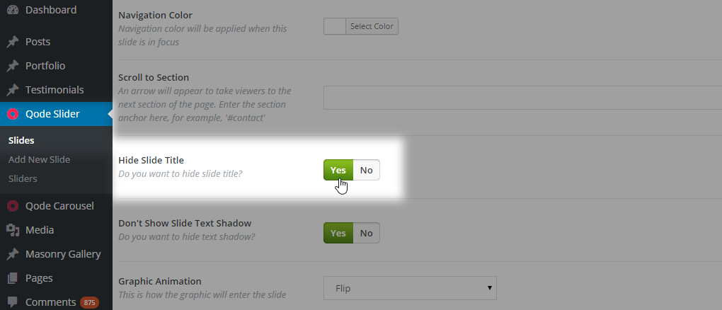
This text field is a required one, similar to the one for pages, posts and all other post types. Therefore, if you do not want to show the title on your slide you shouldn’t leave this field empty, but rather choose Yes next to the Hide Slide Title label. This option is neat when you want to use generic slide names just for easier maintenance in Dashboard, eg. Slide One, Slide Two etc. and you don’t want them to be visible on your site.
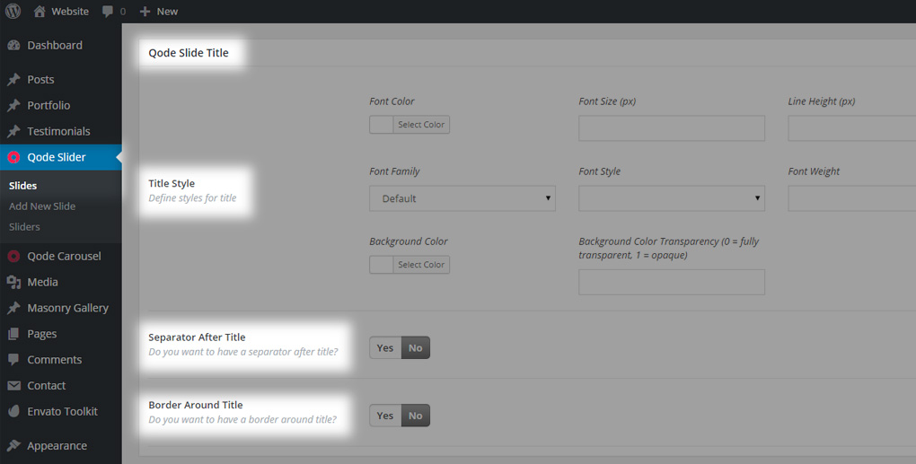
The slide title consists of the title itself, a separator, a border and a background. By default, the separator and border are turned off, and the background color is transparent. If you wish you can turn them on by choosing Yes next to the appropriate label. If the title color isn’t set, white will be used as default - this rule applies to all text fields in a single slide.
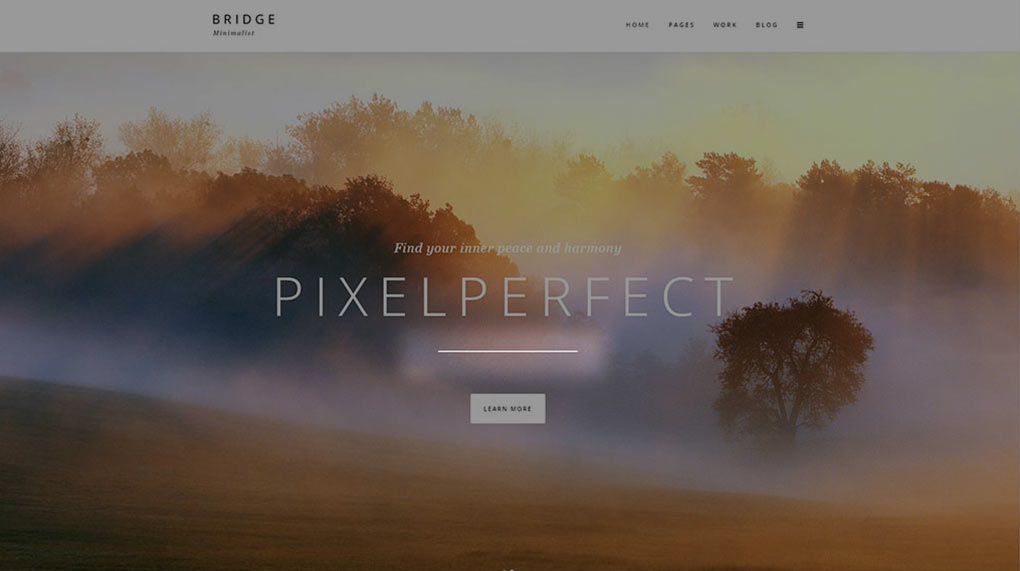
The title separator is a line below the title text that acts like a bottom border or a delimiter between the title and the rest of the content.
The border around title is a line around the title text that acts like a surrounding border or a delimiter between the title and the rest of the content.
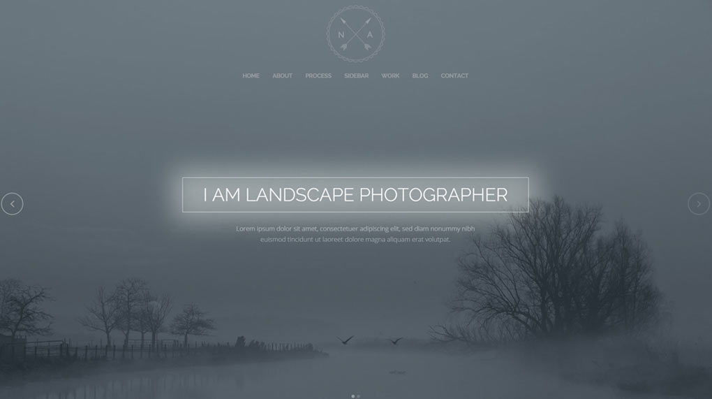
The title background is convenient if you want to make your title text stand-out and be more readable depending on the slide image or video background.

For instance, if you are using a text color that is similar to a dominant slide background color or you just want to make it pop up more and draw more attention. Also, using the title background is a good choice when the slider background color is not consistent during time. A typical scenario involves the usage of a video background. By simply setting a semi-transparent title text background you will ensure your title text is visible during the whole playback time, regardless of the video frame behind it.
8.5.1.2 Slide Subtitle
This text field is optional and if used can be positioned above or below the Slide Title in the content stacking order list (explained below in the content positioning section).
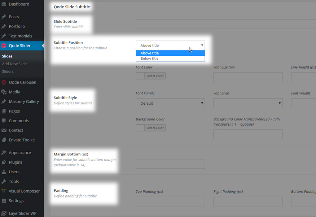
In addition to typography and background options, padding and bottom margin options are also available. The default background color is transparent. Padding allows you to control the distance between the text and the surrounding rectangle filled with background color, while the bottom margin allows you to control the distance between the bottom of that rectangle and the next element in the stacking order – the one directly below the slide subtitle. By increasing the padding you will actually increase the size of the rectangle holder itself.
8.5.1.3 Text
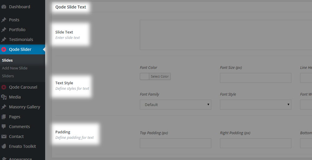
Similarly to Slide Title and Subtitle, for the Slide Text field typography, background and padding options are also available.
8.5.1.4 Buttons
You have an option to use one or two buttons in a single Qode Slide. To do so, simply enter values for both the button label and button link in the appropriate sections within the Qode Slide Button section. Omitting either one of those fields for one button will make that button hidden on your slide. In other words, to use only the second button on your slide, fill-in both fields for it and omit at least one field for the first button, and vice versa.
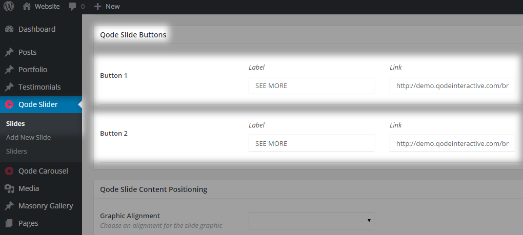
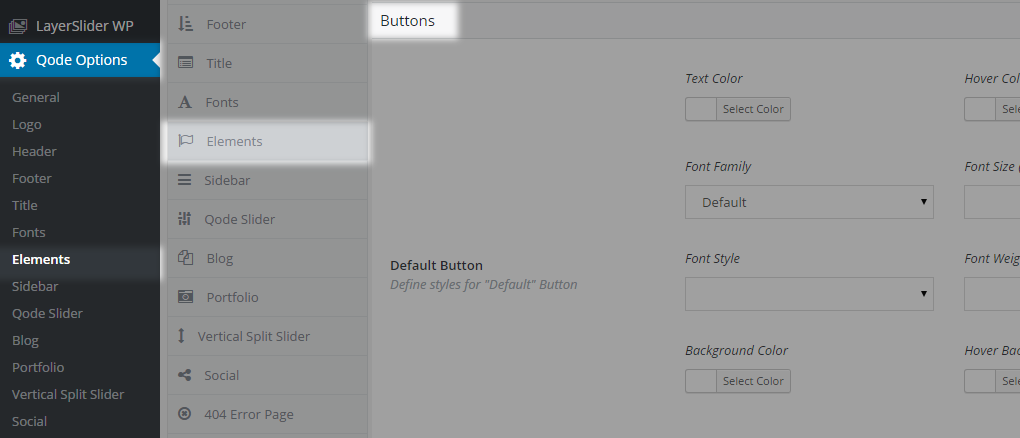
Button 1 default style is the same as for Default Button and Button 2 default style is the same as for White Button in your site. Those styles are controlled in WP Admin -> Qode Options -> Elements –> Buttons. This is a good choice if you want to use buttons in your slide that match other buttons used across your site and is applied out-of-the-box.
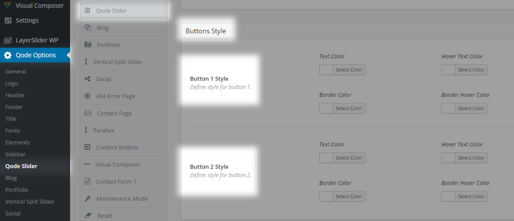
However, additional styling options are provided in case you need to achieve a different look and feel. You can tweak the slide buttons in WP Admin -> Qode Options -> Qode Slider -> Buttons Style. This is a good choice if you want to create a particular layout for your site visitors and trigger a call to action. Please keep in mind that this is a global setting and will affect all slides and sliders on your site.
Important note: A full URL is required for each button when using the link functionality.
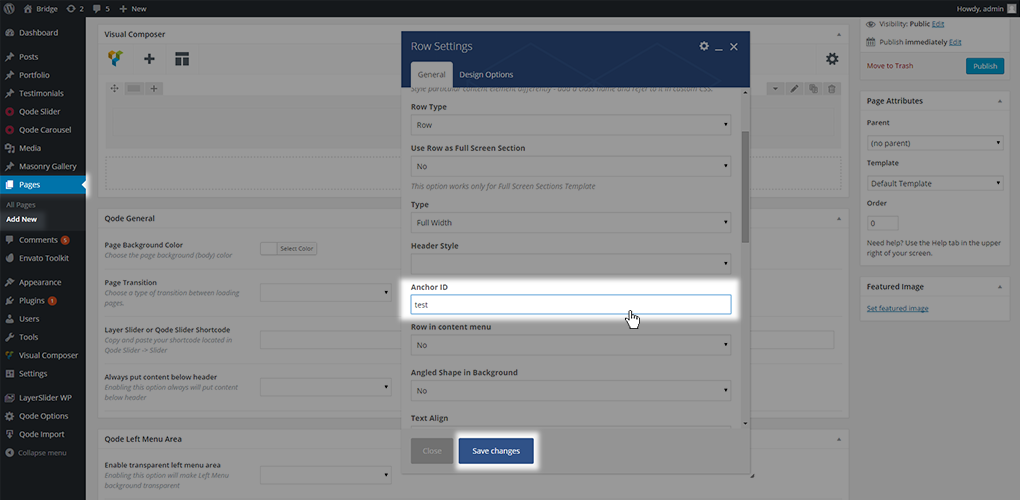
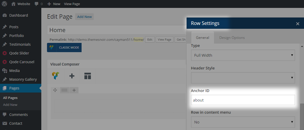
The link can lead to an external website, or can target a section on any part of a page on your website. To achieve this, please enter a valid target Anchor ID parameter after a leading ‘hash’ symbol (#) and the page URL in the dedicated field mentioned above. To create the anchor target on any page, navigate to WP Admin -> Pages where a list of existing pages is shown. Create a new page or edit an existing page. Locate the row that will act as a ‘scroll-to’ target and click to edit it. Enter the Anchor ID (eg. my-anchor) in the Anchor ID field. Now, the full url to this section will be http://your-site.com/page-name#my-anchor.
For targeting a section on the same page the slider is displayed on, you can either use the Qode Slider buttons as described above, or the actual Scroll To Section field as explained later on.
8.5.1.5 Graphic
The slide graphic allows you to use an image as a part of the actual slide content. It is convenient for displaying your logo, a product image, or any kind of graphic that you would like to display alongside the slide text. To add an image, click the Upload button next to the Slider Graphic label in the Qode Slide Graphic section. The standard WordPress media dialogue will appear. Choose an existing image from the Media Library tab or upload a new image from the Upload Files tab in the Media library. Select an image and click the Select Image button.
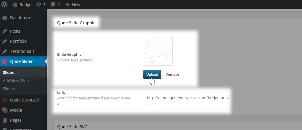
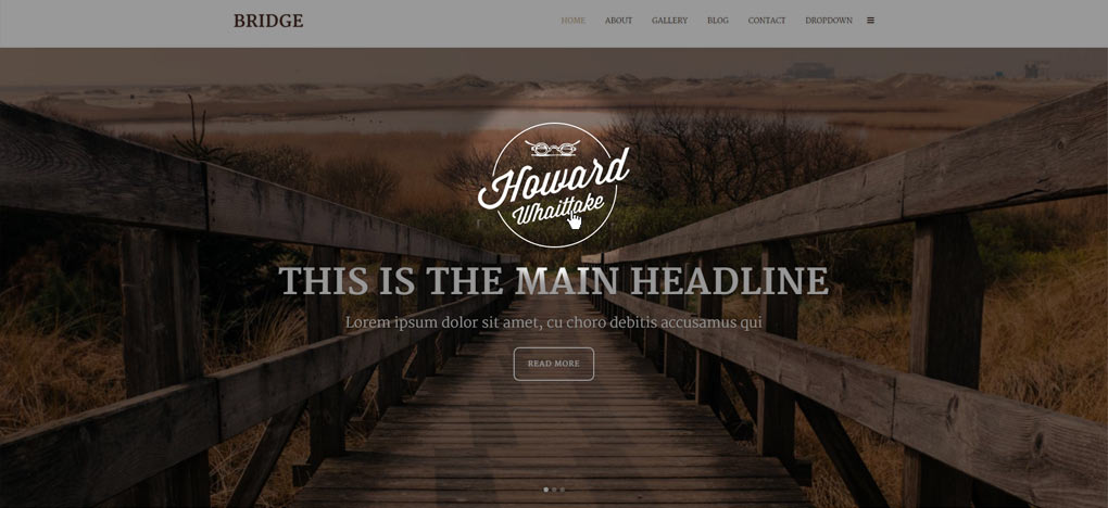
This image can be used as a link as well. To achieve this, enter a full URL in the Link field in the Qode Slide Graphic section.
This link can target a section on any page on your website, similar to the Buttons’ functionality.
8.5.1.6 SVG
If you want to use a SVG generated with a graphic editing tool, you can do so by entering the SVG source code in the SVG Source Code field in the Qode Slide SVG section.
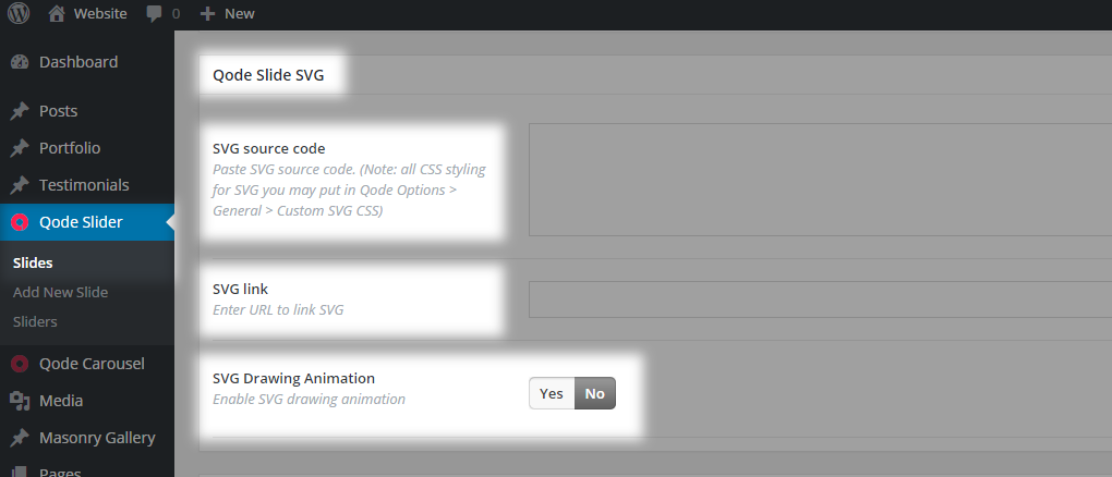
This SVG can be used as a link as well. To achieve this, enter a full URL you would like the SVG to lead to on click in the Link Label field in the Qode Slide Graphic section.
This link can target a section on any page on your website, similar to the Buttons’ functionality.
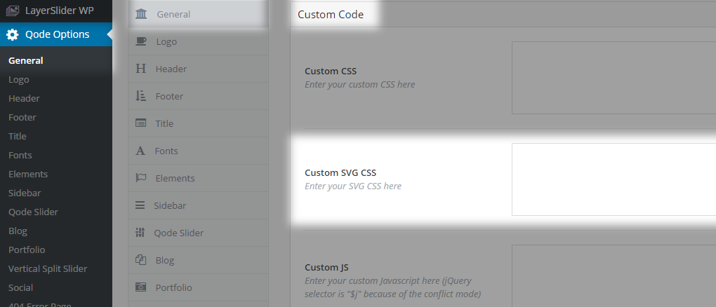
Additional custom styles for the SVG element can be also applied. A list of CSS properties can be found at this link: http://www.w3.org/TR/SVG/styling.html
The SVG CSS field is located in Qode Options -> General -> Custom Code -> Custom SVG CSS.
8.5.1.7 Scroll To Section
You can use this feature to link to a part of your content located on the same page as your Qode Slider. To do so, simply enter the Anchor ID of the Row that contains the section you’re looking to scroll to in the Scroll To Section field in the Qode Slide General section. Please note, the ID must have a leading ‘hash’ symbol (#) included.
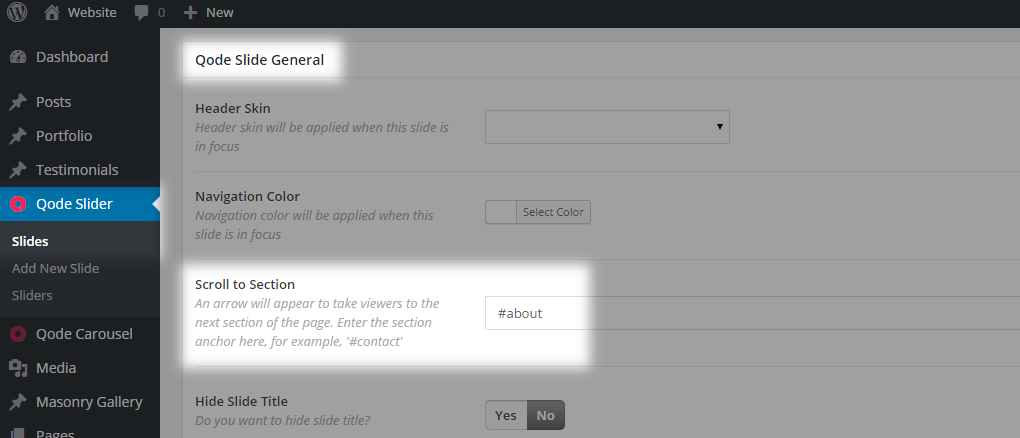
This is actually a link represented as a down-pointing arrow placed as the last item in stacking order - at the very bottom of the slide. Besides using this arrow as an actual link it is a good UX to let the site visitors know that there’s content below the slider especially if it is consuming the full height of your viewport.
8.5.2 Slider Content Positioning
Now, when you have created a slide’s content, it’s time to set what goes where. You have two major options at your disposal - to position the graphic together with the content – as if they were the same section, or you can position them separately.
If you choose to position them together, select No next to Separate Text and Graphic Positioning label in the Qode Slide Content Positioning section, otherwise choose Yes, and additional positioning options will become available.
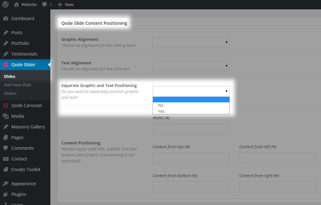
What follows is a more hands-on approach on content positioning that will explain in detail what is going on in your Qode Slide under the hood. In the context of content positioning, slide Graphic and slide SVG elements are both treated as graphic content. Every other element within the slide is treated as textual content – Slide Title, Slide Subtitle, Slide Text, Buttons and Scroll To link. If you go for separate positioning, the content will be placed in two separate boxes (HTML tags if you will) – invisible on the front-end, but used for structuring. One will wrap all graphic elements and the other will wrap around text elements. On the other hand, if you choose to position both content and graphic together, they will be placed in the same wrapper.
Content elements are positioned in separate rows inside the main ‘box’ wrapper, ordered from top to bottom – one element per row. Excluded from this rule are buttons, if both are used, they will be placed in the same row, next to each other.
Here is the stacking order in the ‘box’ wrapper if both graphic and text content are positioned together:
- Slide Graphic
- Slide SVG
- Slide Title
- Slide Subtitle
- Slide Text
- Button 1 and Button 2
- Scroll To Section link
If graphic and text content are positioned separately, the stacking order list for the graphic content is as follows:
- Slide Graphic
- Slide SVG
And the stacking order list for text elements is as follows:
- Slide SVG
- Slide Title
- Slide Subtitle
- Slide Text
- Button 1 and Button 2
- Scroll To Section link
It is important to know that content width and position are not relative to the browser window but relative to our grid system. Another important thing to know is the rule regarding graphic elements when advanced responsiveness is turned on. In this case, the size of graphic elements, represented in percentage, is calculated in relation to the actual graphic dimensions so you should keep this in mind if you are using images for this purpose that are larger than our grid.
Note: The Bridge theme grid is set to be 1100px wide and it is centered horizontally in the browser window.
Now that you are familiar with the ground rules of content positioning, we will walk through all the available options. You can control the ‘Box’ wrapper width and its position inside the Qode Slider. Besides that, you can control the alignment of elements within the wrapper itself.
Content width takes a value defined in percentage and it controls the width of the wrapper. If left blank, 50% will be used as default value. If a graphic element is wider than the wrapper, it will be scaled down to fit the wrapper’s width. If a text element is wider than wrapper, text will be broken into a new line. You can the width by entering a number in the field below the Width label in the Qode Slide Content Positioning section. Please note that you need to enter numbers only, without the actual percentage symbol.
Content alignment options for graphic and text content are pretty straightforward – they control the alignment of elements inside the wrapper. If left blank, graphic content will be left aligned and text content will be centered horizontally.
Available alignment options for use are left, center and right and you can set them from the dropdown box next to the Graphic Alignment and Text Alignment labels respectively.
Content positioning takes values in percentages that define the distance between the wrapper and slider edges vertically and between the wrapper and the grid horizontally. If left blank, 20% will be used for Content From Top as the default value and 25% will be used for Content From Left as the default value. Content From Bottom and Content From Right don’t have default values if left blank. In the case when both graphic and text content are positioned together, those default values will center the slide content horizontally by default.
When it comes to content positioning in the case when both text and graphic are positioned separately, keep in mind that two wrappers can overlap causing undesired effects.
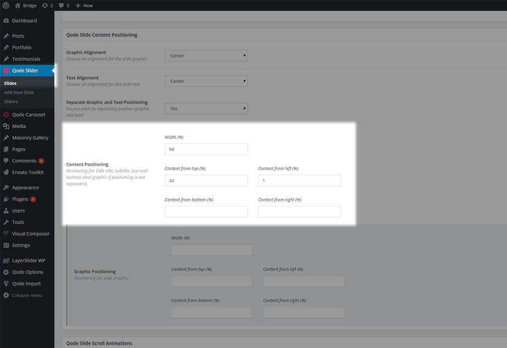
Here’s a positioning scenario related to horizontal positioning only.
Let’s say you want to position a graphic on the left hand side and some text on the right hand side of the slide. Also, let’s assume you want to avoid overlapping, but position the graphic next to the text. First, choose to position the graphic and the text separately. Set these positioning values - width for text to 45, left to 55 and alignment to left. This will position the wrapper on the right hand side and align its contents to left. Now, set the width for the graphic also to 45, left to 0 and alignment to right. the overall outcome is a 10% distance between the graphic and text wrappers.
Combination of these settings
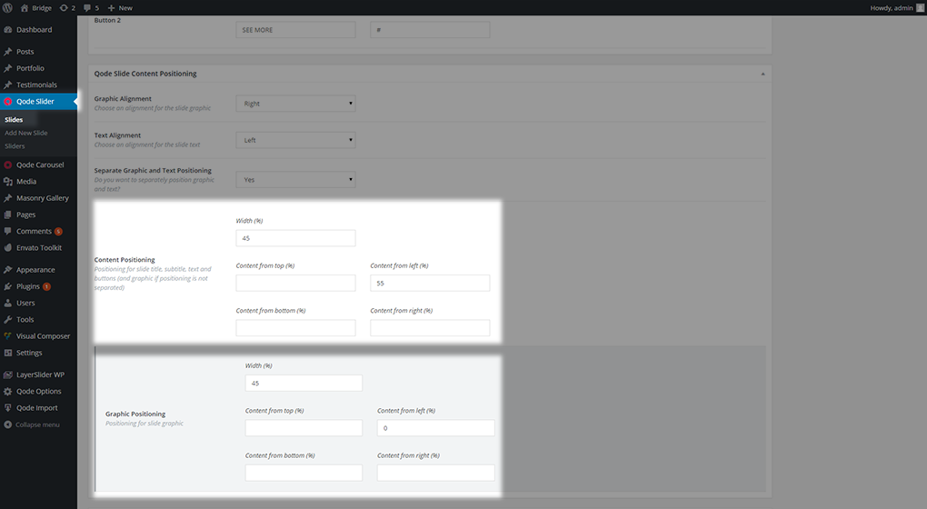
will produce this output on your slide.

8.5.3 Content Size Responsivness
The initial size of graphic elements will remain the original/uploaded one, if the width of the graphic element is smaller than the dedicated container width. Otherwise, if the graphic element is larger in size, it will take the width of the container. This applies only if advanced responsiveness is turned off.
By default, content elements will keep their size unchanged no matter what browser window width is at the moment. Advanced logic for content size reduction in Qode slider can be applied if needed. Please navigate to slider edit screen and choose yes from the dropdown box next to the Advanced Responsiveness label. It is applied on the Graphic, Title, Subtitle, Text and Buttons. In other words, the width of a particular element will be reduced by some coefficient when a particular browser width breakpoint is reached – these width values are defined as breakpoints.
You have two breakpoint sets at your disposal which cover different browser width ranges. The first set is the default one and it will be used even if not defined in the shortcode. This set consists of the following browser width ranges:
- above 1600px
- 1600px – 1200px
- 1200px – 900px
- 900px – 650px
- 650px – 500px
- 500px – 320px
- below 320px
The second set must be defined in the slider shortcode as a parameter for the attribute called q_responsive_breakpoints and consists of the following browser width ranges:
- above 1600px
- 1600px – 1300px
- 1300px – 1000px
- 1000px – 768px
- 768px – 567px
- 576px – 320px
- below 320px
If needed, you can override the default coefficient for a particular element by entering a numeric value between 0 and 1 in the field next to the dedicated label.
Note that when advanced responsiveness is enabled it will also affect the slider height in case the responsive height parameter is being used. This will be explained in following sections.
8.5.4 Navigation
Slider navigation can be static or dynamic and you can choose one or the other. Slider navigation is a global setting applied on all sliders and slides on your site. Navigation can be turned off per slider by entering no as the value for the show_navigation_arrows parameter in shortcode.
Static slider navigation is the default one and consists of buttons for previous and next slides that are positioned on the left and right hand side of the slider. Vertically centered and dotted pagination is located at the bottom of the slider, horizontally centered. Note that if you are using the left menu which is initially set to be transparent, both of navigation arrows are positioned in the lower right corner of a slider:
In addition to buttons, you can navigate through slides using the swipe/drag action in the middle of the slider, between the previous and next buttons.
Dynamic slider navigation consists of custom images displayed instead of your mouse pointer when hovering over clickable slider areas that are acting as a previous or next link or if you hover between them over the swipe/drag area. In other words, arrows follow the movements of your mouse pointer on screen.
To switch from static to dynamic slider navigation navigate to Dashboard -> Qode Options -> Qode Slider and choose Yes next to the Enable Custom Cursor for Navigation label in the Custom Cursor Navigation Style section.
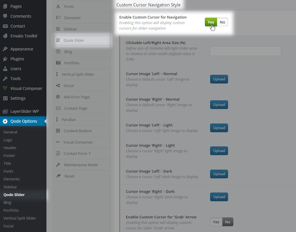
The width of these dynamic navigation areas is defined in percentage values set relative to the width of the whole slider. Leaving the field next to the Clickable Left/Right Area Size (%) label empty will set 23% as a default value. The rest of the slider in the middle will act as a swipe/drag area.
You can additionally customize previous, next and swipe arrows appearance by using your own images instead of default ones. Click on upload image next to the dedicated label, and the standard WordPress media dialogue appears. Choose an existing image from your Media Library tab or upload a new image from the Upload Files tab. Select an image and click the Select Image button.
Please note that images for custom arrows should have a transparent background in order to maintain good visual appearance.
Prior to customizing the swipe arrow, you must enable its usage by choosing Yes next to the Enable Custom Cursor for 'Grab' Arrow label in the Custom Cursor Navigation Style section.
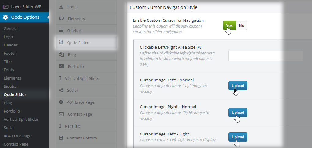
8.5.5 Effects
In this section we will go through the various animation and style effects that can be used with the Qode Slider.
8.5.5.1 Effects On Header
Each slide can affect the header style if necessary, and this will be applied only when a particular slide is active (visible). This can be used in situations when your header elements isn’t visible enough when a particular slide is in focus.
A typical usage scenario is when you have a transparent header with white menu items and one of your slides underneath the header has dominantly light colors. In that case a good option is to force dark skin on the header for that particular slide. Light header skin on the other hand is a predefined style which has white-colored menu items and other header elements. It is meant for usage on dark backgrounds.

Two options are available to control the color of items in the header. The first one is more hands-on and allows you to affect the whole header area by choosing a Header Skin. This will affect all elements in the header, including header background color, menu items color, displayed logo and header icons color.

The second one is moderate and will affect only the color of the slide navigation buttons.
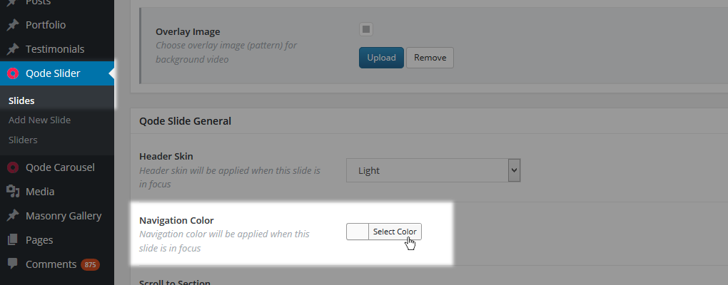
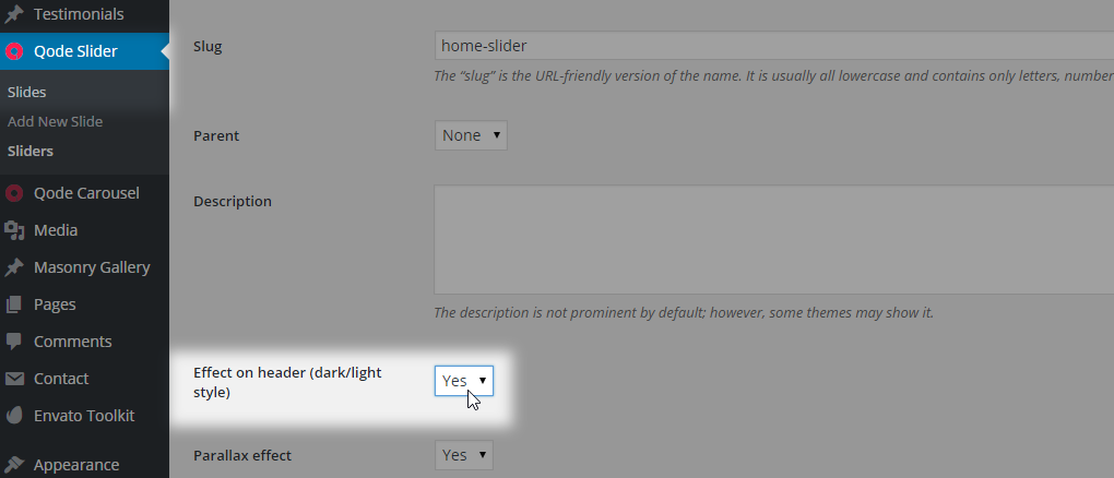
In order to apply the chosen options you must set them within a slide and confirm their usage in the slider by choosing Yes next to Effect on header (dark/light skin) in the Edit Slider screen.
8.5.5.2 Effects On Focus
There are two options allowing you to control content appearance when a slide comes into focus. In other words, this is how content will enter into the viewport.
Appearance for Slide Title, Slide Subtitle, Text and Buttons is controlled by the Content Animation dropdown. If All At Once is selected, those elements will come into view at the same time. Otherwise they will appear separately, one at a time, in the stacking order from top to bottom.
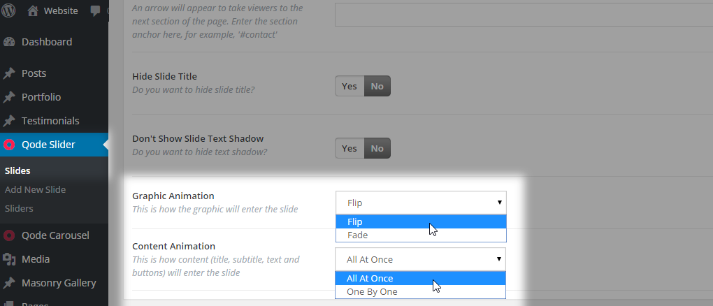
Appearance for the Slide Graphic and SVG elements is controlled by the Graphic Animation dropdown. You can choose between Flip or Fade effects.
8.5.5.3 Effects Between Two Slides
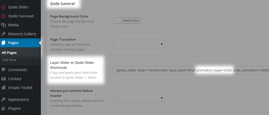
Effects between slides are controlled on a per slider instance. This is actually the transition effect between the current and the next slide - when the current is becoming inactive (leaving viewport) and the next one is becoming active (coming on stage). Two options are available here - slide and fade, and you can set one of them by choosing slide or fade as the value for the animation_type parameter in the slider shortcode.
8.5.5.4 Effects On Scroll
PARALLAX
Regarding the Qode Slider, a parallax effect will produce asynchronous positioning of the slider content on one, and the slider background on the other side when the page is scrolled, as seen in this demo:
Note: this option is not applied when passepartout is enabled.
ANIMATIONS
You can set additional animation of a particular content element that will be performed on page scroll.
Note: This option is for advanced users since CSS properties knowledge is required.
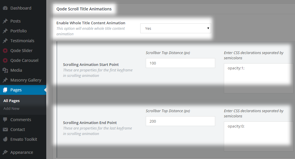
Choose the start and end point for the desired element and choose the type of effect along with start and end attribute values. For example:
Let’s modify title element and add animation effects to it. Choose 100px for start and 200px end, opacity 1 for start and opacity 0 for end. These settings will produce title fading out animation on page scroll. Animation will begin when 100px are scrolled out and it will be finished when 200px are scrolled out.
8.5.5.5 SVG Drawing
This option is great for an engaging visual impact on your site visitors. It is important to know that SVG drawing animation is only applied onto the path element within the SVG structure.
Note: In order to generate a proper draw-able SVG source code, advanced graphic editing skill is required.
For example, you can use your logo outlined with paths (draw-able content) together with fonts for your company name (non-drawable content). This combination will produce static text and animated logo drawing.
To enable this option simply select Yes next to the SVG Drawing Animation label in the Qode Slide SVG section. Additionally, you can control the drawing speed by entering a numeric value in the field next to the SVG Frame Rate in the Qode Slide SVG section. The default value is set to 30 frames per second, and the rule is – the higher the value, the slower the animation is.
8.6 USING THE SLIDER
In the following section we will explain in more detail how to use the Qode Slider, how to set it onto a page on your website, and we will go through the various useful options the Qode Slider provides.
8.6.1 Positioning
The Qode Slider is positioned, as mentioned in a previous article, at the top of the page. It can be placed below or behind the header and this depends on header transparency. If the header is initially set to be fully or semi-transparent the Qode Slider will be positioned behind it. Otherwise, if the header is without transparency, the Qode Slider will be positioned below the header.
Regardless of header transparency, the Qode Slider will be placed below the header if the Always put content below header option is turned on.
Note: A similar principle applies if the header position is switched from top navigation to left menu layout.
Top menu transparent: http://demo.qodeinteractive.com/bridge7/
Top menu non transparent: http://demo.qodeinteractive.com/bridge19/
Left menu transparent: http://demo.qodeinteractive.com/bridge82/
Left menu non transparent: http://demo.qodeinteractive.com/bridge2/
8.6.2 Autoplay
Autoplay is set on a per slider instance - using a shortcode argument called auto_start and can be set to true or false. This is a pretty straightforward feature, one slider can automatically cycle slides (set to true) or slides can be cycled manually using the slider navigation elements (set to false).
8.6.3 Basic Usage
The usage of the Qode Slider is pretty simple:
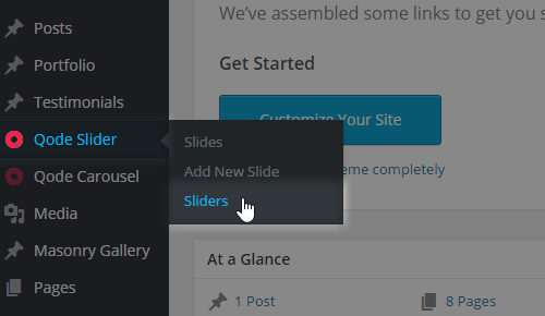
01 Locate to the desired slider in WP Admin -> Qode Slider -> Sliders
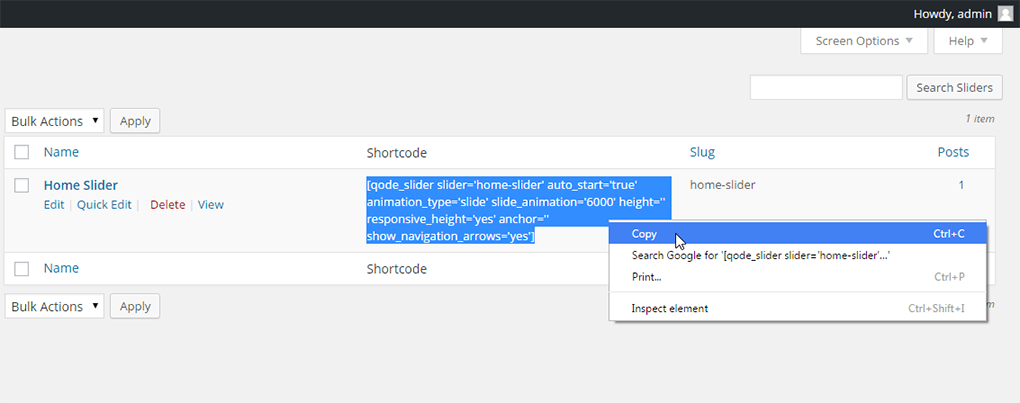
02 Copy the shortcode located next to the slider name
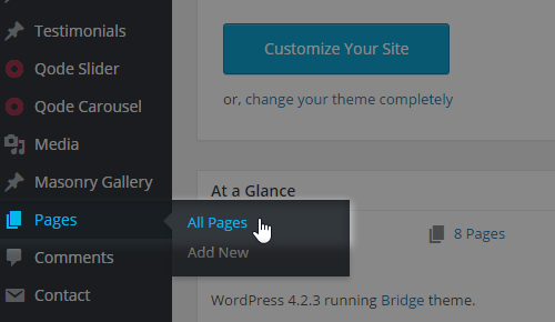
03 Now, navigate to the page you want to place the slider into: WP Admin-> Pages and open that page, which will bring you to the page edit screen.
04 Paste the shortcode into the dedicated field located in the Qode General section - Qode Slider or Layer slider shotcode.
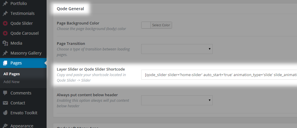
Note: In a similar manner you can apply Qode Slider to a portfolio item or a blog post.
Let’s have a look at a default shortcode:
Default shortcode:
8.6.4 Width And Height
The Qode Slider is developed to be in full width – with a ‘Hero’ role. It will always adapt to the width of the site. What this means is that if you are using a boxed layout, the Qode Slider will be in grid, otherwise it’ll be 100% of the browser width.
Note: Keep in mind that slider content is always in grid, therefore only slider background is affected with the width attribute – stretching across the whole width of the view-port.
In regards to setting your slider’s height, you have a few options at your disposal. Adding a height value directly in the shortcode on a page edit screen defines how that slider is displayed on that particular page. Therefore, you can have the same slider distributed on several pages in various layouts, depending on the shortcode you paste.
A Slider can be full height, meaning that its height will always be calculated to fit the browser window height, and this is the default option. Also, the Qode slider can have a dedicate height value regardless of viewport dimensions. It’s controlled with the shortcode parameter called height.
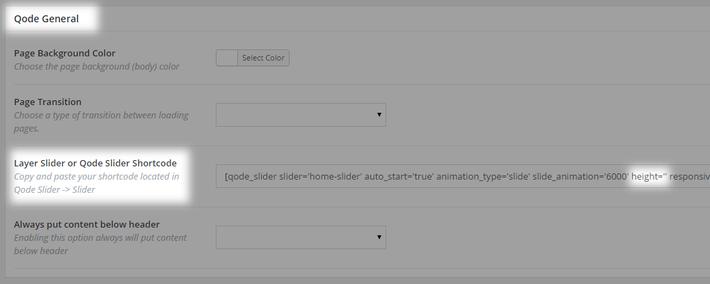

If the height parameter is left empty, the Qode slider will be in full-height, otherwise you need to enter a desired value. To have a 600 pixels high slider, simply enter 600 – omitting the unit itself.
Fullheight: http://demo.qodeinteractive.com/bridge4/
Controlled height: http://demo.qodeinteractive.com/bridge51/
If you are using a slider with a defined height parameter, then you can also use the responsive height option. This option is applied on a per slider basis using the shortcode argument called responsive_height. There are two distinct ways of calculating the slider height using coefficients related to browser width.
Before going deeper into this matter, here is an example of a calculated height. If slider height is set to 500px (500 in the shortcode) and the coefficient is 0.8, the calculated height will be 500px x 0.8 = 400px.
8.6.4.1 Default Responsivness
If Advanced Responsiveness is turned off the default responsive height comes into play. Slider height is calculated using coefficients as follows - bound to a certain pixel range:
- above 1300px: 1
- 1300px – 1000px: 0.8
- 1000px – 768px: 0.7
- below 768px: 1
8.6.4.2 Advanced Responsivness
However, when Advanced Responsiveness is turned on, the slider height is calculated using coefficients related to a breakpoint set being used.
The default breakpoint set is set1 and it will be applied even if not specifically defined in the shortcode. Slider height is calculated using coefficients as follows - bound to a certain pixel range:
- above 1600px: 1
- 1600px - 1200px: 0.75
- 1200px - 900px: 0.6
- 900px - 650px: 0.55
- below 650px: 0.45
To use the second set of breakpoints, set2, you need to specify it in shortcode attribute called q_responsive_breakpoints. If used, then the Slider height is calculated using coefficients as follows - bound to a certain pixel range:
Let’s have a look at a extended shortcode:
- above 1600px: 1
- 1600px - 1300px: 0.75
- 1300px - 1000px: 0.6
- 1000px - 768px: 0.55
- below 768px: 0.45
8.6.4.3 Mobile Height
Non-related to the height option you are using with previously mentioned options, you can control the slider height on mobile devices for all Qode sliders on your site using the global setting. This option is handy if you want to have more control of the slider height but don’t want to dig into advanced responsiveness and fine tuning
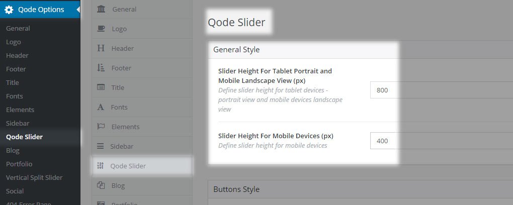
This options is located under Qode Options -> Qode Slider -> General section.
Value set in the field next to Slider Height For Tablet Portrait and Mobile Landscape View (px) label will be applied on browser width between 768px and 480px. This should affect portrait orientated tablet devices and landscape orientated mobile phones.
Value set in the field next to Slider Height For Mobile Devices (px) label will be applied for browser width less than 480px. This should affect portrait orientated mobile phones.

8.6.4.4 Qode Slider Through Shortcode Examples
Now let’s have a look at a few examples focusing on how to easily set necessary options to achieve a particular slider height. Please note, basic examples will utilize non responsive content.
Basic example 1 – Full height on all screens (fullscreen if site layout isn’t boxed)

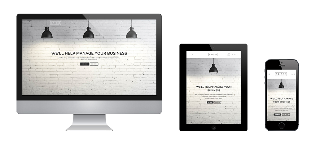
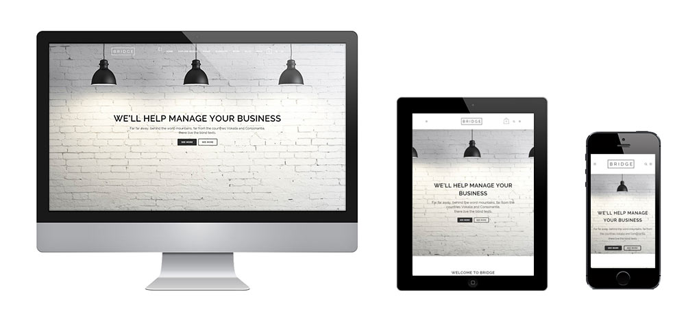
Basic example 2 – Full height on desktop screens (fullscreen if site layout isn’t boxed) and controlled height on mobile devices (all sliders on site)
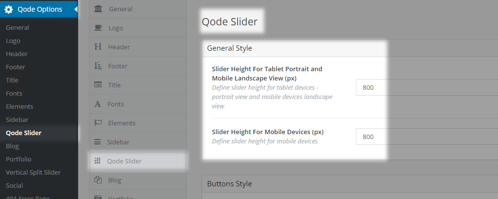
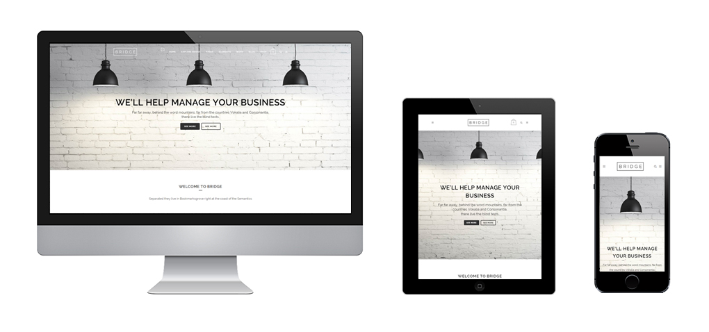
Basic example 3 – Same controlled height on all screens
Basic example 4 – Different controlled height on desktop and mobile devices

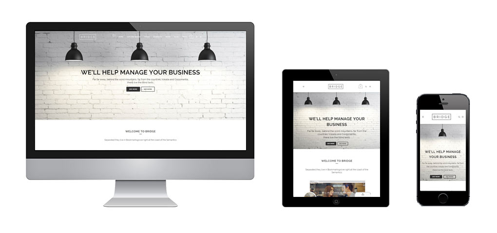
8.6.5 Anchoring– Scroll To Slider
The slider can be used as an anchor target. Since the slider will always be at the top of the page, above the page content, this option is neat for one page sites when the “Home” link from the main menu should scroll to top of the page, just like in this demo:
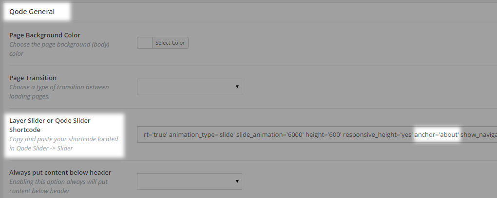
This option is applied on a per slider instance by entering a value into the slider shortcode with the parameter called anchor. This value should be unique on the page where the slider is positioned, and it should be used as a value for anchor trigger in links and menu items.

8.6.6 Slide Duration
Duration is another pretty straightforward feature which defines time interval between two slide transitions. Or in other words, it defines for how long one slide will be in focus.
This option is applied on a per slider instance by setting a shortcode parameter called slide_animation. The default value is 6000 and represents a number of milliseconds between two slides.
8.7 TIPS AND TRICKS
In the following section you will find some useful tips and tricks regarding the Qode Slider.
8.7.1 Choosing Appropriate Image Sizes
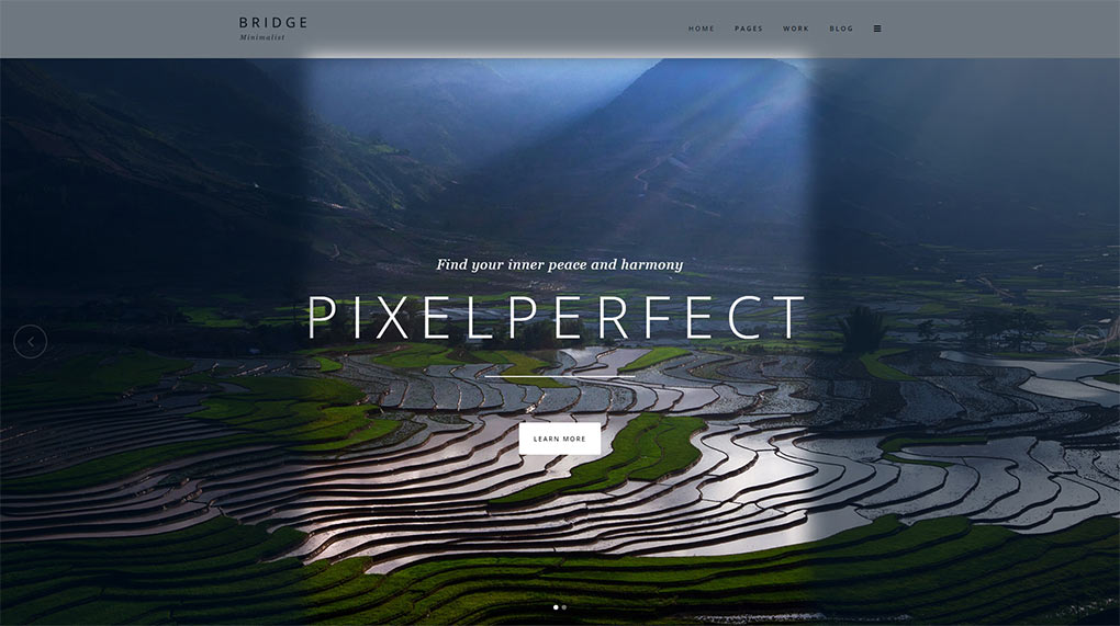
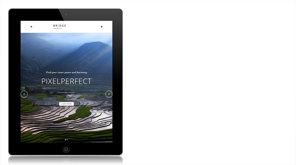
It is important to know that most of the time parts of the slide background won’t be visible. The actual visible portion will vary depending on screen orientation and width/height aspect ratio.
For instance, the common aspect ratio of portrait orientated tablets is 3:4 (iPad), and for desktop monitors it is 16:9 (full-HD resolution). In all instances the background is scaled to be as large as possible so that the slider area is completely covered by the background image or background video. In other words, some background clipping must occur, while the ‘content-safe’ area is the very center of each slide – this area is always visible.
Keeping this safe area in mind, if you are using slider background as an important part of your visual message, like an image showing your product for a product launching website, make sure that product is placed within that safe area so it won’t be clipped out.
8.7.2 Slider With Angled Bottom
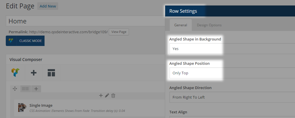
To achieve this effect you should create an angled shape background for the very first row below the Qode Slider. To do so, open the row’s edit dialogue in the page edit screen, and set Yes in the Angled Shape Background dropdown field. Afterwards, new options will become available, so make sure to set either Default or Only Top in the Angled Shape Position field.
